
OutlinedCard
Functions summary
Unit |
@ComposableOutlined Wear Material 3 |
Unit |
@ComposableOutlined Wear Material 3 |
Functions
OutlinedCard
@Composable
fun OutlinedCard(
    modifier: Modifier = Modifier,
    shape: Shape = CardDefaults.shape,
    colors: CardColors = CardDefaults.outlinedCardColors(),
    border: BorderStroke = CardDefaults.outlinedCardBorder(),
    contentPadding: PaddingValues = CardDefaults.ContentPadding,
    transformation: SurfaceTransformation? = null,
    content: @Composable ColumnScope.() -> Unit
): Unit
Outlined Wear Material 3 Card that offers a single slot to take any content.
This OutlinedCard does not handle input events - see the other OutlinedCard overloads if you want a clickable OutlinedCard.
Outlined Card components that take specific content such as icons, images, titles, subtitles and labels. Outlined Cards have a visual boundary around the container. This can emphasise the content of this card.
The OutlinedCard is Rectangle-shaped with rounded corners by default.
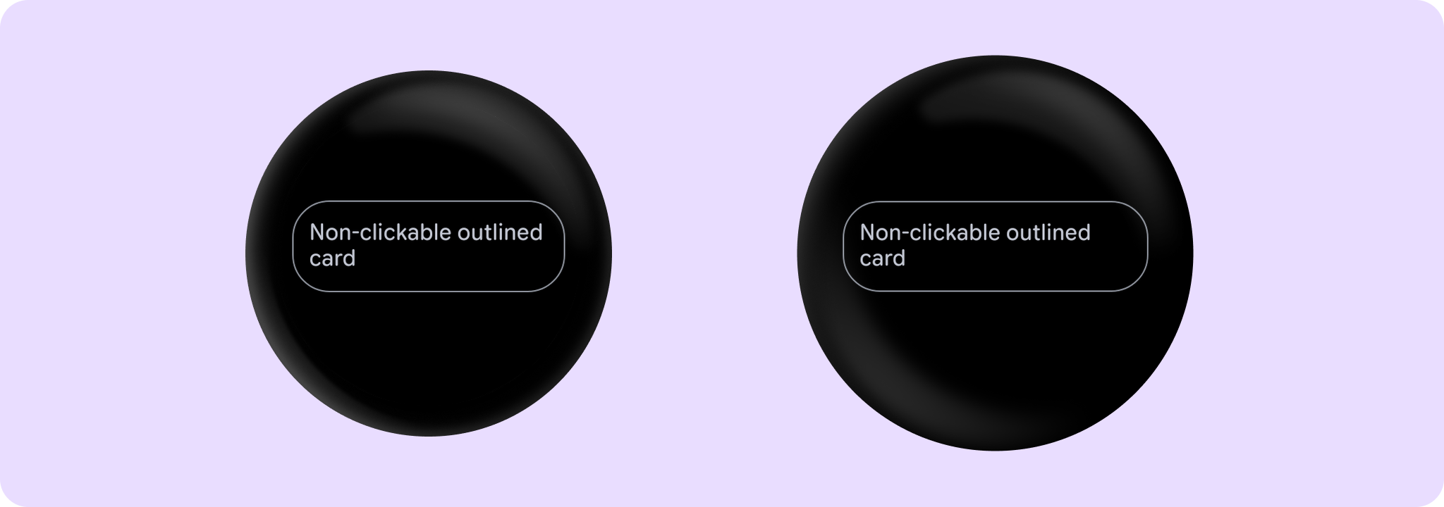
Example of a non-clickable OutlinedCard:
import androidx.wear.compose.material3.Card
import androidx.wear.compose.material3.OutlinedCard
import androidx.wear.compose.material3.Text

OutlinedCard { Text("Non-clickable outlined card") }
For more information, see the Cards Wear OS Material design guide.
| Parameters | |
|---|---|
modifier: Modifier = Modifier |
Modifier to be applied to the card |
shape: Shape = CardDefaults.shape |
Defines the card's shape. It is strongly recommended to use the default as this shape is a key characteristic of the Wear Material Theme |
colors: CardColors = CardDefaults.outlinedCardColors() |
|
border: BorderStroke = CardDefaults.outlinedCardBorder() |
A BorderStroke object which is used for the outline drawing. |
contentPadding: PaddingValues = CardDefaults.ContentPadding |
The spacing values to apply internally between the container and the content |
transformation: SurfaceTransformation? = null |
Transformation to be used when card appears inside a container that needs to dynamically change its content separately from the background. |
content: @Composable ColumnScope.() -> Unit |
The main slot for a content of this card |
OutlinedCard
@Composable
fun OutlinedCard(
    onClick: () -> Unit,
    modifier: Modifier = Modifier,
    onLongClick: (() -> Unit)? = null,
    onLongClickLabel: String? = null,
    enabled: Boolean = true,
    shape: Shape = CardDefaults.shape,
    colors: CardColors = CardDefaults.outlinedCardColors(),
    border: BorderStroke = CardDefaults.outlinedCardBorder(),
    contentPadding: PaddingValues = CardDefaults.ContentPadding,
    interactionSource: MutableInteractionSource? = null,
    transformation: SurfaceTransformation? = null,
    content: @Composable ColumnScope.() -> Unit
): Unit
Outlined Wear Material 3 Card that offers a single slot to take any content.
Outlined Card components that take specific content such as icons, images, titles, subtitles and labels. Outlined Cards have a visual boundary around the container. This can emphasise the content of this card.
The OutlinedCard is Rectangle-shaped with rounded corners by default.
Cards can be enabled or disabled. A disabled card will not respond to click events.
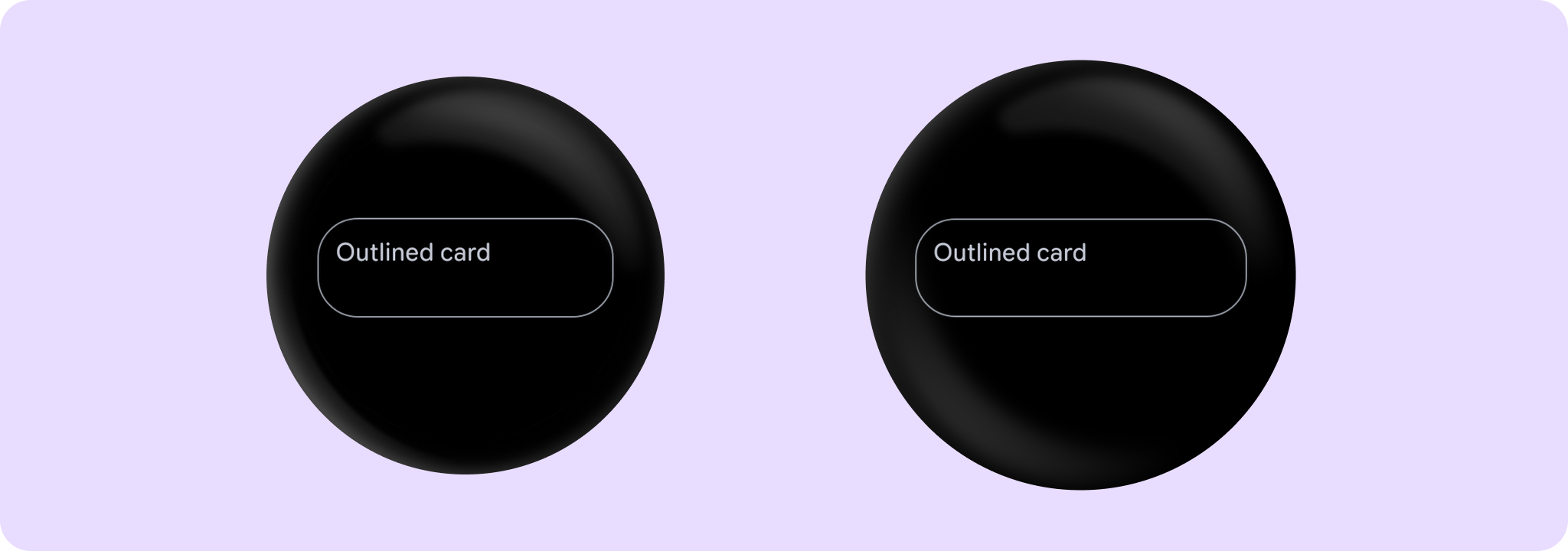
Example of an OutlinedCard:
import androidx.wear.compose.material3.Card
import androidx.wear.compose.material3.OutlinedCard
import androidx.wear.compose.material3.Text

OutlinedCard(onClick = { /* Do something */ }) { Text("Outlined card") }
For more information, see the Cards Wear OS Material design guide.
| Parameters | |
|---|---|
onClick: () -> Unit |
Will be called when the user clicks the card |
modifier: Modifier = Modifier |
Modifier to be applied to the card |
onLongClick: (() -> Unit)? = null |
Called when this card is long clicked (long-pressed). When this callback is set, |
onLongClickLabel: String? = null |
Semantic / accessibility label for the |
enabled: Boolean = true |
Controls the enabled state of the card. When false, this card will not be clickable and there will be no ripple effect on click. Wear cards do not have any specific elevation or alpha differences when not enabled - they are simply not clickable. |
shape: Shape = CardDefaults.shape |
Defines the card's shape. It is strongly recommended to use the default as this shape is a key characteristic of the Wear Material Theme |
colors: CardColors = CardDefaults.outlinedCardColors() |
|
border: BorderStroke = CardDefaults.outlinedCardBorder() |
A BorderStroke object which is used for the outline drawing. |
contentPadding: PaddingValues = CardDefaults.ContentPadding |
The spacing values to apply internally between the container and the content |
interactionSource: MutableInteractionSource? = null |
an optional hoisted |
transformation: SurfaceTransformation? = null |
Transformation to be used when card appears inside a container that needs to dynamically change its content separately from the background. |
content: @Composable ColumnScope.() -> Unit |
The main slot for a content of this card |