
SegmentedCircularProgressIndicator
Functions summary
Unit |
@ComposableMaterial Design segmented circular progress indicator. |
Unit |
@ComposableMaterial Design segmented circular progress indicator. |
Functions
SegmentedCircularProgressIndicator
@Composable
fun SegmentedCircularProgressIndicator(
    segmentCount: @IntRange(from = 1) Int,
    segmentValue: (segmentIndex: Int) -> Boolean,
    modifier: Modifier = Modifier,
    startAngle: Float = CircularProgressIndicatorDefaults.StartAngle,
    endAngle: Float = startAngle,
    colors: ProgressIndicatorColors = ProgressIndicatorDefaults.colors(),
    strokeWidth: Dp = CircularProgressIndicatorDefaults.largeStrokeWidth,
    gapSize: Dp = CircularProgressIndicatorDefaults.calculateRecommendedGapSize(strokeWidth),
    enabled: Boolean = true
): Unit
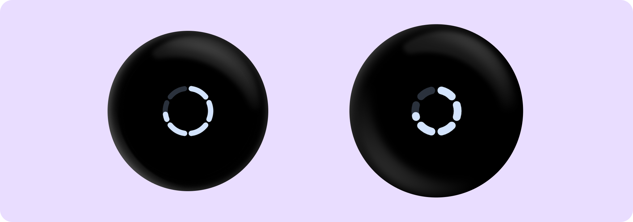
Material Design segmented circular progress indicator.
A segmented variant of CircularProgressIndicator that is divided into equally sized segments. This overload of SegmentedCircularProgressIndicator allows for each segment to be individually indicated as completed, such as for showing activity for intervals within a longer period
Example of SegmentedCircularProgressIndicator where the segments are turned on/off:
import androidx.compose.foundation.background
import androidx.compose.foundation.layout.Box
import androidx.compose.foundation.layout.fillMaxSize
import androidx.compose.foundation.layout.padding
import androidx.compose.ui.Modifier
import androidx.wear.compose.material3.CircularProgressIndicator
import androidx.wear.compose.material3.CircularProgressIndicatorDefaults
import androidx.wear.compose.material3.MaterialTheme
import androidx.wear.compose.material3.ProgressIndicatorDefaults
import androidx.wear.compose.material3.SegmentedCircularProgressIndicator

Box(
    modifier =
        Modifier.background(MaterialTheme.colorScheme.background)
            .padding(CircularProgressIndicatorDefaults.FullScreenPadding)
            .fillMaxSize()
) {
    SegmentedCircularProgressIndicator(segmentCount = 5, segmentValue = { it % 2 != 0 })
}

Example of smaller size SegmentedCircularProgressIndicator:
import androidx.compose.foundation.layout.Box
import androidx.compose.foundation.layout.fillMaxSize
import androidx.compose.foundation.layout.size
import androidx.compose.ui.Alignment
import androidx.compose.ui.Modifier
import androidx.compose.ui.unit.dp
import androidx.wear.compose.material3.CircularProgressIndicator
import androidx.wear.compose.material3.SegmentedCircularProgressIndicator

Box(modifier = Modifier.fillMaxSize()) {
    SegmentedCircularProgressIndicator(
        segmentCount = 8,
        segmentValue = { it % 2 != 0 },
        modifier = Modifier.align(Alignment.Center).size(80.dp),
    )
}

| Parameters | |
|---|---|
segmentCount: @IntRange(from = 1) Int |
Number of equal segments that the progress indicator should be divided into. Has to be a number equal or greater to 1. |
segmentValue: (segmentIndex: Int) -> Boolean |
A function that for each segment between 1.. |
modifier: Modifier = Modifier |
Modifier to be applied to the SegmentedCircularProgressIndicator. |
startAngle: Float = CircularProgressIndicatorDefaults.StartAngle |
The starting position of the progress arc, measured clockwise in degrees (0 to 360) from the 3 o'clock position. For example, 0 and 360 represent 3 o'clock, 90 and 180 represent 6 o'clock and 9 o'clock respectively. Default is 270 degrees |
endAngle: Float = startAngle |
The ending position of the progress arc, measured clockwise in degrees (0 to 360) from the 3 o'clock position. For example, 0 and 360 represent 3 o'clock, 90 and 180 represent 6 o'clock and 9 o'clock respectively. By default equal to |
colors: ProgressIndicatorColors = ProgressIndicatorDefaults.colors() |
|
strokeWidth: Dp = CircularProgressIndicatorDefaults.largeStrokeWidth |
The stroke width for the progress indicator. |
gapSize: Dp = CircularProgressIndicatorDefaults.calculateRecommendedGapSize(strokeWidth) |
The size of the gap between segments (in Dp). |
enabled: Boolean = true |
controls the enabled state. Although this component is not clickable, it can be contained within a clickable component. When enabled is |
SegmentedCircularProgressIndicator
@Composable
fun SegmentedCircularProgressIndicator(
    segmentCount: @IntRange(from = 1) Int,
    progress: () -> Float,
    modifier: Modifier = Modifier,
    allowProgressOverflow: Boolean = false,
    startAngle: Float = CircularProgressIndicatorDefaults.StartAngle,
    endAngle: Float = startAngle,
    colors: ProgressIndicatorColors = ProgressIndicatorDefaults.colors(),
    strokeWidth: Dp = CircularProgressIndicatorDefaults.largeStrokeWidth,
    gapSize: Dp = CircularProgressIndicatorDefaults.calculateRecommendedGapSize(strokeWidth),
    enabled: Boolean = true
): Unit
Material Design segmented circular progress indicator.
A segmented variant of CircularProgressIndicator that is divided into equally sized segments.
Example of SegmentedCircularProgressIndicator with progress value:
import androidx.compose.foundation.background
import androidx.compose.foundation.layout.Box
import androidx.compose.foundation.layout.fillMaxSize
import androidx.compose.foundation.layout.padding
import androidx.compose.ui.Modifier
import androidx.wear.compose.material3.CircularProgressIndicator
import androidx.wear.compose.material3.CircularProgressIndicatorDefaults
import androidx.wear.compose.material3.MaterialTheme
import androidx.wear.compose.material3.ProgressIndicatorDefaults
import androidx.wear.compose.material3.SegmentedCircularProgressIndicator

Box(
    modifier =
        Modifier.background(MaterialTheme.colorScheme.background)
            .padding(CircularProgressIndicatorDefaults.FullScreenPadding)
            .fillMaxSize()
) {
    SegmentedCircularProgressIndicator(segmentCount = 5, progress = { 0.5f })
}

Example of smaller size SegmentedCircularProgressIndicator:
import androidx.compose.foundation.layout.Box
import androidx.compose.foundation.layout.fillMaxSize
import androidx.compose.foundation.layout.size
import androidx.compose.ui.Alignment
import androidx.compose.ui.Modifier
import androidx.compose.ui.unit.dp
import androidx.wear.compose.material3.CircularProgressIndicator
import androidx.wear.compose.material3.SegmentedCircularProgressIndicator

Box(modifier = Modifier.fillMaxSize()) {
    SegmentedCircularProgressIndicator(
        segmentCount = 6,
        progress = { 0.75f },
        modifier = Modifier.align(Alignment.Center).size(80.dp),
    )
}
| Parameters | |
|---|---|
segmentCount: @IntRange(from = 1) Int |
Number of equal segments that the progress indicator should be divided into. Has to be a number equal or greater to 1. |
progress: () -> Float |
The progress of this progress indicator where 0.0 represents no progress and 1.0 represents completion. Values smaller than 0.0 will be coerced to 0, while values larger than 1.0 will be wrapped around and shown as overflow with a different track color. The progress is applied to the entire |
modifier: Modifier = Modifier |
Modifier to be applied to the SegmentedCircularProgressIndicator. |
allowProgressOverflow: Boolean = false |
When progress overflow is allowed, values smaller than 0.0 will be coerced to 0, while values larger than 1.0 will be wrapped around and shown as overflow with a different track color |
startAngle: Float = CircularProgressIndicatorDefaults.StartAngle |
The starting position of the progress arc, measured clockwise in degrees (0 to 360) from the 3 o'clock position. For example, 0 and 360 represent 3 o'clock, 90 and 180 represent 6 o'clock and 9 o'clock respectively. Default is 270 degrees |
endAngle: Float = startAngle |
The ending position of the progress arc, measured clockwise in degrees (0 to 360) from the 3 o'clock position. For example, 0 and 360 represent 3 o'clock, 90 and 180 represent 6 o'clock and 9 o'clock respectively. By default equal to |
colors: ProgressIndicatorColors = ProgressIndicatorDefaults.colors() |
|
strokeWidth: Dp = CircularProgressIndicatorDefaults.largeStrokeWidth |
The stroke width for the progress indicator. |
gapSize: Dp = CircularProgressIndicatorDefaults.calculateRecommendedGapSize(strokeWidth) |
The size of the gap between segments (in Dp). |
enabled: Boolean = true |
controls the enabled state. Although this component is not clickable, it can be contained within a clickable component. When enabled is |