
Get started with large screens
Large screens expand your app development opportunities. The large screens of tablets, foldables, and ChromeOS devices showcase content, facilitate multitasking, and enable user interfaces not possible on small screens.
Imagine your app on large screens
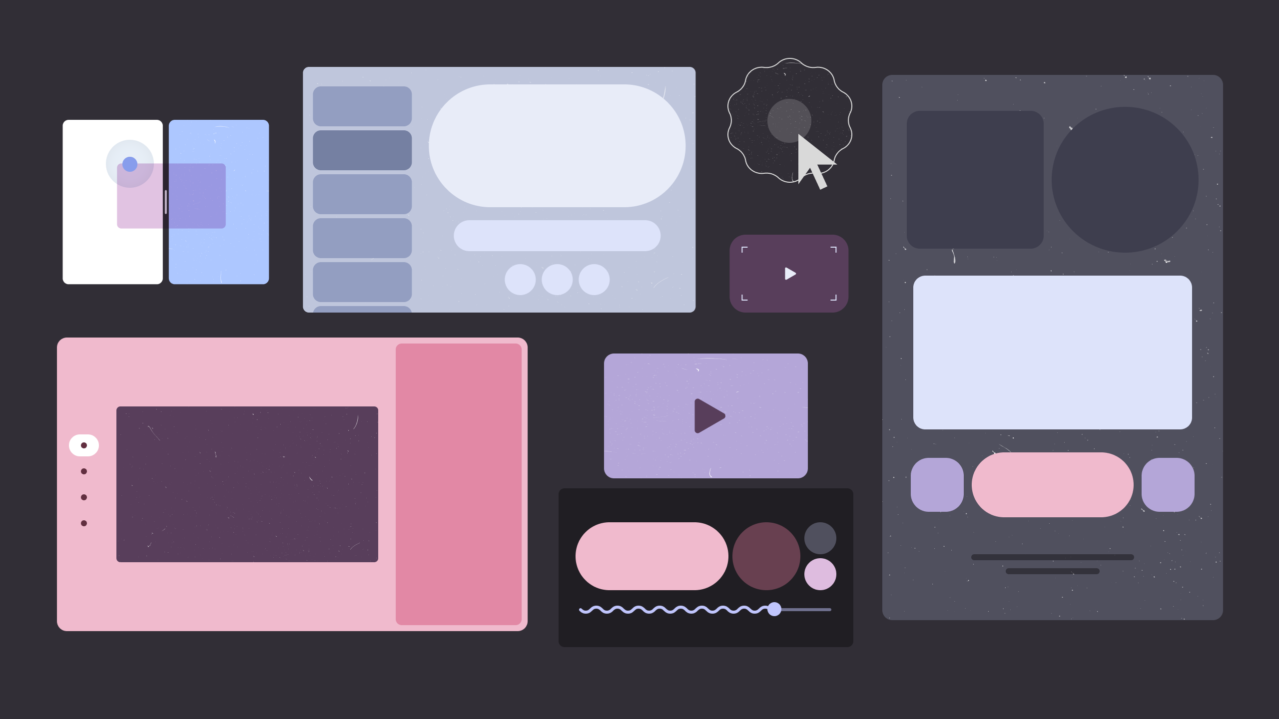
A more productive productivity app, more engaging media app, more immersive game. Imagine what you can do with the wide open display space of large screens.
Productivity
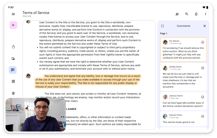
Make apps more productive with plenty of work space for tools, text, and uncluttered interactivity.
Creativity
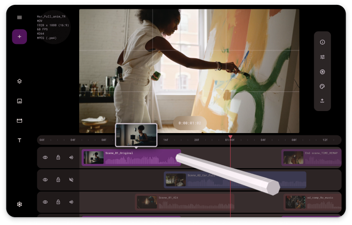
Enable big ideas on large screens. Put palettes, pickers, and panels within easy reach of finger or stylus for natural creative control.
Media
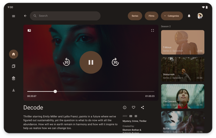
Expand the viewing or listening experience with related content such as similar titles, author biographies, playlists, or song lyrics.
For more large screen designs, visit the UI design gallery.
Build for everyone…
Large screen devices are a fast growing market segment. Enable your app to run on all large screen form factors in addition to standard phones. Make your app available to as many users as possible. Build for every device, for everyone.
…with the help of app quality guidelines

To get started with large screen development, follow the Adaptive app quality guidelines. The guidelines are a comprehensive set of requirements designed to help make your app the best it can be on all display sizes, including large screens.
App quality tiers
The quality guidelines are organized into three tiers: Adaptive ready, Adaptive optimized, and Adaptive differentiated. Add large screen capabilities to your app by progressively working through the tiers, starting with Adaptive ready. If you have an existing app, use the quality guideline tests to determine the tier your app supports, then implement features tier by tier until your app is uniquely differentiated for large screens.
Tier 3
Adaptive ready
Expand your app's possibilities on large screens. Support portrait and landscape device orientations and multi-window mode. Create layouts that fill the available app space.
Tier 2
Adaptive optimized
Increase user engagement. Accommodate displays of all sizes with responsive/adaptive layouts. Support keyboard, mouse, trackpad, and stylus.
Tier 1
Adaptive differentiated
Make your app stand out from the app store crowd. Add differentiated features like tabletop posture on foldables for a user experience standard phones can't match.
…and proven canonical layouts
The large screen canonical layouts—list‑detail, feed, and supporting pane—are versatile, popular UI designs. Implement the layouts in your app to provide an optimized large screen experience your users will love.
Get started
Select a quality tier and get started with large screens—all screens—today!