
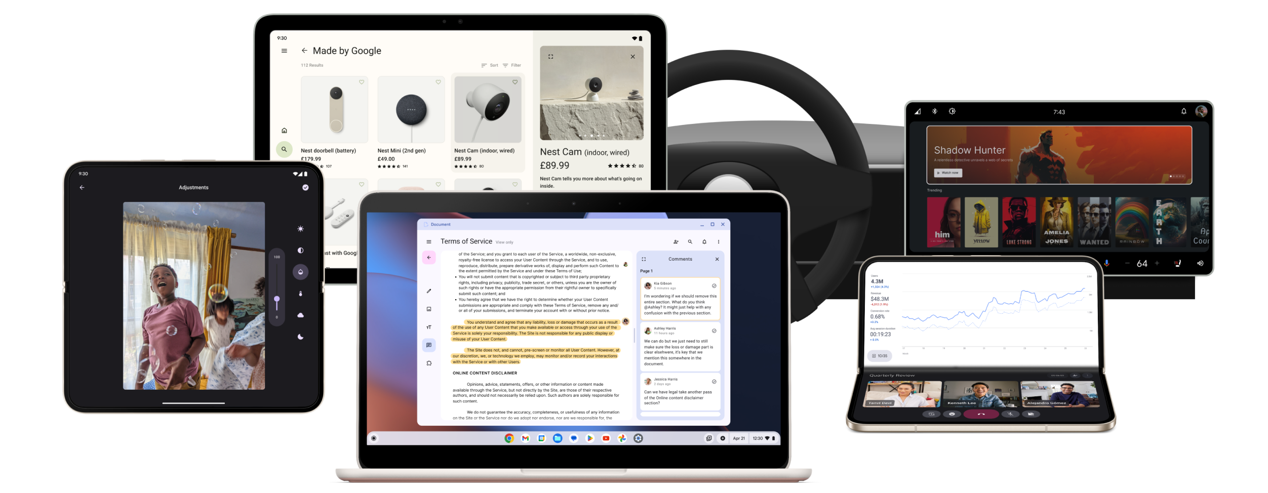
Build adaptive apps
Unlock your app's full potential on phones, tablets, foldables, ChromeOS, cars, and XR.
Reach more users on more devices. Increase user engagement and retention.
Reach more users on more devices. Increase user engagement and retention.
Build for more devices, more users
Simplify development across all types of devices. Reach the fastest growing segment of Android users on more than 580 million large screen Android devices, including premium flagship devices.
Rank higher on Google Play
Adaptive apps rank higher and are more often selected for Editors’ Choice on Google Play. Help users find apps that resize well, aren't letterboxed, and support portrait and landscape orientations.
Attract and retain users
Adaptive apps have higher user satisfaction, user engagement, and time-in-app metrics on large screen form factors such as foldables, tablets, and ChromeOS devices, where users spend 9x more in dollar value than users who have only a phone.
Optimize the user experience on all devices
Build your app to work seamlessly on a wide variety of devices. Support configuration changes to ensure your app looks and works great in every window size, aspect ratio, orientation, and posture. Maintain continuity—enable users to pick up where they left off across different form factors and platforms. Avoid bad user experiences like compatibility modes and letterboxing.
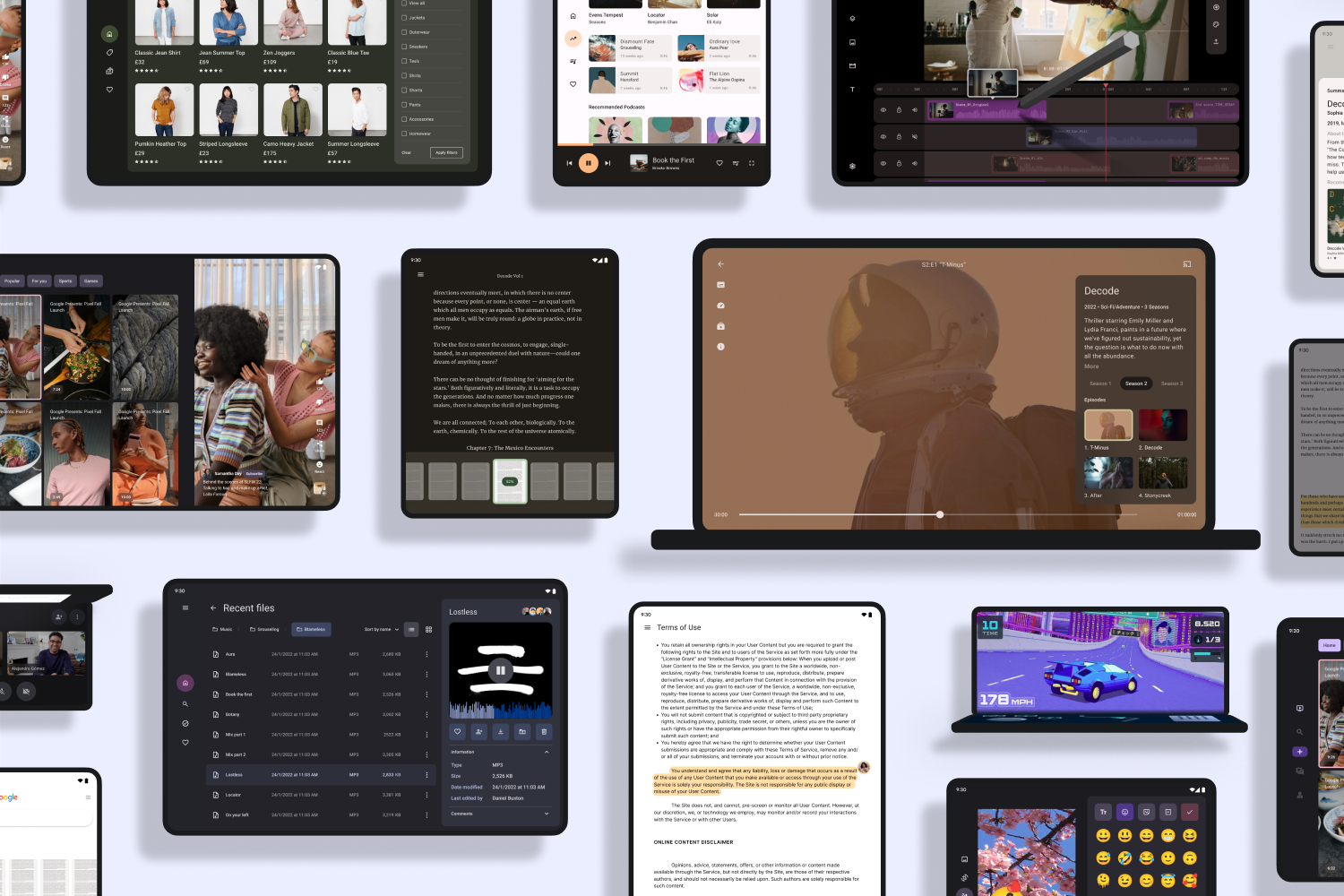
Create adaptive layouts
Provide a great user experience on all device form factors, from conventional phones
to tablets to cars. Adapt your app's UI to different display sizes and configurations
to enhance the user experience, improve accessibility, future-proof your app for new
devices, and reduce development and maintenance costs.
Support external input devices
Increase your app's reach and accessibility. Create a truly inclusive user experience
by optimizing your app for a wide range of input devices. Ensure effortless
interaction with mouse, trackpad, keyboard, stylus, and accessibility tools,
empowering every user to easily navigate your app and realize its full potential.
Showcase differentiating experiences
Leverage the latest advancements in the Android ecosystem to create unique user
experiences. New form factors, such as foldable devices, offer innovative device
configurations, like tabletop posture, which enables users to operate their foldable
device without holding it in their hands. Differentiate your app from the ordinary
with exceptional capabilities.
Guarantee reliability with automated testing
Automate testing with tools like the Espresso testing framework and Jetpack Compose testing APIs. Automated testing speeds up development by providing rapid feedback, eliminating errors caused by human intervention, and improving app stability through comprehensive testing. The result: lower development cost, better resource allocation, and faster release cycles to ultimately enhance the user experience with a more stable and reliable app.
Get inspired
Tour the large screen gallery
Explore inspiring, optimized designs for large screen devices. Browse UI/UX templates for popular app categories, including media, creativity, games, and more.
Check out adaptive app success stories
Optimize your app for screens of all sizes to provide the best experience for your users and deliver positive business results. More and more apps across all categories have been taking advantage of the opportunities presented by multiple form factors. See the experiences developers have built, learn about the implementations they've created, and find out why adaptive app development is important to their businesses.
Latest news

BLOG
Goodbye Mobile Only, Hello Adaptive: Three essential updates
Updated December 19, 2025
In 2025 the Android ecosystem has grown far beyond the phone. Today, developers have the opportunity to reach over 500 million active devices, including foldables, tablets, XR, Chromebooks, and...
In 2025 the Android ecosystem has grown far beyond the phone. Today, developers have the opportunity to reach over 500 million active devices, including foldables, tablets, XR, Chromebooks, and...
BLOG
Unfold new possibilities with Compose Adaptive Layouts 1.2 beta
Updated September 3, 2025
Compose Adaptive Layouts 1.2 is now in beta, introducing powerful new layout strategies like reflow and levitate. Build polished, responsive UIs with less code for the expanding foldable ecosystem...
Compose Adaptive Layouts 1.2 is now in beta, introducing powerful new layout strategies like reflow and levitate. Build polished, responsive UIs with less code for the expanding foldable ecosystem...

BLOG
A product manager's guide to adapting Android apps across devices
Updated June 10, 2025
Reach users on over 500 million active large screen devices. Explore the ROI of adaptive apps, from increased discoverability in Google Play to significantly higher user engagement and retention...
Reach users on over 500 million active large screen devices. Explore the ROI of adaptive apps, from increased discoverability in Google Play to significantly higher user engagement and retention...