
WideClassicCard
Functions summary
Unit |
@Composable
|
Functions
WideClassicCard
@Composable
fun WideClassicCard(
    onClick: () -> Unit,
    image: @Composable BoxScope.() -> Unit,
    title: @Composable () -> Unit,
    modifier: Modifier = Modifier,
    onLongClick: (() -> Unit)? = null,
    subtitle: @Composable () -> Unit = {},
    description: @Composable () -> Unit = {},
    shape: CardShape = CardDefaults.shape(),
    colors: CardColors = CardDefaults.colors(),
    scale: CardScale = CardDefaults.scale(),
    border: CardBorder = CardDefaults.border(),
    glow: CardGlow = CardDefaults.glow(),
    contentPadding: PaddingValues = PaddingValues(),
    interactionSource: MutableInteractionSource? = null
): Unit
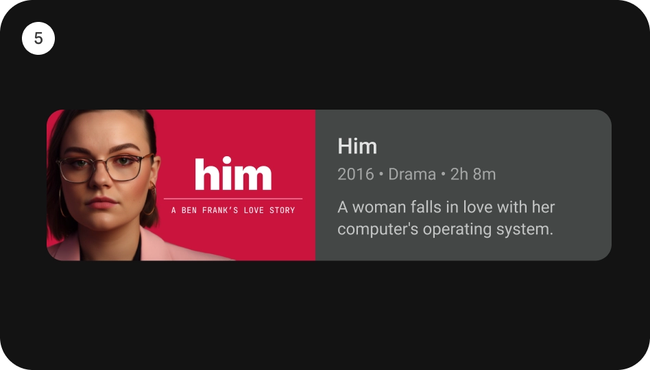
WideClassicCard is an opinionated TV Material card that offers a 4 slot layout to show information about a subject.
This card has a horizontal layout with the interactive surface Surface, which provides the image slot at the start, followed by the title, subtitle, and description slots at the end.
This Card handles click events, calling its onClick lambda.
Checkout TV design guidelines to learn more about Material Wide Classic Card.
import androidx.compose.foundation.background
import androidx.compose.foundation.layout.Box
import androidx.compose.foundation.layout.PaddingValues
import androidx.compose.foundation.layout.fillMaxWidth
import androidx.compose.foundation.layout.height
import androidx.compose.foundation.layout.padding
import androidx.compose.foundation.layout.size
import androidx.compose.ui.Modifier
import androidx.compose.ui.graphics.Color
import androidx.compose.ui.unit.dp
import androidx.tv.material3.Card
import androidx.tv.material3.ClassicCard
import androidx.tv.material3.Text
import androidx.tv.material3.WideClassicCard

WideClassicCard(
    modifier = Modifier.size(180.dp, 100.dp),
    image = { Box(modifier = Modifier.fillMaxWidth().height(80.dp).background(Color.Blue)) },
    title = { Text(text = "Wide Classic Card", modifier = Modifier.padding(start = 8.dp)) },
    contentPadding = PaddingValues(8.dp),
    onClick = {},
)
| Parameters | |
|---|---|
onClick: () -> Unit |
called when this card is clicked. |
image: @Composable BoxScope.() -> Unit |
defines the |
title: @Composable () -> Unit |
defines the |
modifier: Modifier = Modifier |
the |
onLongClick: (() -> Unit)? = null |
called when this card is long clicked (long-pressed). |
subtitle: @Composable () -> Unit = {} |
defines the |
description: @Composable () -> Unit = {} |
defines the |
shape: CardShape = CardDefaults.shape() |
|
colors: CardColors = CardDefaults.colors() |
|
scale: CardScale = CardDefaults.scale() |
|
border: CardBorder = CardDefaults.border() |
|
glow: CardGlow = CardDefaults.glow() |
|
contentPadding: PaddingValues = PaddingValues() |
|
interactionSource: MutableInteractionSource? = null |
an optional hoisted |