
ConfirmationDialog
Functions summary
Unit |
@ComposableShows a transient |
Unit |
@ComposableShows a transient |
Functions
ConfirmationDialog
@Composable
fun ConfirmationDialog(
    visible: Boolean,
    onDismissRequest: () -> Unit,
    curvedText: (CurvedScope.() -> Unit)?,
    modifier: Modifier = Modifier,
    colors: ConfirmationDialogColors = ConfirmationDialogDefaults.colors(),
    properties: DialogProperties = DialogProperties(),
    durationMillis: Long = ConfirmationDialogDefaults.DurationMillis,
    content: @Composable () -> Unit
): Unit
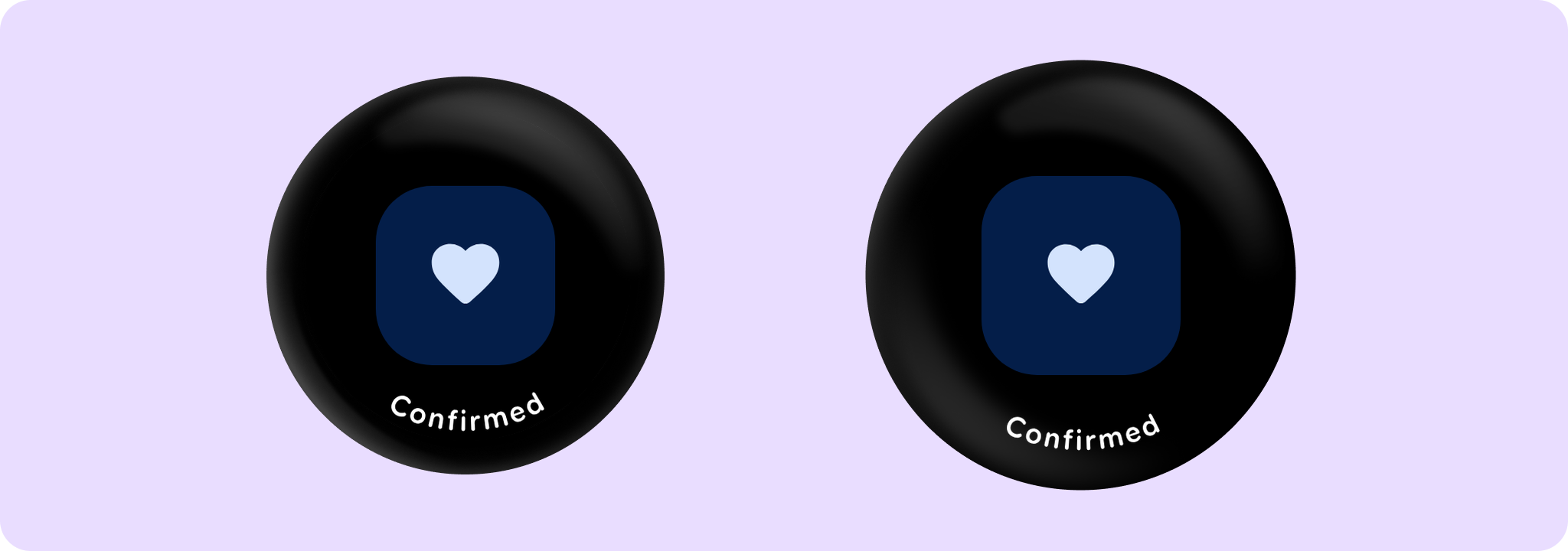
Shows a transient ConfirmationDialog with an icon and optional very short curvedText. The length of the curved text should be very short and should not exceed 1-2 words. If a longer text is required, then the alternative ConfirmationDialog overload with slot for linear text should be used instead.
The ConfirmationDialog shows a message to the user for durationMillis. After a specified timeout, the onDismissRequest callback will be invoked, where it's up to the caller to handle the dismissal. To hide the confirmation dialog, the visible parameter should be set to false.
Where user input is required, such as choosing to ok or cancel an action, use AlertDialog instead of ConfirmationDialog.
Example of a ConfirmationDialog with an icon and a curved text content:
import androidx.compose.foundation.layout.Box
import androidx.compose.foundation.layout.fillMaxSize
import androidx.compose.runtime.mutableStateOf
import androidx.compose.runtime.remember
import androidx.compose.ui.Alignment
import androidx.compose.ui.Modifier
import androidx.wear.compose.material3.ConfirmationDialog
import androidx.wear.compose.material3.ConfirmationDialogDefaults
import androidx.wear.compose.material3.FilledTonalButton
import androidx.wear.compose.material3.Icon
import androidx.wear.compose.material3.Text
import androidx.wear.compose.material3.confirmationDialogCurvedText
import androidx.wear.compose.material3.samples.icons.FavoriteIcon

var showConfirmation by remember { mutableStateOf(false) }

Box(Modifier.fillMaxSize()) {
    FilledTonalButton(
        modifier = Modifier.align(Alignment.Center),
        onClick = { showConfirmation = true },
        label = { Text("Show Confirmation") },
    )
}

// Has an icon and a short curved text content, which will be displayed along the bottom edge of
// the screen.
val curvedTextStyle = ConfirmationDialogDefaults.curvedTextStyle
ConfirmationDialog(
    visible = showConfirmation,
    onDismissRequest = { showConfirmation = false },
    curvedText = { confirmationDialogCurvedText("Confirmed", curvedTextStyle) },
) {
    FavoriteIcon(ConfirmationDialogDefaults.IconSize)
}
| Parameters | |
|---|---|
visible: Boolean |
A boolean indicating whether the confirmation dialog should be displayed. |
onDismissRequest: () -> Unit |
A lambda function to be called when the dialog is dismissed - either by swiping right or when the |
curvedText: (CurvedScope.() -> Unit)? |
A slot for displaying curved text content which will be shown along the bottom edge of the dialog. We recommend using |
modifier: Modifier = Modifier |
Modifier to be applied to the confirmation content. |
colors: ConfirmationDialogColors = ConfirmationDialogDefaults.colors() |
A |
properties: DialogProperties = DialogProperties() |
An optional |
durationMillis: Long = ConfirmationDialogDefaults.DurationMillis |
The duration in milliseconds for which the dialog is displayed. This value will be adjusted by the accessibility manager according to the content displayed. |
content: @Composable () -> Unit |
A slot for displaying an icon inside the confirmation dialog. It's recommended to set its size to |
ConfirmationDialog
@Composable
fun ConfirmationDialog(
    visible: Boolean,
    onDismissRequest: () -> Unit,
    text: (@Composable ColumnScope.() -> Unit)?,
    modifier: Modifier = Modifier,
    colors: ConfirmationDialogColors = ConfirmationDialogDefaults.colors(),
    properties: DialogProperties = DialogProperties(),
    durationMillis: Long = ConfirmationDialogDefaults.DurationMillis,
    content: @Composable () -> Unit
): Unit
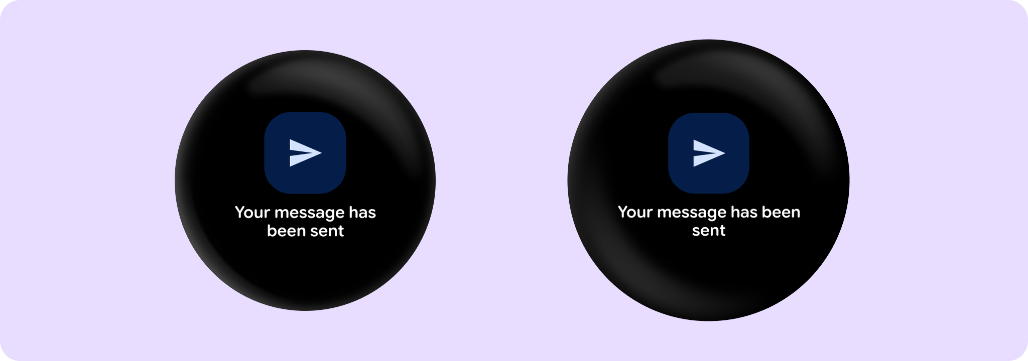
Shows a transient ConfirmationDialog with an icon and optional short text. The length of the text should not exceed 3 lines. If the text is very short and fits into 1-2 words, consider using the alternative ConfirmationDialog overload with the curvedText parameter instead.
The confirmation dialog will show a message to the user for durationMillis. After a specified timeout, the onDismissRequest callback will be invoked, where it's up to the caller to handle the dismissal. To hide the confirmation dialog, visible parameter should be set to false.
Where user input is required, such as choosing to ok or cancel an action, use AlertDialog instead of ConfirmationDialog.
Example of a ConfirmationDialog with an icon and a text which fits into 3 lines:
import androidx.compose.foundation.layout.Box
import androidx.compose.foundation.layout.fillMaxSize
import androidx.compose.foundation.layout.size
import androidx.compose.material.icons.Icons
import androidx.compose.material.icons.automirrored.filled.Send
import androidx.compose.runtime.mutableStateOf
import androidx.compose.runtime.remember
import androidx.compose.ui.Alignment
import androidx.compose.ui.Modifier
import androidx.wear.compose.material3.ConfirmationDialog
import androidx.wear.compose.material3.ConfirmationDialogDefaults
import androidx.wear.compose.material3.FilledTonalButton
import androidx.wear.compose.material3.Icon
import androidx.wear.compose.material3.Text

var showConfirmation by remember { mutableStateOf(false) }

Box(Modifier.fillMaxSize()) {
    FilledTonalButton(
        modifier = Modifier.align(Alignment.Center),
        onClick = { showConfirmation = true },
        label = { Text("Show Confirmation") },
    )
}

// Has an icon and a text content. Text will be displayed in the center of the screen below the
// icon.
ConfirmationDialog(
    visible = showConfirmation,
    onDismissRequest = { showConfirmation = false },
    text = { Text(text = "Your message has been sent") },
) {
    Icon(
        imageVector = Icons.AutoMirrored.Filled.Send,
        contentDescription = null,
        modifier = Modifier.size(ConfirmationDialogDefaults.SmallIconSize),
    )
}
| Parameters | |
|---|---|
visible: Boolean |
A boolean indicating whether the confirmation dialog should be displayed. |
onDismissRequest: () -> Unit |
A lambda function to be called when the dialog is dismissed - either by swiping right or when the |
text: (@Composable ColumnScope.() -> Unit)? |
A slot for displaying text below the icon. It should not exceed 3 lines. |
modifier: Modifier = Modifier |
Modifier to be applied to the confirmation content. |
colors: ConfirmationDialogColors = ConfirmationDialogDefaults.colors() |
A |
properties: DialogProperties = DialogProperties() |
An optional |
durationMillis: Long = ConfirmationDialogDefaults.DurationMillis |
The duration in milliseconds for which the dialog is displayed. This value will be adjusted by the accessibility manager according to the content displayed. |
content: @Composable () -> Unit |
A slot for displaying an icon inside the confirmation dialog, which can be animated. It's recommended to set its size to |