
ScreenScaffold
Functions summary
Unit |
@Composable
|
Unit |
@Composable
|
Unit |
@Composable
|
Unit |
@Composable
|
Unit |
@Composable
|
Unit |
@Composable
|
Unit |
@Composable
|
Unit |
@Composable
|
Unit |
@Composable
|
Unit |
@Composable
|
Unit |
@Composable
|
Unit |
@Composable
|
Unit |
@Composable
|
Unit |
@Composable
|
Unit |
@Composable
|
Unit |
@Composable
|
Unit |
@Composable
|
Unit |
@Composable
|
Functions
ScreenScaffold
@Composable
fun ScreenScaffold(
    modifier: Modifier = Modifier,
    scrollInfoProvider: ScrollInfoProvider? = null,
    contentPadding: PaddingValues = ScreenScaffoldDefaults.contentPadding,
    scrollIndicator: (@Composable BoxScope.() -> Unit)? = null,
    overscrollEffect: OverscrollEffect? = rememberOverscrollEffect(),
    content: @Composable BoxScope.(PaddingValues) -> Unit
): Unit
ScreenScaffold is one of the Wear Material3 scaffold components.
The scaffold components AppScaffold and ScreenScaffold lay out the structure of a screen and coordinate transitions of the ScrollIndicator and TimeText components. AppScaffold should be at the top of the composition (because it provides ScaffoldState) and ScreenScaffold should be part of AppScaffold's content. When used in conjunction with a navigation component such as Navigation3's NavDisplay with SwipeDismissableSceneStrategy or Navigation's SwipeDismissableNavHost, AppScaffold remains at the top of the composition, whilst ScreenScaffold will be placed for each individual composable route.
On devices that support the system status bar, the system status bar overlay replaces application-rendered TimeText. On devices that do not support the system status bar, this scaffold automatically falls back to inheriting standard in-app TimeText from AppScaffold.
ScreenScaffold displays the ScrollIndicator at the center-end of the screen by default and coordinates showing/hiding the system status bar (or TimeText) and ScrollIndicator according to scrollInfoProvider.
Example of using AppScaffold and ScreenScaffold:
import androidx.compose.foundation.layout.fillMaxSize
import androidx.compose.foundation.layout.fillMaxWidth
import androidx.compose.ui.Modifier
import androidx.wear.compose.foundation.lazy.TransformingLazyColumn
import androidx.wear.compose.foundation.lazy.rememberTransformingLazyColumnState
import androidx.wear.compose.material3.AppScaffold
import androidx.wear.compose.material3.Button
import androidx.wear.compose.material3.ButtonDefaults
import androidx.wear.compose.material3.EdgeButton
import androidx.wear.compose.material3.ScreenScaffold
import androidx.wear.compose.material3.SurfaceTransformation
import androidx.wear.compose.material3.Text
import androidx.wear.compose.material3.lazy.rememberTransformationSpec
import androidx.wear.compose.material3.lazy.transformedHeight

// Declare just one [AppScaffold] per app such as in the activity.
// [AppScaffold] allows static screen elements (i.e. [TimeText]) to remain visible
// during in-app transitions such as swipe-to-dismiss.
AppScaffold {
    val transformationSpec = rememberTransformationSpec()

    // Define the navigation hierarchy within the AppScaffold,
    // such as using SwipeDismissableNavHost.
    // For this sample, we will define a single screen inline.
    val listState = rememberTransformingLazyColumnState()

    // By default, ScreenScaffold will handle transitions showing/hiding ScrollIndicator,
    // showing/hiding/scrolling away TimeText and optionally hosting the EdgeButton.
    ScreenScaffold(scrollState = listState) { contentPadding ->
        TransformingLazyColumn(
            state = listState,
            contentPadding = contentPadding,
            modifier = Modifier.fillMaxSize(),
        ) {
            items(10) {
                Button(
                    onClick = {},
                    label = { Text("Item ${it + 1}") },
                    transformation = SurfaceTransformation(transformationSpec),
                    modifier =
                        Modifier.transformedHeight(this, transformationSpec)
                            .minimumVerticalContentPadding(
                                ButtonDefaults.minimumVerticalListContentPadding
                            )
                            .fillMaxWidth(),
                )
            }
        }
    }
}
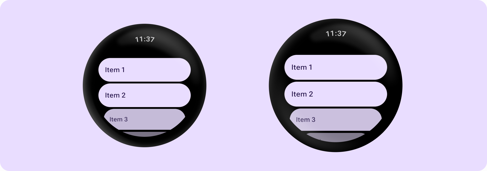
| Parameters | |
|---|---|
modifier: Modifier = Modifier |
The modifier for the screen scaffold. |
scrollInfoProvider: ScrollInfoProvider? = null |
Provider for scroll information used to scroll away screen elements such as the system status bar (or |
contentPadding: PaddingValues = ScreenScaffoldDefaults.contentPadding |
The padding to apply around the entire content. This contentPadding is then received by the |
scrollIndicator: (@Composable BoxScope.() -> Unit)? = null |
The |
overscrollEffect: OverscrollEffect? = rememberOverscrollEffect() |
the |
content: @Composable BoxScope.(PaddingValues) -> Unit |
The body content for this screen. The lambda receives a |
ScreenScaffold
@Composable
fun ScreenScaffold(
    scrollState: LazyListState,
    modifier: Modifier = Modifier,
    contentPadding: PaddingValues = ScreenScaffoldDefaults.contentPadding,
    scrollIndicator: (@Composable BoxScope.() -> Unit)? = { ScrollIndicator(scrollState) },
    overscrollEffect: OverscrollEffect? = rememberOverscrollEffect(),
    content: @Composable BoxScope.(PaddingValues) -> Unit
): Unit
ScreenScaffold is one of the Wear Material3 scaffold components.
The scaffold components AppScaffold and ScreenScaffold lay out the structure of a screen and coordinate transitions of the ScrollIndicator and TimeText components. AppScaffold should be at the top of the composition (because it provides ScaffoldState) and ScreenScaffold should be part of AppScaffold's content. When used in conjunction with a navigation component such as Navigation3's NavDisplay with SwipeDismissableSceneStrategy or Navigation's SwipeDismissableNavHost, AppScaffold remains at the top of the composition, whilst ScreenScaffold will be placed for each individual composable route.
On devices that support the system status bar, the system status bar overlay replaces application-rendered TimeText. On devices that do not support the system status bar, this scaffold automatically falls back to inheriting standard in-app TimeText from AppScaffold.
ScreenScaffold displays the ScrollIndicator at the center-end of the screen by default and coordinates showing/hiding the system status bar (or TimeText) and ScrollIndicator according to scrollState.
| Parameters | |
|---|---|
scrollState: LazyListState |
The scroll state for |
modifier: Modifier = Modifier |
The modifier for the screen scaffold. |
contentPadding: PaddingValues = ScreenScaffoldDefaults.contentPadding |
The padding to apply around the entire content. This contentPadding is then received by the |
scrollIndicator: (@Composable BoxScope.() -> Unit)? = { ScrollIndicator(scrollState) } |
The |
overscrollEffect: OverscrollEffect? = rememberOverscrollEffect() |
the |
content: @Composable BoxScope.(PaddingValues) -> Unit |
The body content for this screen. The lambda receives a |
ScreenScaffold
@Composable
fun ScreenScaffold(
    scrollState: ScalingLazyListState,
    modifier: Modifier = Modifier,
    contentPadding: PaddingValues = ScreenScaffoldDefaults.contentPadding,
    scrollIndicator: (@Composable BoxScope.() -> Unit)? = { ScrollIndicator(scrollState) },
    overscrollEffect: OverscrollEffect? = rememberOverscrollEffect(),
    content: @Composable BoxScope.(PaddingValues) -> Unit
): Unit
ScreenScaffold is one of the Wear Material3 scaffold components.
The scaffold components AppScaffold and ScreenScaffold lay out the structure of a screen and coordinate transitions of the ScrollIndicator and TimeText components. AppScaffold should be at the top of the composition (because it provides ScaffoldState) and ScreenScaffold should be part of AppScaffold's content. When used in conjunction with a navigation component such as Navigation3's NavDisplay with SwipeDismissableSceneStrategy or Navigation's SwipeDismissableNavHost, AppScaffold remains at the top of the composition, whilst ScreenScaffold will be placed for each individual composable route.
On devices that support the system status bar, the system status bar overlay replaces application-rendered TimeText. On devices that do not support the system status bar, this scaffold automatically falls back to inheriting standard in-app TimeText from AppScaffold.
ScreenScaffold displays the ScrollIndicator at the center-end of the screen by default and coordinates showing/hiding the system status bar (or TimeText) and ScrollIndicator according to scrollState.
| Parameters | |
|---|---|
scrollState: ScalingLazyListState |
The scroll state for |
modifier: Modifier = Modifier |
The modifier for the screen scaffold. |
contentPadding: PaddingValues = ScreenScaffoldDefaults.contentPadding |
The padding to apply around the entire content. This contentPadding is then received by the |
scrollIndicator: (@Composable BoxScope.() -> Unit)? = { ScrollIndicator(scrollState) } |
The |
overscrollEffect: OverscrollEffect? = rememberOverscrollEffect() |
the |
content: @Composable BoxScope.(PaddingValues) -> Unit |
The body content for this screen. The lambda receives a |
ScreenScaffold
@Composable
fun ScreenScaffold(
    scrollState: ScrollState,
    modifier: Modifier = Modifier,
    contentPadding: PaddingValues = ScreenScaffoldDefaults.contentPadding,
    scrollIndicator: (@Composable BoxScope.() -> Unit)? = { ScrollIndicator(scrollState) },
    overscrollEffect: OverscrollEffect? = rememberOverscrollEffect(),
    content: @Composable BoxScope.(PaddingValues) -> Unit
): Unit
ScreenScaffold is one of the Wear Material3 scaffold components.
The scaffold components AppScaffold and ScreenScaffold lay out the structure of a screen and coordinate transitions of the ScrollIndicator and TimeText components. AppScaffold should be at the top of the composition (because it provides ScaffoldState) and ScreenScaffold should be part of AppScaffold's content. When used in conjunction with a navigation component such as Navigation3's NavDisplay with SwipeDismissableSceneStrategy or Navigation's SwipeDismissableNavHost, AppScaffold remains at the top of the composition, whilst ScreenScaffold will be placed for each individual composable route.
On devices that support the system status bar, the system status bar overlay replaces application-rendered TimeText. On devices that do not support the system status bar, this scaffold automatically falls back to inheriting standard in-app TimeText from AppScaffold.
ScreenScaffold displays the ScrollIndicator at the center-end of the screen by default and coordinates showing/hiding the system status bar (or TimeText) and ScrollIndicator according to scrollState. Note that this version doesn't support a bottom button slot, for that use the overload that takes LazyListState or the one that takes a ScalingLazyListState.
Example of using AppScaffold and ScreenScaffold:
import androidx.compose.foundation.layout.fillMaxSize
import androidx.compose.foundation.layout.fillMaxWidth
import androidx.compose.ui.Modifier
import androidx.wear.compose.foundation.lazy.TransformingLazyColumn
import androidx.wear.compose.foundation.lazy.rememberTransformingLazyColumnState
import androidx.wear.compose.material3.AppScaffold
import androidx.wear.compose.material3.Button
import androidx.wear.compose.material3.ButtonDefaults
import androidx.wear.compose.material3.EdgeButton
import androidx.wear.compose.material3.ScreenScaffold
import androidx.wear.compose.material3.SurfaceTransformation
import androidx.wear.compose.material3.Text
import androidx.wear.compose.material3.lazy.rememberTransformationSpec
import androidx.wear.compose.material3.lazy.transformedHeight

// Declare just one [AppScaffold] per app such as in the activity.
// [AppScaffold] allows static screen elements (i.e. [TimeText]) to remain visible
// during in-app transitions such as swipe-to-dismiss.
AppScaffold {
    val transformationSpec = rememberTransformationSpec()

    // Define the navigation hierarchy within the AppScaffold,
    // such as using SwipeDismissableNavHost.
    // For this sample, we will define a single screen inline.
    val listState = rememberTransformingLazyColumnState()

    // By default, ScreenScaffold will handle transitions showing/hiding ScrollIndicator,
    // showing/hiding/scrolling away TimeText and optionally hosting the EdgeButton.
    ScreenScaffold(scrollState = listState) { contentPadding ->
        TransformingLazyColumn(
            state = listState,
            contentPadding = contentPadding,
            modifier = Modifier.fillMaxSize(),
        ) {
            items(10) {
                Button(
                    onClick = {},
                    label = { Text("Item ${it + 1}") },
                    transformation = SurfaceTransformation(transformationSpec),
                    modifier =
                        Modifier.transformedHeight(this, transformationSpec)
                            .minimumVerticalContentPadding(
                                ButtonDefaults.minimumVerticalListContentPadding
                            )
                            .fillMaxWidth(),
                )
            }
        }
    }
}
| Parameters | |
|---|---|
scrollState: ScrollState |
The scroll state for a Column, used to drive screen transitions such as system status bar (or |
modifier: Modifier = Modifier |
The modifier for the screen scaffold. |
contentPadding: PaddingValues = ScreenScaffoldDefaults.contentPadding |
The padding to apply around the entire content. This contentPadding is then received by the |
scrollIndicator: (@Composable BoxScope.() -> Unit)? = { ScrollIndicator(scrollState) } |
The |
overscrollEffect: OverscrollEffect? = rememberOverscrollEffect() |
the |
content: @Composable BoxScope.(PaddingValues) -> Unit |
The body content for this screen. The lambda receives a |
ScreenScaffold
@Composable
fun ScreenScaffold(
    scrollState: TransformingLazyColumnState,
    modifier: Modifier = Modifier,
    contentPadding: PaddingValues = ScreenScaffoldDefaults.contentPadding,
    scrollIndicator: (@Composable BoxScope.() -> Unit)? = { ScrollIndicator(scrollState) },
    overscrollEffect: OverscrollEffect? = rememberOverscrollEffect(),
    content: @Composable BoxScope.(PaddingValues) -> Unit
): Unit
ScreenScaffold is one of the Wear Material3 scaffold components.
The scaffold components AppScaffold and ScreenScaffold lay out the structure of a screen and coordinate transitions of the ScrollIndicator and TimeText components. AppScaffold should be at the top of the composition (because it provides ScaffoldState) and ScreenScaffold should be part of AppScaffold's content. When used in conjunction with a navigation component such as Navigation3's NavDisplay with SwipeDismissableSceneStrategy or Navigation's SwipeDismissableNavHost, AppScaffold remains at the top of the composition, whilst ScreenScaffold will be placed for each individual composable route.
On devices that support the system status bar, the system status bar overlay replaces application-rendered TimeText. On devices that do not support the system status bar, this scaffold automatically falls back to inheriting standard in-app TimeText from AppScaffold.
ScreenScaffold displays the ScrollIndicator at the center-end of the screen by default and coordinates showing/hiding the system status bar (or TimeText) and ScrollIndicator according to scrollState.
Example of using AppScaffold and ScreenScaffold:
import androidx.compose.foundation.layout.fillMaxSize
import androidx.compose.foundation.layout.fillMaxWidth
import androidx.compose.ui.Modifier
import androidx.wear.compose.foundation.lazy.TransformingLazyColumn
import androidx.wear.compose.foundation.lazy.rememberTransformingLazyColumnState
import androidx.wear.compose.material3.AppScaffold
import androidx.wear.compose.material3.Button
import androidx.wear.compose.material3.ButtonDefaults
import androidx.wear.compose.material3.EdgeButton
import androidx.wear.compose.material3.ScreenScaffold
import androidx.wear.compose.material3.SurfaceTransformation
import androidx.wear.compose.material3.Text
import androidx.wear.compose.material3.lazy.rememberTransformationSpec
import androidx.wear.compose.material3.lazy.transformedHeight

// Declare just one [AppScaffold] per app such as in the activity.
// [AppScaffold] allows static screen elements (i.e. [TimeText]) to remain visible
// during in-app transitions such as swipe-to-dismiss.
AppScaffold {
    val transformationSpec = rememberTransformationSpec()

    // Define the navigation hierarchy within the AppScaffold,
    // such as using SwipeDismissableNavHost.
    // For this sample, we will define a single screen inline.
    val listState = rememberTransformingLazyColumnState()

    // By default, ScreenScaffold will handle transitions showing/hiding ScrollIndicator,
    // showing/hiding/scrolling away TimeText and optionally hosting the EdgeButton.
    ScreenScaffold(scrollState = listState) { contentPadding ->
        TransformingLazyColumn(
            state = listState,
            contentPadding = contentPadding,
            modifier = Modifier.fillMaxSize(),
        ) {
            items(10) {
                Button(
                    onClick = {},
                    label = { Text("Item ${it + 1}") },
                    transformation = SurfaceTransformation(transformationSpec),
                    modifier =
                        Modifier.transformedHeight(this, transformationSpec)
                            .minimumVerticalContentPadding(
                                ButtonDefaults.minimumVerticalListContentPadding
                            )
                            .fillMaxWidth(),
                )
            }
        }
    }
}
| Parameters | |
|---|---|
scrollState: TransformingLazyColumnState |
The scroll state for |
modifier: Modifier = Modifier |
The modifier for the screen scaffold. |
contentPadding: PaddingValues = ScreenScaffoldDefaults.contentPadding |
The padding to apply around the entire content. This contentPadding is then received by the |
scrollIndicator: (@Composable BoxScope.() -> Unit)? = { ScrollIndicator(scrollState) } |
The |
overscrollEffect: OverscrollEffect? = rememberOverscrollEffect() |
the |
content: @Composable BoxScope.(PaddingValues) -> Unit |
The body content for this screen. The lambda receives a |
ScreenScaffold
@Composable
fun ScreenScaffold(
    modifier: Modifier = Modifier,
    scrollInfoProvider: ScrollInfoProvider? = null,
    contentPadding: PaddingValues = ScreenScaffoldDefaults.contentPadding,
    timeText: (@Composable () -> Unit)? = null,
    scrollIndicator: (@Composable BoxScope.() -> Unit)? = null,
    overscrollEffect: OverscrollEffect? = rememberOverscrollEffect(),
    content: @Composable BoxScope.(PaddingValues) -> Unit
): Unit
ScreenScaffold is one of the Wear Material3 scaffold components.
The scaffold components AppScaffold and ScreenScaffold lay out the structure of a screen and coordinate transitions of the ScrollIndicator and TimeText components. AppScaffold should be at the top of the composition (because it provides ScaffoldState) and ScreenScaffold should be part of AppScaffold's content. When used in conjunction with a navigation component such as Navigation3's NavDisplay with SwipeDismissableSceneStrategy or Navigation's SwipeDismissableNavHost, AppScaffold remains at the top of the composition, whilst ScreenScaffold will be placed for each individual composable route.
This overload supports passing a custom timeText or disabling the system status bar overlay for this screen. For screens that do not require custom time text, use the overload without the timeText parameter.
ScreenScaffold displays the ScrollIndicator at the center-end of the screen by default and coordinates showing/hiding the status bar (or TimeText) and ScrollIndicator according to scrollInfoProvider.
Example of using AppScaffold and ScreenScaffold:
import androidx.compose.foundation.layout.fillMaxSize
import androidx.compose.foundation.layout.fillMaxWidth
import androidx.compose.ui.Modifier
import androidx.wear.compose.foundation.lazy.TransformingLazyColumn
import androidx.wear.compose.foundation.lazy.rememberTransformingLazyColumnState
import androidx.wear.compose.material3.AppScaffold
import androidx.wear.compose.material3.Button
import androidx.wear.compose.material3.ButtonDefaults
import androidx.wear.compose.material3.EdgeButton
import androidx.wear.compose.material3.ScreenScaffold
import androidx.wear.compose.material3.SurfaceTransformation
import androidx.wear.compose.material3.Text
import androidx.wear.compose.material3.lazy.rememberTransformationSpec
import androidx.wear.compose.material3.lazy.transformedHeight

// Declare just one [AppScaffold] per app such as in the activity.
// [AppScaffold] allows static screen elements (i.e. [TimeText]) to remain visible
// during in-app transitions such as swipe-to-dismiss.
AppScaffold {
    val transformationSpec = rememberTransformationSpec()

    // Define the navigation hierarchy within the AppScaffold,
    // such as using SwipeDismissableNavHost.
    // For this sample, we will define a single screen inline.
    val listState = rememberTransformingLazyColumnState()

    // By default, ScreenScaffold will handle transitions showing/hiding ScrollIndicator,
    // showing/hiding/scrolling away TimeText and optionally hosting the EdgeButton.
    ScreenScaffold(scrollState = listState) { contentPadding ->
        TransformingLazyColumn(
            state = listState,
            contentPadding = contentPadding,
            modifier = Modifier.fillMaxSize(),
        ) {
            items(10) {
                Button(
                    onClick = {},
                    label = { Text("Item ${it + 1}") },
                    transformation = SurfaceTransformation(transformationSpec),
                    modifier =
                        Modifier.transformedHeight(this, transformationSpec)
                            .minimumVerticalContentPadding(
                                ButtonDefaults.minimumVerticalListContentPadding
                            )
                            .fillMaxWidth(),
                )
            }
        }
    }
}
| Parameters | |
|---|---|
modifier: Modifier = Modifier |
The modifier for the screen scaffold. |
scrollInfoProvider: ScrollInfoProvider? = null |
Provider for scroll information used to scroll away screen elements such as the status bar (or |
contentPadding: PaddingValues = ScreenScaffoldDefaults.contentPadding |
The padding to apply around the entire content. This contentPadding is then received by the |
timeText: (@Composable () -> Unit)? = null |
The time text and status bar configuration for this screen: - |
scrollIndicator: (@Composable BoxScope.() -> Unit)? = null |
The |
overscrollEffect: OverscrollEffect? = rememberOverscrollEffect() |
the |
content: @Composable BoxScope.(PaddingValues) -> Unit |
The body content for this screen. The lambda receives a |
ScreenScaffold
@Composable
fun ScreenScaffold(
    scrollState: LazyListState,
    modifier: Modifier = Modifier,
    contentPadding: PaddingValues = ScreenScaffoldDefaults.contentPadding,
    timeText: (@Composable () -> Unit)? = null,
    scrollIndicator: (@Composable BoxScope.() -> Unit)? = { ScrollIndicator(scrollState) },
    overscrollEffect: OverscrollEffect? = rememberOverscrollEffect(),
    content: @Composable BoxScope.(PaddingValues) -> Unit
): Unit
ScreenScaffold is one of the Wear Material3 scaffold components.
The scaffold components AppScaffold and ScreenScaffold lay out the structure of a screen and coordinate transitions of the ScrollIndicator and TimeText components. AppScaffold should be at the top of the composition (because it provides ScaffoldState) and ScreenScaffold should be part of AppScaffold's content. When used in conjunction with a navigation component such as Navigation3's NavDisplay with SwipeDismissableSceneStrategy or Navigation's SwipeDismissableNavHost, AppScaffold remains at the top of the composition, whilst ScreenScaffold will be placed for each individual composable route.
This overload supports passing a custom timeText or disabling the system status bar overlay for this screen. For screens that do not require custom time text, use the overload without the timeText parameter.
ScreenScaffold displays the ScrollIndicator at the center-end of the screen by default and coordinates showing/hiding the status bar (or TimeText) and ScrollIndicator according to scrollState.
| Parameters | |
|---|---|
scrollState: LazyListState |
The scroll state for |
modifier: Modifier = Modifier |
The modifier for the screen scaffold. |
contentPadding: PaddingValues = ScreenScaffoldDefaults.contentPadding |
The padding to apply around the entire content. This contentPadding is then received by the |
timeText: (@Composable () -> Unit)? = null |
The time text and status bar configuration for this screen: - |
scrollIndicator: (@Composable BoxScope.() -> Unit)? = { ScrollIndicator(scrollState) } |
The |
overscrollEffect: OverscrollEffect? = rememberOverscrollEffect() |
the |
content: @Composable BoxScope.(PaddingValues) -> Unit |
The body content for this screen. The lambda receives a |
ScreenScaffold
@Composable
fun ScreenScaffold(
    scrollState: ScalingLazyListState,
    modifier: Modifier = Modifier,
    contentPadding: PaddingValues = ScreenScaffoldDefaults.contentPadding,
    timeText: (@Composable () -> Unit)? = null,
    scrollIndicator: (@Composable BoxScope.() -> Unit)? = { ScrollIndicator(scrollState) },
    overscrollEffect: OverscrollEffect? = rememberOverscrollEffect(),
    content: @Composable BoxScope.(PaddingValues) -> Unit
): Unit
ScreenScaffold is one of the Wear Material3 scaffold components.
The scaffold components AppScaffold and ScreenScaffold lay out the structure of a screen and coordinate transitions of the ScrollIndicator and TimeText components. AppScaffold should be at the top of the composition (because it provides ScaffoldState) and ScreenScaffold should be part of AppScaffold's content. When used in conjunction with a navigation component such as Navigation3's NavDisplay with SwipeDismissableSceneStrategy or Navigation's SwipeDismissableNavHost, AppScaffold remains at the top of the composition, whilst ScreenScaffold will be placed for each individual composable route.
This overload supports passing a custom timeText or disabling the system status bar overlay for this screen. For screens that do not require custom time text, use the overload without the timeText parameter.
ScreenScaffold displays the ScrollIndicator at the center-end of the screen by default and coordinates showing/hiding the status bar (or TimeText) and ScrollIndicator according to scrollState.
| Parameters | |
|---|---|
scrollState: ScalingLazyListState |
The scroll state for |
modifier: Modifier = Modifier |
The modifier for the screen scaffold. |
contentPadding: PaddingValues = ScreenScaffoldDefaults.contentPadding |
The padding to apply around the entire content. This contentPadding is then received by the |
timeText: (@Composable () -> Unit)? = null |
The time text and status bar configuration for this screen: - |
scrollIndicator: (@Composable BoxScope.() -> Unit)? = { ScrollIndicator(scrollState) } |
The |
overscrollEffect: OverscrollEffect? = rememberOverscrollEffect() |
the |
content: @Composable BoxScope.(PaddingValues) -> Unit |
The body content for this screen. The lambda receives a |
ScreenScaffold
@Composable
fun ScreenScaffold(
    scrollState: ScrollState,
    modifier: Modifier = Modifier,
    contentPadding: PaddingValues = ScreenScaffoldDefaults.contentPadding,
    timeText: (@Composable () -> Unit)? = null,
    scrollIndicator: (@Composable BoxScope.() -> Unit)? = { ScrollIndicator(scrollState) },
    overscrollEffect: OverscrollEffect? = rememberOverscrollEffect(),
    content: @Composable BoxScope.(PaddingValues) -> Unit
): Unit
ScreenScaffold is one of the Wear Material3 scaffold components.
The scaffold components AppScaffold and ScreenScaffold lay out the structure of a screen and coordinate transitions of the ScrollIndicator and TimeText components. AppScaffold should be at the top of the composition (because it provides ScaffoldState) and ScreenScaffold should be part of AppScaffold's content. When used in conjunction with a navigation component such as Navigation3's NavDisplay with SwipeDismissableSceneStrategy or Navigation's SwipeDismissableNavHost, AppScaffold remains at the top of the composition, whilst ScreenScaffold will be placed for each individual composable route.
This overload supports passing a custom timeText or disabling the system status bar overlay for this screen. For screens that do not require custom time text, use the overload without the timeText parameter.
ScreenScaffold displays the ScrollIndicator at the center-end of the screen by default and coordinates showing/hiding the status bar (or TimeText) and ScrollIndicator according to scrollState. Note that this version doesn't support a bottom button slot, for that use the overload that takes LazyListState or the one that takes a ScalingLazyListState.
Example of using AppScaffold and ScreenScaffold:
import androidx.compose.foundation.layout.fillMaxSize
import androidx.compose.foundation.layout.fillMaxWidth
import androidx.compose.ui.Modifier
import androidx.wear.compose.foundation.lazy.TransformingLazyColumn
import androidx.wear.compose.foundation.lazy.rememberTransformingLazyColumnState
import androidx.wear.compose.material3.AppScaffold
import androidx.wear.compose.material3.Button
import androidx.wear.compose.material3.ButtonDefaults
import androidx.wear.compose.material3.EdgeButton
import androidx.wear.compose.material3.ScreenScaffold
import androidx.wear.compose.material3.SurfaceTransformation
import androidx.wear.compose.material3.Text
import androidx.wear.compose.material3.lazy.rememberTransformationSpec
import androidx.wear.compose.material3.lazy.transformedHeight

// Declare just one [AppScaffold] per app such as in the activity.
// [AppScaffold] allows static screen elements (i.e. [TimeText]) to remain visible
// during in-app transitions such as swipe-to-dismiss.
AppScaffold {
    val transformationSpec = rememberTransformationSpec()

    // Define the navigation hierarchy within the AppScaffold,
    // such as using SwipeDismissableNavHost.
    // For this sample, we will define a single screen inline.
    val listState = rememberTransformingLazyColumnState()

    // By default, ScreenScaffold will handle transitions showing/hiding ScrollIndicator,
    // showing/hiding/scrolling away TimeText and optionally hosting the EdgeButton.
    ScreenScaffold(scrollState = listState) { contentPadding ->
        TransformingLazyColumn(
            state = listState,
            contentPadding = contentPadding,
            modifier = Modifier.fillMaxSize(),
        ) {
            items(10) {
                Button(
                    onClick = {},
                    label = { Text("Item ${it + 1}") },
                    transformation = SurfaceTransformation(transformationSpec),
                    modifier =
                        Modifier.transformedHeight(this, transformationSpec)
                            .minimumVerticalContentPadding(
                                ButtonDefaults.minimumVerticalListContentPadding
                            )
                            .fillMaxWidth(),
                )
            }
        }
    }
}
| Parameters | |
|---|---|
scrollState: ScrollState |
The scroll state for a Column, used to drive screen transitions such as status bar (or |
modifier: Modifier = Modifier |
The modifier for the screen scaffold. |
contentPadding: PaddingValues = ScreenScaffoldDefaults.contentPadding |
The padding to apply around the entire content. This contentPadding is then received by the |
timeText: (@Composable () -> Unit)? = null |
The time text and status bar configuration for this screen: - |
scrollIndicator: (@Composable BoxScope.() -> Unit)? = { ScrollIndicator(scrollState) } |
The |
overscrollEffect: OverscrollEffect? = rememberOverscrollEffect() |
the |
content: @Composable BoxScope.(PaddingValues) -> Unit |
The body content for this screen. The lambda receives a |
ScreenScaffold
@Composable
fun ScreenScaffold(
    scrollState: TransformingLazyColumnState,
    modifier: Modifier = Modifier,
    contentPadding: PaddingValues = ScreenScaffoldDefaults.contentPadding,
    timeText: (@Composable () -> Unit)? = null,
    scrollIndicator: (@Composable BoxScope.() -> Unit)? = { ScrollIndicator(scrollState) },
    overscrollEffect: OverscrollEffect? = rememberOverscrollEffect(),
    content: @Composable BoxScope.(PaddingValues) -> Unit
): Unit
ScreenScaffold is one of the Wear Material3 scaffold components.
The scaffold components AppScaffold and ScreenScaffold lay out the structure of a screen and coordinate transitions of the ScrollIndicator and TimeText components. AppScaffold should be at the top of the composition (because it provides ScaffoldState) and ScreenScaffold should be part of AppScaffold's content. When used in conjunction with a navigation component such as Navigation3's NavDisplay with SwipeDismissableSceneStrategy or Navigation's SwipeDismissableNavHost, AppScaffold remains at the top of the composition, whilst ScreenScaffold will be placed for each individual composable route.
This overload supports passing a custom timeText or disabling the system status bar overlay for this screen. For screens that do not require custom time text, use the overload without the timeText parameter.
ScreenScaffold displays the ScrollIndicator at the center-end of the screen by default and coordinates showing/hiding the status bar (or TimeText) and ScrollIndicator according to scrollState.
Example of using AppScaffold and ScreenScaffold:
import androidx.compose.foundation.layout.fillMaxSize
import androidx.compose.foundation.layout.fillMaxWidth
import androidx.compose.ui.Modifier
import androidx.wear.compose.foundation.lazy.TransformingLazyColumn
import androidx.wear.compose.foundation.lazy.rememberTransformingLazyColumnState
import androidx.wear.compose.material3.AppScaffold
import androidx.wear.compose.material3.Button
import androidx.wear.compose.material3.ButtonDefaults
import androidx.wear.compose.material3.EdgeButton
import androidx.wear.compose.material3.ScreenScaffold
import androidx.wear.compose.material3.SurfaceTransformation
import androidx.wear.compose.material3.Text
import androidx.wear.compose.material3.lazy.rememberTransformationSpec
import androidx.wear.compose.material3.lazy.transformedHeight

// Declare just one [AppScaffold] per app such as in the activity.
// [AppScaffold] allows static screen elements (i.e. [TimeText]) to remain visible
// during in-app transitions such as swipe-to-dismiss.
AppScaffold {
    val transformationSpec = rememberTransformationSpec()

    // Define the navigation hierarchy within the AppScaffold,
    // such as using SwipeDismissableNavHost.
    // For this sample, we will define a single screen inline.
    val listState = rememberTransformingLazyColumnState()

    // By default, ScreenScaffold will handle transitions showing/hiding ScrollIndicator,
    // showing/hiding/scrolling away TimeText and optionally hosting the EdgeButton.
    ScreenScaffold(scrollState = listState) { contentPadding ->
        TransformingLazyColumn(
            state = listState,
            contentPadding = contentPadding,
            modifier = Modifier.fillMaxSize(),
        ) {
            items(10) {
                Button(
                    onClick = {},
                    label = { Text("Item ${it + 1}") },
                    transformation = SurfaceTransformation(transformationSpec),
                    modifier =
                        Modifier.transformedHeight(this, transformationSpec)
                            .minimumVerticalContentPadding(
                                ButtonDefaults.minimumVerticalListContentPadding
                            )
                            .fillMaxWidth(),
                )
            }
        }
    }
}
| Parameters | |
|---|---|
scrollState: TransformingLazyColumnState |
The scroll state for |
modifier: Modifier = Modifier |
The modifier for the screen scaffold. |
contentPadding: PaddingValues = ScreenScaffoldDefaults.contentPadding |
The padding to apply around the entire content. This contentPadding is then received by the |
timeText: (@Composable () -> Unit)? = null |
The time text and status bar configuration for this screen: - |
scrollIndicator: (@Composable BoxScope.() -> Unit)? = { ScrollIndicator(scrollState) } |
The |
overscrollEffect: OverscrollEffect? = rememberOverscrollEffect() |
the |
content: @Composable BoxScope.(PaddingValues) -> Unit |
The body content for this screen. The lambda receives a |
ScreenScaffold
@Composable
fun ScreenScaffold(
    scrollInfoProvider: ScrollInfoProvider,
    edgeButton: @Composable BoxScope.() -> Unit,
    modifier: Modifier = Modifier,
    contentPadding: PaddingValues = ScreenScaffoldDefaults.contentPadding,
    scrollIndicator: (@Composable BoxScope.() -> Unit)? = null,
    edgeButtonSpacing: Dp = ScreenScaffoldDefaults.EdgeButtonSpacing,
    overscrollEffect: OverscrollEffect? = rememberOverscrollEffect(),
    content: @Composable BoxScope.(PaddingValues) -> Unit
): Unit
ScreenScaffold is one of the Wear Material3 scaffold components.
The scaffold components AppScaffold and ScreenScaffold lay out the structure of a screen and coordinate transitions of the ScrollIndicator and TimeText components. AppScaffold should be at the top of the composition (because it provides ScaffoldState) and ScreenScaffold should be part of AppScaffold's content. When used in conjunction with a navigation component such as Navigation3's NavDisplay with SwipeDismissableSceneStrategy or Navigation's SwipeDismissableNavHost, AppScaffold remains at the top of the composition, whilst ScreenScaffold will be placed for each individual composable route.
On devices that support the system status bar, the system status bar overlay replaces application-rendered TimeText. On devices that do not support the system status bar, this scaffold automatically falls back to inheriting standard in-app TimeText from AppScaffold.
ScreenScaffold displays the ScrollIndicator at the center-end of the screen by default and coordinates showing/hiding the system status bar (or TimeText), ScrollIndicator and the bottom button according to a scrollInfoProvider.
This version of ScreenScaffold has a special slot for a button at the bottom, that grows and shrinks to take the available space after the scrollable content. In this overload, both edgeButton and scrollInfoProvider must be specified.
| Parameters | |
|---|---|
scrollInfoProvider: ScrollInfoProvider |
Provider for scroll information used to scroll away screen elements such as the system status bar (or |
edgeButton: @Composable BoxScope.() -> Unit |
slot for a |
modifier: Modifier = Modifier |
The modifier for the screen scaffold. |
contentPadding: PaddingValues = ScreenScaffoldDefaults.contentPadding |
The padding to apply around the entire content. This contentPadding is then received by the |
scrollIndicator: (@Composable BoxScope.() -> Unit)? = null |
The |
edgeButtonSpacing: Dp = ScreenScaffoldDefaults.EdgeButtonSpacing |
The space between |
overscrollEffect: OverscrollEffect? = rememberOverscrollEffect() |
the |
content: @Composable BoxScope.(PaddingValues) -> Unit |
The body content for this screen. The lambda receives a |
ScreenScaffold
@Composable
fun ScreenScaffold(
    scrollState: LazyListState,
    edgeButton: @Composable BoxScope.() -> Unit,
    modifier: Modifier = Modifier,
    contentPadding: PaddingValues = ScreenScaffoldDefaults.contentPadding,
    scrollIndicator: (@Composable BoxScope.() -> Unit)? = { ScrollIndicator(scrollState) },
    overscrollEffect: OverscrollEffect? = rememberOverscrollEffect(),
    edgeButtonSpacing: Dp = ScreenScaffoldDefaults.EdgeButtonSpacing,
    content: @Composable BoxScope.(PaddingValues) -> Unit
): Unit
ScreenScaffold is one of the Wear Material3 scaffold components.
The scaffold components AppScaffold and ScreenScaffold lay out the structure of a screen and coordinate transitions of the ScrollIndicator and TimeText components. AppScaffold should be at the top of the composition (because it provides ScaffoldState) and ScreenScaffold should be part of AppScaffold's content. When used in conjunction with a navigation component such as Navigation3's NavDisplay with SwipeDismissableSceneStrategy or Navigation's SwipeDismissableNavHost, AppScaffold remains at the top of the composition, whilst ScreenScaffold will be placed for each individual composable route.
On devices that support the system status bar, the system status bar overlay replaces application-rendered TimeText. On devices that do not support the system status bar, this scaffold automatically falls back to inheriting standard in-app TimeText from AppScaffold.
ScreenScaffold displays the ScrollIndicator at the center-end of the screen by default and coordinates showing/hiding the system status bar (or TimeText) and ScrollIndicator according to scrollState.
This version of ScreenScaffold has a special slot for a button at the bottom, that grows and shrinks to take the available space after the scrollable content.
| Parameters | |
|---|---|
scrollState: LazyListState |
The scroll state for |
edgeButton: @Composable BoxScope.() -> Unit |
Slot for an |
modifier: Modifier = Modifier |
The modifier for the screen scaffold. |
contentPadding: PaddingValues = ScreenScaffoldDefaults.contentPadding |
The padding to apply around the entire content. This contentPadding is then received by the |
scrollIndicator: (@Composable BoxScope.() -> Unit)? = { ScrollIndicator(scrollState) } |
The |
overscrollEffect: OverscrollEffect? = rememberOverscrollEffect() |
the |
edgeButtonSpacing: Dp = ScreenScaffoldDefaults.EdgeButtonSpacing |
The space between |
content: @Composable BoxScope.(PaddingValues) -> Unit |
The body content for this screen. The lambda receives a |
ScreenScaffold
@Composable
fun ScreenScaffold(
    scrollState: ScalingLazyListState,
    edgeButton: @Composable BoxScope.() -> Unit,
    modifier: Modifier = Modifier,
    contentPadding: PaddingValues = ScreenScaffoldDefaults.contentPadding,
    scrollIndicator: (@Composable BoxScope.() -> Unit)? = { ScrollIndicator(scrollState) },
    edgeButtonSpacing: Dp = ScreenScaffoldDefaults.EdgeButtonSpacing,
    overscrollEffect: OverscrollEffect? = rememberOverscrollEffect(),
    content: @Composable BoxScope.(PaddingValues) -> Unit
): Unit
ScreenScaffold is one of the Wear Material3 scaffold components.
The scaffold components AppScaffold and ScreenScaffold lay out the structure of a screen and coordinate transitions of the ScrollIndicator and TimeText components. AppScaffold should be at the top of the composition (because it provides ScaffoldState) and ScreenScaffold should be part of AppScaffold's content. When used in conjunction with a navigation component such as Navigation3's NavDisplay with SwipeDismissableSceneStrategy or Navigation's SwipeDismissableNavHost, AppScaffold remains at the top of the composition, whilst ScreenScaffold will be placed for each individual composable route.
On devices that support the system status bar, the system status bar overlay replaces application-rendered TimeText. On devices that do not support the system status bar, this scaffold automatically falls back to inheriting standard in-app TimeText from AppScaffold.
ScreenScaffold displays the ScrollIndicator at the center-end of the screen by default and coordinates showing/hiding the system status bar (or TimeText) and ScrollIndicator according to scrollState.
This version of ScreenScaffold has a special slot for a button at the bottom, that grows and shrinks to take the available space after the scrollable content.
When using ScreenScaffold with EdgeButton and ScalingLazyColumn, you should pass autoCentering = null for the ScalingLazyColumn in order to achieve the correct spacing above the EdgeButton.
| Parameters | |
|---|---|
scrollState: ScalingLazyListState |
The scroll state for |
edgeButton: @Composable BoxScope.() -> Unit |
Slot for an |
modifier: Modifier = Modifier |
The modifier for the screen scaffold. |
contentPadding: PaddingValues = ScreenScaffoldDefaults.contentPadding |
The padding to apply around the entire content. This contentPadding is then received by the |
scrollIndicator: (@Composable BoxScope.() -> Unit)? = { ScrollIndicator(scrollState) } |
The |
edgeButtonSpacing: Dp = ScreenScaffoldDefaults.EdgeButtonSpacing |
The space between |
overscrollEffect: OverscrollEffect? = rememberOverscrollEffect() |
the |
content: @Composable BoxScope.(PaddingValues) -> Unit |
The body content for this screen. The lambda receives a |
ScreenScaffold
@Composable
fun ScreenScaffold(
    scrollState: TransformingLazyColumnState,
    edgeButton: @Composable BoxScope.() -> Unit,
    modifier: Modifier = Modifier,
    contentPadding: PaddingValues = ScreenScaffoldDefaults.contentPadding,
    scrollIndicator: (@Composable BoxScope.() -> Unit)? = { ScrollIndicator(scrollState) },
    edgeButtonSpacing: Dp = ScreenScaffoldDefaults.EdgeButtonSpacing,
    overscrollEffect: OverscrollEffect? = rememberOverscrollEffect(),
    content: @Composable BoxScope.(PaddingValues) -> Unit
): Unit
ScreenScaffold is one of the Wear Material3 scaffold components.
The scaffold components AppScaffold and ScreenScaffold lay out the structure of a screen and coordinate transitions of the ScrollIndicator and TimeText components. AppScaffold should be at the top of the composition (because it provides ScaffoldState) and ScreenScaffold should be part of AppScaffold's content. When used in conjunction with a navigation component such as Navigation3's NavDisplay with SwipeDismissableSceneStrategy or Navigation's SwipeDismissableNavHost, AppScaffold remains at the top of the composition, whilst ScreenScaffold will be placed for each individual composable route.
On devices that support the system status bar, the system status bar overlay replaces application-rendered TimeText. On devices that do not support the system status bar, this scaffold automatically falls back to inheriting standard in-app TimeText from AppScaffold.
ScreenScaffold displays the ScrollIndicator at the center-end of the screen by default and coordinates showing/hiding the system status bar (or TimeText) and ScrollIndicator according to scrollState.
This version of ScreenScaffold has a special slot for a button at the bottom, that grows and shrinks to take the available space after the scrollable content.
Example of using AppScaffold and ScreenScaffold with TransformingLazyColumn:
import androidx.compose.foundation.background
import androidx.compose.foundation.gestures.Orientation
import androidx.compose.foundation.gestures.scrollable
import androidx.compose.foundation.layout.fillMaxSize
import androidx.compose.foundation.layout.fillMaxWidth
import androidx.compose.foundation.rememberOverscrollEffect
import androidx.compose.ui.Modifier
import androidx.compose.ui.graphics.Color
import androidx.compose.ui.unit.dp
import androidx.wear.compose.foundation.lazy.TransformingLazyColumn
import androidx.wear.compose.foundation.lazy.rememberTransformingLazyColumnState
import androidx.wear.compose.material3.AppScaffold
import androidx.wear.compose.material3.Button
import androidx.wear.compose.material3.ButtonDefaults
import androidx.wear.compose.material3.EdgeButton
import androidx.wear.compose.material3.ScreenScaffold
import androidx.wear.compose.material3.SurfaceTransformation
import androidx.wear.compose.material3.Text
import androidx.wear.compose.material3.lazy.rememberTransformationSpec
import androidx.wear.compose.material3.lazy.transformedHeight

// Declare just one [AppScaffold] per app such as in the activity.
// [AppScaffold] allows static screen elements (i.e. [TimeText]) to remain visible
// during in-app transitions such as swipe-to-dismiss.
AppScaffold(modifier = Modifier.background(Color.Black)) {
    val transformationSpec = rememberTransformationSpec()

    // Define the navigation hierarchy within the AppScaffold,
    // such as using SwipeDismissableNavHost.
    // For this sample, we will define a single screen inline.
    val listState = rememberTransformingLazyColumnState()
    // By default, ScreenScaffold will handle transitions showing/hiding ScrollIndicator,
    // showing/hiding/scrolling away TimeText and optionally hosting the EdgeButton.
    ScreenScaffold(
        scrollState = listState,
        // Define custom spacing between [EdgeButton] and [TransformingLazyColumn].
        edgeButtonSpacing = 15.dp,
        edgeButton = {
            EdgeButton(
                onClick = {},
                modifier =
                    // In case user starts scrolling from the EdgeButton.
                    Modifier.scrollable(
                        listState,
                        orientation = Orientation.Vertical,
                        reverseDirection = true,
                        // An overscroll effect should be applied to the EdgeButton for proper
                        // scrolling behavior.
                        overscrollEffect = rememberOverscrollEffect(),
                    ),
            ) {
                Text("Clear All")
            }
        },
    ) { contentPadding ->
        TransformingLazyColumn(
            state = listState,
            modifier = Modifier.fillMaxSize(),
            // Bottom spacing is derived from [ScreenScaffold.edgeButtonSpacing].
            contentPadding = contentPadding,
        ) {
            items(4) {
                Button(
                    onClick = {},
                    label = { Text("Item ${it + 1}") },
                    transformation = SurfaceTransformation(transformationSpec),
                    modifier =
                        Modifier.transformedHeight(this, transformationSpec)
                            .minimumVerticalContentPadding(
                                ButtonDefaults.minimumVerticalListContentPadding
                            )
                            .fillMaxWidth(),
                )
            }
        }
    }
}
| Parameters | |
|---|---|
scrollState: TransformingLazyColumnState |
The scroll state for |
edgeButton: @Composable BoxScope.() -> Unit |
Slot for an |
modifier: Modifier = Modifier |
The modifier for the screen scaffold. |
contentPadding: PaddingValues = ScreenScaffoldDefaults.contentPadding |
The padding to apply around the entire content. This contentPadding is then received by the |
scrollIndicator: (@Composable BoxScope.() -> Unit)? = { ScrollIndicator(scrollState) } |
The |
edgeButtonSpacing: Dp = ScreenScaffoldDefaults.EdgeButtonSpacing |
The space between |
overscrollEffect: OverscrollEffect? = rememberOverscrollEffect() |
the |
content: @Composable BoxScope.(PaddingValues) -> Unit |
The body content for this screen. The lambda receives a |
ScreenScaffold
@Composable
fun ScreenScaffold(
    scrollInfoProvider: ScrollInfoProvider,
    edgeButton: @Composable BoxScope.() -> Unit,
    modifier: Modifier = Modifier,
    contentPadding: PaddingValues = ScreenScaffoldDefaults.contentPadding,
    timeText: (@Composable () -> Unit)? = null,
    scrollIndicator: (@Composable BoxScope.() -> Unit)? = null,
    edgeButtonSpacing: Dp = ScreenScaffoldDefaults.EdgeButtonSpacing,
    overscrollEffect: OverscrollEffect? = rememberOverscrollEffect(),
    content: @Composable BoxScope.(PaddingValues) -> Unit
): Unit
ScreenScaffold is one of the Wear Material3 scaffold components.
The scaffold components AppScaffold and ScreenScaffold lay out the structure of a screen and coordinate transitions of the ScrollIndicator and TimeText components. AppScaffold should be at the top of the composition (because it provides ScaffoldState) and ScreenScaffold should be part of AppScaffold's content. When used in conjunction with a navigation component such as Navigation3's NavDisplay with SwipeDismissableSceneStrategy or Navigation's SwipeDismissableNavHost, AppScaffold remains at the top of the composition, whilst ScreenScaffold will be placed for each individual composable route.
This overload supports passing a custom timeText or disabling the system status bar overlay for this screen. For screens that do not require custom time text, use the overload without the timeText parameter.
ScreenScaffold displays the ScrollIndicator at the center-end of the screen by default and coordinates showing/hiding the status bar (or TimeText), ScrollIndicator and the bottom button according to a scrollInfoProvider.
This version of ScreenScaffold has a special slot for a button at the bottom, that grows and shrinks to take the available space after the scrollable content. In this overload, both edgeButton and scrollInfoProvider must be specified.
| Parameters | |
|---|---|
scrollInfoProvider: ScrollInfoProvider |
Provider for scroll information used to scroll away screen elements such as the status bar (or |
edgeButton: @Composable BoxScope.() -> Unit |
slot for a |
modifier: Modifier = Modifier |
The modifier for the screen scaffold. |
contentPadding: PaddingValues = ScreenScaffoldDefaults.contentPadding |
The padding to apply around the entire content. This contentPadding is then received by the |
timeText: (@Composable () -> Unit)? = null |
The time text and status bar configuration for this screen: - |
scrollIndicator: (@Composable BoxScope.() -> Unit)? = null |
The |
edgeButtonSpacing: Dp = ScreenScaffoldDefaults.EdgeButtonSpacing |
The space between |
overscrollEffect: OverscrollEffect? = rememberOverscrollEffect() |
the |
content: @Composable BoxScope.(PaddingValues) -> Unit |
The body content for this screen. The lambda receives a |
ScreenScaffold
@Composable
fun ScreenScaffold(
    scrollState: LazyListState,
    edgeButton: @Composable BoxScope.() -> Unit,
    modifier: Modifier = Modifier,
    contentPadding: PaddingValues = ScreenScaffoldDefaults.contentPadding,
    timeText: (@Composable () -> Unit)? = null,
    scrollIndicator: (@Composable BoxScope.() -> Unit)? = { ScrollIndicator(scrollState) },
    overscrollEffect: OverscrollEffect? = rememberOverscrollEffect(),
    edgeButtonSpacing: Dp = ScreenScaffoldDefaults.EdgeButtonSpacing,
    content: @Composable BoxScope.(PaddingValues) -> Unit
): Unit
ScreenScaffold is one of the Wear Material3 scaffold components.
The scaffold components AppScaffold and ScreenScaffold lay out the structure of a screen and coordinate transitions of the ScrollIndicator and TimeText components. AppScaffold should be at the top of the composition (because it provides ScaffoldState) and ScreenScaffold should be part of AppScaffold's content. When used in conjunction with a navigation component such as Navigation3's NavDisplay with SwipeDismissableSceneStrategy or Navigation's SwipeDismissableNavHost, AppScaffold remains at the top of the composition, whilst ScreenScaffold will be placed for each individual composable route.
This overload supports passing a custom timeText or disabling the system status bar overlay for this screen. For screens that do not require custom time text, use the overload without the timeText parameter.
ScreenScaffold displays the ScrollIndicator at the center-end of the screen by default and coordinates showing/hiding the status bar (or TimeText) and ScrollIndicator according to scrollState.
This version of ScreenScaffold has a special slot for a button at the bottom, that grows and shrinks to take the available space after the scrollable content.
| Parameters | |
|---|---|
scrollState: LazyListState |
The scroll state for |
edgeButton: @Composable BoxScope.() -> Unit |
Slot for an |
modifier: Modifier = Modifier |
The modifier for the screen scaffold. |
contentPadding: PaddingValues = ScreenScaffoldDefaults.contentPadding |
The padding to apply around the entire content. This contentPadding is then received by the |
timeText: (@Composable () -> Unit)? = null |
The time text and status bar configuration for this screen: - |
scrollIndicator: (@Composable BoxScope.() -> Unit)? = { ScrollIndicator(scrollState) } |
The |
overscrollEffect: OverscrollEffect? = rememberOverscrollEffect() |
the |
edgeButtonSpacing: Dp = ScreenScaffoldDefaults.EdgeButtonSpacing |
The space between |
content: @Composable BoxScope.(PaddingValues) -> Unit |
The body content for this screen. The lambda receives a |
ScreenScaffold
@Composable
fun ScreenScaffold(
    scrollState: ScalingLazyListState,
    edgeButton: @Composable BoxScope.() -> Unit,
    modifier: Modifier = Modifier,
    contentPadding: PaddingValues = ScreenScaffoldDefaults.contentPadding,
    timeText: (@Composable () -> Unit)? = null,
    scrollIndicator: (@Composable BoxScope.() -> Unit)? = { ScrollIndicator(scrollState) },
    edgeButtonSpacing: Dp = ScreenScaffoldDefaults.EdgeButtonSpacing,
    overscrollEffect: OverscrollEffect? = rememberOverscrollEffect(),
    content: @Composable BoxScope.(PaddingValues) -> Unit
): Unit
ScreenScaffold is one of the Wear Material3 scaffold components.
The scaffold components AppScaffold and ScreenScaffold lay out the structure of a screen and coordinate transitions of the ScrollIndicator and TimeText components. AppScaffold should be at the top of the composition (because it provides ScaffoldState) and ScreenScaffold should be part of AppScaffold's content. When used in conjunction with a navigation component such as Navigation3's NavDisplay with SwipeDismissableSceneStrategy or Navigation's SwipeDismissableNavHost, AppScaffold remains at the top of the composition, whilst ScreenScaffold will be placed for each individual composable route.
This overload supports passing a custom timeText or disabling the system status bar overlay for this screen. For screens that do not require custom time text, use the overload without the timeText parameter.
ScreenScaffold displays the ScrollIndicator at the center-end of the screen by default and coordinates showing/hiding the status bar (or TimeText) and ScrollIndicator according to scrollState.
This version of ScreenScaffold has a special slot for a button at the bottom, that grows and shrinks to take the available space after the scrollable content.
When using ScreenScaffold with EdgeButton and ScalingLazyColumn, you should pass autoCentering = null for the ScalingLazyColumn in order to achieve the correct spacing above the EdgeButton.
| Parameters | |
|---|---|
scrollState: ScalingLazyListState |
The scroll state for |
edgeButton: @Composable BoxScope.() -> Unit |
Slot for an |
modifier: Modifier = Modifier |
The modifier for the screen scaffold. |
contentPadding: PaddingValues = ScreenScaffoldDefaults.contentPadding |
The padding to apply around the entire content. This contentPadding is then received by the |
timeText: (@Composable () -> Unit)? = null |
The time text and status bar configuration for this screen: - |
scrollIndicator: (@Composable BoxScope.() -> Unit)? = { ScrollIndicator(scrollState) } |
The |
edgeButtonSpacing: Dp = ScreenScaffoldDefaults.EdgeButtonSpacing |
The space between |
overscrollEffect: OverscrollEffect? = rememberOverscrollEffect() |
the |
content: @Composable BoxScope.(PaddingValues) -> Unit |
The body content for this screen. The lambda receives a |
ScreenScaffold
@Composable
fun ScreenScaffold(
    scrollState: TransformingLazyColumnState,
    edgeButton: @Composable BoxScope.() -> Unit,
    modifier: Modifier = Modifier,
    contentPadding: PaddingValues = ScreenScaffoldDefaults.contentPadding,
    timeText: (@Composable () -> Unit)? = null,
    scrollIndicator: (@Composable BoxScope.() -> Unit)? = { ScrollIndicator(scrollState) },
    edgeButtonSpacing: Dp = ScreenScaffoldDefaults.EdgeButtonSpacing,
    overscrollEffect: OverscrollEffect? = rememberOverscrollEffect(),
    content: @Composable BoxScope.(PaddingValues) -> Unit
): Unit
ScreenScaffold is one of the Wear Material3 scaffold components.
The scaffold components AppScaffold and ScreenScaffold lay out the structure of a screen and coordinate transitions of the ScrollIndicator and TimeText components. AppScaffold should be at the top of the composition (because it provides ScaffoldState) and ScreenScaffold should be part of AppScaffold's content. When used in conjunction with a navigation component such as Navigation3's NavDisplay with SwipeDismissableSceneStrategy or Navigation's SwipeDismissableNavHost, AppScaffold remains at the top of the composition, whilst ScreenScaffold will be placed for each individual composable route.
This overload supports passing a custom timeText or disabling the system status bar overlay for this screen. For screens that do not require custom time text, use the overload without the timeText parameter.
ScreenScaffold displays the ScrollIndicator at the center-end of the screen by default and coordinates showing/hiding the status bar (or TimeText) and ScrollIndicator according to scrollState.
This version of ScreenScaffold has a special slot for a button at the bottom, that grows and shrinks to take the available space after the scrollable content.
Example of using AppScaffold and ScreenScaffold with TransformingLazyColumn:
import androidx.compose.foundation.background
import androidx.compose.foundation.gestures.Orientation
import androidx.compose.foundation.gestures.scrollable
import androidx.compose.foundation.layout.fillMaxSize
import androidx.compose.foundation.layout.fillMaxWidth
import androidx.compose.foundation.rememberOverscrollEffect
import androidx.compose.ui.Modifier
import androidx.compose.ui.graphics.Color
import androidx.compose.ui.unit.dp
import androidx.wear.compose.foundation.lazy.TransformingLazyColumn
import androidx.wear.compose.foundation.lazy.rememberTransformingLazyColumnState
import androidx.wear.compose.material3.AppScaffold
import androidx.wear.compose.material3.Button
import androidx.wear.compose.material3.ButtonDefaults
import androidx.wear.compose.material3.EdgeButton
import androidx.wear.compose.material3.ScreenScaffold
import androidx.wear.compose.material3.SurfaceTransformation
import androidx.wear.compose.material3.Text
import androidx.wear.compose.material3.lazy.rememberTransformationSpec
import androidx.wear.compose.material3.lazy.transformedHeight

// Declare just one [AppScaffold] per app such as in the activity.
// [AppScaffold] allows static screen elements (i.e. [TimeText]) to remain visible
// during in-app transitions such as swipe-to-dismiss.
AppScaffold(modifier = Modifier.background(Color.Black)) {
    val transformationSpec = rememberTransformationSpec()

    // Define the navigation hierarchy within the AppScaffold,
    // such as using SwipeDismissableNavHost.
    // For this sample, we will define a single screen inline.
    val listState = rememberTransformingLazyColumnState()
    // By default, ScreenScaffold will handle transitions showing/hiding ScrollIndicator,
    // showing/hiding/scrolling away TimeText and optionally hosting the EdgeButton.
    ScreenScaffold(
        scrollState = listState,
        // Define custom spacing between [EdgeButton] and [TransformingLazyColumn].
        edgeButtonSpacing = 15.dp,
        edgeButton = {
            EdgeButton(
                onClick = {},
                modifier =
                    // In case user starts scrolling from the EdgeButton.
                    Modifier.scrollable(
                        listState,
                        orientation = Orientation.Vertical,
                        reverseDirection = true,
                        // An overscroll effect should be applied to the EdgeButton for proper
                        // scrolling behavior.
                        overscrollEffect = rememberOverscrollEffect(),
                    ),
            ) {
                Text("Clear All")
            }
        },
    ) { contentPadding ->
        TransformingLazyColumn(
            state = listState,
            modifier = Modifier.fillMaxSize(),
            // Bottom spacing is derived from [ScreenScaffold.edgeButtonSpacing].
            contentPadding = contentPadding,
        ) {
            items(4) {
                Button(
                    onClick = {},
                    label = { Text("Item ${it + 1}") },
                    transformation = SurfaceTransformation(transformationSpec),
                    modifier =
                        Modifier.transformedHeight(this, transformationSpec)
                            .minimumVerticalContentPadding(
                                ButtonDefaults.minimumVerticalListContentPadding
                            )
                            .fillMaxWidth(),
                )
            }
        }
    }
}
| Parameters | |
|---|---|
scrollState: TransformingLazyColumnState |
The scroll state for |
edgeButton: @Composable BoxScope.() -> Unit |
Slot for an |
modifier: Modifier = Modifier |
The modifier for the screen scaffold. |
contentPadding: PaddingValues = ScreenScaffoldDefaults.contentPadding |
The padding to apply around the entire content. This contentPadding is then received by the |
timeText: (@Composable () -> Unit)? = null |
The time text and status bar configuration for this screen: - |
scrollIndicator: (@Composable BoxScope.() -> Unit)? = { ScrollIndicator(scrollState) } |
The |
edgeButtonSpacing: Dp = ScreenScaffoldDefaults.EdgeButtonSpacing |
The space between |
overscrollEffect: OverscrollEffect? = rememberOverscrollEffect() |
the |
content: @Composable BoxScope.(PaddingValues) -> Unit |
The body content for this screen. The lambda receives a |