
CompactButton
Functions summary
Unit |
@ComposableBase level Wear Material3 |
Unit |
@ComposableA Wear Material3 |
Functions
CompactButton
@Composable
fun CompactButton(
    onClick: () -> Unit,
    modifier: Modifier = Modifier,
    onLongClick: (() -> Unit)? = null,
    onLongClickLabel: String? = null,
    enabled: Boolean = true,
    shape: Shape = CompactButtonDefaults.shape,
    colors: ButtonColors = ButtonDefaults.buttonColors(),
    border: BorderStroke? = null,
    contentPadding: PaddingValues = CompactButtonDefaults.ContentPadding,
    interactionSource: MutableInteractionSource? = null,
    transformation: SurfaceTransformation? = null,
    content: @Composable RowScope.() -> Unit
): Unit
Base level Wear Material3 CompactButton that offers a single slot to take any content.
For a compact button with a predefined layout that applies Material3 UX guidelines to the icon and label, see the overload of CompactButton with those parameters.
The CompactButton is Stadium shaped and has a max height designed to take no more than one line of text and/or one icon. The default max height is CompactButtonDefaults.Height. This includes a visible button height of 32.dp and 8.dp of padding above and below the button in order to meet accessibility guidelines that request a minimum of 48.dp height and width of tappable area.
CompactButton takes the ButtonDefaults.buttonColors color scheme by default, with colored background, contrasting content color and no border. This is a high-emphasis button for the primary, most important or most common action on a screen.
Other recommended ButtonColors for different levels of emphasis are: ButtonDefaults.filledTonalButtonColors, ButtonDefaults.outlinedButtonColors and ButtonDefaults.childButtonColors.
CompactButton can be enabled or disabled. A disabled button will not respond to click events.
Example of a CompactButton with a single content slot:
import androidx.compose.foundation.background
import androidx.compose.foundation.layout.Box
import androidx.compose.foundation.layout.Spacer
import androidx.compose.foundation.layout.size
import androidx.compose.foundation.layout.width
import androidx.compose.foundation.shape.CircleShape
import androidx.compose.ui.Modifier
import androidx.compose.ui.draw.clip
import androidx.compose.ui.graphics.Color
import androidx.compose.ui.semantics.onClick
import androidx.compose.ui.text.font.FontStyle
import androidx.compose.ui.text.font.FontWeight
import androidx.compose.ui.text.style.TextOverflow
import androidx.compose.ui.unit.sp
import androidx.wear.compose.material3.Button
import androidx.wear.compose.material3.ButtonDefaults
import androidx.wear.compose.material3.CompactButton
import androidx.wear.compose.material3.CompactButtonDefaults
import androidx.wear.compose.material3.Icon
import androidx.wear.compose.material3.Text

CompactButton(
    onClick = { /* Do something */ },
    modifier = modifier,
    content = {
        Box(
            Modifier.size(CompactButtonDefaults.ExtraSmallIconSize)
                .clip(CircleShape)
                .background(Color.Green)
        )
        Spacer(Modifier.width(ButtonDefaults.IconSpacing))
        Text(
            "Custom content",
            maxLines = 1,
            overflow = TextOverflow.Ellipsis,
            fontWeight = FontWeight.Bold,
            fontStyle = FontStyle.Italic,
            letterSpacing = 0.5.sp,
        )
    },
)
| Parameters | |
|---|---|
onClick: () -> Unit |
Will be called when the user clicks the button |
modifier: Modifier = Modifier |
Modifier to be applied to the button |
onLongClick: (() -> Unit)? = null |
Called when this button is long clicked (long-pressed). When this callback is set, |
onLongClickLabel: String? = null |
Semantic / accessibility label for the |
enabled: Boolean = true |
Controls the enabled state of the button. When |
shape: Shape = CompactButtonDefaults.shape |
Defines the button's shape. It is strongly recommended to use the default as this shape is a key characteristic of the Wear Material3 Theme |
colors: ButtonColors = ButtonDefaults.buttonColors() |
|
border: BorderStroke? = null |
Optional |
contentPadding: PaddingValues = CompactButtonDefaults.ContentPadding |
The spacing values to apply internally between the container and the content |
interactionSource: MutableInteractionSource? = null |
an optional hoisted |
transformation: SurfaceTransformation? = null |
Transformation to be used when button appears inside a container that needs to dynamically change its content separately from the background. |
content: @Composable RowScope.() -> Unit |
Slot for composable body content displayed on the CompactButton |
CompactButton
@Composable
fun CompactButton(
    onClick: () -> Unit,
    modifier: Modifier = Modifier,
    onLongClick: (() -> Unit)? = null,
    onLongClickLabel: String? = null,
    icon: (@Composable BoxScope.() -> Unit)? = null,
    enabled: Boolean = true,
    shape: Shape = CompactButtonDefaults.shape,
    colors: ButtonColors = ButtonDefaults.buttonColors(),
    border: BorderStroke? = null,
    contentPadding: PaddingValues = CompactButtonDefaults.ContentPadding,
    interactionSource: MutableInteractionSource? = null,
    transformation: SurfaceTransformation? = null,
    label: (@Composable RowScope.() -> Unit)? = null
): Unit
A Wear Material3 CompactButton that offers two slots and a specific layout for an icon and label. Both the icon and label are optional however it is expected that at least one will be provided.
For a compact button with a single content slot, see the overload of CompactButton with a content parameter.
The CompactButton is Stadium shaped and has a max height designed to take no more than one line of text and/or one icon. The default max height is CompactButtonDefaults.Height. This includes a visible button height of 32.dp and 8.dp of padding above and below the button in order to meet accessibility guidelines that request a minimum of 48.dp height and width of tappable area.
If an icon is provided then the labels should be "start" aligned, e.g. left aligned in left-to-right mode so that the text starts next to the icon.
The items are laid out as follows.
-
If a label is provided then the button will be laid out with the optional icon at the start of a row followed by the label with a default max height of
CompactButtonDefaults.Height. -
If only an icon is provided it will be laid out vertically and horizontally centered with a default height of
CompactButtonDefaults.Heightand the default width ofCompactButtonDefaults.IconOnlyWidth
If neither icon nor label is provided then the button will be displayed like an icon only button but with no contents or background color.
CompactButton takes the ButtonDefaults.buttonColors color scheme by default, with colored background, contrasting content color and no border. This is a high-emphasis button for the primary, most important or most common action on a screen.
Other recommended ButtonColors for different levels of emphasis are: ButtonDefaults.filledTonalButtonColors, ButtonDefaults.outlinedButtonColors and ButtonDefaults.childButtonColors.
CompactButton can be enabled or disabled. A disabled button will not respond to click events.
Example of a CompactButton with an icon and a label
import androidx.compose.foundation.layout.size
import androidx.compose.ui.Modifier
import androidx.compose.ui.res.painterResource
import androidx.compose.ui.semantics.onClick
import androidx.compose.ui.text.style.TextOverflow
import androidx.wear.compose.material3.Button
import androidx.wear.compose.material3.ButtonDefaults
import androidx.wear.compose.material3.CompactButton
import androidx.wear.compose.material3.CompactButtonDefaults
import androidx.wear.compose.material3.Icon
import androidx.wear.compose.material3.Text

CompactButton(
    onClick = { /* Do something */ },
    icon = {
        Icon(
            painter = painterResource(R.drawable.ic_favorite_rounded),
            contentDescription = "Favorite icon",
            modifier = Modifier.size(CompactButtonDefaults.ExtraSmallIconSize),
        )
    },
    modifier = modifier,
    label = { Text("Compact Button", maxLines = 1, overflow = TextOverflow.Ellipsis) },
)

Example of a CompactButton with an icon and label and with ButtonDefaults.filledTonalButtonColors
import androidx.compose.foundation.layout.size
import androidx.compose.ui.Modifier
import androidx.compose.ui.graphics.Color
import androidx.compose.ui.res.painterResource
import androidx.compose.ui.semantics.onClick
import androidx.compose.ui.text.style.TextOverflow
import androidx.wear.compose.material3.Button
import androidx.wear.compose.material3.ButtonDefaults
import androidx.wear.compose.material3.CompactButton
import androidx.wear.compose.material3.CompactButtonDefaults
import androidx.wear.compose.material3.Icon
import androidx.wear.compose.material3.Text

CompactButton(
    onClick = { /* Do something */ },
    icon = {
        Icon(
            painter = painterResource(R.drawable.ic_favorite_rounded),
            contentDescription = "Favorite icon",
            modifier = Modifier.size(CompactButtonDefaults.ExtraSmallIconSize),
        )
    },
    colors = ButtonDefaults.filledTonalButtonColors(),
    modifier = modifier,
    label = {
        Text("Filled Tonal Compact Button", maxLines = 1, overflow = TextOverflow.Ellipsis)
    },
)
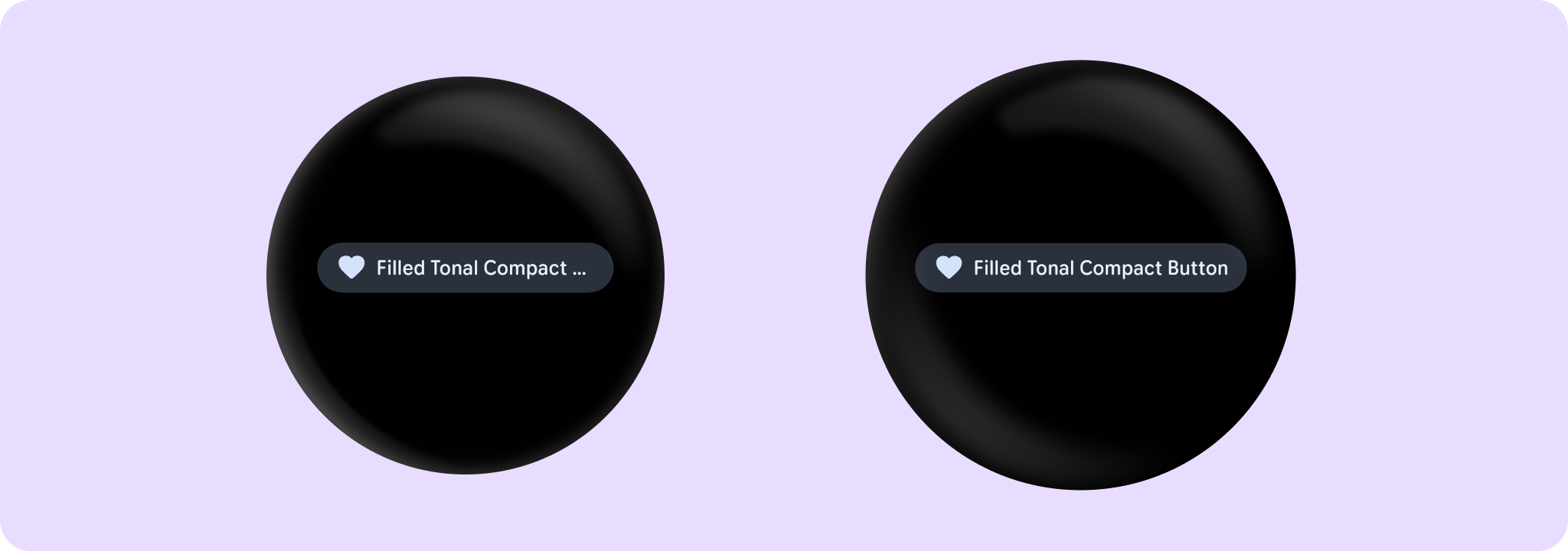
Example of a CompactButton with an icon and label and with ButtonDefaults.outlinedButtonBorder and ButtonDefaults.outlinedButtonColors. The example includes a Text that expands and collapses when the CompactButton is clicked.
import androidx.compose.foundation.layout.Column
import androidx.compose.foundation.layout.Spacer
import androidx.compose.foundation.layout.height
import androidx.compose.foundation.layout.size
import androidx.compose.foundation.layout.width
import androidx.compose.material.icons.Icons
import androidx.compose.material.icons.filled.KeyboardArrowDown
import androidx.compose.material.icons.filled.KeyboardArrowUp
import androidx.compose.runtime.mutableStateOf
import androidx.compose.runtime.remember
import androidx.compose.ui.Alignment
import androidx.compose.ui.Modifier
import androidx.compose.ui.graphics.Color
import androidx.compose.ui.semantics.onClick
import androidx.compose.ui.text.style.TextOverflow
import androidx.wear.compose.material3.Button
import androidx.wear.compose.material3.ButtonDefaults
import androidx.wear.compose.material3.CompactButton
import androidx.wear.compose.material3.CompactButtonDefaults
import androidx.wear.compose.material3.Icon
import androidx.wear.compose.material3.Text

Column(horizontalAlignment = Alignment.CenterHorizontally) {
    var expanded by remember { mutableStateOf(false) }
    if (expanded) {
        Text("A multiline string showing two lines")
    } else {
        Text("One line text")
    }
    Spacer(Modifier.height(ButtonDefaults.IconSpacing))
    CompactButton(
        onClick = { expanded = !expanded },
        colors = ButtonDefaults.outlinedButtonColors(),
        border = ButtonDefaults.outlinedButtonBorder(enabled = true),
        modifier = modifier,
        content = {
            if (expanded) {
                Text("Show Less", maxLines = 1, overflow = TextOverflow.Ellipsis)
            } else {
                Text("Show More", maxLines = 1, overflow = TextOverflow.Ellipsis)
            }
            Spacer(Modifier.width(ButtonDefaults.IconSpacing))
            if (expanded) {
                Icon(
                    Icons.Filled.KeyboardArrowUp,
                    contentDescription = "Collapse",
                    modifier = Modifier.size(CompactButtonDefaults.ExtraSmallIconSize),
                )
            } else {
                Icon(
                    Icons.Filled.KeyboardArrowDown,
                    contentDescription = "Expand",
                    modifier = Modifier.size(CompactButtonDefaults.ExtraSmallIconSize),
                )
            }
        },
    )
}

Example of a CompactButton with onLongClick:
import androidx.compose.ui.semantics.onClick
import androidx.compose.ui.semantics.semantics
import androidx.wear.compose.material3.Button
import androidx.wear.compose.material3.CompactButton
import androidx.wear.compose.material3.Text

CompactButton(
    onClick = onClickHandler,
    onLongClick = onLongClickHandler,
    onLongClickLabel = "Long click",
    label = { Text("Long clickable") },
    modifier =
        modifier.semantics {
            // Also override the 'click label' to say 'Double tap to press' instead of
            // the usual 'Double tap to activate'.
            onClick("press") { false }
        },
)
| Parameters | |
|---|---|
onClick: () -> Unit |
Will be called when the user clicks the button |
modifier: Modifier = Modifier |
Modifier to be applied to the button |
onLongClick: (() -> Unit)? = null |
Called when this button is long clicked (long-pressed). When this callback is set, |
onLongClickLabel: String? = null |
Semantic / accessibility label for the |
icon: (@Composable BoxScope.() -> Unit)? = null |
A slot for providing the button's icon. The contents are expected to be a horizontally and vertically center-aligned icon of size |
enabled: Boolean = true |
Controls the enabled state of the button. When |
shape: Shape = CompactButtonDefaults.shape |
Defines the button's shape. It is strongly recommended to use the default as this shape is a key characteristic of the Wear Material3 Theme |
colors: ButtonColors = ButtonDefaults.buttonColors() |
|
border: BorderStroke? = null |
Optional |
contentPadding: PaddingValues = CompactButtonDefaults.ContentPadding |
The spacing values to apply internally between the container and the content |
interactionSource: MutableInteractionSource? = null |
an optional hoisted |
transformation: SurfaceTransformation? = null |
Transformation to be used when button appears inside a container that needs to dynamically change its content separately from the background. |
label: (@Composable RowScope.() -> Unit)? = null |
A slot for providing the button's main label. By default, CompactButton applies Material3 UX guidelines, so that |