
AppScaffold
Functions summary
Unit |
@Composable
|
Unit |
@Composable
|
Functions
AppScaffold
@Composable
fun AppScaffold(
    modifier: Modifier = Modifier,
    containerColor: Color = MaterialTheme.colorScheme.background,
    contentColor: Color = contentColorFor(containerColor),
    content: @Composable BoxScope.() -> Unit
): Unit
AppScaffold is one of the Wear Material3 scaffold components.
The scaffold components AppScaffold and ScreenScaffold lay out the structure of a screen and coordinate transitions of the ScrollIndicator and TimeText components.
On devices that support the system status bar, the system status bar overlay replaces application-rendered TimeText across screens inside this scaffold. On devices that do not support the system status bar, this scaffold automatically falls back to rendering standard in-app TimeText. It provides a slot for the main application content, which will usually be supplied by a navigation component such as Navigation3's NavDisplay with SwipeDismissableSceneStrategy.
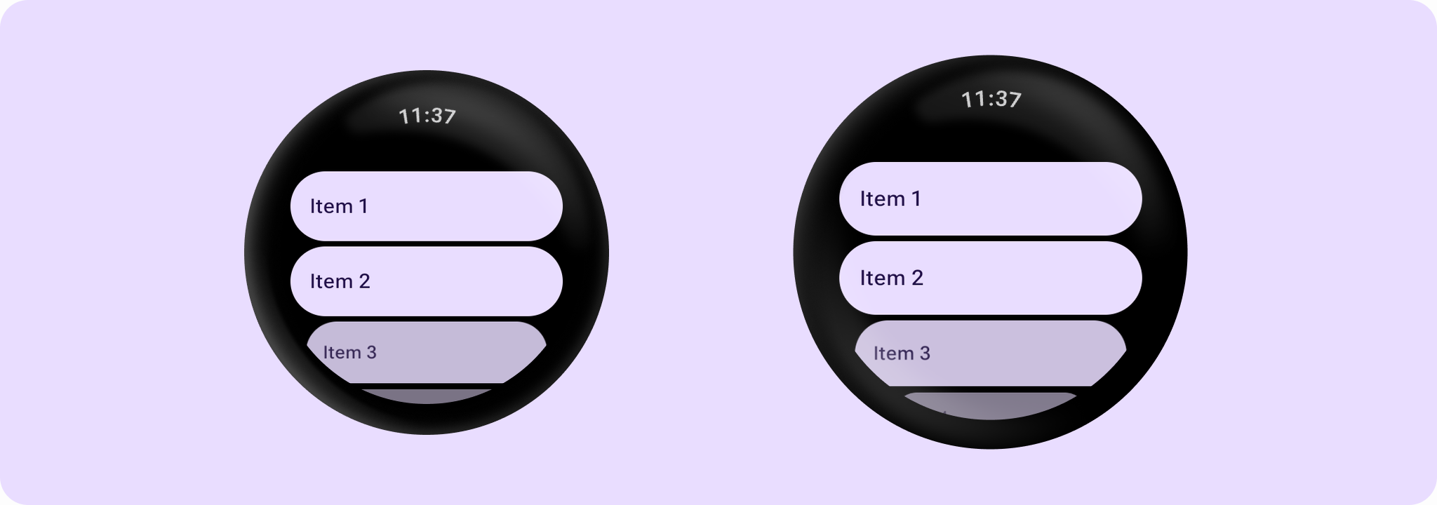
Example of using AppScaffold and ScreenScaffold:
import androidx.compose.foundation.layout.fillMaxSize
import androidx.compose.foundation.layout.fillMaxWidth
import androidx.compose.ui.Modifier
import androidx.wear.compose.foundation.lazy.TransformingLazyColumn
import androidx.wear.compose.foundation.lazy.rememberTransformingLazyColumnState
import androidx.wear.compose.material3.AppScaffold
import androidx.wear.compose.material3.Button
import androidx.wear.compose.material3.ButtonDefaults
import androidx.wear.compose.material3.EdgeButton
import androidx.wear.compose.material3.ScreenScaffold
import androidx.wear.compose.material3.SurfaceTransformation
import androidx.wear.compose.material3.Text
import androidx.wear.compose.material3.lazy.rememberTransformationSpec
import androidx.wear.compose.material3.lazy.transformedHeight

// Declare just one [AppScaffold] per app such as in the activity.
// [AppScaffold] allows static screen elements (i.e. [TimeText]) to remain visible
// during in-app transitions such as swipe-to-dismiss.
AppScaffold {
    val transformationSpec = rememberTransformationSpec()

    // Define the navigation hierarchy within the AppScaffold,
    // such as using SwipeDismissableNavHost.
    // For this sample, we will define a single screen inline.
    val listState = rememberTransformingLazyColumnState()

    // By default, ScreenScaffold will handle transitions showing/hiding ScrollIndicator,
    // showing/hiding/scrolling away TimeText and optionally hosting the EdgeButton.
    ScreenScaffold(scrollState = listState) { contentPadding ->
        TransformingLazyColumn(
            state = listState,
            contentPadding = contentPadding,
            modifier = Modifier.fillMaxSize(),
        ) {
            items(10) {
                Button(
                    onClick = {},
                    label = { Text("Item ${it + 1}") },
                    transformation = SurfaceTransformation(transformationSpec),
                    modifier =
                        Modifier.transformedHeight(this, transformationSpec)
                            .minimumVerticalContentPadding(
                                ButtonDefaults.minimumVerticalListContentPadding
                            )
                            .fillMaxWidth(),
                )
            }
        }
    }
}
| Parameters | |
|---|---|
modifier: Modifier = Modifier |
The modifier for the top level of the scaffold. |
containerColor: Color = MaterialTheme.colorScheme.background |
The container color of the app drawn behind the |
contentColor: Color = contentColorFor(containerColor) |
The content color for the application |
content: @Composable BoxScope.() -> Unit |
The main content for this application. |
AppScaffold
@Composable
fun AppScaffold(
    modifier: Modifier = Modifier,
    timeText: @Composable () -> Unit = AppScaffoldDefaults.timeText,
    containerColor: Color = MaterialTheme.colorScheme.background,
    contentColor: Color = contentColorFor(containerColor),
    content: @Composable BoxScope.() -> Unit
): Unit
AppScaffold is one of the Wear Material3 scaffold components.
The scaffold components AppScaffold and ScreenScaffold lay out the structure of a screen and coordinate transitions of the ScrollIndicator and TimeText components.
AppScaffold allows static screen elements such as TimeText to remain visible during in-app transitions such as swipe-to-dismiss. It provides a slot for the main application content, which will usually be supplied by a navigation component such as SwipeDismissableNavHost.
Example of using AppScaffold and ScreenScaffold:
import androidx.compose.foundation.layout.fillMaxSize
import androidx.compose.foundation.layout.fillMaxWidth
import androidx.compose.ui.Modifier
import androidx.wear.compose.foundation.lazy.TransformingLazyColumn
import androidx.wear.compose.foundation.lazy.rememberTransformingLazyColumnState
import androidx.wear.compose.material3.AppScaffold
import androidx.wear.compose.material3.Button
import androidx.wear.compose.material3.ButtonDefaults
import androidx.wear.compose.material3.EdgeButton
import androidx.wear.compose.material3.ScreenScaffold
import androidx.wear.compose.material3.SurfaceTransformation
import androidx.wear.compose.material3.Text
import androidx.wear.compose.material3.lazy.rememberTransformationSpec
import androidx.wear.compose.material3.lazy.transformedHeight

// Declare just one [AppScaffold] per app such as in the activity.
// [AppScaffold] allows static screen elements (i.e. [TimeText]) to remain visible
// during in-app transitions such as swipe-to-dismiss.
AppScaffold {
    val transformationSpec = rememberTransformationSpec()

    // Define the navigation hierarchy within the AppScaffold,
    // such as using SwipeDismissableNavHost.
    // For this sample, we will define a single screen inline.
    val listState = rememberTransformingLazyColumnState()

    // By default, ScreenScaffold will handle transitions showing/hiding ScrollIndicator,
    // showing/hiding/scrolling away TimeText and optionally hosting the EdgeButton.
    ScreenScaffold(scrollState = listState) { contentPadding ->
        TransformingLazyColumn(
            state = listState,
            contentPadding = contentPadding,
            modifier = Modifier.fillMaxSize(),
        ) {
            items(10) {
                Button(
                    onClick = {},
                    label = { Text("Item ${it + 1}") },
                    transformation = SurfaceTransformation(transformationSpec),
                    modifier =
                        Modifier.transformedHeight(this, transformationSpec)
                            .minimumVerticalContentPadding(
                                ButtonDefaults.minimumVerticalListContentPadding
                            )
                            .fillMaxWidth(),
                )
            }
        }
    }
}
| Parameters | |
|---|---|
modifier: Modifier = Modifier |
The modifier for the top level of the scaffold. |
timeText: @Composable () -> Unit = AppScaffoldDefaults.timeText |
The default time text to display across screens in this application. Defaults to |
containerColor: Color = MaterialTheme.colorScheme.background |
The container color of the app drawn behind the |
contentColor: Color = contentColorFor(containerColor) |
The content color for the application |
content: @Composable BoxScope.() -> Unit |
The main content for this application. |