CompactButtonDefaults
object CompactButtonDefaults
Contains the default values used by CompactButton
Summary
Public functions |
|
|---|---|
Unit |
@ComposableLays out the content of a |
Public properties |
|
|---|---|
PaddingValues |
The default content padding used by |
Dp |
The recommended icon size when used in |
Dp |
The height applied for the |
Dp |
Recommended horizontal content padding for |
Dp |
The recommended icon size when used in |
PaddingValues |
The default padding to be provided around a |
Dp |
Recommended vertical content padding for |
Dp |
The minimum vertical content padding for the list when a |
RoundedCornerShape |
Recommended |
Public functions
Content
@Composable
fun Content(
    modifier: Modifier = Modifier,
    icon: (@Composable BoxScope.() -> Unit)? = null,
    enabled: Boolean = true,
    colors: ButtonColors = ButtonDefaults.buttonColors(),
    label: (@Composable RowScope.() -> Unit)? = null
): Unit
Lays out the content of a CompactButton with support for an icon and a label.
While the standard CompactButton overloads provide this layout out-of-the-box, CompactButtonDefaults.Content can be used inside the CompactButton overload that takes a generic content to build custom button layouts (for example, to wrap the content in a gesture hint indicator like OneHandedGestureIndicator) while maintaining standard typography, colors, and spacing.
Both the icon and label are optional however it is expected that at least one will be provided.
Example of a CompactButtonDefaults.Content layout with OneHandedGestureIndicator:
import androidx.compose.foundation.interaction.MutableInteractionSource
import androidx.compose.foundation.layout.Box
import androidx.compose.foundation.layout.fillMaxSize
import androidx.compose.foundation.layout.size
import androidx.compose.runtime.mutableStateOf
import androidx.compose.runtime.remember
import androidx.compose.ui.Alignment
import androidx.compose.ui.Modifier
import androidx.compose.ui.res.painterResource
import androidx.compose.ui.semantics.onClick
import androidx.wear.compose.material3.Button
import androidx.wear.compose.material3.ButtonDefaults
import androidx.wear.compose.material3.CompactButton
import androidx.wear.compose.material3.CompactButtonDefaults
import androidx.wear.compose.material3.Icon
import androidx.wear.compose.material3.MaterialTheme
import androidx.wear.compose.material3.Text
import androidx.wear.compose.material3.onehandedgesture.GestureAction
import androidx.wear.compose.material3.onehandedgesture.OneHandedGestureIndicator
import androidx.wear.compose.material3.onehandedgesture.OneHandedGestureIndicatorState
import androidx.wear.compose.material3.onehandedgesture.oneHandedGesture
import androidx.wear.compose.material3.onehandedgesture.rememberOneHandedGestureConfiguration

var label by remember { mutableStateOf("Compact Button") }
val onClick = remember { { label = "Gestured" } }
val interactionSource = remember { MutableInteractionSource() }
val gestureConfig = rememberOneHandedGestureConfiguration(action = GestureAction.Primary)
val indicatorState = remember { OneHandedGestureIndicatorState() }

Box(modifier = Modifier.fillMaxSize(), contentAlignment = Alignment.Center) {
    CompactButton(
        onClick = onClick,
        interactionSource = interactionSource,
        modifier =
            Modifier.oneHandedGesture(
                gestureConfiguration = gestureConfig,
                onGestureLabel = "click",
                interactionSource = interactionSource,
                onGestureAvailable = { indicatorState.isIndicatorActive = true },
                onGesture = onClick,
            ),
    ) {
        OneHandedGestureIndicator(
            gestureConfiguration = gestureConfig,
            indicatorState = indicatorState,
            gestureIndicatorTint = MaterialTheme.colorScheme.onPrimary,
        ) {
            CompactButtonDefaults.Content(
                icon = {
                    Icon(
                        painter = painterResource(R.drawable.ic_favorite_rounded),
                        contentDescription = "Favorite icon",
                        modifier = Modifier.size(CompactButtonDefaults.ExtraSmallIconSize),
                    )
                },
                colors = ButtonDefaults.buttonColors(),
                label = { Text(label) },
            )
        }
    }
}
| Parameters | |
|---|---|
modifier: Modifier = Modifier |
Modifier to be applied to the compact button content layout. |
icon: (@Composable BoxScope.() -> Unit)? = null |
A slot for providing the button's icon. The contents are expected to be a horizontally and vertically center-aligned icon of size |
enabled: Boolean = true |
Controls the enabled state of the button. When |
colors: ButtonColors = ButtonDefaults.buttonColors() |
|
label: (@Composable RowScope.() -> Unit)? = null |
A slot for providing the button's main label. By default, CompactButtonDefaults.Content applies Material3 UX guidelines, so that |
Public properties
ContentPadding
val ContentPadding: PaddingValues
The default content padding used by CompactButton
ExtraSmallIconSize
val ExtraSmallIconSize: Dp
The recommended icon size when used in CompactButtons containing both icon and text.
Height
val Height: Dp
The height applied for the CompactButton. This includes a visible button height of 32.dp and 8.dp of padding above and below the button in order to meet accessibility guidelines that request a minimum of 48.dp height and width of tappable area.
Note that you can override it by adjusting Modifier.height and Modifier.padding directly on CompactButton.
HorizontalPadding
val HorizontalPadding: Dp
Recommended horizontal content padding for CompactButton
SmallIconSize
val SmallIconSize: Dp
The recommended icon size when used in CompactButtons containing icon-only content.
TapTargetPadding
val TapTargetPadding: PaddingValues
The default padding to be provided around a CompactButton in order to ensure that its tappable area meets minimum UX guidance.
minimumVerticalListContentPadding
val minimumVerticalListContentPadding: Dp
The minimum vertical content padding for the list when a CompactButton is placed at the top or bottom edge. Recommended for use with androidx.wear.compose.foundation.lazy.TransformingLazyColumnItemScope's androidx.wear.compose.foundation.lazy.TransformingLazyColumnItemScope.minimumVerticalContentPadding, which allows items to choose a preferred content padding for the list. TransformingLazyColumn takes its contentPadding as the maximum of the preferred content padding values and its own contentPadding parameter.
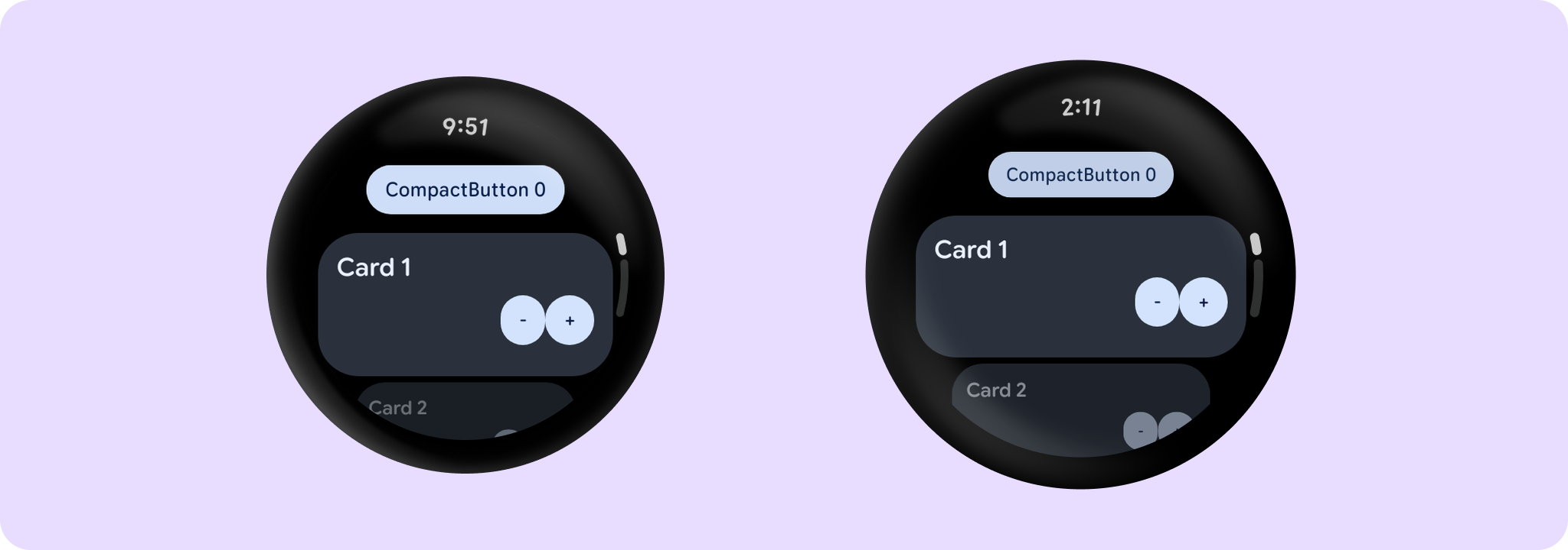
import androidx.compose.foundation.layout.Row
import androidx.compose.foundation.layout.Spacer
import androidx.compose.foundation.layout.fillMaxWidth
import androidx.compose.runtime.mutableIntStateOf
import androidx.compose.runtime.mutableStateOf
import androidx.compose.runtime.remember
import androidx.compose.ui.Modifier
import androidx.wear.compose.foundation.lazy.TransformingLazyColumn
import androidx.wear.compose.foundation.lazy.itemsIndexed
import androidx.wear.compose.foundation.lazy.rememberTransformingLazyColumnState
import androidx.wear.compose.material3.AppScaffold
import androidx.wear.compose.material3.Button
import androidx.wear.compose.material3.ButtonDefaults
import androidx.wear.compose.material3.Card
import androidx.wear.compose.material3.CardDefaults
import androidx.wear.compose.material3.CompactButton
import androidx.wear.compose.material3.CompactButtonDefaults
import androidx.wear.compose.material3.EdgeButton
import androidx.wear.compose.material3.ListHeader
import androidx.wear.compose.material3.ListHeaderDefaults
import androidx.wear.compose.material3.ScreenScaffold
import androidx.wear.compose.material3.SurfaceTransformation
import androidx.wear.compose.material3.Text
import androidx.wear.compose.material3.lazy.rememberTransformationSpec
import androidx.wear.compose.material3.lazy.transformedHeight

val transformationSpec = rememberTransformationSpec()
val state = rememberTransformingLazyColumnState()
var elements by remember { mutableStateOf(listOf(0, 1, 2, 3, 4, 5, 6, 7, 8, 9)) }
var nextElement by remember { mutableIntStateOf(10) }

fun addElementAfter(index: Int) {
    elements =
        elements.subList(0, index + 1) +
            listOf(nextElement++) +
            elements.subList(index + 1, elements.count())
}

fun removeElementAt(index: Int) {
    elements = elements.subList(0, index) + elements.subList(index + 1, elements.count())
}

AppScaffold {
    ScreenScaffold(
        state,
        edgeButton = {
            EdgeButton(onClick = { elements = elements.shuffled() }) { Text("Shuffle") }
        },
    ) { contentPadding ->
        TransformingLazyColumn(state = state, contentPadding = contentPadding) {
            itemsIndexed(elements, key = { _, key -> key }) { index, key ->
                if (key % 3 == 0) {
                    CompactButton(
                        onClick = { removeElementAt(index) },
                        modifier =
                            Modifier.minimumVerticalContentPadding(
                                    CompactButtonDefaults.minimumVerticalListContentPadding
                                )
                                .transformedHeight(this, transformationSpec)
                                .animateItem(),
                        transformation = SurfaceTransformation(transformationSpec),
                    ) {
                        Text("CompactButton $key")
                    }
                } else if (key % 4 == 0) {
                    ListHeader(
                        modifier =
                            Modifier.minimumVerticalContentPadding(
                                    ListHeaderDefaults.minimumTopListContentPadding,
                                    ListHeaderDefaults.minimumBottomListContentPadding,
                                )
                                .transformedHeight(this, transformationSpec),
                        transformation = SurfaceTransformation(transformationSpec),
                    ) {
                        Text("ListHeader heading")
                    }
                } else {
                    Card(
                        onClick = {},
                        modifier =
                            Modifier.fillMaxWidth()
                                .minimumVerticalContentPadding(
                                    CardDefaults.minimumVerticalListContentPadding
                                )
                                .transformedHeight(this, transformationSpec)
                                .animateItem(),
                        transformation = SurfaceTransformation(transformationSpec),
                    ) {
                        Text("Card $key")
                        Row {
                            Spacer(modifier = Modifier.weight(1f))
                            CompactButton(
                                onClick = { removeElementAt(index) },
                                enabled = elements.count() > 1,
                            ) {
                                Text("-")
                            }
                            CompactButton(onClick = { addElementAfter(index) }) { Text("+") }
                        }
                    }
                }
            }
        }
    }
}