
Android Studio のエディタ領域内には、Jetpack Compose を使用して生産性を向上させる機能が用意されています。
ライブ テンプレート
Android Studio には、次のような Compose 関連のライブ テンプレートが用意されています。ライブ テンプレートを使用すると、対応するテンプレートの短縮名を入力してコード スニペットをすばやく挿入できます。
comp:@Composable関数を設定するprev: コンポーズ可能な関数@Previewを作成するpaddp:padding修飾子を dp で追加するweight:weight修飾子を追加するW、WR、WC: 現在のコンポーザブルをBox、Row、またはColumnコンテナで囲む
ガターアイコン
ガターアイコンは、サイドバーにある行番号の横に表示されるコンテキスト アクションです。Android Studio では、デベロッパーのエクスペリエンスを向上させるために、Jetpack Compose 固有のガターアイコンがいくつか導入されています。
プレビューをデプロイする
@Preview は、エミュレータまたは実機に、ガターアイコンから直接デプロイできます。
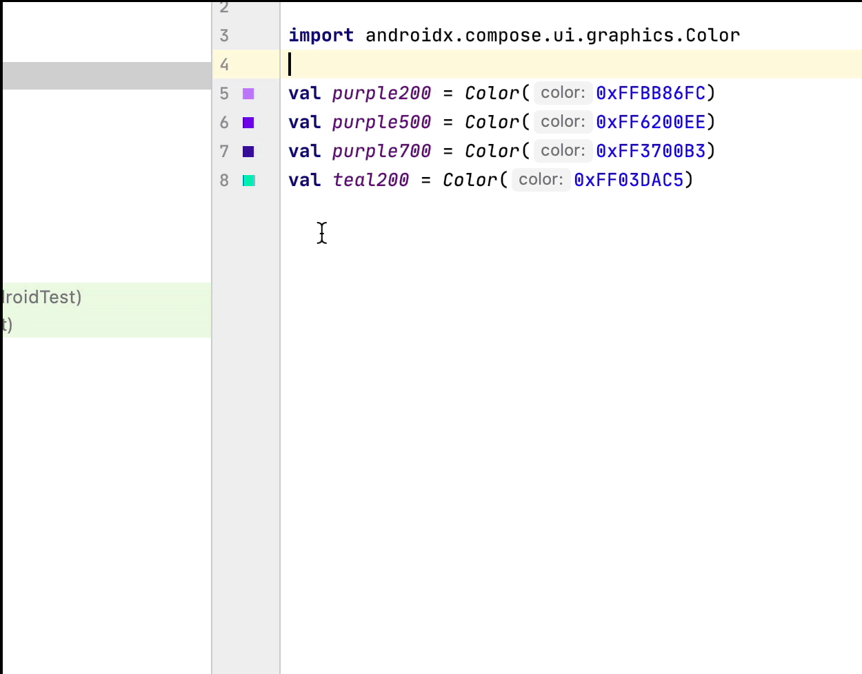
カラー選択ツール
コンポーザブルの内部または外部で色が定義されている場合、プレビューがガターに表示されます。次のように、カラー選択ツールをクリックすることで色を変更できます。
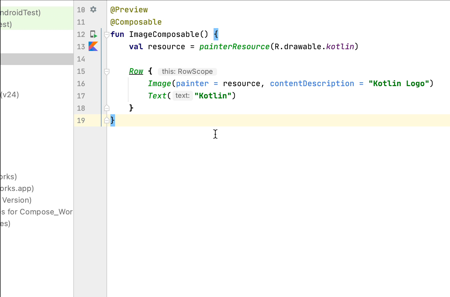
画像リソース選択ツール
コンポーザブルの内部または外部でドローアブル、ベクター、画像が定義されている場合、プレビューがガターに表示されます。次のように、画像リソース選択ツールをクリックすることで、ドローアブル、ベクター、画像を変更できます。
あなたへのおすすめ
- 注: JavaScript がオフになっている場合はリンクテキストが表示されます
- Compose レイアウトの基本
- Compose 修飾子
- リストとグリッド