Shadows visually elevate your UI, indicate interactivity to users, and provide immediate feedback on user actions. Compose provides several ways to incorporate shadows into your app:
Modifier.shadow(): Creates an elevation-based shadow behind a composable that conforms to Material Design guidelines.Modifier.dropShadow(): Creates a customizable shadow that appears behind a composable, making it appear elevated.Modifier.innerShadow(): Creates a shadow inside the borders of a composable, making it appear pressed into the surface behind it.
Modifier.shadow() is suitable for creating basic shadows, while the
dropShadow() and innerShadow() modifiers offer more fine-grained control and
precision over shadow rendering.
This page describes how to implement each of these modifiers, including how to
animate shadows upon user interaction and how to chain the
innerShadow() and dropShadow() modifiers to
create gradient shadows,
neumorphic shadows, and more.
Create basic shadows
Modifier.shadow() creates a basic shadow following Material Design
guidelines that simulates a light source from above. The shadow
depth is based on an elevation value, and the cast shadow is clipped to the
shape of the composable.
@Composable fun ElevationBasedShadow() { Box( modifier = Modifier.aspectRatio(1f).fillMaxSize(), contentAlignment = Alignment.Center ) { Box( Modifier .size(100.dp, 100.dp) .shadow(10.dp, RectangleShape) .background(Color.White) ) } }
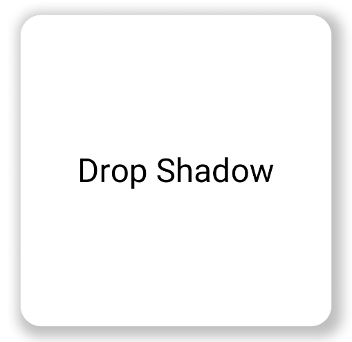
Modifier.shadow().Implement drop shadows
Use the dropShadow() modifier to draw an accurate shadow behind your
content, which makes the element appear elevated.
You can control the following key aspects through its Shadow parameter:
radius: Defines the softness and diffusion of your blur.color: Defines the color of the tint.offset: Positions the shadow's geometry along the x and y axes.spread: Controls the expansion or contraction of the shadow's geometry.
Additionally, the shape parameter defines the shadow's overall shape. It can
use any geometry from the androidx.compose.foundation.shape package, as well
as the Material Expressive shapes.
To implement a basic drop shadow, add the dropShadow() modifier onto your
composable chain, providing the radius, color, and spread. Note that the
purpleColor background that appears on top of the shadow is drawn after the
dropShadow() modifier:
@Composable fun SimpleDropShadowUsage() { Box(Modifier.fillMaxSize()) { Box( Modifier .width(300.dp) .height(300.dp) .dropShadow( shape = RoundedCornerShape(20.dp), shadow = Shadow( radius = 10.dp, spread = 6.dp, color = Color(0x40000000), offset = DpOffset(x = 4.dp, 4.dp) ) ) .align(Alignment.Center) .background( color = Color.White, shape = RoundedCornerShape(20.dp) ) ) { Text( "Drop Shadow", modifier = Modifier.align(Alignment.Center), fontSize = 32.sp ) } } }
Key points about the code
- The
dropShadow()modifier is applied to the innerBox. The shadow has the following characteristics:- A rounded rectangle shape (
RoundedCornerShape(20.dp)) - A blur radius of
10.dp, making the edges soft and diffused - A spread of
6.dp, which expands the shadow's size and makes it larger than the box casting it - An alpha of
0.5f, making the shadow semi-transparent
- A rounded rectangle shape (
- After the shadow is defined, the .
background()modifier is applied.- The
Boxis filled with a white color. - The background is clipped to the same rounded rectangle shape as the shadow.
- The
Result
Implement inner shadows
To create an inverse effect to dropShadow(), use
Modifier.innerShadow(), which creates the illusion that an element is
recessed or pressed into the underlying surface.
Order is significant when creating inner shadows. The innerShadow() modifier
draws on top of the content. To make sure the shadow is visible, you typically
perform the following steps:
- Draw your background content.
- Apply the
innerShadow()modifier to create the concave appearance.
If the innerShadow() is placed before the background, the background is drawn
over the shadow, hiding it completely.
The following example shows an application of innerShadow() on a
RoundedCornerShape:
@Composable fun SimpleInnerShadowUsage() { Box(Modifier.fillMaxSize()) { Box( Modifier .width(300.dp) .height(200.dp) .align(Alignment.Center) // note that the background needs to be defined before defining the inner shadow .background( color = Color.White, shape = RoundedCornerShape(20.dp) ) .innerShadow( shape = RoundedCornerShape(20.dp), shadow = Shadow( radius = 10.dp, spread = 2.dp, color = Color(0x40000000), offset = DpOffset(x = 6.dp, 7.dp) ) ) ) { Text( "Inner Shadow", modifier = Modifier.align(Alignment.Center), fontSize = 32.sp ) } } }
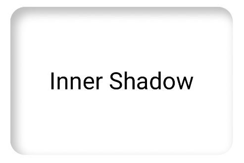
Modifier.innerShadow() on a rounded corner
rectangle.Animate shadows on user interaction
To make your shadows respond to user interactions, you can integrate shadow properties with Compose's animation APIs. When a user presses a button, for example, the shadow can change to provide instantaneous visual feedback.
The following code creates a "pressed" effect with a shadow (the illusion that the surface is being pushed down into the screen):
@Composable fun AnimatedColoredShadows() { SnippetsTheme { Box(Modifier.fillMaxSize()) { val interactionSource = remember { MutableInteractionSource() } val isPressed by interactionSource.collectIsPressedAsState() // Create transition with pressed state val transition = updateTransition( targetState = isPressed, label = "button_press_transition" ) fun <T> buttonPressAnimation() = tween<T>( durationMillis = 400, easing = EaseInOut ) // Animate all properties using the transition val shadowAlpha by transition.animateFloat( label = "shadow_alpha", transitionSpec = { buttonPressAnimation() } ) { pressed -> if (pressed) 0f else 1f } // ... val blueDropShadow by transition.animateColor( label = "shadow_color", transitionSpec = { buttonPressAnimation() } ) { pressed -> if (pressed) Color.Transparent else blueDropShadowColor } // ... Box( Modifier .clickable( interactionSource, indication = null ) { // ** ...... **// } .width(300.dp) .height(200.dp) .align(Alignment.Center) .dropShadow( shape = RoundedCornerShape(70.dp), shadow = Shadow( radius = 10.dp, spread = 0.dp, color = blueDropShadow, offset = DpOffset(x = 0.dp, -(2).dp), alpha = shadowAlpha ) ) .dropShadow( shape = RoundedCornerShape(70.dp), shadow = Shadow( radius = 10.dp, spread = 0.dp, color = darkBlueDropShadow, offset = DpOffset(x = 2.dp, 6.dp), alpha = shadowAlpha ) ) // note that the background needs to be defined before defining the inner shadow .background( color = Color(0xFFFFFFFF), shape = RoundedCornerShape(70.dp) ) .innerShadow( shape = RoundedCornerShape(70.dp), shadow = Shadow( radius = 8.dp, spread = 4.dp, color = innerShadowColor2, offset = DpOffset(x = 4.dp, 0.dp) ) ) .innerShadow( shape = RoundedCornerShape(70.dp), shadow = Shadow( radius = 20.dp, spread = 4.dp, color = innerShadowColor1, offset = DpOffset(x = 4.dp, 0.dp), alpha = innerShadowAlpha ) ) ) { Text( "Animated Shadows", // ... ) } } } }
Key points about the code
- Declares the start and end states for the parameters to animate upon press
with
transition.animateColorandtransition.animateFloat. - Uses
updateTransitionand provides it with the chosentargetState (targetState = isPressed)to verify all animations are synchronized. WheneverisPressedchanges, the transition object automatically manages the animation of all child properties from their current values to the new target values. - Defines the
buttonPressAnimationspecification, which controls the timing and easing of the transition. It specifies atween(short for in-between) with a duration of 400 milliseconds and anEaseInOutcurve, which means the animation starts slow, speeds up in the middle, and slows down at the end. - Defines a
Boxwith a chain of modifier functions that apply all the animated properties to create the visual element, including the following:- .
clickable(): A modifier that makes theBoxinteractive. .dropShadow(): Two outer drop shadows are applied first. Their color and alpha properties are linked to the animated values (blueDropShadow, etc) and create the initial raised appearance..innerShadow(): Two inner shadows are drawn on top of the background. Their properties are linked to the other set of animated values (innerShadowColor1, etc) and create the indented appearance.
- .
Result
Create gradient shadows
Shadows are not limited to solid colors. The shadow API accepts a Brush, which
lets you create gradient shadows.
Box( modifier = Modifier .width(240.dp) .height(200.dp) .dropShadow( shape = RoundedCornerShape(70.dp), shadow = Shadow( radius = 10.dp, spread = animatedSpread.dp, brush = Brush.sweepGradient( colors ), offset = DpOffset(x = 0.dp, y = 0.dp), alpha = animatedAlpha ) ) .clip(RoundedCornerShape(70.dp)) .background(Color(0xEDFFFFFF)), contentAlignment = Alignment.Center ) { Text( text = breathingText, color = Color.Black, style = MaterialTheme.typography.bodyLarge ) }
Key points about the code
dropShadow()adds a shadow behind the box.brush = Brush.sweepGradient(colors)colors the shadow with a gradient that rotates through a list of predefinedcolors, creating a rainbow-like effect.
Result
You can use a brush as a shadow to create a gradient dropShadow() with a
"breathing" animation:
Combine shadows
You can combine and layer the dropShadow() and innerShadow() modifiers to
create a variety of effects. The following sections show you how to produce
neumorphic, neobrutalist, and realistic shadows with this technique.
Create neumorphic shadows
Neumorphic shadows are characterized by a soft appearance that emerges organically from the background. To create neumorphic shadows, do the following:
- Use an element that shares the same colors as its background.
- Apply two faint, opposing drop shadows: a light shadow to one corner, and a dark shadow to the opposite corner.
The following snippet layers two dropShadow() modifiers to create the
neumorphic effect:
@Composable fun NeumorphicRaisedButton( shape: RoundedCornerShape = RoundedCornerShape(30.dp) ) { val bgColor = Color(0xFFe0e0e0) val lightShadow = Color(0xFFFFFFFF) val darkShadow = Color(0xFFb1b1b1) val upperOffset = -10.dp val lowerOffset = 10.dp val radius = 15.dp val spread = 0.dp Box( modifier = Modifier .fillMaxSize() .background(bgColor) .wrapContentSize(Alignment.Center) .size(240.dp) .dropShadow( shape, shadow = Shadow( radius = radius, color = lightShadow, spread = spread, offset = DpOffset(upperOffset, upperOffset) ), ) .dropShadow( shape, shadow = Shadow( radius = radius, color = darkShadow, spread = spread, offset = DpOffset(lowerOffset, lowerOffset) ), ) .background(bgColor, shape) ) }

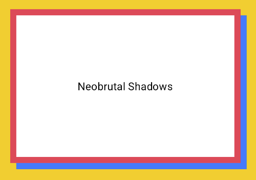
Create neobrutalist shadows
The neobrutalist style showcases high-contrast, blocky layouts, vivid colors,
and thick borders. To create this effect, use a dropShadow() with zero blur
and a distinct offset, as shown in the following snippet:
@Composable fun NeoBrutalShadows() { SnippetsTheme { val dropShadowColor = Color(0xFF007AFF) val borderColor = Color(0xFFFF2D55) Box(Modifier.fillMaxSize()) { Box( Modifier .width(300.dp) .height(200.dp) .align(Alignment.Center) .dropShadow( shape = RoundedCornerShape(0.dp), shadow = Shadow( radius = 0.dp, spread = 0.dp, color = dropShadowColor, offset = DpOffset(x = 8.dp, 8.dp) ) ) .border( 8.dp, borderColor ) .background( color = Color.White, shape = RoundedCornerShape(0.dp) ) ) { Text( "Neobrutal Shadows", modifier = Modifier.align(Alignment.Center), style = MaterialTheme.typography.bodyMedium ) } } } }
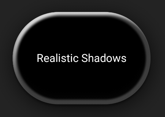
Create realistic shadows
Realistic shadows mimic shadows in the physical world— they appear lit by a
primary light source, resulting in both a direct shadow and a more diffuse
shadow. You can stack multiple dropShadow() and innerShadow() instances with
different properties to recreate realistic shadow effects, as shown in the
following snippet:
@Composable fun RealisticShadows() { Box(Modifier.fillMaxSize()) { val dropShadowColor1 = Color(0xB3000000) val dropShadowColor2 = Color(0x66000000) val innerShadowColor1 = Color(0xCC000000) val innerShadowColor2 = Color(0xFF050505) val innerShadowColor3 = Color(0x40FFFFFF) val innerShadowColor4 = Color(0x1A050505) Box( Modifier .width(300.dp) .height(200.dp) .align(Alignment.Center) .dropShadow( shape = RoundedCornerShape(100.dp), shadow = Shadow( radius = 40.dp, spread = 0.dp, color = dropShadowColor1, offset = DpOffset(x = 2.dp, 8.dp) ) ) .dropShadow( shape = RoundedCornerShape(100.dp), shadow = Shadow( radius = 4.dp, spread = 0.dp, color = dropShadowColor2, offset = DpOffset(x = 0.dp, 4.dp) ) ) // note that the background needs to be defined before defining the inner shadow .background( color = Color.Black, shape = RoundedCornerShape(100.dp) ) // // .innerShadow( shape = RoundedCornerShape(100.dp), shadow = Shadow( radius = 12.dp, spread = 3.dp, color = innerShadowColor1, offset = DpOffset(x = 6.dp, 6.dp) ) ) .innerShadow( shape = RoundedCornerShape(100.dp), shadow = Shadow( radius = 4.dp, spread = 1.dp, color = Color.White, offset = DpOffset(x = 5.dp, 5.dp) ) ) .innerShadow( shape = RoundedCornerShape(100.dp), shadow = Shadow( radius = 12.dp, spread = 5.dp, color = innerShadowColor2, offset = DpOffset(x = (-3).dp, (-12).dp) ) ) .innerShadow( shape = RoundedCornerShape(100.dp), shadow = Shadow( radius = 3.dp, spread = 10.dp, color = innerShadowColor3, offset = DpOffset(x = 0.dp, 0.dp) ) ) .innerShadow( shape = RoundedCornerShape(100.dp), shadow = Shadow( radius = 3.dp, spread = 9.dp, color = innerShadowColor4, offset = DpOffset(x = 1.dp, 1.dp) ) ) ) { Text( "Realistic Shadows", modifier = Modifier.align(Alignment.Center), fontSize = 24.sp, color = Color.White ) } } }
Key points about the code
- Two chained
dropShadow()modifiers with distinct properties are applied, followed by abackground()modifier. - Chained
innerShadow()modifiers are applied to forge the metallic rim effect around the component's edge.
Result
The previous code snippet produces the following: