
The
verticalScroll
and
horizontalScroll
modifiers provide the simplest way to allow the user to scroll an element when
the bounds of its contents are larger than its maximum size constraints. With
the verticalScroll and horizontalScroll modifiers you don't need to
translate or offset the contents.
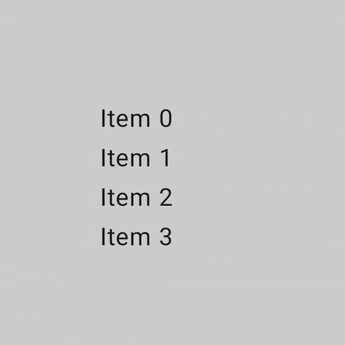
@Composable private fun ScrollBoxes() { Column( modifier = Modifier .background(Color.LightGray) .size(100.dp) .verticalScroll(rememberScrollState()) ) { repeat(10) { Text("Item $it", modifier = Modifier.padding(2.dp)) } } }
The ScrollState
lets you change the scroll position or get its current state. To create it
with default parameters, use
rememberScrollState().
@Composable private fun ScrollBoxesSmooth() { // Smoothly scroll 100px on first composition val state = rememberScrollState() LaunchedEffect(Unit) { state.animateScrollTo(100) } Column( modifier = Modifier .background(Color.LightGray) .size(100.dp) .padding(horizontal = 8.dp) .verticalScroll(state) ) { repeat(10) { Text("Item $it", modifier = Modifier.padding(2.dp)) } } }
Scrollable area modifier
The scrollableArea modifier is a fundamental building block for creating
custom scrollable containers. It provides a higher-level abstraction over the
scrollable modifier, handling common requirements like gesture delta
interpretation, content clipping, and overscroll effects.
While scrollableArea is used for custom implementations, you should generally
prefer ready-made solutions like verticalScroll, horizontalScroll,
or composables like LazyColumn for standard scrolling lists. These
higher-level components are simpler for common use cases and are themselves
built by using scrollableArea.
Difference between scrollableArea and scrollable modifiers
The main difference between scrollableArea and scrollable lies in how they
interpret user scroll gestures:
scrollable(raw delta): The delta directly reflects the physical movement of the user's input (e.g., pointer drag) on the screen.scrollableArea(content-oriented delta): Thedeltais semantically inverted to represent the selected change in the scroll position to make the content appear to move with the user's gesture, which is usually the opposite of the pointer movement.
Think of it like this: scrollable tells you how the pointer moved, while
scrollableArea translates that pointer movement into how the content should
move within a typical scrollable view. This inversion is why scrollableArea
feels more natural when implementing a standard scrollable container.
The following table summarizes the delta signs for common scenarios:
User gesture |
delta reported to |
delta reported to |
|---|---|---|
Pointer moves UP |
Negative |
Positive |
Pointer moves DOWN |
Positive |
Negative |
Pointer moves LEFT |
Negative |
Positive (Negative for RTL) |
Pointer moves RIGHT |
Positive |
Negative (Positive for RTL) |
(*) Note on scrollableArea delta sign: The sign of the delta from
scrollableArea is not just a simple inversion. It intelligently considers:
- Orientation: Vertical or horizontal.
LayoutDirection: LTR or RTL (especially important for horizontal scrolling).reverseScrollingflag: Whether scroll direction is inverted.
In addition to inverting the scroll delta, scrollableArea also clips the
content to the bounds of the layout and handles the rendering of overscroll
effects. By default, it uses the effect provided by LocalOverscrollFactory.
You can customize or disable this by using the scrollableArea overload
that accepts an OverscrollEffect parameter.
When to use scrollableArea modifier
You should use the scrollableArea modifier when you need to build a custom
scrolling component that isn't adequately served by the horizontalScroll or
verticalScroll modifiers or Lazy layouts. This often involves cases with:
- Custom layout logic: When the arrangement of items changes dynamically based on the scroll position.
- Unique visual effects: Applying transformations, scaling, or other effects to children as they scroll.
- Direct control: Needing fine-grained control over the scrolling mechanics
beyond what
verticalScrollor Lazy layouts expose.
Create custom wheel-like lists using scrollableArea
The following sample demonstrates using scrollableArea to build a custom
vertical list where items scale down as they move away from the center, creating
a "wheel-like" visual effect. This kind of scroll-dependent transformation is a
perfect use case for scrollableArea.
scrollableArea.
@Composable private fun ScrollableAreaSample() { // ... Layout( modifier = Modifier .size(150.dp) .scrollableArea(scrollState, Orientation.Vertical) .background(Color.LightGray), // ... ) { measurables, constraints -> // ... // Update the maximum scroll value to not scroll beyond limits and stop when scroll // reaches the end. scrollState.maxValue = (totalHeight - viewportHeight).coerceAtLeast(0) // Position the children within the layout. layout(constraints.maxWidth, viewportHeight) { // The current vertical scroll position, in pixels. val scrollY = scrollState.value val viewportCenterY = scrollY + viewportHeight / 2 var placeableLayoutPositionY = 0 placeables.forEach { placeable -> // This sample applies a scaling effect to items based on their distance // from the center, creating a wheel-like effect. // ... // Place the item horizontally centered with a layer transformation for // scaling to achieve wheel-like effect. placeable.placeRelativeWithLayer( x = constraints.maxWidth / 2 - placeable.width / 2, // Offset y by the scroll position to make placeable visible in the viewport. y = placeableLayoutPositionY - scrollY, ) { scaleX = scaleFactor scaleY = scaleFactor } // Move to the next item's vertical position. placeableLayoutPositionY += placeable.height } } } } // ...
Scrollable modifier
The
scrollable
modifier differs from the scroll modifiers in that scrollable detects the
scroll gestures and captures the deltas, but does not offset its contents
automatically. This is instead delegated to the user through
ScrollableState
, which is required for this modifier to work correctly.
When constructing ScrollableState you must provide a consumeScrollDelta
function which will be invoked on each scroll step (by gesture input, smooth
scrolling or flinging) with the delta in pixels. This function must return the
amount of scrolling distance consumed, to ensure the event is properly
propagated in cases where there are nested elements that have the scrollable
modifier.
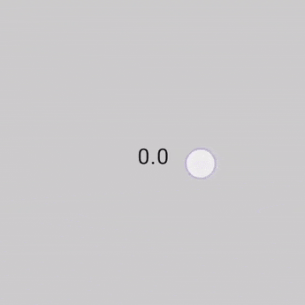
The following snippet detects the gestures and displays a numerical value for an offset, but does not offset any elements:
@Composable private fun ScrollableSample() { // actual composable state var offset by remember { mutableFloatStateOf(0f) } Box( Modifier .size(150.dp) .scrollable( orientation = Orientation.Vertical, // Scrollable state: describes how to consume // scrolling delta and update offset state = rememberScrollableState { delta -> offset += delta delta } ) .background(Color.LightGray), contentAlignment = Alignment.Center ) { Text(offset.toString()) } }
Recommended for you
- Note: link text is displayed when JavaScript is off
- Understand gestures
- Migrate
CoordinatorLayoutto Compose - Using Views in Compose