
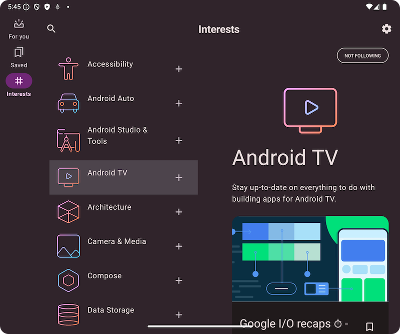
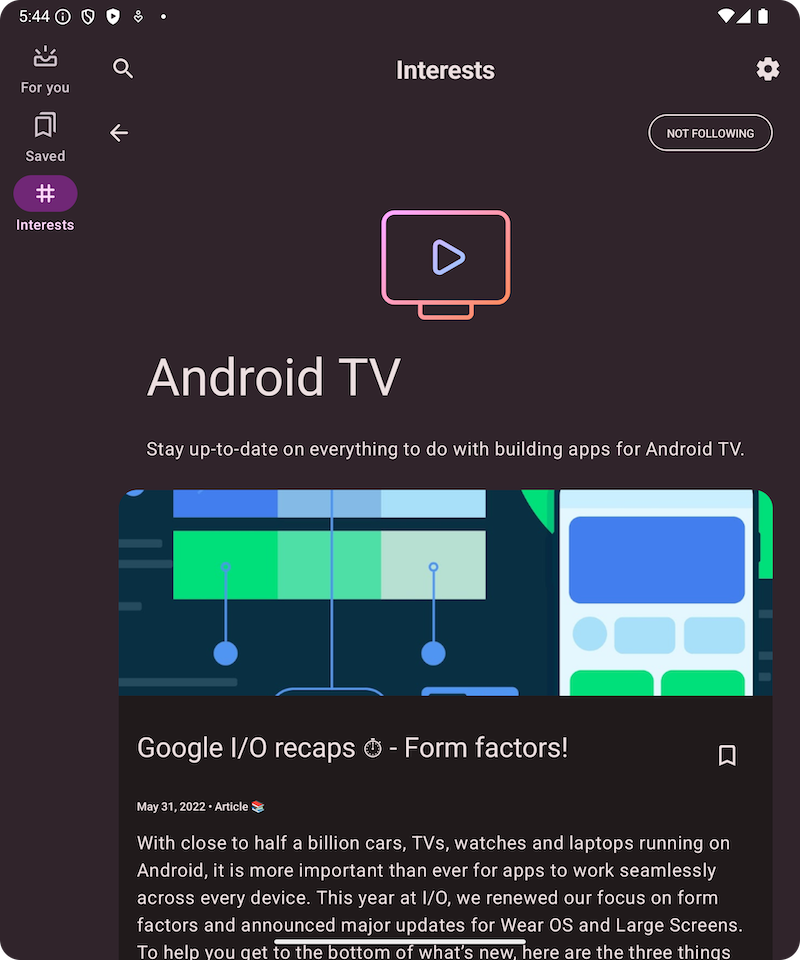
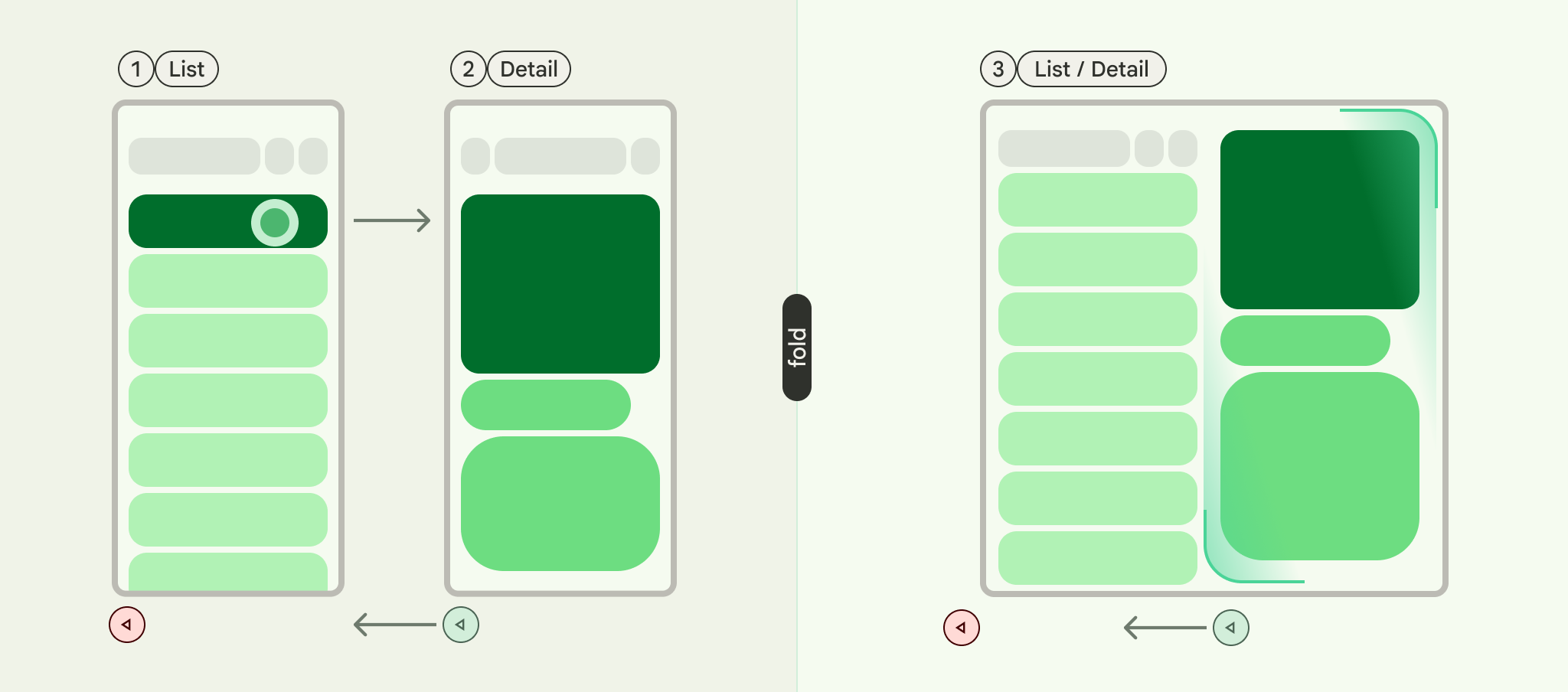
List-detail is a UI pattern that consists of a dual-pane layout where one pane presents a list of items and another pane displays the details of items selected from the list.
The pattern is particularly useful for applications that provide in-depth information about elements of large collections, for example, an email client that has a list of emails and the detailed content of each email message. List-detail can also be used for less critical paths such as dividing app preferences into a list of categories with the preferences for each category in the detail pane.
Implement the List-Detail Pattern with NavigableListDetailPaneScaffold
NavigableListDetailPaneScaffold is a composable that simplifies implementing a
list-detail layout in Jetpack Compose. It wraps ListDetailPaneScaffold and
adds built-in navigation and predictive back animations.
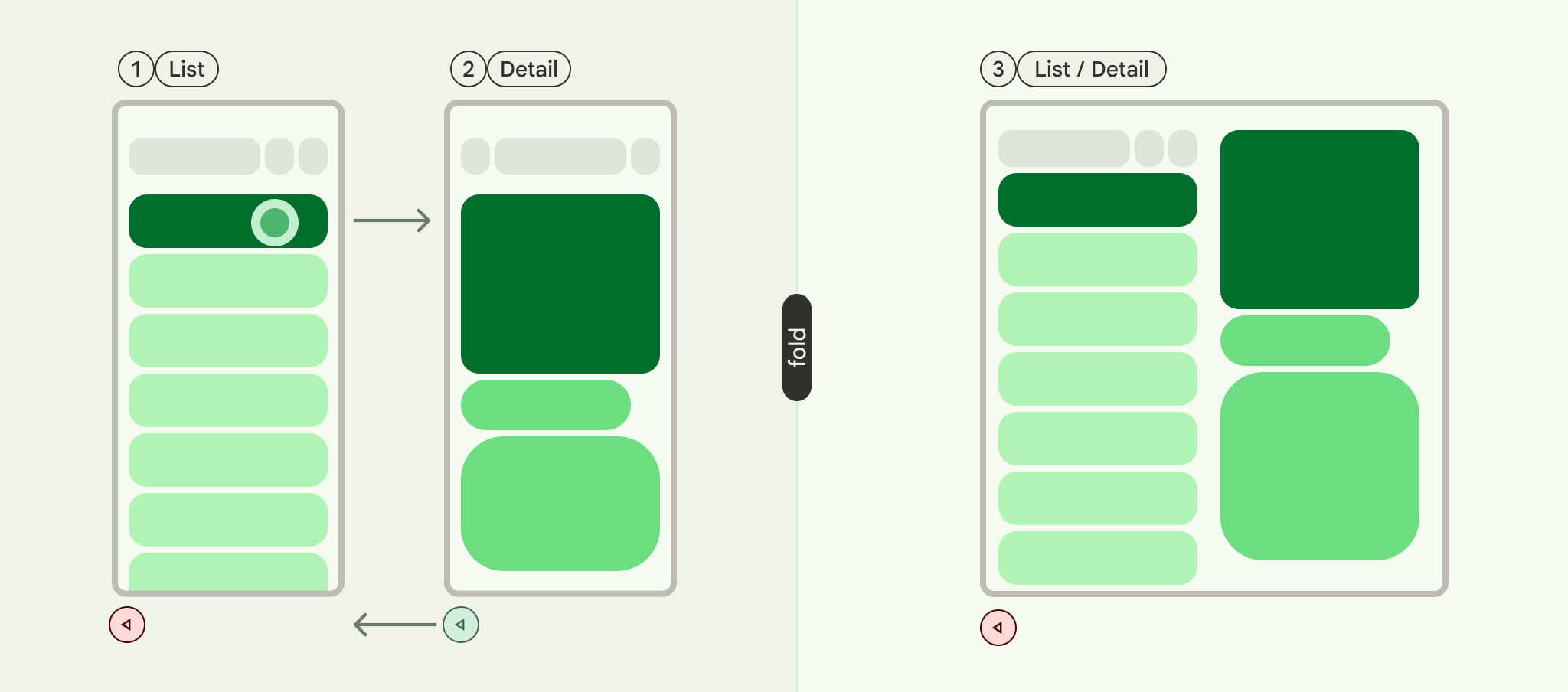
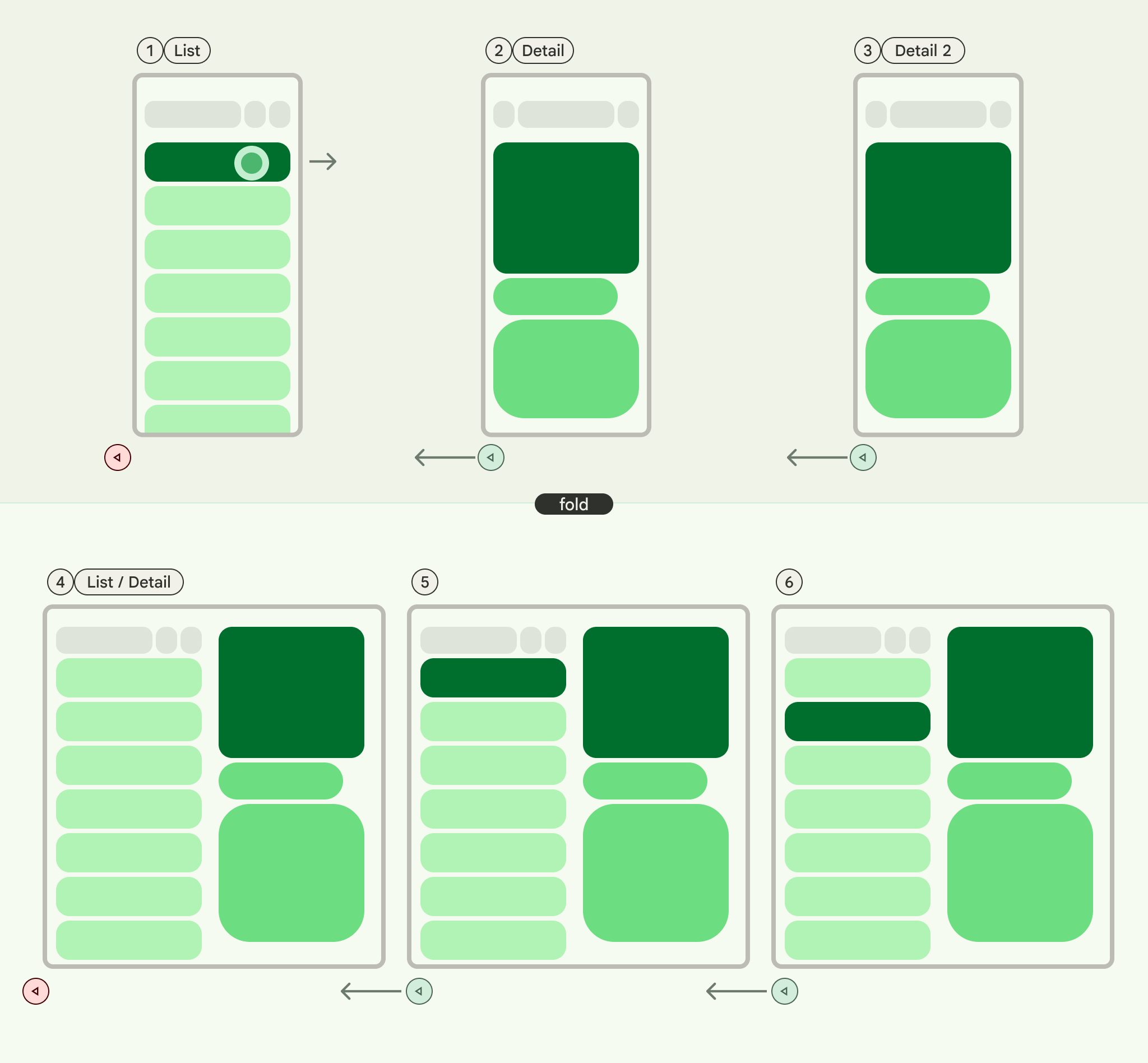
A list-detail scaffold supports up to three panes:
- List pane: Displays a collection of items.
- Detail pane: Shows the details of a selected item.
- Extra pane (optional): Provides additional context when needed.
The scaffold adapts based on window size:
- In large windows, the list and detail panes appear side by side.
- In small windows, only one pane is visible at a time, switching as users navigate.
Declare dependencies
NavigableListDetailPaneScaffold is part of the Material 3 adaptive navigation
library.
Add the following three related dependencies to the build.gradle file of your
app or module:
Kotlin
implementation("androidx.compose.material3.adaptive:adaptive")
implementation("androidx.compose.material3.adaptive:adaptive-layout")
implementation("androidx.compose.material3.adaptive:adaptive-navigation")
Groovy
implementation 'androidx.compose.material3.adaptive:adaptive'
implementation 'androidx.compose.material3.adaptive:adaptive-layout'
implementation 'androidx.compose.material3.adaptive:adaptive-navigation'
- adaptive: Low-level building blocks such as
HingeInfoandPosture - adaptive-layout: Adaptive layouts such as
ListDetailPaneScaffoldandSupportingPaneScaffold - adaptive-navigation: Composables for navigating within and between panes,
as well as adaptive layouts that support navigation by default such as
NavigableListDetailPaneScaffoldandNavigableSupportingPaneScaffold
Ensure your project includes compose-material3-adaptive version 1.1.0-beta1 or higher.
Opt-in to the predictive back gesture
To enable predictive back animations in Android 15 or lower, you must opt-in
to support the predictive back gesture. To opt-in, add
android:enableOnBackInvokedCallback="true" to the <application> tag or
individual <activity> tags within your AndroidManifest.xml file. For more
information, see Opt-in to the predictive back gesture.
Once your app targets Android 16 (API level 36) or higher, predictive back is enabled by default.
Basic usage
Implement NavigableListDetailPaneScaffold as follows:
- Use a class that represents the selected content. Use a
Parcelableclass to support saving and restoring the selected list item. Use the kotlin-parcelize plugin to generate the code for you. - Create a
ThreePaneScaffoldNavigatorwithrememberListDetailPaneScaffoldNavigator.
This navigator is used to move between the list, detail, and extra panes. By
declaring a generic type, the navigator also tracks the state of the scaffold
(that is, which MyItem is being displayed). Since this type is parcelable, the
state can be saved and restored by the navigator to automatically handle
configuration changes.
Pass the navigator to the
NavigableListDetailPaneScaffoldcomposable.Supply your list pane implementation to the
NavigableListDetailPaneScaffold. UseAnimatedPaneto apply the default pane animations during navigation. Then useThreePaneScaffoldNavigatorto navigate to the detail pane,ListDetailPaneScaffoldRole.Detail, and display the passed item.Include your detail pane implementation in
NavigableListDetailPaneScaffold.
When navigation is complete, currentDestination contains the pane your app
has navigated to, including the content displayed in the pane. The contentKey
property is the same type specified in the original call so you can access
any data that you need to display.
- Optionally, change the
defaultBackBehaviorinNavigableListDetailPaneScaffold. By default,NavigableListDetailPaneScaffoldusesPopUntilScaffoldValueChangefordefaultBackBehavior.
If your app requires a different back navigation pattern, you can override this
behavior by specifying another BackNavigationBehavior option.
BackNavigationBehavior options
The following section uses the example of an email app with a list of emails in one pane and a detailed view in the other.
PopUntilScaffoldValueChange (Default and recommended in most cases)
This behavior focuses on changes to the overall layout structure. In a multi-pane setup, changing the email content in the detailed pane doesn't alter the underlying layout structure. Therefore, the back button might exit the app or the current navigation graph because there's no layout change to revert to within the current context. In a single-pane layout, pressing back will skip through content changes within the detail view and return to the list view, as this represents a clear layout change.
Consider the following examples:
- Multi-Pane: You're viewing an email (Item 1) in the detail pane. Clicking on another email (Item 2) updates the detail pane, but the list and detail panes remain visible. Pressing back might exit the app or the current navigation flow.
- Single-Pane: You view Item 1, then Item 2, pressing back will return you directly to the email list pane.
Use this when you want users to perceive distinct layout transitions with each back action.
PopUntilContentChange
This behavior prioritizes the content displayed. If you view Item 1 and then Item 2, pressing back will revert to Item 1, regardless of the layout.
Consider the following examples:
- Multi-Pane: You view Item 1 in the detail pane, then click Item 2 in the list. The detail pane updates. Pressing back will restore the detail pane to Item 1.
- Single-Pane: The same content reversion occurs.
Use this when your user expects to return to the previously viewed content with the back action.
PopUntilCurrentDestinationChange
This behavior pops the back stack until the current navigation destination changes. This applies equally to single and multi-pane layouts.
Consider the following examples:
Regardless of whether you're in a single or multi-pane layout, pressing back will always move the focus from the highlighted navigation element to the previous destination. In our email app, this means the visual indication of the selected pane will shift.
Use this when maintaining a clear visual indication of the current navigation is crucial for the user experience.
PopLatest
This option removes only the most recent destination from the backstack. Use this option for back navigation without skipping intermediate states.
After you implement these steps, your code should look similar to the following:
NavigableListDetailPaneScaffold( navigator = navigator, listPane = { AnimatedPane { ListContent( words = sampleWords, selectionState = navigator.currentDestination?.contentKey?.let { SelectionVisibilityState.ShowSelection(it) } ?: SelectionVisibilityState.NoSelection, onWordClick = { word -> scope.launch { navigator.navigateTo(ListDetailPaneScaffoldRole.Detail, word) } }, animatedVisibilityScope = this@AnimatedPane, sharedTransitionScope = this@SharedTransitionLayout ) } }, detailPane = { AnimatedPane { DetailContent( definedWord = navigator.currentDestination?.contentKey, animatedVisibilityScope = this@AnimatedPane, sharedTransitionScope = this@SharedTransitionLayout, onClosePane = { scope.launch { navigator.navigateBack( backNavigationBehavior = BackNavigationBehavior.PopUntilScaffoldValueChange ) } } ) } }
Content and code samples on this page are subject to the licenses described in the Content License. Java and OpenJDK are trademarks or registered trademarks of Oracle and/or its affiliates.
Last updated 2026-06-18 UTC.