Rails provide access to destinations in apps that run on devices with large screens. You should use navigation rails for:
- Top-level destinations that need to be accessible anywhere in an app
- Three to seven main destinations
- Tablet or desktop layouts
This page shows you how to display rails in your app with related screens and basic navigation.
API surface
Use the NavigationRail composable with NavigationRailItem to
implement a rail in your application. The NavigationRailItem represents a
single rail item in the rail column.
NavigationRailItem includes the following key parameters:
selected: Determines whether the current rail item is visually highlighted.onClick(): A required lambda function that defines the action to be performed when the user clicks on the rail item. This is where you typically handle navigation events, update the selected rail item state, or load corresponding content.label: Displays text within the rail item. Optional.icon: Displays an icon within the rail item. Optional.
Example: Rail-based navigation
The following snippet implements a navigation rail so users can navigate between different screens in an app:
@Composable fun NavigationRailExample(modifier: Modifier = Modifier) { val navController = rememberNavController() val startDestination = Destination.SONGS var selectedDestination by rememberSaveable { mutableIntStateOf(startDestination.ordinal) } Scaffold(modifier = modifier) { contentPadding -> NavigationRail(modifier = Modifier.padding(contentPadding)) { Destination.entries.forEachIndexed { index, destination -> NavigationRailItem( selected = selectedDestination == index, onClick = { navController.navigate(route = destination.route) selectedDestination = index }, icon = { Icon( destination.icon, contentDescription = destination.contentDescription ) }, label = { Text(destination.label) } ) } } AppNavHost(navController, startDestination) } }
Key points
NavigationRaildisplays a vertical column of rail items, with each item corresponding to aDestination.val navController = rememberNavController()creates and remembers an instance ofNavHostController, which manages the navigation within aNavHost.var selectedDestination by rememberSaveable { mutableIntStateOf(startDestination.ordinal) }manages the state of the selected rail item.startDestination.ordinalgets the numerical index (position) of theDestination.SONGSenum entry.
- When a rail item is clicked,
navController.navigate(route =
destination.route)
is called to navigate to the corresponding screen. - The
onClicklambda of theNavigationRailItemupdates theselectedDestinationstate to visually highlight the clicked rail item. - It calls the
AppNavHostcomposable, passing thenavControllerandstartDestination, to display the actual content of the selected screen.
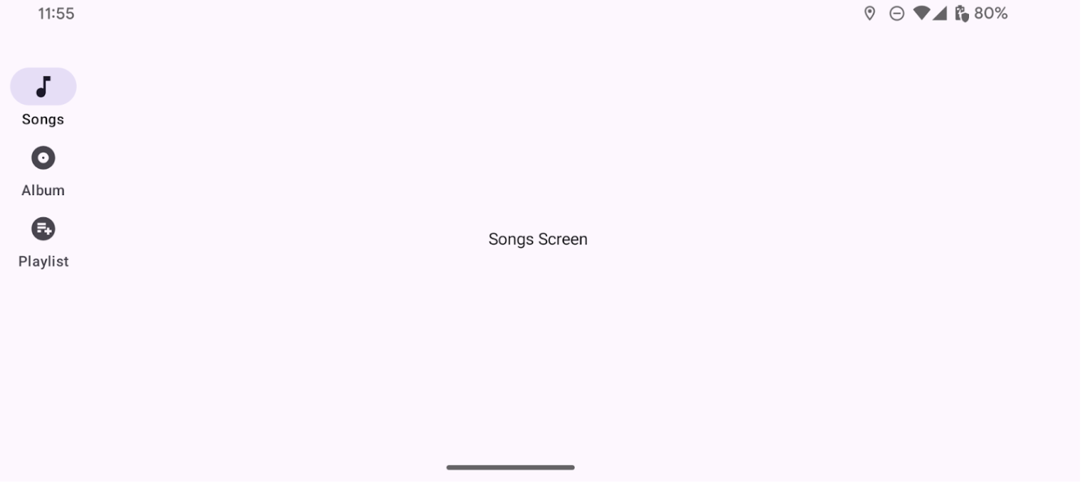
Result
The following image shows the result of the previous snippet: