
Material, Compose UI, and Foundation APIs implement and offer many accessible practices by default. They contain built-in semantics that follow their specific role and function. This means most accessibility support is provided with little or no additional work.
Using the appropriate APIs for the appropriate purpose means that components usually come with predefined accessibility behaviors that cover standard use cases. However, always double-check whether these defaults fit your accessibility needs. If not, Compose provides ways to cover more specific requirements.
Understanding the default accessibility semantics and patterns in Compose APIs helps you use them with accessibility in mind. It also helps you support accessibility in more custom components.
Minimum touch target sizes
Any on-screen element that someone can click, touch, or interact with must be large enough for reliable interaction. When sizing these elements, make sure to set the minimum size to 48dp to correctly follow the Material Design accessibility guidelines.
Material components—like Checkbox, RadioButton, Switch,
Slider, and Surface—set this minimum size internally, but only
when the component can receive user actions. For example, when a Checkbox has
its onCheckedChange parameter set to a non-null value, the checkbox includes
padding to have a width and height of at least 48 dp.
@Composable private fun CheckableCheckbox() { Checkbox(checked = true, onCheckedChange = {}) }

When the onCheckedChange parameter is set to null, the padding is not
included, because the component cannot be interacted with directly.
@Composable private fun NonClickableCheckbox() { Checkbox(checked = true, onCheckedChange = null) }

When implementing selection controls like Switch, RadioButton, or
Checkbox, you typically lift the clickable behavior to a parent container by
setting the click callback on the composable to null, and adding a
toggleable or selectable modifier to the parent composable.
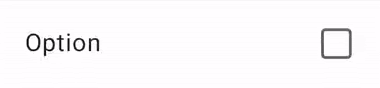
@Composable private fun CheckableRow() { MaterialTheme { var checked by remember { mutableStateOf(false) } Row( Modifier .toggleable( value = checked, role = Role.Checkbox, onValueChange = { checked = !checked } ) .padding(16.dp) .fillMaxWidth() ) { Text("Option", Modifier.weight(1f)) Checkbox(checked = checked, onCheckedChange = null) } } }
When the size of a clickable composable is smaller than the minimum touch target size, Compose still increases the touch target size. It does so by expanding the touch target size outside of the boundaries of the composable.
The following example contains a very small clickable Box. The touch target
area is automatically expanded beyond the boundaries of the Box, so tapping
next to the Box still triggers the click event.
@Composable private fun SmallBox() { var clicked by remember { mutableStateOf(false) } Box( Modifier .size(100.dp) .background(if (clicked) Color.DarkGray else Color.LightGray) ) { Box( Modifier .align(Alignment.Center) .clickable { clicked = !clicked } .background(Color.Black) .size(1.dp) ) } }
To prevent possible overlap between touch areas of different composables, always
use a large enough minimum size for the composable. In the example, that would
mean using the sizeIn modifier to set the minimum size for the inner box:
@Composable private fun LargeBox() { var clicked by remember { mutableStateOf(false) } Box( Modifier .size(100.dp) .background(if (clicked) Color.DarkGray else Color.LightGray) ) { Box( Modifier .align(Alignment.Center) .clickable { clicked = !clicked } .background(Color.Black) .sizeIn(minWidth = 48.dp, minHeight = 48.dp) ) } }

Graphic elements
When you define an Image or Icon composable, there is no
automatic way for the Android framework to understand what the app is
displaying. You need to pass a textual description of the graphic element.
Imagine a screen where the user can share the current page with friends. This screen contains a clickable share icon:
Based on the icon alone, the Android framework can't describe it to a visually impaired user. The Android framework needs an additional textual description of the icon.
The contentDescription parameter describes a graphic element. Use a localized
string, as it is visible to the user.
@Composable private fun ShareButton(onClick: () -> Unit) { IconButton(onClick = onClick) { Icon( imageVector = Icons.Filled.Share, contentDescription = stringResource(R.string.label_share) ) } }
Some graphic elements are purely decorative and you might not want to
communicate them to the user. When you set the contentDescription parameter
to null, you indicate to the Android framework that this element does not
have associated actions or state.
@Composable private fun PostImage(post: Post, modifier: Modifier = Modifier) { val image = post.imageThumb ?: painterResource(R.drawable.placeholder_1_1) Image( painter = image, // Specify that this image has no semantic meaning contentDescription = null, modifier = modifier .size(40.dp, 40.dp) .clip(MaterialTheme.shapes.small) ) }
contentDescription is mainly meant to be used for graphic elements,
such as images. Material components, like Button or Text, and actionable
behaviors, like clickable or toggleable, come with other predefined
semantics that describe their intrinsic behavior, and can be changed through
other Compose APIs.
Interactive elements
Material and Foundation Compose APIs make UI elements that users can interact
with through the clickable and toggleable modifier APIs. Because
interactable components might consist of multiple elements, clickable and
toggleable merge their children's semantics by default, so that the component
is treated as one logical entity.
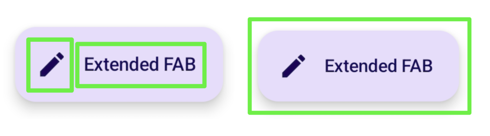
For example, a Material Button might consist of a child icon and some
text. Instead of treating the children as individuals, a Material
Button merges its children semantics by default, so that accessibility
services can group them accordingly:
Similarly, using the clickable modifier also causes a composable to
merge its descendants' semantics into a single entity, which is sent to
accessibility services with a corresponding action representation:
Row( // Uses `mergeDescendants = true` under the hood modifier = Modifier.clickable { openArticle() } ) { Icon( painter = painterResource(R.drawable.ic_logo), contentDescription = "Open", ) Text("Accessibility in Compose") }
You can also set a specific onClickLabel on the parent clickable to provide
additional information to accessibility services and offer a more polished
representation of the action:
Row( modifier = Modifier .clickable(onClickLabel = "Open this article") { openArticle() } ) { Icon( painter = painterResource(R.drawable.ic_logo), contentDescription = "Open" ) Text("Accessibility in Compose") }
Using TalkBack as an example, this clickable modifier and its click label
would enable TalkBack to provide an action hint of "Double tap to open this
article", rather than the more generic default feedback of "Double tap to
activate".
This feedback changes depending on the type of action. A long click would provide a TalkBack hint of "Double tap and hold to", followed by a label:
Row( modifier = Modifier .combinedClickable( onLongClickLabel = "Bookmark this article", onLongClick = { addToBookmarks() }, onClickLabel = "Open this article", onClick = { openArticle() }, ) ) {}
In some cases, you may not have direct access to the clickable modifier (for
example, when it's set somewhere in a lower nested layer),but still want to
change the announcement label from the default. To do this, split setting the
clickable from modifying the announcement by using the semantics
modifier and setting the click label there, to modify the action representation:
@Composable private fun ArticleList(openArticle: () -> Unit) { NestedArticleListItem( // Clickable is set separately, in a nested layer: onClickAction = openArticle, // Semantics are set here: modifier = Modifier.semantics { onClick( label = "Open this article", action = { // Not needed here: openArticle() true } ) } ) }
You don't need to pass the click action twice. Existing Compose APIs, such as
clickable or Button, handle this for you. The merging logic verifies
that the outermost modifier label and action are taken for the information that
is present. In the previous example, the NestedArticleListItem automatically
passes the openArticle() click action to its clickable semantics. You can
leave the click action null in the second semantics modifier action. However,
the click label is taken from the second semantics modifier
onClick(label = "Open this document") because it wasn't present in the first.
You might run into scenarios where you expect children semantics to be merged into a parent one, but that doesn't happen. See Merging and clearing for more in-depth information.
Custom components
When building a custom component, review the implementation of a
similar component in the Material library or other Compose libraries. Then,
mimic or modify its accessibility behavior as appropriate. For example, if you
replace the Material Checkbox with your own implementation, looking at
the existing Checkbox implementation will remind you to add the
triStateToggleable modifier, which
handles the accessibility
properties for the component. Additionally, make heavy use of Foundation
modifiers, as these include built-in accessibility considerations and existing
Compose practices covered in this section.
You can also find an example of a custom toggle component in the Clear and set semantics section, as well as more detailed information on how to support accessibility in custom components in the API guidelines.
Recommended for you
- Note: link text is displayed when JavaScript is off
- Accessibility in Compose
- Testing your Compose layout