
Progress indicators visually surface the status of an operation. They use motion to bring to the user's attention how near completion the process is, such as loading or processing data. They can also signify that processing is taking place, without reference to how close to completion it might be.
Consider these three use cases where you might use a progress indicator:
- Loading content: While fetching content from a network, such as loading an image or data for a user profile.
- File upload: Give the user feedback on how long the upload might take.
- Long processing: While an app is processing a large amount of data, convey to the user how much of the total is complete.
In Material Design, there are two types of progress indicator:
- Determinate: Displays exactly how much progress has been made.
- Indeterminate: Animates continually without regard to progress.
Likewise, a progress indicator can take one of the two following forms:
- Linear: A horizontal bar that fills from left to right.
- Circular: A circle whose stroke grows in length until it encompasses the full circumference of the circle.

API surface
Although there are several composables you can use to create progress indicators consistent with Material Design, their parameters don't differ greatly. Among the key parameters you should keep in mind are the following:
progress: The current progress that the indicator displays. Pass aFloatbetween0.0and1.0.color: The color of the actual indicator. That is, the part of the component that reflects progress and which fully encompasses the component when progress is complete.trackColor: The color of the track over which the indicator is drawn.
M3 Expressive update
Material 3 Expressive introduces LinearWavyProgressIndicator and
CircularWavyProgressIndicator as additional options alongside the standard
flat LinearProgressIndicator and CircularProgressIndicator. These indicators
feature a rounded style and configurations for track height and wave shape.
Choose the visual style that best fits your product.
For more information about the M3 Expressive updates for progress indicators, see the Material Design 3 progress indicator guidelines.
Progress indicators have a rounded, colorful style and additional configurations to choose from, including a wavy shape and variable track height. The active indicator has two shape options: wavy and flat.
Wavy
Wavy progress indicators offer both determinate and indeterminate variants, and let you customize their appearance with wave parameters for more expressive visuals.
Wavy linear indicators increase the height of the overall container.
There are two variants of wavy progress indicators: linear and circular.
Determinate linear wavy progress indicator
By default, when using a wavy progress indicator, a wave speed is applied to
create a constant wave motion, even in determinate mode. You can turn this wave
motion off by passing 0.dp to waveSpeed.
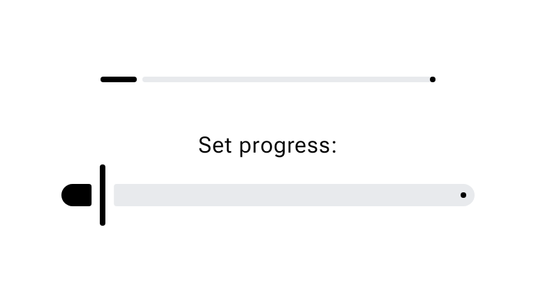
The following snippet demonstrates how to implement a determinate
LinearWavyProgressIndicator controlled by a Slider:
@OptIn(ExperimentalMaterial3Api::class) @Composable fun LinearWavyProgressIndicatorSample() { val sliderState = rememberSliderState(0.1f) val animatedProgress by animateFloatAsState( targetValue = sliderState.value, animationSpec = ProgressIndicatorDefaults.ProgressAnimationSpec, ) Column(horizontalAlignment = Alignment.CenterHorizontally) { LinearWavyProgressIndicator(progress = { animatedProgress }) Spacer(Modifier.requiredHeight(30.dp)) Text("Set progress:") Slider( state = sliderState, onValueChange = { sliderState.value = it }, modifier = Modifier.width(300.dp), ) } }
Indeterminate linear wavy progress indicator
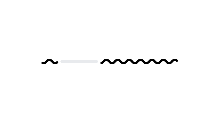
Use indeterminate indicators to show that a process is happening when the wait
time is unknown. The following snippet demonstrates how to implement an
indeterminate LinearWavyProgressIndicator:
@Composable fun IndeterminateLinearWavyProgressIndicatorSample() { Column(horizontalAlignment = Alignment.CenterHorizontally) { LinearWavyProgressIndicator() } }
Determinate circular wavy progress indicator
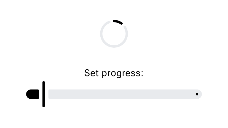
The wavy shape can make longer processes feel less static and is best used when
a more expressive style is appropriate. The following snippet demonstrates how
to implement a determinate CircularWavyProgressIndicator controlled by a
Slider:
@OptIn(ExperimentalMaterial3Api::class) @Composable fun CircularWavyProgressIndicatorSample() { val sliderState = rememberSliderState(0.1f) val animatedProgress by animateFloatAsState( targetValue = sliderState.value, animationSpec = ProgressIndicatorDefaults.ProgressAnimationSpec, ) Column(horizontalAlignment = Alignment.CenterHorizontally) { CircularWavyProgressIndicator(progress = { animatedProgress }) Spacer(Modifier.requiredHeight(30.dp)) Text("Set progress:") Slider( state = sliderState, onValueChange = { sliderState.value = it }, modifier = Modifier.width(300.dp), ) } }
Indeterminate circular wavy progress indicator
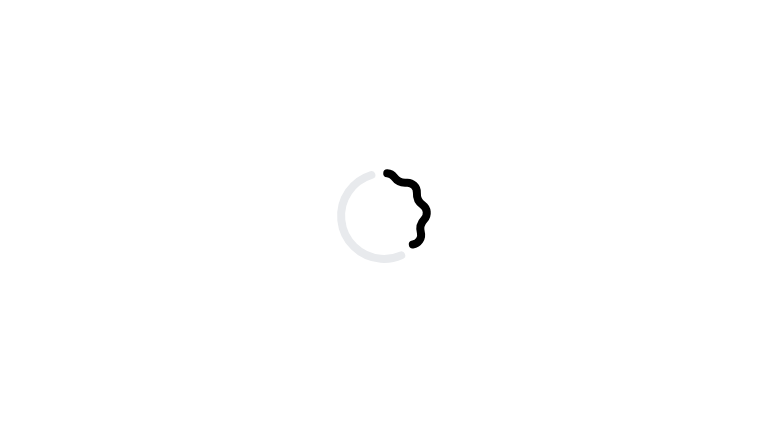
Circular progress indicators should be centered directly on the container or
page that's loading, such as a button or card. The following snippet
demonstrates how to implement an indeterminate CircularWavyProgressIndicator:
@Composable fun IndeterminateCircularWavyProgressIndicatorSample() { Column(horizontalAlignment = Alignment.CenterHorizontally) { CircularWavyProgressIndicator() } }
Flat
Determinate indicators
A determinate indicator reflects exactly how complete an action is. Use either
the LinearProgressIndicator or CircularProgressIndicator
composables and pass a value for the progress parameter.
The following snippet demonstrates how to implement a determinate
LinearProgressIndicator controlled by a Slider:
@OptIn(ExperimentalMaterial3Api::class) @Composable fun LinearProgressIndicatorSample() { val sliderState = rememberSliderState(0.1f) val animatedProgress by animateFloatAsState( targetValue = sliderState.value, animationSpec = ProgressIndicatorDefaults.ProgressAnimationSpec, ) Column(horizontalAlignment = Alignment.CenterHorizontally) { LinearProgressIndicator(progress = { animatedProgress }) Spacer(Modifier.requiredHeight(30.dp)) Text("Set progress:") Slider( state = sliderState, onValueChange = { sliderState.value = it }, modifier = Modifier.width(300.dp), ) } }
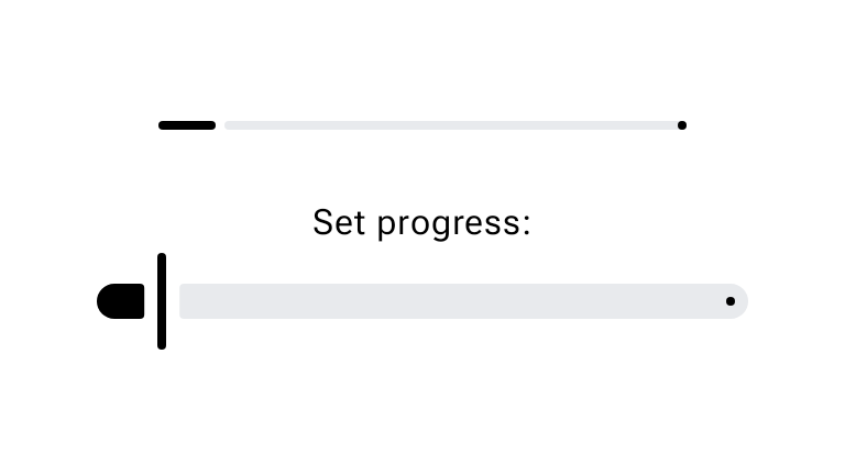
The following snippet demonstrates how to implement a determinate
CircularProgressIndicator controlled by a Slider:
@OptIn(ExperimentalMaterial3Api::class) @Composable fun CircularProgressIndicatorSample() { val sliderState = rememberSliderState(0.1f) val animatedProgress by animateFloatAsState( targetValue = sliderState.value, animationSpec = ProgressIndicatorDefaults.ProgressAnimationSpec, ) Column(horizontalAlignment = Alignment.CenterHorizontally) { CircularProgressIndicator(progress = { animatedProgress }) Spacer(Modifier.requiredHeight(30.dp)) Text("Set progress:") Slider( state = sliderState, onValueChange = { sliderState.value = it }, modifier = Modifier.width(300.dp), ) } }
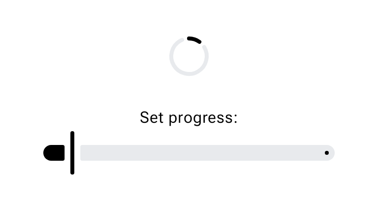
The following snippet provides a relatively detailed example. When the user
presses the button, the app replaces it with the progress indicator and launches
a coroutine that gradually increases the value of progress. This causes the
progress indicator to iterate up in turn.
@Composable fun LinearDeterminateIndicator() { var currentProgress by remember { mutableFloatStateOf(0f) } var loading by remember { mutableStateOf(false) } val scope = rememberCoroutineScope() // Create a coroutine scope // Animate between progress updates so the indicator fills smoothly. val animatedProgress by animateFloatAsState( targetValue = currentProgress, animationSpec = ProgressIndicatorDefaults.ProgressAnimationSpec, ) if (loading) { LinearProgressIndicator( progress = { animatedProgress }, modifier = Modifier.fillMaxWidth(), ) } else { Button(onClick = { loading = true scope.launch { loadProgress { progress -> currentProgress = progress } loading = false // Reset loading when the coroutine finishes } }) { Text("Start loading") } } } /** Iterate the progress value */ suspend fun loadProgress(updateProgress: (Float) -> Unit) { for (i in 1..100) { updateProgress(i.toFloat() / 100) delay(100) } }
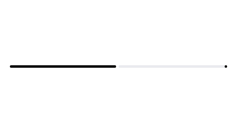
When loading is partially complete, the linear indicator in the preceding example appears as follows:
Likewise, the circular indicator appears as follows:
Indeterminate indicators
An indeterminate indicator does not reflect how close to completion an operation is. Rather, it uses motion to indicate to the user that processing is ongoing, though without specifying any degree of completion.
To create an indeterminate progress indicator, use the LinearProgressIndicator
or CircularProgressIndicator composable, but don't pass in a value for
progress. The following snippet demonstrates how to implement an indeterminate
LinearProgressIndicator:
@Composable fun IndeterminateLinearProgressIndicatorSample() { Column(horizontalAlignment = Alignment.CenterHorizontally) { LinearProgressIndicator() } }
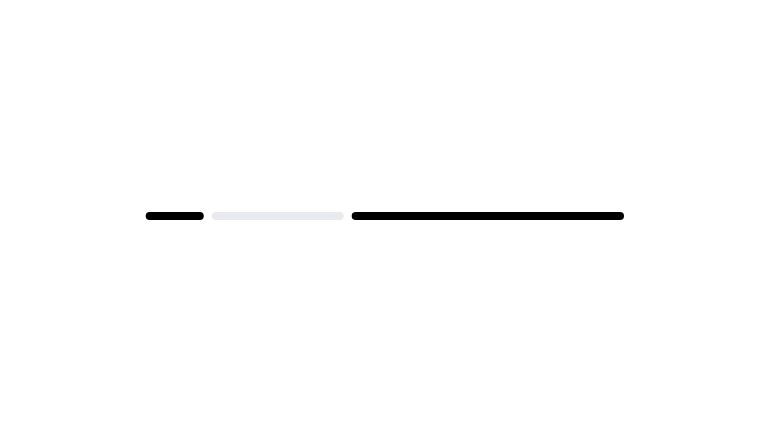
The following snippet demonstrates how to implement an indeterminate
CircularProgressIndicator:
@Composable fun IndeterminateCircularProgressIndicatorSample() { Column(horizontalAlignment = Alignment.CenterHorizontally) { CircularProgressIndicator() } }
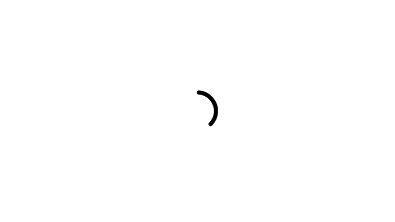
The following example demonstrates how you can toggle an indeterminate indicator
with a button press. This example also demonstrates how you can pass values for
the color and trackColor parameters to customize the appearance of the
indicator:
@Composable fun IndeterminateCircularIndicator() { var loading by remember { mutableStateOf(false) } if (loading) { CircularProgressIndicator( modifier = Modifier.size(64.dp), color = MaterialTheme.colorScheme.secondary, trackColor = MaterialTheme.colorScheme.surfaceVariant, ) } else { Button(onClick = { loading = true }) { Text("Start loading") } } }
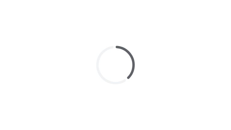
The following is an example of this implementation when the indicator is active:
The following is an example of the same implementation, but with
LinearProgressIndicator instead of CircularProgressIndicator: