
Developers often encounter unique difficulties when creating applications for foldables—especially devices like the Samsung Trifold or the original Pixel Fold, which opens in landscape format (rotation_0 = landscape). Developer mistakes include:
- Wrong assumptions about device orientation
- Overlooked use-cases
- Failure to recalculate or cache values across configuration changes
Specific device-related issues include:
- A mismatch in device natural orientation between the cover and inner displays (assumptions based on rotation_0 = portrait), causing apps to fail on fold and unfold journeys
- Different screen densities and incorrect density config change handling
- Camera preview issues caused by camera sensor dependency on natural orientation
To deliver a high-quality user experience on foldable devices, focus on the following critical areas:
- Determine the app's orientation based on the actual screen area the app occupies, not the device's physical orientation
- Update camera previews to manage device orientation and aspect ratios correctly, avoid sideways previews, and prevent stretched or cropped images
- Maintain app continuity during device folding or unfolding by either
retaining the state with
ViewModelor similar approaches, or manually handling screen density changes and orientation changes, which avoids app restarts or loss of state - For apps utilizing motion sensors, adjust the coordinate system to align with the screen's current orientation and avoid assumptions based on rotation_0 = portrait, guaranteeing precise user interactions
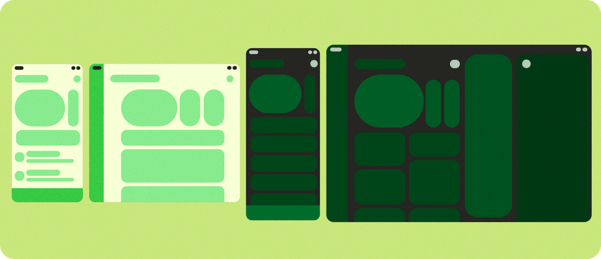
Build adaptive
If your app is already adaptive and adheres to the optimized level (Tier 2) outlined in the Adaptive app quality guidelines, the app should function well on foldable devices. Otherwise, before double-checking the specific details of trifold and landscape foldables, review the following foundational Android adaptive development concepts.
Adaptive layouts
Your UI must handle not just different screen sizes, but real-time changes in aspect ratio, such as unfolding and entering multi-window or desktop windowing modes. See About adaptive layouts for further guidance on how to:
- Design and implement adaptive layouts
- Adjust your app's primary navigation based on window size
- Use window size classes to adapt your app's UI
- Simplify implementation of canonical layouts, such as list‑detail, using the Jetpack APIs
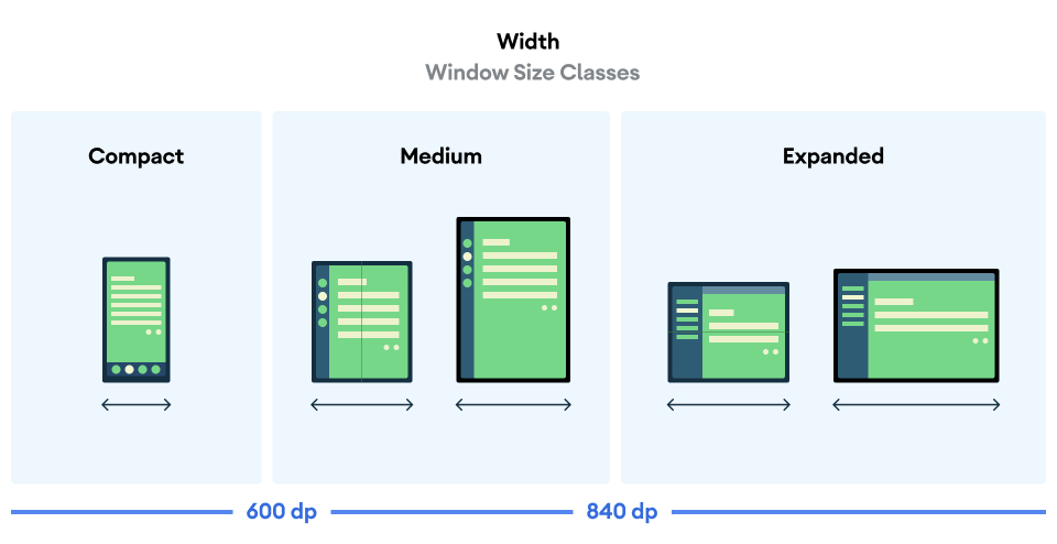
Window size classes
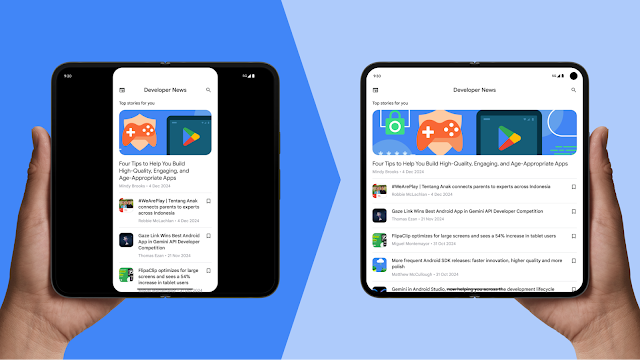
Foldable devices, including landscape foldables and trifolds, can shift between compact, medium, and expanded window size classes instantly. Understanding and implementing these classes ensures your app displays the correct navigation components and content density for the current device state.
The following example uses the Material 3 adaptive library to determine how much
space the app has available by first invoking the
currentWindowAdaptiveInfo() function, then using the corresponding
layouts for the three window size classes:
val adaptiveInfo = currentWindowAdaptiveInfo()
val windowSizeClass = adaptiveInfo.windowSizeClass

when {
  windowSizeClass.isWidthAtLeastBreakpoint(WIDTH_DP_EXPANDED_LOWER_BOUND) -> // Expanded
  windowSizeClass.isWidthAtLeastBreakpoint(WIDTH_DP_MEDIUM_LOWER_BOUND) -> // Medium
  else -> // Compact
}
For more information, see Use window size classes.
Adaptive app quality
Adhering to Tier 2 (Adaptive app optimized) or Tier 1 (Adaptive differentiated) of the Adaptive app quality guidelines ensures your app provides a compelling user experience on trifold devices, landscape foldables, and other large-screen devices. The guidelines cover critical checks across multiple tier levels to go from adaptive ready to a differentiated experience.
Android 16 and higher
For apps targeting Android 16 (API level 36) and higher, the system ignores orientation, resizability, and aspect ratio restrictions on displays with smallest width >= 600dp. Apps fill the entire display window, regardless of aspect ratio or a user's preferred orientation, and the letterboxing compatibility mode isn't used anymore.
Special considerations
Trifolds and landscape foldables introduce unique hardware behaviors that require specific handling, particularly regarding sensors, camera preview, and configuration continuity (retaining state when folding, unfolding, or resizing).
Camera preview
A common problem on landscape foldables or aspect ratio calculations (in scenarios like multi-window, desktop windowing, or connected displays), is when the camera preview appears stretched, sideways, cropped, or rotated.
Mismatched assumptions
This issue often happens on large screen and foldable devices because apps can assume fixed relationships between camera features—like aspect ratio and sensor orientation—and device features—like device orientation and natural orientation.
New form factors challenge this assumption. A foldable device can change its display size and aspect ratio without device rotation changing. For example, unfolding a device changes the aspect ratio, but if the user doesn't rotate the device, its rotation stays the same. If an app assumes that aspect ratio correlates to device rotation, it may incorrectly rotate or scale the camera preview. The same can happen if an app assumes camera sensor orientation matches a portrait device orientation, which isn't always true for landscape foldables.
Solution 1: Jetpack CameraX (Best)
The simplest and most robust solution is to use the Jetpack CameraX library. Its
PreviewView UI element is designed to handle all preview complexities
automatically:
PreviewViewcorrectly adjusts for sensor orientation, device rotation, and scaling.- It maintains the aspect ratio of the camera image, typically by centering and cropping (FILL_CENTER).
- You can set the scale type to
FIT_CENTERto letterbox the preview if needed.
For more information, see Implement a preview in the CameraX documentation.
Solution 2: CameraViewfinder
If you are using an existing Camera2 codebase, the CameraViewfinder library
(backward compatible to API level 21) is another modern solution. It simplifies
displaying the camera feed by using a TextureView or SurfaceView and
applying all the necessary transformations (aspect ratio, scale, and rotation)
for you.
For more information, see the Introducing Camera Viewfinder blog post and Camera preview developer guide.
Solution 3: Manual Camera2 implementation
If you can't use CameraX or CameraViewfinder, you must manually calculate the
orientation and aspect ratio and ensure the calculations are updated on each
configuration change:
- Get the camera sensor orientation (for example, 0, 90, 180, 270 degrees)
from
CameraCharacteristics. - Get the device's current display rotation (for example, 0, 90, 180, 270 degrees).
- Use these two values to determine the necessary transformations for your
SurfaceVieworTextureView. - Ensure the aspect ratio of your output
Surfacematches the aspect ratio of the camera preview to prevent distortion. - The camera app might be running in a portion of the screen, either in multi-window or desktop windowing mode or on a connected display. For this reason, screen size shouldn't be used to determine the dimensions of the camera viewfinder, use window metrics instead.
For more information, see the Camera preview developer guide and Your Camera app on different form factors video.
Solution 4: Perform basic camera actions using an intent
If you don't need many camera features, a straightforward solution is to perform basic camera actions like capturing a photo or video using the device's default camera application. You don't need to integrate with a camera library; instead, use an Intent.
For more information, see Camera intents.
Configuration and continuity
Foldable devices enhance UI versatility but can initiate more configuration changes than nonfoldables. Your app must manage these configuration changes and their combinations, such as device rotation, folding/unfolding, and window resizing in multi-window or desktop modes, while retaining or restoring app state. For example, apps must maintain the following continuity:
- App state without crashing or causing disruptive changes to users (for example, when switching screens or sending the app to the background)
- Scroll position of scrollable fields
- Text typed into text fields and keyboard state
- Media playback position so playback resumes where it left off when the configuration change was initiated
The configuration changes that are frequently triggered include screenSize,
smallestScreenSize, screenLayout, orientation, density, fontScale,
touchscreen, and keyboard.
See android:configChanges and Handle configuration changes. For
additional information about managing app state, see Save UI states.
Density config changes
The outer and inner screens of trifolds and landscape foldable devices might
feature different pixel densities. Therefore, managing the configuration change
for density requires extra attention. Android typically restarts the activity
when display density changes, which can cause data loss. To prevent the system
from restarting the activity, declare density handling in your manifest and
manage the configuration change programmatically in your app.
AndroidManifest.xml configuration
density: Declares that the app will handle the screen density change- Other config changes: It's also good to declare other frequently occurring
config changes, for example,
screenSize,orientation,keyboardHidden,fontScale, and so forth
Declaring density (and other config changes) prevents the system from restarting the activity and instead calls onConfigurationChanged().
onConfigurationChanged() implementation
When a density change occurs, you must update your resources (like reloading bitmaps or recalculating layout sizes) in the callback:
- Verify that the DPI changed to
newConfig.densityDpi - Reset custom views, custom drawables, and so forth to he new density
Resource items to process
- Image resource: Replace bitmaps and drawables with density-specific resources, or adjust the scale directly
- Layout unit (dp to px conversion): Recalculate view size, margin, padding
- Font and text size: Reapply sp unit text size
- Custom
View/Canvasdrawing: Update the pixel-based values used to drawCanvas
Determining app orientation
Never rely on the physical device rotation when building adaptive, because it will be ignored on large screen devices and an app in multi-window mode could have a different orientation than the device. Instead, use Configuration.orientation or WindowMetrics to identify if your app is currently in landscape or portrait orientation based on the window size.
Solution 1: Use Configuration.orientation
This property identifies the orientation in which your app is currently displayed.
Solution 2: Use WindowMetrics#getBounds()
You can get the app's current display bounds and check its width and height to determine orientation.
If you need to limit app orientation on phones (or the outer screens of foldables) but not on large screen devices, see Restrict app orientation on phones.
Postures and display modes
Foldable postures and states such as tabletop and HALF_OPENED are
supported by both portrait foldables and landscape foldables. Trifolds, however,
don't support tabletop posture and cannot be used HALF_OPENED. Trifolds
instead offer a larger screen for a unique user experience when fully unfolded.
To differentiate your app on foldables that support HALF_OPENED, use Jetpack
WindowManager APIs such as FoldingFeature.
Learn more about foldable postures, states, and support for camera preview in the following developer guides:
Foldables offer unique viewing experiences. Rear display mode and dual‑screen mode enable you to build special display features for foldable devices such as rear‑camera selfie preview and simultaneous but different displays on inner and outer screens. For more information see:
Locking orientation to natural sensor orientation
For very specific use cases—in particular, apps that need to take over the whole
screen unrelated to the folded state of the device—the nosensor flag let you
lock the app to the natural orientation of the device. For example, on a Pixel
Fold, the natural orientation of the device when folded is portrait, while the
natural orientation when unfolded is landscape. Adding the nosensor flag
forces the app to be locked in portrait when running on the outer display and
locked to landscape when running on the inner display.
<activity
  android:name=".MainActivity"
  android:screenOrientation="nosensor">
Games and XR sensor remapping
For games and XR apps, raw sensor data (like gyroscope or accelerometer) is provided in the device-fixed coordinate system. If the user rotates the device to play a game in landscape, the sensor axes don't rotate with the screen, leading to incorrect game controls.
To fix this issue, check the current Display.getRotation() and remap the axes accordingly:
- Rotation 0: x=x, y=y
- Rotation 90: x=-y, y=x
- Rotation 180: x=-x, y=-y
- Rotation 270: x=y, y=-x
For rotation vectors (used in compass or XR apps), use SensorManager.remapCoordinateSystem() to map the camera lens direction or top of the screen to the new axes based on the current rotation.
App compatibility
Applications must follow the app quality guidelines to ensure compatibility across all form factors and connected displays. If an application cannot comply with the guidelines, device manufacturers can implement compatibility treatments, although this may degrade the user experience.
For additional information, review the comprehensive list of compatibility workarounds provided in the platform, specifically those related to camera preview, overrides, and Android 16 API changes that could change your app behavior.
To learn more about building adaptive apps, see the Adaptive app quality guidelines.