
A carousel displays a scrollable list of items that adapt dynamically based on window size. Use carousels to showcase a collection of related content. Carousel items emphasize visuals, but can also contain brief text that adapts to the item size.
There are four carousel layouts available to suit different use cases:
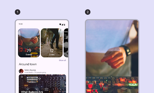
- Multi-browse: Includes differently sized items. Recommended for browsing many items at once, like photos.
- Uncontained: Contains items that are a single size and flow past the edge of the screen. Can be customized to show more text or other UI above or below each item.
- Hero: Highlights one large image to focus on and provides a peek of what's next with a small item. Recommended for spotlighting content that you want to emphasize, like movie or show thumbnails.
- Full-screen: Shows one edge-to-edge large item at a time and scrolls vertically. Recommended for content that is taller than it is wide.
This page shows you how to implement the multi-browse and uncontained carousel layouts. See the Carousel Material 3 guidelines for more information about the layout types.
API surface
To implement multi-browse and uncontained carousels, use the
HorizontalMultiBrowseCarousel and HorizontalUncontainedCarousel
composables. These composables share the following key parameters:
state: ACarouselStateinstance that manages the current item index and scroll position. Create this state usingrememberCarouselState { itemCount }, whereitemCountis the total number of items in the carousel.itemSpacing: Defines the amount of empty space between adjacent items in the carousel.contentPadding: Applies padding around the content area of the carousel. Use this to add space before the first item or after the last item, or to provide margins for the items within the scrollable region.content: A composable function that receives an integer index. Use this lambda to define the UI for each item in the carousel based on its index.
These composables differ in how they specify item sizing:
itemWidth(forHorizontalUncontainedCarousel): Specifies the exact width for each item in an uncontained carousel.preferredItemWidth(forHorizontalMultiBrowseCarousel): Suggests the ideal width for items in a multi-browse carousel, letting the component display multiple items if space permits.
Example: Multi-browse carousel
This snippet implements a multi-browse carousel:
@Composable fun CarouselExample_MultiBrowse() { data class CarouselItem( val id: Int, @DrawableRes val imageResId: Int, val contentDescription: String ) val items = remember { listOf( CarouselItem(0, R.drawable.cupcake, "cupcake"), CarouselItem(1, R.drawable.donut, "donut"), CarouselItem(2, R.drawable.eclair, "eclair"), CarouselItem(3, R.drawable.froyo, "froyo"), CarouselItem(4, R.drawable.gingerbread, "gingerbread"), ) } HorizontalMultiBrowseCarousel( state = rememberCarouselState { items.count() }, modifier = Modifier .fillMaxWidth() .wrapContentHeight() .padding(top = 16.dp, bottom = 16.dp), preferredItemWidth = 186.dp, itemSpacing = 8.dp, contentPadding = PaddingValues(horizontal = 16.dp) ) { i -> val item = items[i] Image( modifier = Modifier .height(205.dp) .maskClip(MaterialTheme.shapes.extraLarge), painter = painterResource(id = item.imageResId), contentDescription = item.contentDescription, contentScale = ContentScale.Crop ) } }
Key points about the code
- Defines a
CarouselItemdata class, which structures the data for each element in the carousel. - Creates and remembers a
ListofCarouselItemobjects that are populated with image resources and descriptions. - Uses the
HorizontalMultiBrowseCarouselcomposable, which is designed for displaying multiple items in a carousel.- The carousel's state is initialized using
rememberCarouselState, which is given the total count of items. - Items have a
preferredItemWidth(here,186.dp), which suggests an optimal width for each item. The carousel uses this to determine how many items can fit on the screen at once. - The
itemSpacingparameter adds a small gap between items. - The trailing lambda of
HorizontalMultiBrowseCarouseliterates through theCarouselItems. In each iteration, it retrieves the item at indexiand renders anImagecomposable for it. Modifier.maskClip(MaterialTheme.shapes.extraLarge)applies a predefined shape mask to each image, giving it rounded corners.contentDescriptionprovides an accessibility description for the image.
- The carousel's state is initialized using
Result
The following image shows the result from the preceding snippet:
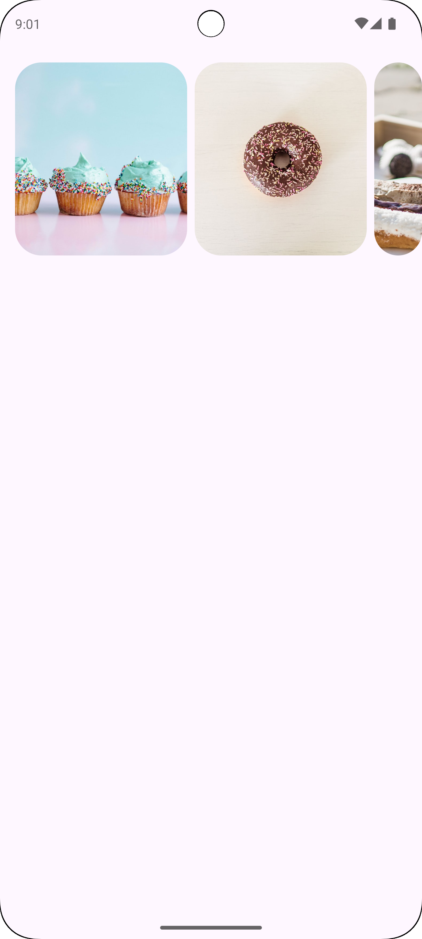
Example: Uncontained carousel
The following snippet implements an uncontained carousel:
@Composable fun CarouselExample() { data class CarouselItem( val id: Int, @DrawableRes val imageResId: Int, val contentDescription: String ) val carouselItems = remember { listOf( CarouselItem(0, R.drawable.cupcake, "cupcake"), CarouselItem(1, R.drawable.donut, "donut"), CarouselItem(2, R.drawable.eclair, "eclair"), CarouselItem(3, R.drawable.froyo, "froyo"), CarouselItem(4, R.drawable.gingerbread, "gingerbread"), ) } HorizontalUncontainedCarousel( state = rememberCarouselState { carouselItems.count() }, modifier = Modifier .fillMaxWidth() .wrapContentHeight() .padding(top = 16.dp, bottom = 16.dp), itemWidth = 186.dp, itemSpacing = 8.dp, contentPadding = PaddingValues(horizontal = 16.dp) ) { i -> val item = carouselItems[i] Image( modifier = Modifier .height(205.dp) .maskClip(MaterialTheme.shapes.extraLarge), painter = painterResource(id = item.imageResId), contentDescription = item.contentDescription, contentScale = ContentScale.Crop ) } }
Key points about the code
- The
HorizontalUncontainedCarouselcomposable creates the carousel layout.- The
itemWidthparameter sets a fixed width for each item in the carousel.
- The
Result
The following image shows the result from the preceding snippet:
