
Canonical layouts are proven, versatile layouts that provide an optimal user experience on a variety of form factors.
The canonical layouts support small screen phones as well as tablets, foldables, and ChromeOS devices. Derived from Material Design guidance, the layouts are aesthetic as well as functional.
The Android framework includes specialized components that make implementation of the layouts straightforward and reliable.
The canonical layouts create engaging, productivity‑enhancing UIs that form the foundation of great apps.
List-detail

The list-detail layout enables users to explore lists of items that have descriptive, explanatory, or other supplementary information—the item detail.
The layout divides the app window into two side-by-side panes: one for the list, one for the detail. Users select items from the list to display the item detail. Deep links in the detail reveal additional content in the detail pane.
Expanded-width displays (see Use window size classes) accommodate both the list and detail at the same time. Selection of a list item updates the detail pane to show the related content for the selected item.
Medium- and compact-width displays show either the list or the detail, depending on user interaction with the app. When just the list is visible, selection of a list item displays the detail in place of the list. When just the detail is visible, pressing the back button redisplays the list.
Configuration changes such as device orientation changes or app window size changes can change the display's window size class. A list‑detail layout responds accordingly, preserving app state:
- If an expanded-width display showing both the list and detail panes narrows to medium or compact, the detail pane remains visible and the list pane is hidden
- If a medium- or compact-width display has just the detail pane visible and the window size class widens to expanded, the list and detail are shown together, and the list indicates that the item corresponding to the content in the detail pane is selected
- If a medium- or compact-width display has just the list pane visible and widens to expanded, the list and a placeholder detail pane are shown together
List-detail is ideal for messaging apps, contact managers, interactive media browsers or any app where the content can be organized as a list of items that reveal additional information.
Implementation
The declarative paradigm of Compose supports window size class logic that determines whether to show the list and detail panes at the same time (when the width window size class is expanded) or just the list or detail pane (when the width window size class is medium or compact).
To ensure unidirectional data flow, hoist all state, including current window size class and detail of the selected list item (if any), so all composables have access to the data and can render correctly.
When showing just the detail pane on small window sizes, add a BackHandler
to remove the detail pane and display just the list pane. The BackHandler is
not part of the overall app navigation since the handler is dependent on the
window size class and selected detail state.
ListDetailPaneScaffold is a high-level composable that simplifies the
implementation of list-detail layouts. It automatically handles pane logic based
on window size classes and supports navigation between panes.
Here is a minimal implementation using ListDetailPaneScaffold:
@OptIn(ExperimentalMaterial3AdaptiveApi::class) @Composable fun MyListDetailPaneScaffold() { val navigator = rememberListDetailPaneScaffoldNavigator() ListDetailPaneScaffold( directive = navigator.scaffoldDirective, value = navigator.scaffoldValue, listPane = { // Listing Pane }, detailPane = { // Details Pane } ) }
The following are the key components in this example:
rememberListDetailPaneScaffoldNavigator: Creates a navigator to manage navigation between the list and detail panes.listPane: Displays the list of items.detailPane: Displays the content of a selected item.
For detailed implementation examples, see:
- Build a list-detail layout developer guide
- list-detail-compose sample
Feed
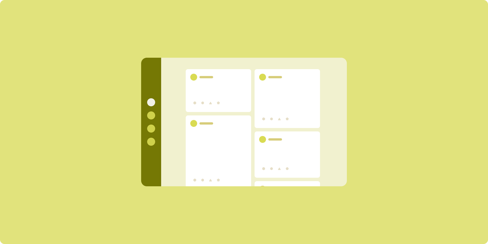
A feed layout arranges equivalent content elements in a configurable grid for quick, convenient viewing of a large amount of content.
Size and position establish relationships among the content elements.
Content groups are created by making elements the same size and positioning them together. Attention is drawn to elements by making them larger than nearby elements.
Cards and lists are common components of feed layouts.
A feed layout supports displays of almost any size because the grid can adapt from a single, scrolling column to a multi‑column scrolling feed of content.
Feeds are especially well suited for news and social media apps.
Implementation
A feed consists of a large number of content elements in a vertical scrolling container laid out in a grid. Lazy lists efficiently render a large number of items in columns or rows. Lazy grids render items in grids, supporting configuration of the item sizes and spans.
Configure the columns of the grid layout based on the available display area to set the minimum allowable width for grid items. When defining grid items, adjust column spans to emphasize some items over others.
For section headers, dividers, or other items designed to occupy the full width
of the feed, use maxLineSpan to take up the full width of the layout.
On compact-width displays that don't have enough space to show more than one
column, LazyVerticalGrid behaves just like a LazyColumn.
Here is a minimal implementation using LazyVerticalGrid:
@Composable fun MyFeed(names: List<String>) { LazyVerticalGrid( // GridCells.Adaptive automatically adapts column count based on available width columns = GridCells.Adaptive(minSize = 180.dp), ) { items(names) { name -> Text(name) } } }
The key to an adaptive feed is the columns configuration.
GridCells.Adaptive(minSize = 180.dp) creates a grid where each column is at
least 180.dp wide. The grid then displays as many columns as can fit in the
available space.
For an example implementation, see the Feed with Compose sample.
Supporting pane

Supporting pane layout organizes app content into primary and secondary display areas.
The primary display area occupies the majority of the app window (typically about two thirds) and contains the main content. The secondary display area is a pane that takes up the remainder of the app window and presents content that supports the main content.
Supporting pane layouts work well on expanded-width displays (see Use window size classes) in landscape orientation. Medium- or compact‑width displays support showing both the primary and secondary display areas if the content is adaptable to narrower display spaces, or if the additional content can be initially hidden in a bottom or side sheet accessible by means of a control such as a menu or button.
A supporting pane layout differs from a list‑detail layout in the relationship of the primary and secondary content. Secondary pane content is meaningful only in relation to the primary content; for example, a supporting pane tool window is irrelevant by itself. The supplementary content in the detail pane of a list‑detail layout, however, is meaningful even without the primary content, for example, the description of a product from a product listing.
Use cases for supporting pane include:
- Productivity apps: A document or spreadsheet accompanied by reviewer comments in a supporting pane
- Media apps: A streaming video and a list of related videos in a supporting pane, or the depiction of an album of music supplemented with a playlist
- Tools and settings: A media editing tool with palettes, effects, and other settings in a support pane
Implementation
Compose supports window size class logic, which lets you to determine whether to show both the main content and the supporting content at the same time or place the supporting content in an alternative location.
Hoist all state, including current window size class and information related to the data in the main content and supporting content.
For compact-width displays, place the supporting content below the main content or inside a bottom sheet. For medium and expanded widths, place the supporting content next to the main content, sized appropriately based on the content and space available. For medium width, split the display space equally between the main and supporting content. For expanded width, give 70% of the space to the main content, 30% to the supporting content.
SupportingPaneScaffold is a high-level composable that simplifies the
implementation of supporting pane layouts. The composable automatically handles
pane logic based on window size classes, displaying panes side by side on large
screens or hiding the supporting pane on small screens. SupportingPaneScaffold
also supports navigation between panes.
The following is a minimal implementation:
@OptIn(ExperimentalMaterial3AdaptiveApi::class) @Composable fun MySupportingPaneScaffold() { // Creates and remembers a navigator to control pane visibility and navigation val navigator = rememberSupportingPaneScaffoldNavigator() SupportingPaneScaffold( // Directive and value help control pane visibility based on screen size and state directive = navigator.scaffoldDirective, value = navigator.scaffoldValue, mainPane = { // Main Pane for the primary content }, supportingPane = { //Supporting Pane for supplementary content } ) }
rememberSupportingPaneScaffoldNavigator: Composable that creates a navigator to manage pane visibility (for example, hiding or showing the supporting pane on compact screens)mainPane: Composable that displays the primary contentsupportingPane: Composable that displays the supplementary content
For detailed implementation examples, see:
- Build a supporting pane layout developer guide
- supporting-pane-compose sample
Additional resources
- Material Design — Canonical layouts