Loading indicators show progress for a short wait time—typically operations that complete in under five seconds. There are two configurations of loading indicators:
- Default: Uncontained morphing shapes.
- Contained: Morphing shapes within a circular container.

The indicator continuously morphs between its polygon shapes, either indefinitely or in response to a progress value.
Using loading indicators
- Recommended as a replacement for most indeterminate circular progress indicators.
- Always reflect an ongoing process and are never purely decorative.
- Use them when progress isn't measurable, or when it isn't necessary to indicate how long an activity takes.
- Can be used for pull-to-refresh interactions.
- Capture attention through shape-morphing motion.
Examples
Implement a loading indicator
Loading indicators use animation to grab attention, mitigate perceived latency,
and indicate that an activity is in progress. The following snippet renders a
default indeterminate LoadingIndicator:
@Composable fun LoadingIndicatorSample() { Column(horizontalAlignment = Alignment.CenterHorizontally) { LoadingIndicator() } }

Implement a contained loading indicator
Use ContainedLoadingIndicator to render morphing shapes inside a circular
container that provides extra contrast over body content. The following snippet
implements a contained loading indicator:
@Composable fun ContainedLoadingIndicatorSample() { Column(horizontalAlignment = Alignment.CenterHorizontally) { ContainedLoadingIndicator() } }

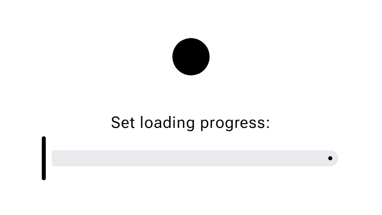
Implement a determinate loading indicator
Pass a progress lambda returning a Float from 0.0 to 1.0 to morph
LoadingIndicator determinately as an operation progresses. The following
snippet drives the loading indicator's progress with a Slider and
rememberSliderState:
@Composable fun DeterminateLoadingIndicatorSample() { val sliderState = rememberSliderState() val animatedProgress by animateFloatAsState( targetValue = sliderState.value, animationSpec = spring( dampingRatio = Spring.DampingRatioNoBouncy, stiffness = Spring.StiffnessVeryLow, visibilityThreshold = 1 / 1000f, ), ) Column(horizontalAlignment = Alignment.CenterHorizontally) { LoadingIndicator(progress = { animatedProgress }) Spacer(Modifier.requiredHeight(30.dp)) Text("Set loading progress:") Slider( state = sliderState, onValueChange = { sliderState.value = it }, modifier = Modifier.width(300.dp), ) } }