Time pickers often appear in dialogs. You can use a relatively generic and minimal implementation of a dialog, or you can implement a custom dialog with more flexibility.
For more information on dialogs in general, including how to use the time picker state, see the Time pickers guide.
Basic example
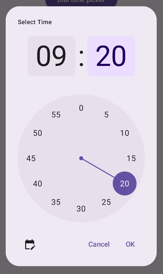
The most straightforward way to create a dialog for your time picker is to
create a composable that implements AlertDialog. The following snippet
provides an example of a relatively minimal dialog using this approach:
@Composable fun DialWithDialogExample( onConfirm: (TimePickerState) -> Unit, onDismiss: () -> Unit, ) { val currentTime = Calendar.getInstance() val timePickerState = rememberTimePickerState( initialHour = currentTime.get(Calendar.HOUR_OF_DAY), initialMinute = currentTime.get(Calendar.MINUTE), is24Hour = true, ) TimePickerDialog( onDismiss = { onDismiss() }, onConfirm = { onConfirm(timePickerState) } ) { TimePicker( state = timePickerState, ) } } @Composable fun TimePickerDialog( onDismiss: () -> Unit, onConfirm: () -> Unit, content: @Composable () -> Unit ) { AlertDialog( onDismissRequest = onDismiss, dismissButton = { TextButton(onClick = { onDismiss() }) { Text("Dismiss") } }, confirmButton = { TextButton(onClick = { onConfirm() }) { Text("OK") } }, text = { content() } ) }
Note the key points in this snippet:
- The
DialWithDialogExamplecomposable wrapsTimePickerin a dialog. TimePickerDialogis a custom composable that creates anAlertDialogwith the following parameters:onDismiss: A function called when the user dismisses the dialog (via the dismiss button or navigation back).onConfirm: A function called when the user clicks the "OK" button.content: A composable that displays the time picker within the dialog.
- The
AlertDialogincludes:- A dismiss button labeled "Dismiss".
- A confirm button labeled "OK".
- The time picker content passed as the
textparameter.
- The
DialWithDialogExampleinitializes theTimePickerStatewith the current time and passes it to both theTimePickerand theonConfirmfunction.
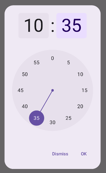
Advanced example
This snippet demonstrates an advanced implementation of a customizable time picker dialog in Jetpack Compose.
@Composable fun AdvancedTimePickerExample( onConfirm: (TimePickerState) -> Unit, onDismiss: () -> Unit, ) { val currentTime = Calendar.getInstance() val timePickerState = rememberTimePickerState( initialHour = currentTime.get(Calendar.HOUR_OF_DAY), initialMinute = currentTime.get(Calendar.MINUTE), is24Hour = true, ) /** Determines whether the time picker is dial or input */ var showDial by remember { mutableStateOf(true) } /** The icon used for the icon button that switches from dial to input */ val toggleIcon = if (showDial) { Icons.Filled.EditCalendar } else { Icons.Filled.AccessTime } AdvancedTimePickerDialog( onDismiss = { onDismiss() }, onConfirm = { onConfirm(timePickerState) }, toggle = { IconButton(onClick = { showDial = !showDial }) { Icon( imageVector = toggleIcon, contentDescription = "Time picker type toggle", ) } }, ) { if (showDial) { TimePicker( state = timePickerState, ) } else { TimeInput( state = timePickerState, ) } } } @Composable fun AdvancedTimePickerDialog( title: String = "Select Time", onDismiss: () -> Unit, onConfirm: () -> Unit, toggle: @Composable () -> Unit = {}, content: @Composable () -> Unit, ) { Dialog( onDismissRequest = onDismiss, properties = DialogProperties(usePlatformDefaultWidth = false), ) { Surface( shape = MaterialTheme.shapes.extraLarge, tonalElevation = 6.dp, modifier = Modifier .width(IntrinsicSize.Min) .height(IntrinsicSize.Min) .background( shape = MaterialTheme.shapes.extraLarge, color = MaterialTheme.colorScheme.surface ), ) { Column( modifier = Modifier.padding(24.dp), horizontalAlignment = Alignment.CenterHorizontally ) { Text( modifier = Modifier .fillMaxWidth() .padding(bottom = 20.dp), text = title, style = MaterialTheme.typography.labelMedium ) content() Row( modifier = Modifier .height(40.dp) .fillMaxWidth() ) { toggle() Spacer(modifier = Modifier.weight(1f)) TextButton(onClick = onDismiss) { Text("Cancel") } TextButton(onClick = onConfirm) { Text("OK") } } } } } }
Note the key points in this snippet:
- The
AdvancedTimePickerExamplecomposable creates a customizable time picker dialog. - It uses a
Dialogcomposable for more flexibility thanAlertDialog. - The dialog includes a customizable title and a toggle button to switch between dial and input modes.
Surfaceapplies shape and elevation to the dialog, withIntrinsicSize.Minfor both width and height.ColumnandRowlayout provide the dialog's structure components.- The example tracks the picker mode using
showDial.- An
IconButtontoggles between modes, updating the icon accordingly. - The dialog content switches between
TimePickerandTimeInputbased on theshowDialstate.
- An
This advanced implementation provides a highly customizable and reusable time picker dialog that can adapt to different use cases in your app.
This implementation appears as follows: