Checkboxes let users select one or more items from a list. You might use a checkbox to let the user do the following:
- Turn an item on or off.
- Select from multiple options in a list.
- Indicate agreement or acceptance.
Anatomy
A checkbox consists of the following elements:
- Box: This is the container for the checkbox.
- Check: This is the visual indicator that shows whether the checkbox is selected or not.
- Label: This is the text that describes the checkbox.
States
A checkbox can be in one of three states:
- Unselected: The checkbox is not selected. The box is empty.
- Indeterminate: The checkbox is in an indeterminate state. The box contains a dash.
- Selected: The checkbox is selected. The box contains a checkmark.
The following image demonstrates the three states of a checkbox.

Implementation
You can use the Checkbox composable to create a checkbox in your app.
There are just a few key parameters to keep in mind:
checked: The boolean that captures whether the checkbox is checked or unchecked.onCheckedChange(): The function that the app calls when the user taps the checkbox.
The following snippet demonstrates how to use the Checkbox composable:
@Composable fun CheckboxMinimalExample() { var checked by remember { mutableStateOf(true) } Row( verticalAlignment = Alignment.CenterVertically, ) { Text( "Minimal checkbox" ) Checkbox( checked = checked, onCheckedChange = { checked = it } ) } Text( if (checked) "Checkbox is checked" else "Checkbox is unchecked" ) }
Explanation
This code creates a checkbox that is initially unchecked. When the user clicks
on the checkbox, the onCheckedChange lambda updates the checked state.
Result
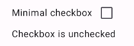
This example produces the following component when unchecked:
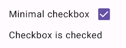
And this is how the same checkbox appears when checked:
Advanced example
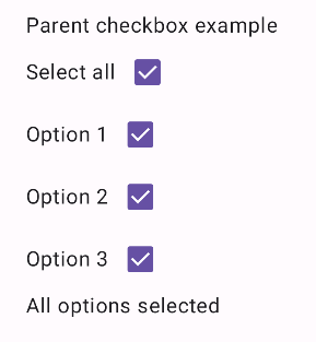
The following is a more complex example of how you can implement checkboxes in your app. In this snippet, there is a parent checkbox and a series of child checkboxes. When the user taps the parent checkbox, the app checks all child checkboxes.
@Composable fun CheckboxParentExample() { // Initialize states for the child checkboxes val childCheckedStates = remember { mutableStateListOf(false, false, false) } // Compute the parent state based on children's states val parentState = when { childCheckedStates.all { it } -> ToggleableState.On childCheckedStates.none { it } -> ToggleableState.Off else -> ToggleableState.Indeterminate } Column { // Parent TriStateCheckbox Row( verticalAlignment = Alignment.CenterVertically, ) { Text("Select all") TriStateCheckbox( state = parentState, onClick = { // Determine new state based on current state val newState = parentState != ToggleableState.On childCheckedStates.forEachIndexed { index, _ -> childCheckedStates[index] = newState } } ) } // Child Checkboxes childCheckedStates.forEachIndexed { index, checked -> Row( verticalAlignment = Alignment.CenterVertically, ) { Text("Option ${index + 1}") Checkbox( checked = checked, onCheckedChange = { isChecked -> // Update the individual child state childCheckedStates[index] = isChecked } ) } } } if (childCheckedStates.all { it }) { Text("All options selected") } }
Explanation
The following are several points you should note from this example:
- State management:
childCheckedStates: A list of booleans usingmutableStateOf()to track the checked state of each child checkbox.parentState: AToggleableStatewhose value derives from the child checkboxes' states.
- UI components:
TriStateCheckbox: Is necessary for the parent checkbox as it has astateparam that lets you set it to indeterminate.Checkbox: Used for each child checkbox with its state linked to the corresponding element inchildCheckedStates.Text: Displays labels and messages ("Select all", "Option X", "All options selected").
- Logic:
- The parent checkbox's
onClickupdates all child checkboxes to the opposite of the current parent state. - Each child checkbox's
onCheckedChangeupdates its corresponding state in thechildCheckedStateslist. - The code displays "
All options selected" when all child checkboxes are checked.
- The parent checkbox's
Result
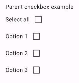
This example produces the following component when all checkboxes are unchecked.
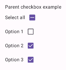
Likewise, this is how the component appears when all options are checked, as when the user taps select all:
When only one option is checked the parent checkbox displays the indeterminate state: