
As accessibility services navigate through elements on the screen, it is important that these elements are grouped, separated, or even hidden at the right granularity. When every single low-level composable in your screen is highlighted independently, users have to interact a lot to move across the screen. If elements merge together too aggressively, users might not understand which elements logically belong together. If there are elements on the screen that are purely decorative, these could be hidden from accessibility services. In these cases, you can use Compose APIs for merging, clearing, and hiding semantics.
Merge semantics
When you apply a clickable modifier to a parent composable, Compose
automatically merges all children elements under it. To understand how
interactive Compose Material and Foundation components use merging strategies
by default, see the Interactive elements section.
It's common for a component to consist of multiple composables. These composables could form a logical group and each could contain important information, but you still might want accessibility services to view them as one element.
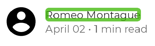
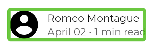
For example, think of a composable that shows a user's avatar, their name, and some extra information:
You can enable Compose to merge these elements by using the mergeDescendants
parameter in the semantics modifier. This way, accessibility services treat the
component as one entity, and all semantics properties of the descendants are
merged:
@Composable private fun PostMetadata(metadata: Metadata) { // Merge elements below for accessibility purposes Row(modifier = Modifier.semantics(mergeDescendants = true) {}) { Image( imageVector = Icons.Filled.AccountCircle, contentDescription = null // decorative ) Column { Text(metadata.author.name) Text("${metadata.date} • ${metadata.readTimeMinutes} min read") } } }
Accessibility services now focus on the whole container at once, and merge its contents:
Each semantics property has a defined merging strategy. For example, the
ContentDescription property adds all descendant ContentDescription values
to a list. You can check the merging strategy of a semantics property by
checking its mergePolicy implementation in SemanticsProperties.kt.
Properties can take on the parent or child value, merge the values into a list
or string, not allow merging at all and throw an exception instead, or any
other custom merging strategy.
There are other scenarios where you expect children semantics to be merged into
a parent one, but that doesn't happen. In the following example, we have
clickable list item parent with children elements, and we might expect the
parent merges all of them:
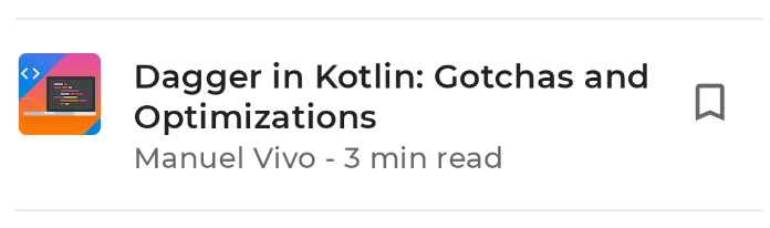
@Composable private fun ArticleListItem( openArticle: () -> Unit, addToBookmarks: () -> Unit, ) { Row(modifier = Modifier.clickable { openArticle() }) { // Merges with parent clickable: Icon( painter = painterResource(R.drawable.ic_logo), contentDescription = "Article thumbnail" ) ArticleDetails() // Defies the merge due to its own clickable: BookmarkButton(onClick = addToBookmarks) } }
When the user presses the clickable item Row, it opens the article. Nested
inside, there is a BookmarkButton to bookmark the article. This nested button
shows up as unmerged, while the rest of the children content inside the row is
merged:
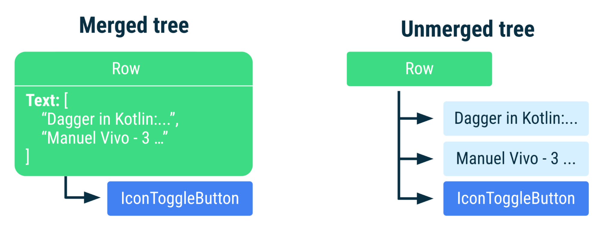
Row node. The unmerged tree contains separate nodes for each Text composable.Some composables are not automatically merged under a parent, by design. A
parent cannot merge its children when the children are also merging, either
from setting mergeDescendants = true explicitly or by being components which
merge themselves, like buttons or clickables. Knowing how certain APIs merge or
defy merging can help you debug some potentially unexpected behaviors.
Use merging when children elements constitute a logical and sensible group
under their parent. But if the nested children need manual adjusting or removal
of their own semantics, other APIs might better suit your needs (for example,
clearAndSetSemantics).
Clear and set semantics
If semantic information needs to be completely cleared or overwritten, a
powerful API to use is clearAndSetSemantics.
When a component needs its own and its descendant semantics cleared, use this API with an empty lambda. When its semantics must be overwritten, include your new content inside the lambda.
Note that when clearing with an empty lambda, the cleared semantics are not
sent to any consumer that uses this information, like accessibility, autofill,
or testing. When overwriting content with
clearAndSetSemantics{/*semantic information*/}, the new semantics replace all
previous semantics of the element and its descendants.
The following is an example of a custom toggle component, represented by an interactable row with an icon and text:
// Developer might intend this to be a toggleable. // Using `clearAndSetSemantics`, on the Row, a clickable modifier is applied, // a custom description is set, and a Role is applied. @Composable fun FavoriteToggle() { val checked = remember { mutableStateOf(true) } Row( modifier = Modifier .toggleable( value = checked.value, onValueChange = { checked.value = it } ) .clearAndSetSemantics { stateDescription = if (checked.value) "Favorited" else "Not favorited" toggleableState = ToggleableState(checked.value) role = Role.Switch }, ) { Icon( imageVector = Icons.Default.Favorite, contentDescription = null // not needed here ) Text("Favorite?") } }
Although the icon and text have some semantic information, together they don't indicate that this component is a toggleable. Merging is not sufficient because you must provide additional information about the component.
Because the snippet above creates a custom toggle component, you need to add
the toggle ability, as well as the stateDescription,
toggleableState, and role semantics. This way, the component
status and associated action are available—for example, TalkBack announces
"Double tap to toggle" instead of "Double tap to activate."
By clearing the original semantics and setting new, more descriptive ones, accessibility services can now see that this is a toggleable component that can alternate state.
When using clearAndSetSemantics, consider the following:
- Because services receive no information when this API is set, it's better to
use it sparingly.
- Semantics information can potentially be used by AI agents and similar services to understand the screen, and thus should only be cleared when necessary.
- Custom semantics may be set within the API lambda.
- Ordering of the modifiers matters―this API clears all semantics that are after where it is applied, regardless of other merging strategies.
Hide semantics
In some scenarios, elements don't need to be sent to accessibility
services—perhaps their additional information is redundant for accessibility,
or it is purely visually decorative and non-interactive. In these cases, you
can hide elements with the hideFromAccessibility API.
In the following examples are components that might need to be hidden: a redundant watermark that spans a component, and a character used to decoratively separate information.
@Composable fun WatermarkExample( watermarkText: String, content: @Composable () -> Unit, ) { Box { WatermarkedContent() // Mark the watermark as hidden to accessibility services. WatermarkText( text = watermarkText, color = Color.Gray.copy(alpha = 0.5f), modifier = Modifier .align(Alignment.BottomEnd) .semantics { hideFromAccessibility() } ) } } @Composable fun DecorativeExample() { Text( modifier = Modifier.semantics { hideFromAccessibility() }, text = "A dot character that is used to decoratively separate information, like •" ) }
Using hideFromAccessibility here ensures the watermark and decoration are
hidden from accessibility services, but still keep their semantics for other
use cases, like testing.
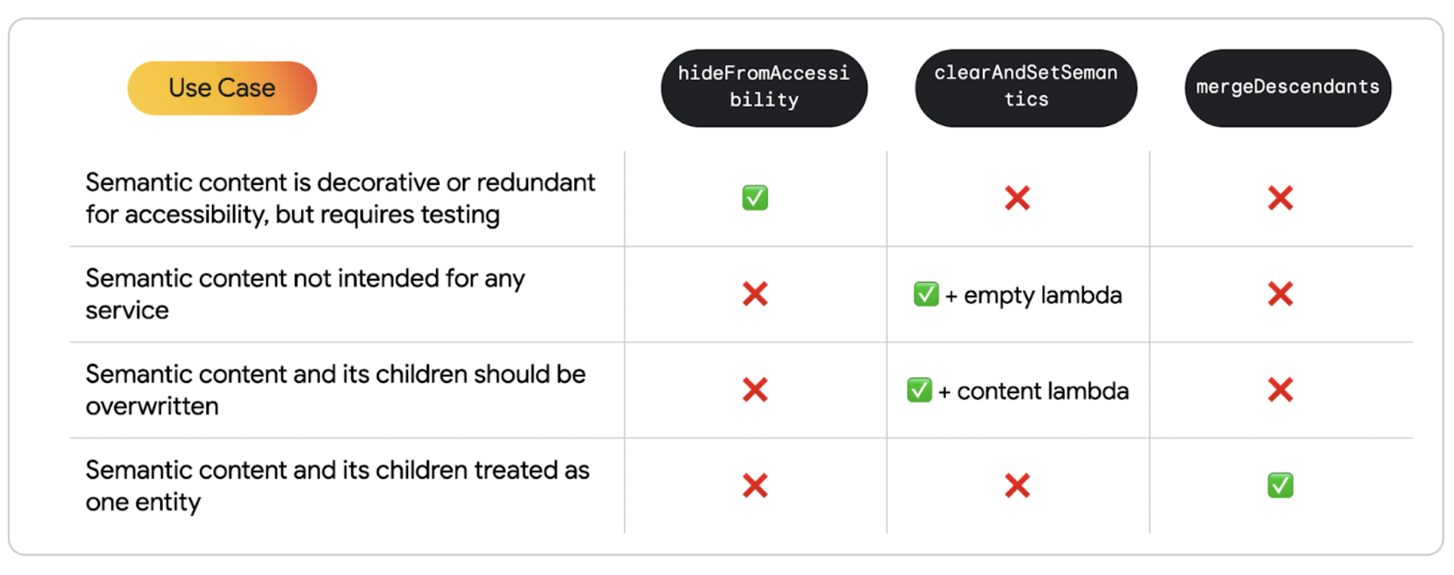
Breakdown of use cases
The following is a summary of use cases to understand how to clearly differentiate between the previous APIs:
- When content is not intended to be used by accessibility services:
- Use
hideFromAccessibilitywhen content is possibly decorative or redundant, but still must be tested. - Use
clearAndSetSemantics{}with an empty lambda when parent and children semantics need to be cleared for all services. - Use
clearAndSetSemantics{/*content*/}with content inside the lambda when a component's semantics needs to be manually set.
- Use
- When content should be treated as one entity, and needs all of its children's information to be complete:
- Use merge semantic descendants.
Recommended for you
- Note: link text is displayed when JavaScript is off
- Accessibility in Compose
- [Material Design 2 in Compose][19]
- Testing your Compose layout