The Slider composable allows users to make selections from a range of
values. You might use a slider to let the user do the following:
- Adjust settings that use a range of values, such as volume, and brightness.
- Filter data in a graph, as when setting a price range.
- User input, like setting a rating in a review.
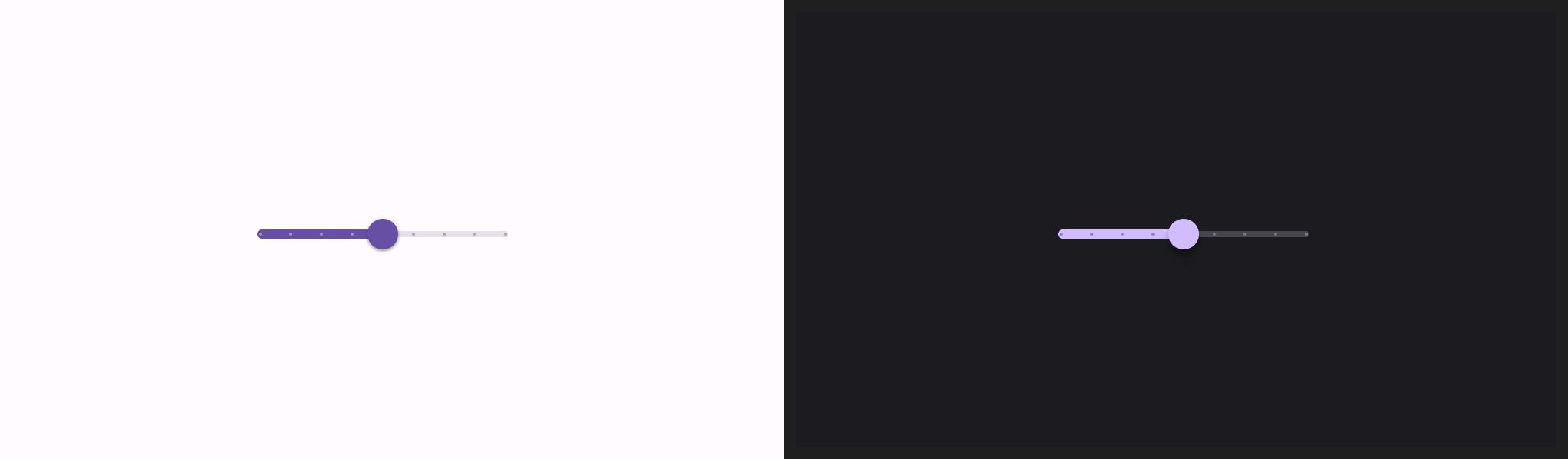
The slider contains a track, thumb, value label, and tick marks:
- Track: The track is the horizontal bar that represents the range of values the slider can take.
- Thumb: The thumb is a draggable control element on the slider that allows the user to select a specific value within the range defined by the track.
- Tick marks: Tick marks are optional visual markers or indicators that appear along the track of the slider.
Basic implementation
See the Slider reference for a full API definition. Some of the key
parameters for the Slider composable are the following:
value: The current value of the slider.onValueChange: A lambda that gets called every time the value is changed.enabled: A boolean value that indicates if the user can interact with the slider.
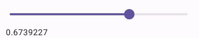
The following example is a straightforward slider. It allows the user to
select a value from 0.0 to 1.0. Because the user can select any value in
that range, the slider is continuous.
@Preview @Composable fun SliderMinimalExample() { var sliderPosition by remember { mutableFloatStateOf(0f) } Column { Slider( value = sliderPosition, onValueChange = { sliderPosition = it } ) Text(text = sliderPosition.toString()) } }
This implementation appears as follows:
Advanced implementation
When implementing a more complex slider, you can additionally make use of the following parameters.
colors: An instance ofSliderColorsthat lets you control the colors of the slider.valueRange: The range of values that the slider can take.steps: The number of notches on the slider to which the thumb snaps.
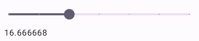
The following snippet implements a slider that has three steps, with a range
from 0.0 to 50.0. Because the thumb snaps to each step, this slider is
discrete.
@Preview @Composable fun SliderAdvancedExample() { var sliderPosition by remember { mutableFloatStateOf(0f) } Column { Slider( value = sliderPosition, onValueChange = { sliderPosition = it }, colors = SliderDefaults.colors( thumbColor = MaterialTheme.colorScheme.secondary, activeTrackColor = MaterialTheme.colorScheme.secondary, inactiveTrackColor = MaterialTheme.colorScheme.secondaryContainer, ), steps = 3, valueRange = 0f..50f ) Text(text = sliderPosition.toString()) } }
The implementation appears as follows:
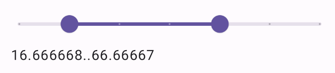
Range slider
You can also use the dedicated RangeSlider composable. This allows the user to
select two values. This can be useful in cases such as when the user wishes to
select a minimum and maximum price.
The following example is a relatively straightforward example of a continuous range slider.
@Preview @Composable fun RangeSliderExample() { var sliderPosition by remember { mutableStateOf(0f..100f) } Column { RangeSlider( value = sliderPosition, steps = 5, onValueChange = { range -> sliderPosition = range }, valueRange = 0f..100f, onValueChangeFinished = { // launch some business logic update with the state you hold // viewModel.updateSelectedSliderValue(sliderPosition) }, ) Text(text = sliderPosition.toString()) } }