シャドウは、UI を視覚的に引き立て、ユーザーの操作にすばやく反応し、インタラクティブ性を示します。Compose には、アプリにシャドウを組み込むための方法がいくつか用意されています。
Modifier.shadow(): マテリアル デザイン ガイドラインに準拠したコンポーザブルの背後に、高度に基づいた影を作成します。Modifier.dropShadow(): コンポーザブルの背後に表示されるカスタマイズ可能な影を作成し、コンポーザブルが浮き上がって見えるようにします。Modifier.innerShadow(): コンポーザブルの境界線の内側に影を作成し、背後のサーフェスに押し込まれているように見せます。
Modifier.shadow() は基本的なシャドウの作成に適していますが、dropShadow() 修飾子と innerShadow() 修飾子は、シャドウ レンダリングのよりきめ細かい制御と精度を提供します。
このページでは、ユーザー操作時にシャドウをアニメーション表示する方法や、innerShadow() 修飾子と dropShadow() 修飾子を連結してグラデーション シャドウやニューモーフィック シャドウなどを作成する方法など、これらの修飾子を実装する方法について説明します。
基本的なシャドウを作成する
Modifier.shadow() は、上からの光源をシミュレートする マテリアル デザイン ガイドラインに沿った基本的なシャドウを作成します。シャドウの深さは elevation 値に基づいており、作成されるシャドウはコンポーザブルの形状にクリップされます。
@Composable fun ElevationBasedShadow() { Box( modifier = Modifier.aspectRatio(1f).fillMaxSize(), contentAlignment = Alignment.Center ) { Box( Modifier .size(100.dp, 100.dp) .shadow(10.dp, RectangleShape) .background(Color.White) ) } }
Modifier.shadow() で作成された高度に基づいたシャドウ。ドロップ シャドウを実装する
dropShadow() 修飾子を使用すると、コンテンツの背後に正確なシャドウが描画され、要素が浮き上がって見えるようになります。
Shadow パラメータを使用して、次の重要なアスペクトを制御できます。
radius: ぼかしの柔らかさと拡散を定義します。color: ティントの色を定義します。offset: 影のジオメトリを X 軸と Y 軸に沿って配置します。spread: 影のジオメトリの拡大または縮小を制御します。
また、shape パラメータは、シャドウの全体的な形状を定義します。androidx.compose.foundation.shape パッケージの任意のジオメトリと、Material Expressive シェイプを使用できます。
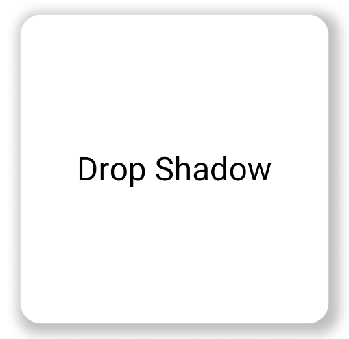
基本的なドロップ シャドウを実装するには、コンポーザブル チェーンに dropShadow() 修飾子を追加し、半径、色、広がりを指定します。シャドウの上に表示される purpleColor の背景は、dropShadow() 修飾子の後に描画されます。
@Composable fun SimpleDropShadowUsage() { Box(Modifier.fillMaxSize()) { Box( Modifier .width(300.dp) .height(300.dp) .dropShadow( shape = RoundedCornerShape(20.dp), shadow = Shadow( radius = 10.dp, spread = 6.dp, color = Color(0x40000000), offset = DpOffset(x = 4.dp, 4.dp) ) ) .align(Alignment.Center) .background( color = Color.White, shape = RoundedCornerShape(20.dp) ) ) { Text( "Drop Shadow", modifier = Modifier.align(Alignment.Center), fontSize = 32.sp ) } } }
コードに関する主なポイント
dropShadow()修飾子は内部のBoxに適用されます。シャドウには次の特性があります。- 角丸四角形(
RoundedCornerShape(20.dp)) - ぼかし半径
10.dp。エッジが柔らかく拡散される 6.dpの広がり。影のサイズを拡大し、影を投影するボックスよりも大きくする- アルファ値が
0.5fで、影が半透明になる
- 角丸四角形(
- シャドウを定義すると、
background()修飾子が適用されます。Boxは白で塗りつぶされています。- 背景は、シャドウと同じ角の丸い長方形の形にクリップされます。
結果
インナー シャドウを実装する
dropShadow() と逆のエフェクトを作成するには、Modifier.innerShadow() を使用します。これにより、要素が凹んでいるか、下のサーフェスに押し込まれているような視覚効果が生まれます。
インナー シャドウを作成する場合、順序が重要となります。innerShadow() 修飾子は、コンテンツの上部に描画します。シャドウが表示されるようにするには、通常、次の手順を行います。
- 背景コンテンツを描画します。
innerShadow()修飾子を適用して、凹面を作成します。
innerShadow() が背景の前に配置されている場合、背景が影の上に描画され、影が完全に隠れます。
次の例は、RoundedCornerShape での innerShadow() の適用を示しています。
@Composable fun SimpleInnerShadowUsage() { Box(Modifier.fillMaxSize()) { Box( Modifier .width(300.dp) .height(200.dp) .align(Alignment.Center) // note that the background needs to be defined before defining the inner shadow .background( color = Color.White, shape = RoundedCornerShape(20.dp) ) .innerShadow( shape = RoundedCornerShape(20.dp), shadow = Shadow( radius = 10.dp, spread = 2.dp, color = Color(0x40000000), offset = DpOffset(x = 6.dp, 7.dp) ) ) ) { Text( "Inner Shadow", modifier = Modifier.align(Alignment.Center), fontSize = 32.sp ) } } }
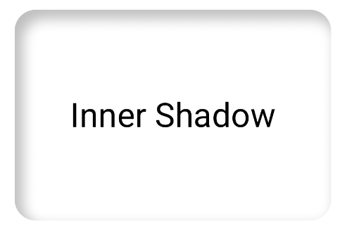
Modifier.innerShadow() を適用した例。ユーザー操作に応じてシャドウをアニメーション表示する
シャドウをユーザー操作に応答させるには、シャドウ プロパティを Compose のアニメーション API と統合します。たとえば、ユーザーがボタンを押すと、影が変化して瞬時に視覚的な反応を示します。
次のコードは、影付きの「押された」エフェクト(表面が画面に押し込まれているような視覚効果)を作成します。
@Composable fun AnimatedColoredShadows() { SnippetsTheme { Box(Modifier.fillMaxSize()) { val interactionSource = remember { MutableInteractionSource() } val isPressed by interactionSource.collectIsPressedAsState() // Create transition with pressed state val transition = updateTransition( targetState = isPressed, label = "button_press_transition" ) fun <T> buttonPressAnimation() = tween<T>( durationMillis = 400, easing = EaseInOut ) // Animate all properties using the transition val shadowAlpha by transition.animateFloat( label = "shadow_alpha", transitionSpec = { buttonPressAnimation() } ) { pressed -> if (pressed) 0f else 1f } // ... val blueDropShadow by transition.animateColor( label = "shadow_color", transitionSpec = { buttonPressAnimation() } ) { pressed -> if (pressed) Color.Transparent else blueDropShadowColor } // ... Box( Modifier .clickable( interactionSource, indication = null ) { // ** ...... **// } .width(300.dp) .height(200.dp) .align(Alignment.Center) .dropShadow( shape = RoundedCornerShape(70.dp), shadow = Shadow( radius = 10.dp, spread = 0.dp, color = blueDropShadow, offset = DpOffset(x = 0.dp, -(2).dp), alpha = shadowAlpha ) ) .dropShadow( shape = RoundedCornerShape(70.dp), shadow = Shadow( radius = 10.dp, spread = 0.dp, color = darkBlueDropShadow, offset = DpOffset(x = 2.dp, 6.dp), alpha = shadowAlpha ) ) // note that the background needs to be defined before defining the inner shadow .background( color = Color(0xFFFFFFFF), shape = RoundedCornerShape(70.dp) ) .innerShadow( shape = RoundedCornerShape(70.dp), shadow = Shadow( radius = 8.dp, spread = 4.dp, color = innerShadowColor2, offset = DpOffset(x = 4.dp, 0.dp) ) ) .innerShadow( shape = RoundedCornerShape(70.dp), shadow = Shadow( radius = 20.dp, spread = 4.dp, color = innerShadowColor1, offset = DpOffset(x = 4.dp, 0.dp), alpha = innerShadowAlpha ) ) ) { Text( "Animated Shadows", // ... ) } } } }
コードに関する主なポイント
transition.animateColorとtransition.animateFloatを使用して、押下時にアニメーション化するパラメータの開始状態と終了状態を宣言します。updateTransitionを使用し、選択したtargetState (targetState = isPressed)を指定して、すべてのアニメーションが同期されていることを確認します。isPressedが変更されるたびに、遷移オブジェクトは、すべての子プロパティのアニメーションを現在の値から新しいターゲット値まで自動的に管理します。- 切り替えのタイミングとイージングを制御する
buttonPressAnimation仕様を定義します。これは、400 ミリ秒の期間とEaseInOutカーブでtween(中間)を指定します。つまり、アニメーションは最初はゆっくりと始まり、中盤で加速し、最後は減速します。 - 次のものを含む、アニメーション プロパティをすべて適用してビジュアル要素を作成する修飾子関数のチェーンを含む
Boxを定義します。- .
clickable():Boxをインタラクティブにする修飾子。 .dropShadow(): 2 つの外側のドロップ シャドウが最初に適用されます。色とアルファ プロパティはアニメーション値(blueDropShadowなど)にリンクされ、最初の隆起した外観を作成します。.innerShadow(): 2 つの内側の影が背景の上に描画されます。これらのプロパティは、他のアニメーション値(innerShadowColor1など)のセットにリンクされ、インデントされた外観を作成します。
- .
結果
グラデーション シャドウを作成する
影は単色に限定されません。シャドウ API は Brush を受け付けます。これにより、グラデーション シャドウを作成できます。
Box( modifier = Modifier .width(240.dp) .height(200.dp) .dropShadow( shape = RoundedCornerShape(70.dp), shadow = Shadow( radius = 10.dp, spread = animatedSpread.dp, brush = Brush.sweepGradient( colors ), offset = DpOffset(x = 0.dp, y = 0.dp), alpha = animatedAlpha ) ) .clip(RoundedCornerShape(70.dp)) .background(Color(0xEDFFFFFF)), contentAlignment = Alignment.Center ) { Text( text = breathingText, color = Color.Black, style = MaterialTheme.typography.bodyLarge ) }
コードに関する主なポイント
dropShadow()は、ボックスの背面に影を追加します。brush = Brush.sweepGradient(colors)は、事前定義されたcolorsのリストをローテーションするグラデーションで影を色付けし、虹のような効果を生み出します。
結果
ブラシをシャドウとして使用して、グラデーション dropShadow() を作成し、「呼吸」アニメーションを適用できます。
シャドウを結合する
dropShadow() 修飾子と innerShadow() 修飾子を組み合わせて重ねることで、さまざまな効果を生み出すことができます。以降のセクションでは、この手法でニューモーフィズム、ネオブルータリズム、リアルな影を生成する方法について説明します。
ニューモーフィズムのシャドウを作成する
ニューモーフィック シャドウは、背景から自然に浮かび上がるようなソフトな外観が特徴です。ニューモーフィック シャドウを作成するには、次の操作を行います。
- 背景と同じ色を使用する要素を使用します。
- 2 つの薄いドロップ シャドウを反対方向に適用します。1 つの角に明るいシャドウ、反対側の角に暗いシャドウを適用します。
次のスニペットでは、2 つの dropShadow() 修飾子を重ねてニューモーフィズム効果を作成しています。
@Composable fun NeumorphicRaisedButton( shape: RoundedCornerShape = RoundedCornerShape(30.dp) ) { val bgColor = Color(0xFFe0e0e0) val lightShadow = Color(0xFFFFFFFF) val darkShadow = Color(0xFFb1b1b1) val upperOffset = -10.dp val lowerOffset = 10.dp val radius = 15.dp val spread = 0.dp Box( modifier = Modifier .fillMaxSize() .background(bgColor) .wrapContentSize(Alignment.Center) .size(240.dp) .dropShadow( shape, shadow = Shadow( radius = radius, color = lightShadow, spread = spread, offset = DpOffset(upperOffset, upperOffset) ), ) .dropShadow( shape, shadow = Shadow( radius = radius, color = darkShadow, spread = spread, offset = DpOffset(lowerOffset, lowerOffset) ), ) .background(bgColor, shape) ) }

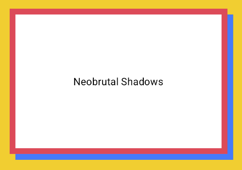
ネオブルータリストのシャドウを作成する
ネオ ブルータリズム スタイルは、高コントラストのブロック状のレイアウト、鮮やかな色、太い境界線を特徴としています。この効果を作成するには、次のスニペットに示すように、ぼかしがゼロで明確なオフセットを持つ dropShadow() を使用します。
@Composable fun NeoBrutalShadows() { SnippetsTheme { val dropShadowColor = Color(0xFF007AFF) val borderColor = Color(0xFFFF2D55) Box(Modifier.fillMaxSize()) { Box( Modifier .width(300.dp) .height(200.dp) .align(Alignment.Center) .dropShadow( shape = RoundedCornerShape(0.dp), shadow = Shadow( radius = 0.dp, spread = 0.dp, color = dropShadowColor, offset = DpOffset(x = 8.dp, 8.dp) ) ) .border( 8.dp, borderColor ) .background( color = Color.White, shape = RoundedCornerShape(0.dp) ) ) { Text( "Neobrutal Shadows", modifier = Modifier.align(Alignment.Center), style = MaterialTheme.typography.bodyMedium ) } } } }
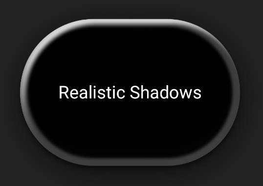
リアルな影を作成する
リアルな影は、現実世界の影を模倣します。つまり、主な光源によって照らされているように見え、直接的な影とより拡散した影の両方が生じます。次のスニペットに示すように、異なるプロパティを持つ複数の dropShadow() インスタンスと innerShadow() インスタンスを重ねて、リアルな影の効果を再現できます。
@Composable fun RealisticShadows() { Box(Modifier.fillMaxSize()) { val dropShadowColor1 = Color(0xB3000000) val dropShadowColor2 = Color(0x66000000) val innerShadowColor1 = Color(0xCC000000) val innerShadowColor2 = Color(0xFF050505) val innerShadowColor3 = Color(0x40FFFFFF) val innerShadowColor4 = Color(0x1A050505) Box( Modifier .width(300.dp) .height(200.dp) .align(Alignment.Center) .dropShadow( shape = RoundedCornerShape(100.dp), shadow = Shadow( radius = 40.dp, spread = 0.dp, color = dropShadowColor1, offset = DpOffset(x = 2.dp, 8.dp) ) ) .dropShadow( shape = RoundedCornerShape(100.dp), shadow = Shadow( radius = 4.dp, spread = 0.dp, color = dropShadowColor2, offset = DpOffset(x = 0.dp, 4.dp) ) ) // note that the background needs to be defined before defining the inner shadow .background( color = Color.Black, shape = RoundedCornerShape(100.dp) ) // // .innerShadow( shape = RoundedCornerShape(100.dp), shadow = Shadow( radius = 12.dp, spread = 3.dp, color = innerShadowColor1, offset = DpOffset(x = 6.dp, 6.dp) ) ) .innerShadow( shape = RoundedCornerShape(100.dp), shadow = Shadow( radius = 4.dp, spread = 1.dp, color = Color.White, offset = DpOffset(x = 5.dp, 5.dp) ) ) .innerShadow( shape = RoundedCornerShape(100.dp), shadow = Shadow( radius = 12.dp, spread = 5.dp, color = innerShadowColor2, offset = DpOffset(x = (-3).dp, (-12).dp) ) ) .innerShadow( shape = RoundedCornerShape(100.dp), shadow = Shadow( radius = 3.dp, spread = 10.dp, color = innerShadowColor3, offset = DpOffset(x = 0.dp, 0.dp) ) ) .innerShadow( shape = RoundedCornerShape(100.dp), shadow = Shadow( radius = 3.dp, spread = 9.dp, color = innerShadowColor4, offset = DpOffset(x = 1.dp, 1.dp) ) ) ) { Text( "Realistic Shadows", modifier = Modifier.align(Alignment.Center), fontSize = 24.sp, color = Color.White ) } } }
コードに関する主なポイント
- 異なるプロパティを持つ 2 つの
dropShadow()修飾子がチェーンされ、その後にbackground()修飾子が適用されます。 - 連鎖した
innerShadow()修飾子が適用され、コンポーネントの端に金属製のリム効果が生成されます。
結果
上記のコード スニペットでは、次の結果が生成されます。