
您可以使用樣式,透過多種方式建構應用程式。選擇哪種做法取決於應用程式採用 Material Design 的程度:
- 完全自訂的設計系統,未使用 Material Design
- 建議:定義會取用主題值的元件樣式,並在設計系統元件上公開樣式參數。
- 使用 Material Design
- 建議:等待 Material 採用,以便與樣式整合。 盡可能在自己的元件上使用樣式。
樣式層
在傳統的 Compose 模型中,自訂作業通常會大量覆寫 MaterialTheme 提供的全域符記 (顏色和字體排版),或盡可能包裝及覆寫設計系統可組合函式的屬性。有時,Material 層中的屬性不會透過子系統或參數公開,但會成為元件本身的硬式編碼預設值。
透過 Styles API,您可以使用新的抽象層,在子系統和元件之間建立橋樑:樣式。
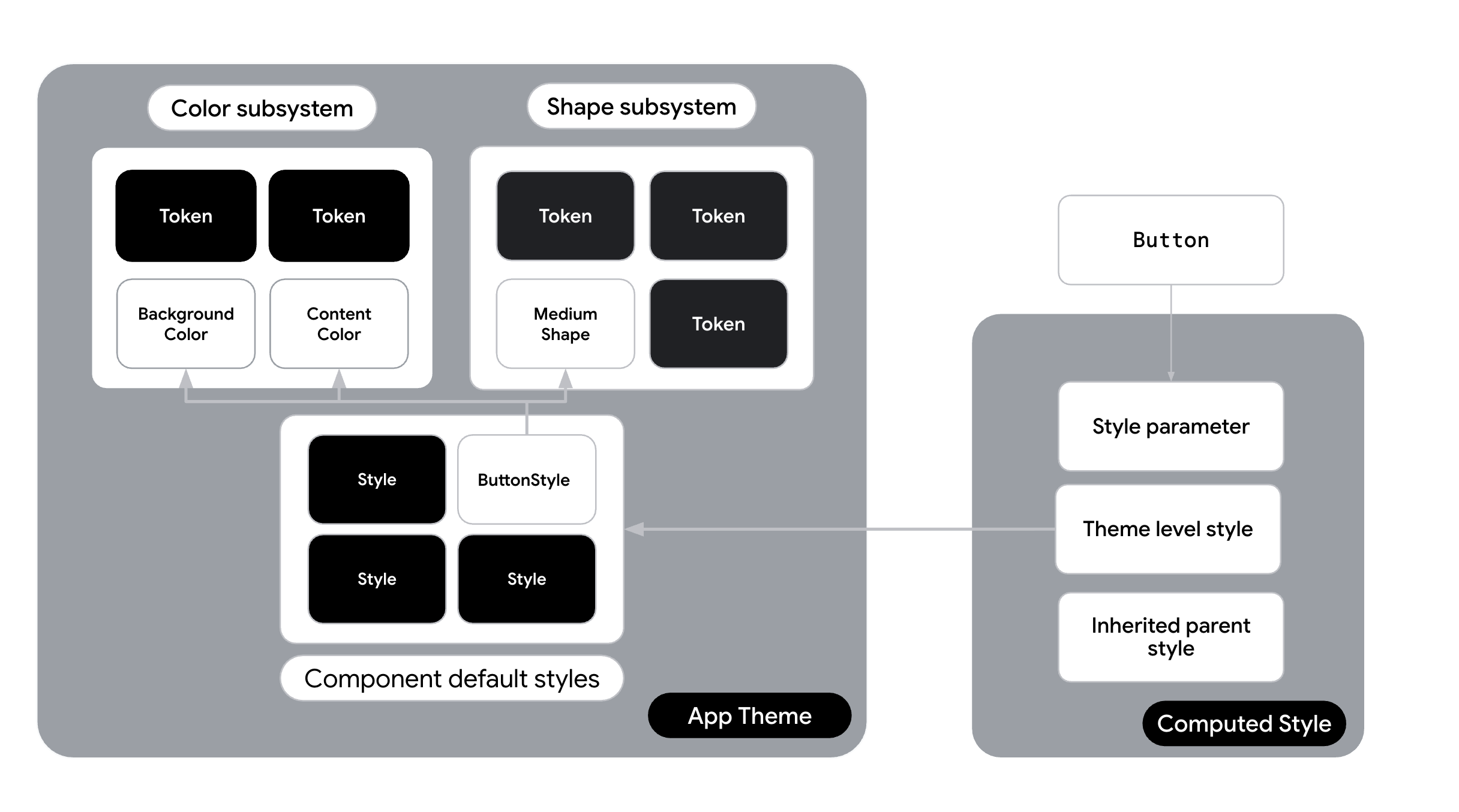
| 圖層 | 責任 | 範例 |
|---|---|---|
| 子系統值 | 具名值 | val Primary = Color(0xFF34A85E) |
| 原子樣式 | 樣式,只會變更一個屬性 | val largeSizeAtomic = Style { size(100.dp, 40.dp) } |
| 元件樣式 | 元件專屬設定 | 按鈕,背景為 Primary,邊框間距為 16dp。val buttonStyle = Style { contentPadding(16.dp) shape(RoundedCornerShape(8.dp)) background(Color.Blue) } |
| 元件 | 使用樣式的實用 UI 元素。 | Button(style = buttonStyle) { ... } |
原子式與單體式樣式
您可以使用 Styles API 將樣式分解為個別的原子樣式。您也可以建立小型的單一用途公用程式樣式,而不必定義複雜的元件專屬樣式 (例如 baseButtonStyle)。這些是您的「原子」。
// Define single-purpose "atomic" styles val paddingAtomic = Style { contentPadding(16.dp) } val roundedCornerShapeAtomic = Style { shape(RoundedCornerShape(8.dp)) } val primaryBackgroundAtomic = Style { background(Color.Blue) } val largeSizeAtomic = Style { size(100.dp, 40.dp) } val interactiveShadowAtomic = Style { hovered { animate { dropShadow( Shadow( offset = DpOffset( 0.dp, 0.dp ), radius = 2.dp, spread = 0.dp, color = Color.Blue, ) ) } } }
使用「then」的組合
新版 Styles API 的強大功能之一是 then 運算子,可讓您合併多個 Style 物件。您可以使用原子公用程式類別建構元件。
傳統 (非不可分割):
// One large monolithic style val buttonStyle = Style { contentPadding(16.dp) shape(RoundedCornerShape(8.dp)) background(Color.Blue) }
原子重構:
// Combine atoms to create the final appearance val buttonStyle = paddingAtomic then roundedCornerShapeAtomic then primaryBackgroundAtomic then interactiveShadowAtomic
在設計系統中採用樣式
在設計系統中採用樣式時,請考慮下列選項,具體取決於設計系統在光譜中的位置。
使用樣式的自訂設計系統
適用時機:您收到一份不以 Material Design 為基礎的品牌指南,且不打算使用 Material Design。
策略:導入完全自訂的設計系統,並將樣式公開為主題的一部分。
如果您未使用 Material 做為主要設計系統語言,這個選項就是自訂路徑。您完全略過 MaterialTheme,並已建立自己的自訂主題。您會建構 CompanyTheme,做為樣式的容器。
- 運作方式:建立
CompanyTheme物件,為系統中的每個元件保留Style物件。您的元件 (可以是 Material 邏輯的包裝函式,也可以是自訂Box或Layout實作項目) 會直接使用這些樣式,並為設計系統的消費者公開Style參數。 - 樣式層:樣式是設計系統的主要定義。權杖是饋送至這些樣式的具名變數。這可實現深度自訂,例如為狀態變化定義專屬動畫 (例如在按下時動畫化比例和顏色)。
如果您要自行建構自訂主題,但不想使用 Material,而且想要採用樣式,請將樣式清單新增至主題。這樣一來,您就能在專案的任何位置存取基本樣式。
建立
Styles類別,儲存應用程式中的各種樣式,並建立預設值。舉例來說,在 Jetsnack 應用程式中,類別名稱為JetsnackStyles:object JetsnackStyles{ val buttonStyle: Style = Style { shape(shapes.medium) background(colors.brand) contentColor(colors.textPrimary) contentPaddingVertical(8.dp) contentPaddingHorizontal(24.dp) textStyle(typography.labelLarge) disabled { animate { background(colors.brandSecondary) } } } val cardStyle: Style = Style { shape(shapes.medium) background(colors.uiBackground) contentColor(colors.textPrimary) } }
在整體主題中提供
Styles,並在StyleScope上公開輔助擴充功能,以便存取子系統:@Immutable class JetsnackTheme( val colors: JetsnackColors = LightJetsnackColors, val typography: androidx.compose.material3.Typography = androidx.compose.material3.Typography(), val shapes: Shapes = Shapes() ) { companion object { val colors: JetsnackColors @Composable @ReadOnlyComposable get() = LocalJetsnackTheme.current.colors val typography: androidx.compose.material3.Typography @Composable @ReadOnlyComposable get() = LocalJetsnackTheme.current.typography val shapes: Shapes @Composable @ReadOnlyComposable get() = LocalJetsnackTheme.current.shapes val styles: JetsnackStyles = JetsnackStyles val LocalJetsnackTheme: ProvidableCompositionLocal<JetsnackTheme> get() = LocalJetsnackThemeInstance } } val StyleScope.colors: JetsnackColors get() = LocalJetsnackTheme.currentValue.colors val StyleScope.typography: androidx.compose.material3.Typography get() = LocalJetsnackTheme.currentValue.typography val StyleScope.shapes: Shapes get() = LocalJetsnackTheme.currentValue.shapes internal val LocalJetsnackThemeInstance = staticCompositionLocalOf { JetsnackTheme() } @Composable fun JetsnackTheme(darkTheme: Boolean = isSystemInDarkTheme(), content: @Composable () -> Unit) { val colors = if (darkTheme) DarkJetsnackColors else LightJetsnackColors val theme = JetsnackTheme(colors = colors) CompositionLocalProvider( LocalJetsnackTheme provides theme, ) { MaterialTheme( typography = LocalJetsnackTheme.current.typography, shapes = LocalJetsnackTheme.current.shapes, content = content, ) } }
在可組合函式中存取
JetsnackStyles:@Composable fun CustomButton(modifier: Modifier, style: Style = Style, text: String) { val interactionSource = remember { MutableInteractionSource() } val styleState = remember(interactionSource) { MutableStyleState(interactionSource) } // Apply style to top level container in combination with incoming style from parameter. Box(modifier = modifier .clickable( interactionSource = interactionSource, indication = null, enabled = true, role = Role.Button, onClick = { }, ) .styleable(styleState, JetsnackTheme.styles.buttonStyle, style)) { Text(text) } }
除了採用全域主題,您也可以使用其他策略,將
Styles整合至應用程式。如果不需要完整的主題設定功能,您可以針對特定通話網站使用 Styles 內嵌功能,或使用靜態定義。除非整個樣式有根本上的差異,否則不應有條件地交換 Styles。建議您在視覺定義中存取動態符記,而不是在不同的樣式物件之間切換。