The Android platform is responsible for drawing the system UI, such as the status bar and navigation bar. This system UI is displayed regardless of which app the user is using.
WindowInsets
provides information about the system
UI to ensure that your app draws in the correct area and your UI isn't obscured
by the system UI.
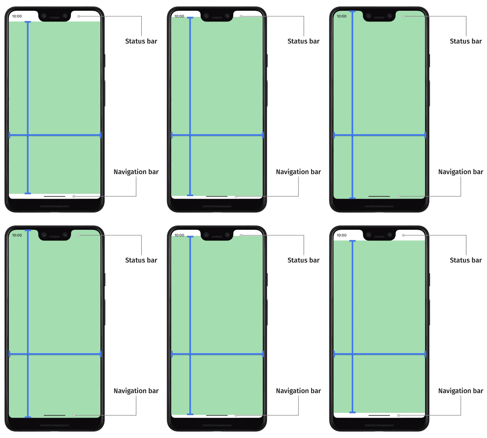
On Android 14 (API level 34) and lower, your app's UI does not draw underneath the system bars and display cutouts by default.
On Android 15 (API level 35) and higher, your app draws underneath the system bars and display cutouts once your app targets SDK 35. This results in a more seamless user experience and allows your app to take full advantage of the window space available to it.
Displaying content behind the system UI is called going edge-to-edge. On this page, you learn about the different types of insets, how to go edge-to-edge, and how to use the inset APIs to animate your UI and ensure your app's content isn't obscured by system UI elements.
Inset fundamentals
When an app goes edge-to-edge, you need to ensure that important content and interactions are not obscured by the system UI. For example, if a button is placed behind the navigation bar, the user may not be able to click it.
The size of the system UI and information about where it is placed is specified via insets.
Each portion of the system UI has a corresponding type of inset that describes its size and where it is placed. For example, status bar insets provide the size and position of the status bar, whereas the navigation bar insets provide the size and position of the navigation bar. Each type of inset consists of four pixel dimensions: top, left, right, and bottom. These dimensions specify how far the system UI extends from the corresponding sides of the app's window. To avoid overlapping with that type of system UI, therefore, app UI must be inset by that amount.
These built-in Android inset types are available through WindowInsets
:
The insets describing the status bars. These are the top system UI bars containing notification icons and other indicators. |
|
The status bar insets for when they are visible. If the status bars are currently hidden (due to entering immersive full screen mode), then the main status bar insets will be empty, but these insets will be non-empty. |
|
The insets describing the navigation bars. These are the system UI bars on the left, right, or bottom side of the device, describing the taskbar or navigation icons. These can change at runtime based on the user's preferred navigation method and interacting with the taskbar. |
|
The navigation bar insets for when they are visible. If the navigation bars are currently hidden (due to entering immersive full screen mode), then the main navigation bar insets will be empty, but these insets will be non-empty. |
|
The inset describing the system UI window decoration if in a freeform window, like top title bar. |
|
The caption bar insets for when they are visible. If the caption bars are currently hidden, then the main caption bar insets will be empty, but these insets will be non-empty. |
|
The union of the system bar insets, which include the status bars, navigation bars, and caption bar. |
|
The system bar insets for when they are visible. If the system bars are currently hidden (due to entering immersive full screen mode), then the main system bar insets will be empty, but these insets will be non-empty. |
|
The insets describing the amount of space on the bottom that the software keyboard occupies. |
|
The insets describing the amount of space that the software keyboard occupied before the current keyboard animation. |
|
The insets describing the amount of space that the software keyboard will occupy after the current keyboard animation. |
|
A type of insets describing more detailed information about the navigation UI, giving the amount of space where "taps" will be handled by the system, and not the app. For transparent navigation bars with gesture navigation, some app elements can be tappable through the system navigation UI. |
|
The tappable element insets for when they are visible. If the tappable elements are currently hidden (due to entering immersive full screen mode), then the main tappable element insets will be empty, but these insets will be non-empty. |
|
The insets representing the amount of insets where the system will intercept gestures for navigation. Apps can manually specify handling a limited amount of these gestures via |
|
A subset of the system gestures that will always be handled by the system, and which can't be opted out via |
|
The insets representing the amount of spacing needed to avoid overlapping with a display cutout (notch or pinhole). |
|
The insets representing the curved areas of a waterfall display. A waterfall display has curved areas along the edges of the screen where the screen begins to wrap along the sides of the device. |
These types are summarized by three "safe" inset types that ensure content isn't obscured:
These "safe" inset types protect content in different ways, based on the underlying platform insets:
- Use
WindowInsets.safeDrawing
to protect content that shouldn't be drawn underneath any system UI. This is the most common usage of insets: to prevent drawing content that is obscured by the system UI (either partially or completely). - Use
WindowInsets.safeGestures
to protect content with gestures. This avoids system gestures clashing with app gestures (such as those for bottom sheets, carousels, or in games). - Use
WindowInsets.safeContent
as a combination ofWindowInsets.safeDrawing
andWindowInsets.safeGestures
to ensure content has no visual overlap and no gesture overlap.
Insets setup
To allow your app full control over where it draws content, follow these setup steps. Without these steps, your app may draw black or solid colors behind the system UI, or not animate synchronously with the software keyboard.
- Target SDK 35 or later to enforce edge-to-edge on Android 15 and higher. Your app displays behind the system UI. You can adjust your app's UI by handling insets.
- Optionally, call
enableEdgeToEdge()
inActivity.onCreate()
, which allows your app to be edge-to-edge on previous Android versions. Set
android:windowSoftInputMode="adjustResize"
in your Activity'sAndroidManifest.xml
entry. This setting allows your app to receive the size of the software IME as insets, which you can use to pad and lay out content appropriately when the IME appears and disappears in your app.<!-- in your AndroidManifest.xml file: --> <activity android:name=".ui.MainActivity" android:label="@string/app_name" android:windowSoftInputMode="adjustResize" android:theme="@style/Theme.MyApplication" android:exported="true">
Compose APIs
Once your Activity has taken control of handling all insets, you can use Compose APIs to ensure that content isn't obscured and interactable elements don't overlap with the system UI. These APIs also synchronize your app's layout with inset changes.
For example, this is the most basic method of applying the insets to the content of your entire app:
override fun onCreate(savedInstanceState: Bundle?) { super.onCreate(savedInstanceState) enableEdgeToEdge() setContent { Box(Modifier.safeDrawingPadding()) { // the rest of the app } } }
This snippet applies the safeDrawing
window insets as padding around the
entire content of the app. While this ensures that interactable elements don't
overlap with the system UI, it also means that none of the app will draw behind
the system UI to achieve an edge-to-edge effect. To make full use of the entire
window, you need to fine-tune where the insets are applied on a screen-by-screen
or component-by-component basis.
All of these inset types are animated automatically with IME animations backported to API 21. By extension, all of your layouts using these insets are also automatically animated as the inset values change.
There are two primary ways to use these inset types to adjust your Composable layouts: padding modifiers and inset size modifiers.
Padding modifiers
Modifier.windowInsetsPadding(windowInsets: WindowInsets)
applies the
given window insets as padding, acting just like Modifier.padding
would.
For example, Modifier.windowInsetsPadding(WindowInsets.safeDrawing)
applies
the safe drawing insets as padding on all 4 sides.
There are also several built-in utility methods for the most common inset types.
Modifier.safeDrawingPadding()
is one such method, equivalent to
Modifier.windowInsetsPadding(WindowInsets.safeDrawing)
. There are analogous
modifiers for the other inset types.
Inset size modifiers
The following modifiers apply an amount of window insets by setting the size of the component to be the size of the insets:
Applies the start side of windowInsets as the width (like |
|
Applies the end side of windowInsets as the width (like |
|
Applies the top side of windowInsets as the height (like |
|
|
Applies the bottom side of windowInsets as the height (like |
These modifiers are especially useful for sizing a Spacer
that takes up the
space of insets:
LazyColumn( Modifier.imePadding() ) { // Other content item { Spacer( Modifier.windowInsetsBottomHeight( WindowInsets.systemBars ) ) } }
Inset consumption
The inset padding modifiers (windowInsetsPadding
and helpers like
safeDrawingPadding
) automatically consume the portion of the insets that are
applied as padding. While going deeper into the composition tree, nested inset
padding modifiers and the inset size modifiers know that some portion of the
insets have already been consumed by outer inset padding modifiers, and avoid
using the same portion of the insets more than once which would result in too
much extra space.
Inset size modifiers also avoid using the same portion of insets more than once if insets have already been consumed. However, since they are changing their size directly, they don't consume insets themselves.
As a result, nesting padding modifiers automatically change the amount of padding applied to each composable.
Looking at the same LazyColumn
example as before, the LazyColumn
is being
resized by the imePadding
modifier. Inside the LazyColumn
, the last item is
sized to be the height of the bottom of the system bars:
LazyColumn( Modifier.imePadding() ) { // Other content item { Spacer( Modifier.windowInsetsBottomHeight( WindowInsets.systemBars ) ) } }
When the IME is closed, the imePadding()
modifier applies no padding, since
the IME has no height. Since the imePadding()
modifier is applying no padding,
no insets are being consumed, and the height of the Spacer
will be the size of
the bottom side of the system bars.
When the IME opens, the IME insets animate to match the size of the IME, and the
imePadding()
modifier begins applying bottom padding to resize the
LazyColumn
as the IME opens. As the imePadding()
modifier begins applying
bottom padding, it also starts consuming that amount of insets. Therefore, the
height of the Spacer
starts to decrease, as part of the spacing for the system
bars has already been applied by the imePadding()
modifier. Once the
imePadding()
modifier is applying an amount of bottom padding that is larger
than the system bars, the height of the Spacer
is zero.
When the IME closes, the changes happen in reverse: The Spacer
starts to
expand from a height of zero once the imePadding()
is applying less than the
bottom side of the system bars, until finally the Spacer
matches the height of
the bottom side of the system bars once the IME is completely animated out.
This behavior is accomplished through communication between all
windowInsetsPadding
modifiers, and can be influenced in a couple of other
ways.
Modifier.consumeWindowInsets(insets: WindowInsets)
also consumes insets
in the same way as Modifier.windowInsetsPadding
, but it doesn't apply
the consumed insets as padding. This is useful in combination with the inset
size modifiers, to indicate to siblings that a certain amount of insets have
already been consumed:
Column(Modifier.verticalScroll(rememberScrollState())) { Spacer(Modifier.windowInsetsTopHeight(WindowInsets.systemBars)) Column( Modifier.consumeWindowInsets( WindowInsets.systemBars.only(WindowInsetsSides.Vertical) ) ) { // content Spacer(Modifier.windowInsetsBottomHeight(WindowInsets.ime)) } Spacer(Modifier.windowInsetsBottomHeight(WindowInsets.systemBars)) }
Modifier.consumeWindowInsets(paddingValues: PaddingValues)
behaves very
similarly to the version with a WindowInsets
argument, but takes an
arbitrary PaddingValues
to consume. This is useful for informing
children when padding or spacing is provided by some other mechanism than the
inset padding modifiers, such as an ordinary Modifier.padding
or fixed height
spacers:
Column(Modifier.padding(16.dp).consumeWindowInsets(PaddingValues(16.dp))) { // content Spacer(Modifier.windowInsetsBottomHeight(WindowInsets.ime)) }
In cases where the raw window insets are needed without consumption, use the
WindowInsets
values directly, or use WindowInsets.asPaddingValues()
to
return a PaddingValues
of the insets that are unaffected by consumption.
However, due to the caveats below, prefer to use the window insets padding
modifiers and window insets size modifiers wherever possible.
Insets and Jetpack Compose phases
Compose uses the underlying AndroidX core APIs to update and animate insets, which use the underlying platform APIs managing insets. Because of that platform behavior, insets have a special relationship with the phases of Jetpack Compose.
The value of insets are updated after the composition phase, but before the layout phase. This means that reading the value of insets in composition generally uses a value of the insets that is one frame late. The built-in modifiers described on this page are built to delay using the values of the insets until the layout phase, which ensures that the inset values are used on the same frame as they are updated.
Keyboard IME animations with WindowInsets
You can apply Modifier.imeNestedScroll()
to a scrolling container to open and
close the IME automatically when scrolling to the bottom of the container.
class WindowInsetsExampleActivity : AppCompatActivity() { override fun onCreate(savedInstanceState: Bundle?) { super.onCreate(savedInstanceState) WindowCompat.setDecorFitsSystemWindows(window, false) setContent { MaterialTheme { MyScreen() } } } } @OptIn(ExperimentalLayoutApi::class) @Composable fun MyScreen() { Box { LazyColumn( modifier = Modifier .fillMaxSize() // fill the entire window .imePadding() // padding for the bottom for the IME .imeNestedScroll(), // scroll IME at the bottom content = { } ) FloatingActionButton( modifier = Modifier .align(Alignment.BottomEnd) .padding(16.dp) // normal 16dp of padding for FABs .navigationBarsPadding() // padding for navigation bar .imePadding(), // padding for when IME appears onClick = { } ) { Icon(imageVector = Icons.Filled.Add, contentDescription = "Add") } } }
Inset support for Material 3 Components
For ease of use, many of the built-in Material 3 composables
(androidx.compose.material3
)
handle insets themselves, based on how the composables are placed in your app
according to the Material specifications.
Inset handling composables
Below is a list of the Material Components that automatically handle insets.
App bars
TopAppBar
/SmallTopAppBar
/CenterAlignedTopAppBar
/MediumTopAppBar
/LargeTopAppBar
: Applies the top and horizontal sides of the system bars as padding since it is used at the top of the window.BottomAppBar
: Applies the bottom and horizontal sides of the system bars as padding.
Content containers
ModalDrawerSheet
/DismissibleDrawerSheet
/PermanentDrawerSheet
(content inside a modal navigation drawer): Applies vertical and start insets to content.ModalBottomSheet
: Applies the bottom insets.NavigationBar
: Applies the bottom and horizontal insets.NavigationRail
: Applies the vertical and start insets.
Scaffold
By default,
Scaffold
provides insets as parameter paddingValues
for you to consume and use.
Scaffold
does not apply the insets to content; this responsibility is yours.
For example, to consume these insets with a LazyColumn
inside a Scaffold
:
Scaffold { innerPadding -> // innerPadding contains inset information for you to use and apply LazyColumn( // consume insets as scaffold doesn't do it by default modifier = Modifier.consumeWindowInsets(innerPadding), contentPadding = innerPadding ) { items(count = 100) { Box( Modifier .fillMaxWidth() .height(50.dp) .background(colors[it % colors.size]) ) } } }
Override default insets
You can change the windowInsets
parameter passed to the composable to
configure the composable's behavior. This parameter can be a different type of
window inset to apply instead, or disabled by passing an empty instance:
WindowInsets(0, 0, 0, 0)
.
For example, to disable the inset handling on
LargeTopAppBar
,
set the windowInsets
parameter to an empty instance:
LargeTopAppBar( windowInsets = WindowInsets(0, 0, 0, 0), title = { Text("Hi") } )
Interop with the View system insets
You may need to override default insets when your screen has both Views and Compose code in the same hierarchy. In this case, you need to be explicit in which one should consume the insets, and which one should ignore them.
For example, if your outermost layout is an Android View layout, you should
consume the insets in the View system and ignore them for Compose.
Alternatively, if your outermost layout is a composable, you should consume the
insets in Compose, and pad the AndroidView
composables accordingly.
By default, each ComposeView
consumes all insets at the
WindowInsetsCompat
level of consumption. To change this default behavior, set
ComposeView.consumeWindowInsets
to false
.
Resources
- Now in Android — a fully functional Android app built entirely with Kotlin and Jetpack Compose.
- Handle edge-to-edge enforcements in Android 15 — a codelab walking through the Android 15 edge-to-edge enforcement
- 3 things to improve your Android app experience: Edge to Edge, Predictive Back, and Glance — a YouTube video speaking to the Android 15 edge-to-edge enforcement
- Edge-to-edge and insets | Compose Tips — a YouTube video showing how to handle insets to draw edge-to-edge
Recommended for you
- Note: link text is displayed when JavaScript is off
- Material Components and layouts
- Migrate
CoordinatorLayout
to Compose - Other considerations