

さまざまなバージョンの Android で通知を最適に表示するには、標準の通知テンプレートを使用して通知を作成します。通知にさらにコンテンツを追加する場合は、展開可能な通知テンプレートの使用を検討してください。
ただし、システム テンプレートがニーズに合わない場合は、通知に独自のレイアウトを使用できます。
コンテンツ領域用のカスタム レイアウトを作成する
カスタム レイアウトが必要な場合は、通知に NotificationCompat.DecoratedCustomViewStyle を適用できます。この API を使用すると、通常はタイトルとテキスト コンテンツが占めるコンテンツ領域にカスタム レイアウトを提供しながら、通知アイコン、タイムスタンプ、サブテキスト、操作ボタンにシステム デコレーションを使用できます。
この API は、次のように基本の通知レイアウトを基に構築することで、展開可能な通知テンプレートと同様に機能します。
NotificationCompat.Builderを使用して基本的な通知を作成します。setStyle()を呼び出して、NotificationCompat.DecoratedCustomViewStyleのインスタンスを渡します。- カスタム レイアウトを
RemoteViewsのインスタンスとしてインフレートします。 setCustomContentView()を呼び出して、折りたたまれた通知のレイアウトを設定します。- 必要に応じて、
setCustomBigContentView()を呼び出して、展開された通知のレイアウトを別に設定します。
レイアウトを準備する
small レイアウトと large レイアウトが必要です。この例では、small レイアウトは次のようになります。
<LinearLayout xmlns:android="http://schemas.android.com/apk/res/android" android:layout_width="match_parent" android:layout_height="wrap_content" android:orientation="vertical"> <TextView android:id="@+id/notification_title" style="@style/TextAppearance.Compat.Notification.Title" android:layout_width="wrap_content" android:layout_height="0dp" android:layout_weight="1" android:text="Small notification, showing only a title" /> </LinearLayout>
large レイアウトは次のようになります。
<LinearLayout xmlns:android="http://schemas.android.com/apk/res/android" android:layout_width="match_parent" android:layout_height="300dp" android:orientation="vertical"> <TextView android:id="@+id/notification_title" style="@style/TextAppearance.Compat.Notification.Title" android:layout_width="wrap_content" android:layout_height="wrap_content" android:layout_weight="1" android:text="Large notification, showing a title and a body." /> <TextView android:id="@+id/notification_body" style="@style/TextAppearance.Compat.Notification.Line2" android:layout_width="wrap_content" android:layout_height="wrap_content" android:layout_weight="1" android:text="This is the body. The height is manually forced to 300dp." /> </LinearLayout>
通知を作成して表示する
レイアウトの準備ができたら、次の例に示すように使用できます。
val notificationManager = getSystemService(Context.NOTIFICATION_SERVICE) as NotificationManager // Get the layouts to use in the custom notification. val notificationLayout = RemoteViews(packageName, R.layout.notification_small) val notificationLayoutExpanded = RemoteViews(packageName, R.layout.notification_large) // Apply the layouts to the notification. val customNotification = NotificationCompat.Builder(context, CHANNEL_ID) .setSmallIcon(R.drawable.notification_icon) .setStyle(NotificationCompat.DecoratedCustomViewStyle()) .setCustomContentView(notificationLayout) .setCustomBigContentView(notificationLayoutExpanded) .build() notificationManager.notify(666, customNotification)
通知の背景色は、デバイスやバージョンによって異なる場合があります。次の例に示すように、カスタム レイアウトのテキストには TextAppearance_Compat_Notification、タイトルには TextAppearance_Compat_Notification_Title などのサポート ライブラリ スタイルを適用します。これらのスタイルは色のバリエーションに合わせて調整されるため、黒地に黒文字や白地に白文字になることはありません。
<TextView
    android:layout_width="wrap_content"
    android:layout_height="match_parent"
    android:layout_weight="1"
    android:text="@string/notification_title"
    android:id="@+id/notification_title"
    style="@style/TextAppearance.Compat.Notification.Title" />
RemoteViews オブジェクトに背景画像を設定しないでください。テキストが読めなくなる可能性があります。
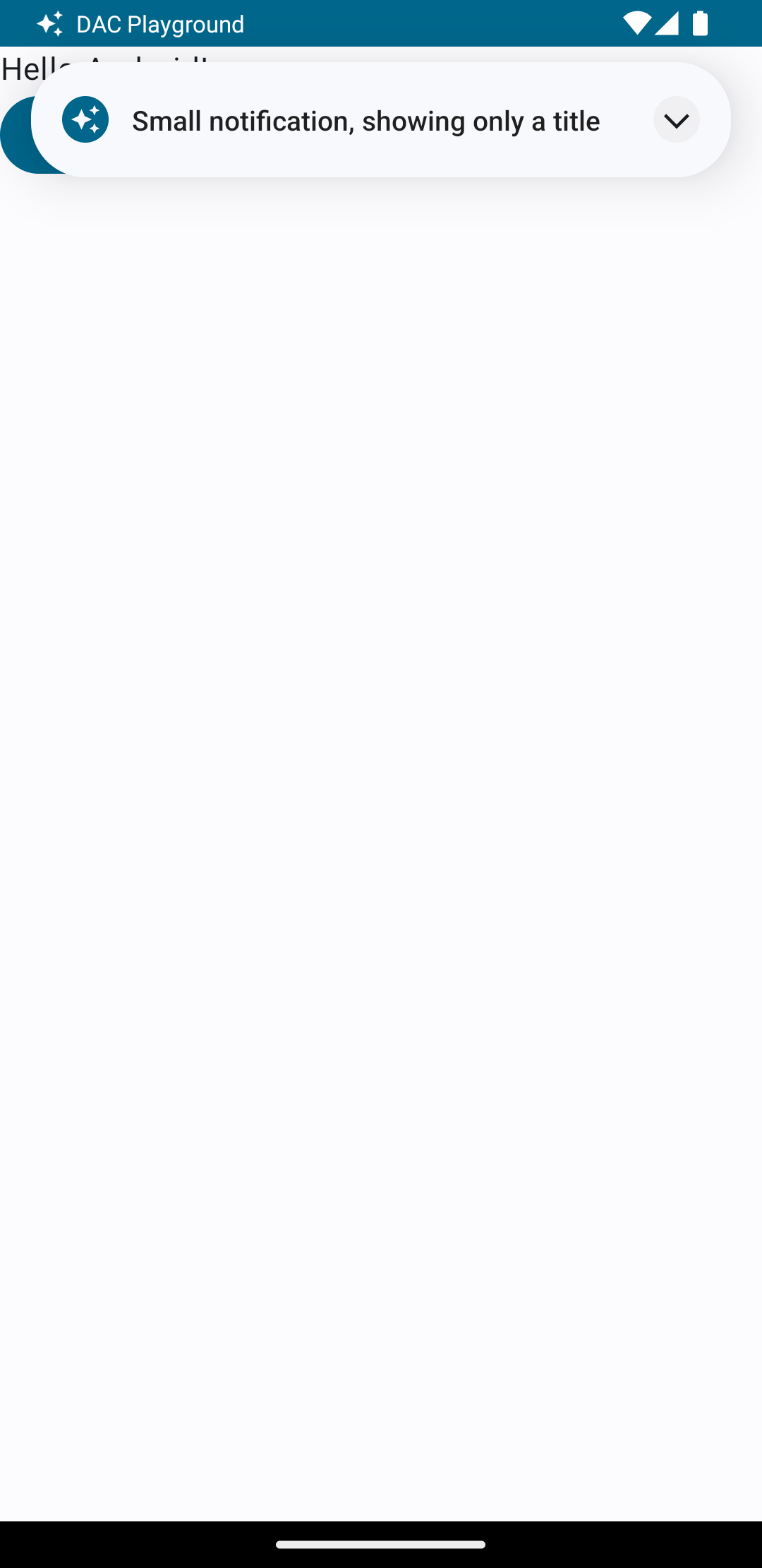
ユーザーがアプリを使用しているときに通知をトリガーすると、図 1 のような結果になります。
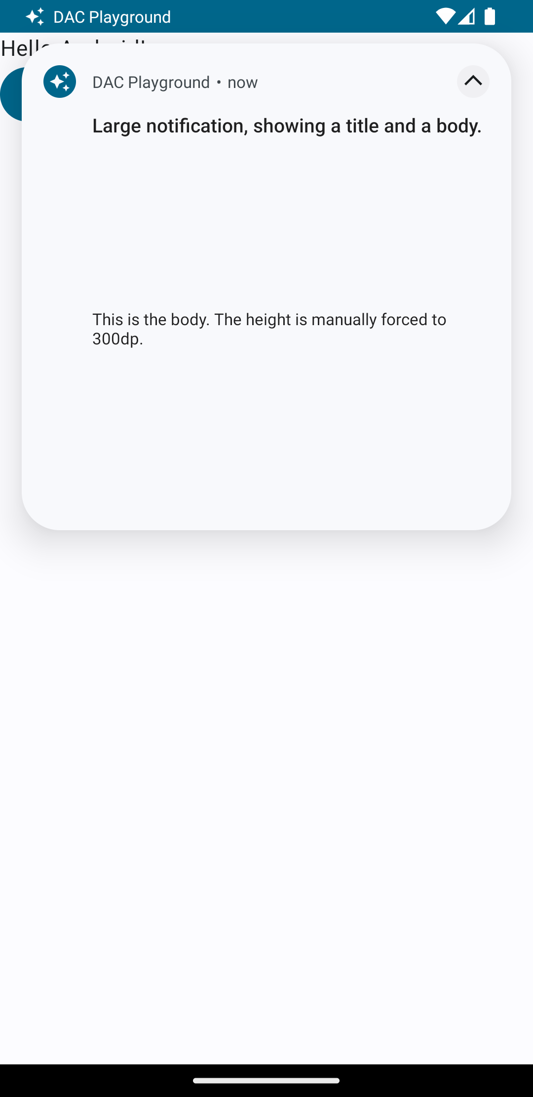
展開矢印をタップすると、図 2 のように通知が展開されます。
通知のタイムアウトが経過すると、通知はシステムバーにのみ表示されます(図 3 を参照)。
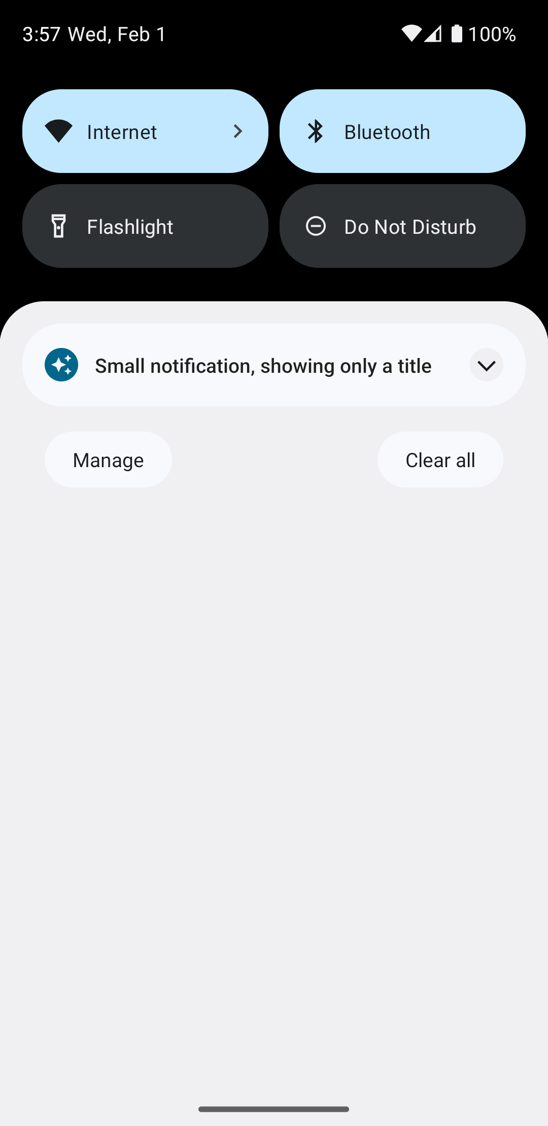
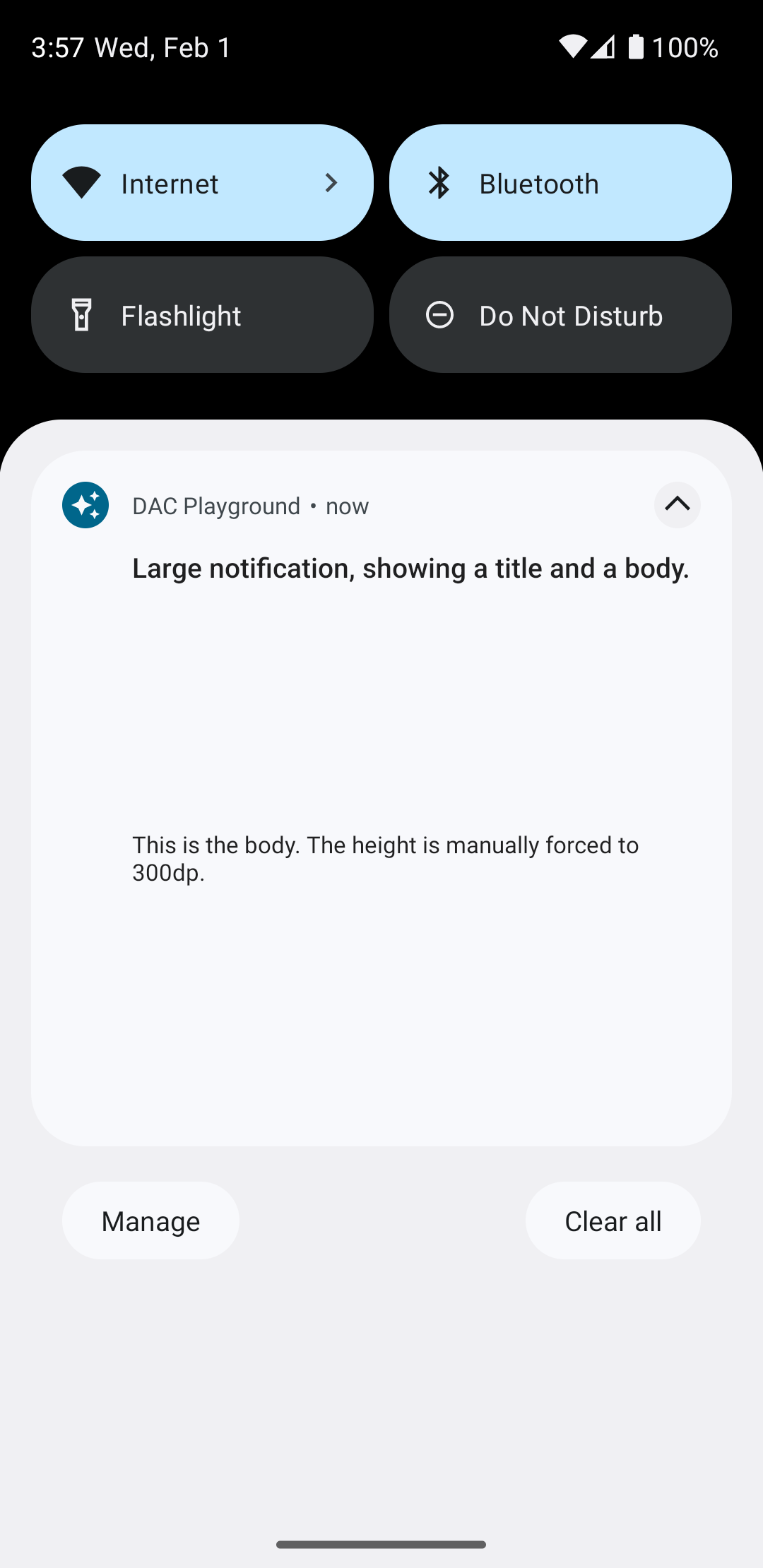
図 4 に示すように、展開矢印をタップすると通知が展開されます。
フルカスタム通知レイアウトを作成する
標準の通知アイコンとヘッダーで通知を装飾したくない場合は、上記の手順に沿って操作しますが、setStyle() を呼び出さないでください。