
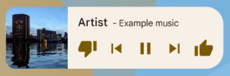
App widgets are miniature app views that you can embed in other apps—such as the home screen—and receive periodic updates. These views are referred to as widgets in the user interface, and you can publish one with an app widget provider (or widget provider). An app component that holds other widgets is called an app widget host (or widget host). Figure 1 shows a sample music widget:
This document describes how to publish a widget using a widget provider. For
details about creating your own AppWidgetHost to host
app widgets, see Build a widget host.
For information about how to design your widget, see App widgets overview.
Widget components
To create a widget, you need the following basic components:
AppWidgetProviderInfoobject- Describes the metadata for a widget, such
as the widget's layout, update frequency, and
AppWidgetProviderclass.AppWidgetProviderInfois defined in XML, as described in this document. AppWidgetProviderclass- Defines the basic methods
that let you programmatically interface with the widget. Through it, you
receive broadcasts when the widget is updated, enabled, disabled, or
deleted. You declare
AppWidgetProviderin the manifest and then implement it, as described in this document. - View layout
- Defines the initial layout for the widget. The layout is defined in XML, as described in this document.
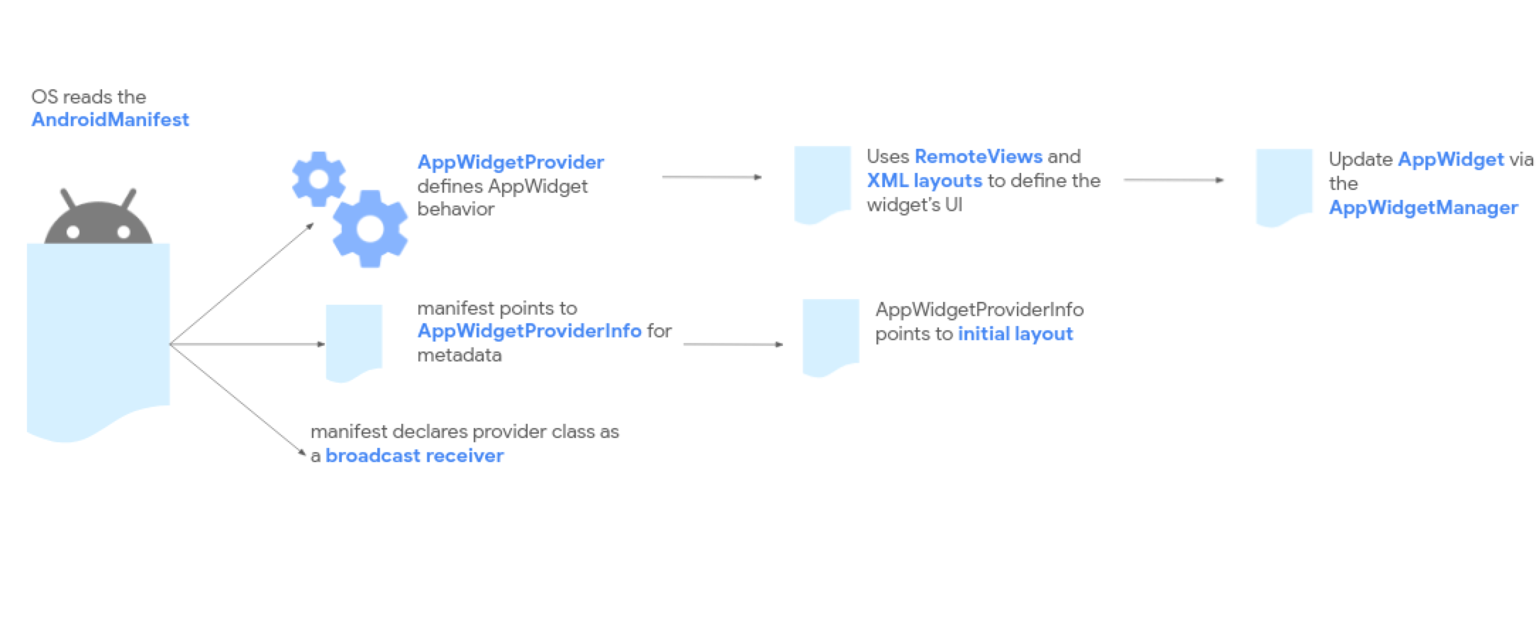
Figure 2 shows how these components fit into the overall app widget processing flow.
If your widget needs user configuration, implement the app widget configuration activity. This activity lets users modify widget settings—for example, the time zone for a clock widget.
- Starting in Android 12 (API level 31), you can provide a default configuration and let users reconfigure the widget later. See Use the widget's default configuration and Enable users to reconfigure placed widgets for more details.
- In Android 11 (API level 30) or lower, this activity is launched every time the user adds the widget to their home screen.
We also recommend the following improvements: flexible widget layouts, miscellaneous enhancements, advanced widgets, collection widgets, and building a widget host.
Declare the AppWidgetProviderInfo XML
Defining the metadata settings (such as default cell sizes, resize constraints, and update frequencies) is exactly identical across both traditional Views and Glance-based widgets.
To learn how to define and configure your metadata XML file, see the Compose-first Declare the AppWidgetProviderInfo XML section in the Glance documentation.
Use the AppWidgetProvider class to handle widget broadcasts
The platform's broadcast receiver mechanics, manifest declaration filters, and
lifecycle event loops are unified underneath the platform. In Compose-first
development, these broadcasts are orchestrated using the
GlanceAppWidgetReceiver wrapper.
To understand how to register your receiver in the manifest and implement Hilt-compatible lifecycle overrides, see the Compose-first Use the AppWidgetProvider class to handle broadcasts section in the Glance documentation.
Create the widget layout
You must define an initial layout for your widget in XML and save it in the
project's res/layout/ directory. Refer to Design guidelines for details.
Creating the widget layout is straightforward if you're familiar with
layouts. However, be aware that widget layouts are based on
RemoteViews, which doesn't support every kind of layout or view widget.
You can't use custom views or subclasses of the views that are supported by
RemoteViews.
RemoteViews also supports ViewStub, which is an invisible, zero-sized
View you can use to lazily inflate layout resources at runtime.
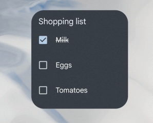
Support for stateful behavior
Android 12 adds support for stateful behavior using the following existing components:
The widget is still stateless. Your app must store the state and register for state change events.
The following code example shows how to implement these components.
Kotlin
// Check the view.
remoteView.setCompoundButtonChecked(R.id.my_checkbox, true)

// Check a radio group.
remoteView.setRadioGroupChecked(R.id.my_radio_group, R.id.radio_button_2)

// Listen for check changes. The intent has an extra with the key
// EXTRA_CHECKED that specifies the current checked state of the view.
remoteView.setOnCheckedChangeResponse(
        R.id.my_checkbox,
        RemoteViews.RemoteResponse.fromPendingIntent(onCheckedChangePendingIntent)
)
Java
// Check the view.
remoteView.setCompoundButtonChecked(R.id.my_checkbox, true);

// Check a radio group.
remoteView.setRadioGroupChecked(R.id.my_radio_group, R.id.radio_button_2);

// Listen for check changes. The intent has an extra with the key
// EXTRA_CHECKED that specifies the current checked state of the view.
remoteView.setOnCheckedChangeResponse(
    R.id.my_checkbox,
    RemoteViews.RemoteResponse.fromPendingIntent(onCheckedChangePendingIntent));
Provide two layouts: one targeting devices running Android 12 or
higher in res/layout-v31, and the other targeting previous
Android 11 or lower in the default res/layout folder.
Implement rounded corners
Calculating the outer background and inner proportional radii is standard and shared. In Compose-first development, this can be set dynamically in Kotlin alongside custom theme resources.
To implement corner radii or set up dynamic styles for older Android devices, see the Compose-first Implement rounded corners section in the Glance documentation.