
画像のカスタマイズには、Image コンポーザブル
(contentScale、colorFilter)のプロパティを使用します。既存の修飾子
を利用して、Image にさまざまな効果を適用することもできます。修飾子は、Image コンポーザブルだけでなく任意の
コンポーザブルにも使用できます。一方、contentScaleと
colorFilterは、Image コンポーザブルの明示的なパラメータです。
コンテンツの調整
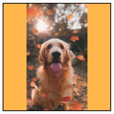
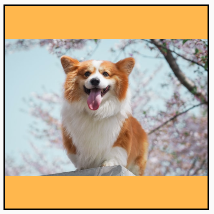
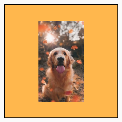
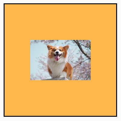
contentScale オプションを指定することで、画像を切り抜いたり、境界内で画像の大きさを変更したりできます。デフォルトでは、contentScale オプションを指定しない場合、ContentScale.Fit が使用されます。
次の例では、Image コンポーザブルの枠を 150 dp に制限して Image コンポーザブルの背景を黄色に設定しています。次の表に、ContentScale オプションの設定を変えた場合の画像を示します。
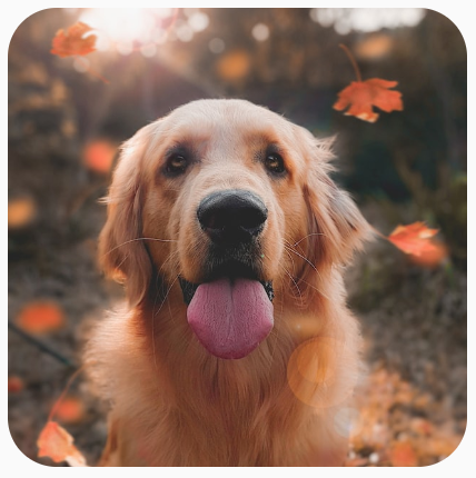
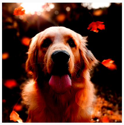
val imageModifier = Modifier .size(150.dp) .border(BorderStroke(1.dp, Color.Black)) .background(Color.Yellow) Image( painter = painterResource(id = R.drawable.dog), contentDescription = stringResource(id = R.string.dog_content_description), contentScale = ContentScale.Fit, modifier = imageModifier )
ContentScale オプションの設定を変えると、出力が変わります。次の表は、適切な ContentScale モードを選択するのに役立ちます。
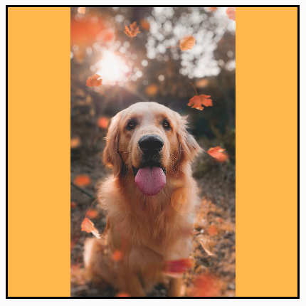
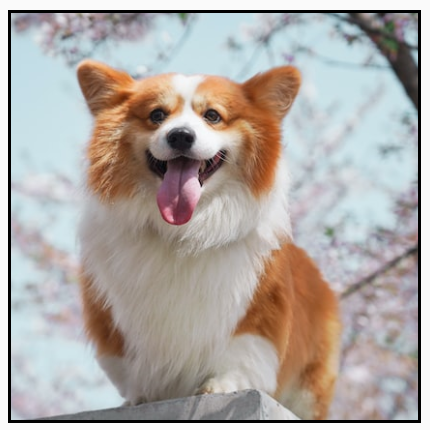
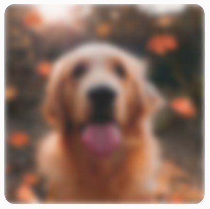
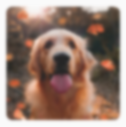
| 元の画像 |
|
|
ContentScale |
結果 - 縦長の画像: | 結果 - 横長の画像: |
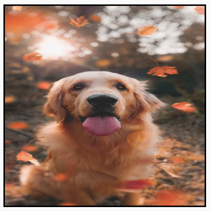
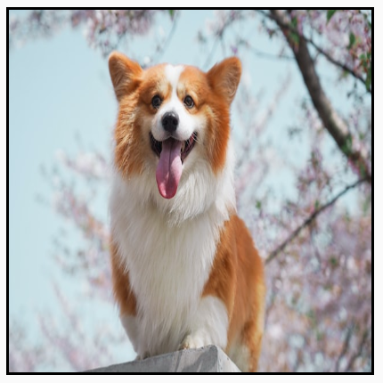
ContentScale.Fit: アスペクト比を維持しながら、画像を均一に拡大・縮小します(デフォルト)。コンテンツが境界より小さい場合、画像はそれに合わせて拡大されます。 |
|
|
ContentScale.Crop: 空いているスペースがなくなるように画像を切り抜いて中央に配置します。 |

|

|
ContentScale.FillHeight: 境界をデスティネーションの高さに合わせ、アスペクト比を維持しながら元の画像を拡大・縮小します。 |
|
|
ContentScale.FillWidth: 境界をデスティネーションの幅に合わせ、アスペクト比を維持しながら元の画像を拡大・縮小します。 |

|

|
ContentScale.FillBounds: デスティネーションの境界に合わせ、垂直方向と水平方向に不均一に コンテンツを拡大・縮小します(注: 画像の比率に正確に合っていないコンテナに配置すると、画像が歪みます)。 |
|
|
ContentScale.Inside: デスティネーションの境界内で、アスペクト比を維持しながら元の画像を拡大・縮小します。元の画像の縦と横がデスティネーションと同じか小さい場合は、「None」に設定した場合と同じような結果になり、コンテンツは常に境界内に収まります。コンテンツが境界よりも小さい場合、スケーリングは適用されません。 |
元の画像が境界より大きい:
 元の画像が境界より小さい:
|
元の画像が境界より大きい:
 元の画像が境界より小さい:
|
ContentScale.None: 元の画像にスケーリングを適用しません。コンテンツがデスティネーションの境界より小さくても、境界に合うように拡大はされません。 |
元の画像が境界より大きい:
 元の画像が境界より小さい:
|
元の画像が境界より大きい:
 元の画像が境界より小さい:
|
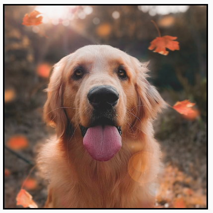
Image コンポーザブルを特定の形にクリップする
画像を特定の形にするには、組み込みの clip 修飾子を使用します。
画像を円形に切り抜くには、Modifier.clip(CircleShape) を使用します。
Image( painter = painterResource(id = R.drawable.dog), contentDescription = stringResource(id = R.string.dog_content_description), contentScale = ContentScale.Crop, modifier = Modifier .size(200.dp) .clip(CircleShape) )
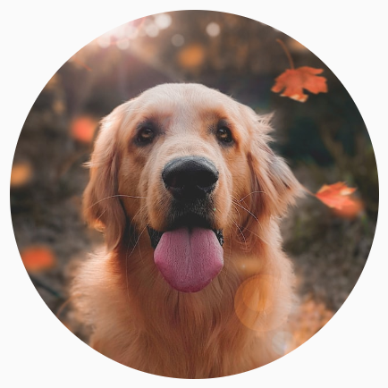
CircleShape を使用して画像をクリップする。角を丸くするには、Modifier.clip(RoundedCornerShape(16.dp) を使って、丸くする角のサイズを指定します。
Image( painter = painterResource(id = R.drawable.dog), contentDescription = stringResource(id = R.string.dog_content_description), contentScale = ContentScale.Crop, modifier = Modifier .size(200.dp) .clip(RoundedCornerShape(16.dp)) )
RoundedCornerShape を使用して画像をクリップする。Shape を拡張して Path を指定し、画像を独自の形にクリップすることもできます。
class SquashedOval : Shape { override fun createOutline( size: Size, layoutDirection: LayoutDirection, density: Density ): Outline { val path = Path().apply { // We create an Oval that starts at ¼ of the width, and ends at ¾ of the width of the container. addOval( Rect( left = size.width / 4f, top = 0f, right = size.width * 3 / 4f, bottom = size.height ) ) } return Outline.Generic(path = path) } } Image( painter = painterResource(id = R.drawable.dog), contentDescription = stringResource(id = R.string.dog_content_description), contentScale = ContentScale.Crop, modifier = Modifier .size(200.dp) .clip(SquashedOval()) )
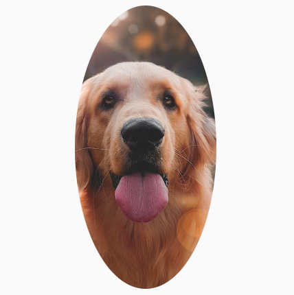
Image コンポーザブルに枠線を追加する
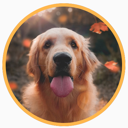
通常、画像の周囲に枠線を付けるには、Modifier.border() と Modifier.clip() を併用します。
val borderWidth = 4.dp Image( painter = painterResource(id = R.drawable.dog), contentDescription = stringResource(id = R.string.dog_content_description), contentScale = ContentScale.Crop, modifier = Modifier .size(150.dp) .border( BorderStroke(borderWidth, Color.Yellow), CircleShape ) .padding(borderWidth) .clip(CircleShape) )
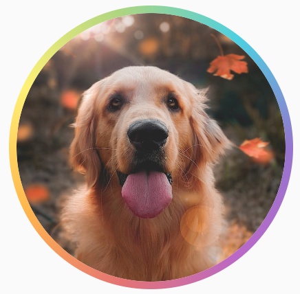
グラデーションの枠を作成する場合は、Brush API を使用すれば、画像の周囲に虹色にグラデーションする枠線を描画できます。
val rainbowColorsBrush = remember { Brush.sweepGradient( listOf( Color(0xFF9575CD), Color(0xFFBA68C8), Color(0xFFE57373), Color(0xFFFFB74D), Color(0xFFFFF176), Color(0xFFAED581), Color(0xFF4DD0E1), Color(0xFF9575CD) ) ) } val borderWidth = 4.dp Image( painter = painterResource(id = R.drawable.dog), contentDescription = stringResource(id = R.string.dog_content_description), contentScale = ContentScale.Crop, modifier = Modifier .size(150.dp) .border( BorderStroke(borderWidth, rainbowColorsBrush), CircleShape ) .padding(borderWidth) .clip(CircleShape) )
カスタム アスペクト比を設定する
画像をカスタム アスペクト比に変換するには、Modifier.aspectRatio(16f/9f) を使用して画像(または任意のコンポーザブル)にカスタム比率を指定します。
Image( painter = painterResource(id = R.drawable.dog), contentDescription = stringResource(id = R.string.dog_content_description), modifier = Modifier.aspectRatio(16f / 9f) )
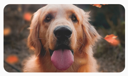
Image で Modifier.aspectRatio(16f/9f) を使用する。カラーフィルタ: 画像のピクセルカラーを変換する
Image コンポーザブルには、画像の各ピクセルの出力を変更できる colorFilter パラメータが用意されています。
画像の色合いを調整する
ColorFilter.tint(color, blendMode) を使用すると、指定された色のブレンドモードが Image コンポーザブルに適用されます。ColorFilter.tint(color, blendMode)
は、BlendMode.SrcIn を使用してコンテンツの色合いを調整します。つまり、画像が表示される画面が、指定した色になります。これは、異なるテーマを設定する必要があるアイコンやベクターに役立ちます。
Image( painter = painterResource(id = R.drawable.baseline_directions_bus_24), contentDescription = stringResource(id = R.string.bus_content_description), colorFilter = ColorFilter.tint(Color.Yellow) )

BlendMode.SrcIn を適用した ColorFilter.tint。BlendMode を追加すると、設定によって異なる効果が画像に適用されます。たとえば、Color.Green を指定して BlendMode.Darken を設定すると、次のような画像になります。
Image( painter = painterResource(id = R.drawable.dog), contentDescription = stringResource(id = R.string.dog_content_description), colorFilter = ColorFilter.tint(Color.Green, blendMode = BlendMode.Darken) )
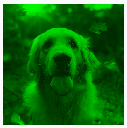
BlendMode.Darken を指定した Color.Green tint。利用可能な各種 BlendMode の詳細については、BlendMode リファレンス ドキュメントをご覧ください。
カラー マトリックスを使用して Image フィルタを適用する
カラー マトリックス ColorFilter オプションを使用して画像を変換します。たとえば、
画像にモノクロ フィルタを適用するには、
ColorMatrix を使用して、彩度を 0f に設定します。
Image( painter = painterResource(id = R.drawable.dog), contentDescription = stringResource(id = R.string.dog_content_description), colorFilter = ColorFilter.colorMatrix(ColorMatrix().apply { setToSaturation(0f) }) )
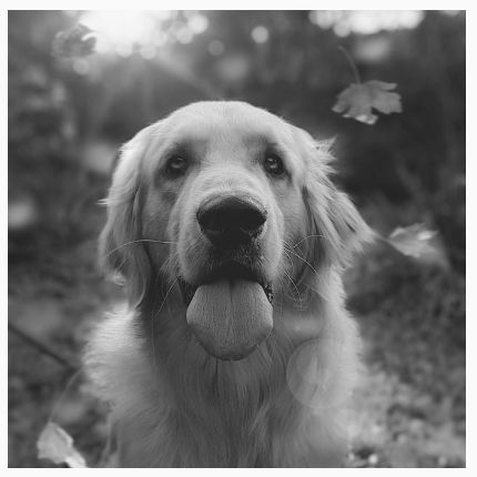
Image コンポーザブルのコントラストや明るさを調整する
画像のコントラストと明るさを変更するには、
ColorMatrix を使用して値を変更します。
val contrast = 2f // 0f..10f (1 should be default) val brightness = -180f // -255f..255f (0 should be default) val colorMatrix = floatArrayOf( contrast, 0f, 0f, 0f, brightness, 0f, contrast, 0f, 0f, brightness, 0f, 0f, contrast, 0f, brightness, 0f, 0f, 0f, 1f, 0f ) Image( painter = painterResource(id = R.drawable.dog), contentDescription = stringResource(id = R.string.dog_content_description), colorFilter = ColorFilter.colorMatrix(ColorMatrix(colorMatrix)) )
ColorMatrix を使用して調整した画像の明るさとコントラスト。Image コンポーザブルの色を反転する
画像の色を反転するには、ColorMatrix を設定します。
val colorMatrix = floatArrayOf( -1f, 0f, 0f, 0f, 255f, 0f, -1f, 0f, 0f, 255f, 0f, 0f, -1f, 0f, 255f, 0f, 0f, 0f, 1f, 0f ) Image( painter = painterResource(id = R.drawable.dog), contentDescription = stringResource(id = R.string.dog_content_description), colorFilter = ColorFilter.colorMatrix(ColorMatrix(colorMatrix)) )
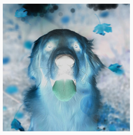
Image コンポーザブルをぼかす
画像をぼかすには、Modifier.blur() を使用します。radiusX と radiusY を指定して、ぼかす範囲の半径を水平方向と垂直方向のそれぞれで指定します。
Image( painter = painterResource(id = R.drawable.dog), contentDescription = stringResource(id = R.string.dog_content_description), contentScale = ContentScale.Crop, modifier = Modifier .size(150.dp) .blur( radiusX = 10.dp, radiusY = 10.dp, edgeTreatment = BlurredEdgeTreatment(RoundedCornerShape(8.dp)) ) )
BlurEffect 画像に適用されました。Images をぼかす場合は、BlurredEdgeTreatment.Unbounded ではなく BlurredEdgeTreatment(Shape) を使用することをおすすめします。後者は、元のコンテンツの境界を超えてレンダリングする画像にぼかしを入れる場合に使用します。画像の場合、コンテンツの境界外にレンダリングすることは少ないかもしれませんが、角丸の長方形をぼかす際には、両者を区別して使用することが必要になる場合があります。
たとえば、上記の画像で BlurredEdgeTreatment を Unbounded に設定すると、画像の境界がはっきりせずにぼやけて表示されます。
Image( painter = painterResource(id = R.drawable.dog), contentDescription = stringResource(id = R.string.dog_content_description), contentScale = ContentScale.Crop, modifier = Modifier .size(150.dp) .blur( radiusX = 10.dp, radiusY = 10.dp, edgeTreatment = BlurredEdgeTreatment.Unbounded ) .clip(RoundedCornerShape(8.dp)) )
BlurEdgeTreatment.Unbounded。あなたへのおすすめ
- 注: JavaScript がオフになっている場合はリンクテキストが表示されます
- グラフィック修飾子
- 画像を読み込む
- マテリアル アイコン