分隔線是細線,可分隔清單或其他容器中的項目。您可以使用 HorizontalDivider 和 VerticalDivider 可組合函式,在應用程式中實作分隔線。
HorizontalDivider:分隔資料欄中的項目。VerticalDivider:分隔同一列中的項目。
API 介面
這兩個元件都提供可修改外觀的參數:
thickness:使用這個參數指定分隔線的粗細。color:使用這個參數指定分隔線的顏色。
水平分隔線範例
以下範例示範如何實作 HorizontalDivider 元件。它會使用 thickness 參數控制行高:
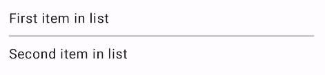
@Composable fun HorizontalDividerExample() { Column( verticalArrangement = Arrangement.spacedBy(8.dp), ) { Text("First item in list") HorizontalDivider(thickness = 2.dp) Text("Second item in list") } }
這項實作會在兩個文字元件之間算繪細細的水平線:
垂直分隔線範例
以下範例示範如何實作 VerticalDivider 元件。它會使用 color 參數為線條提供自訂顏色:
@Composable fun VerticalDividerExample() { Row( modifier = Modifier .fillMaxWidth() .height(IntrinsicSize.Min), horizontalArrangement = Arrangement.SpaceEvenly ) { Text("First item in row") VerticalDivider(color = MaterialTheme.colorScheme.secondary) Text("Second item in row") } }
這項實作會在兩個文字元件之間算繪細細的垂直線: