
You can customize images using properties on an Image composable
(contentScale, colorFilter). You can also apply existing modifiers
to apply different effects to your Image. Modifiers can be used on any
composable, not just the Image composable, whereas contentScale and
colorFilter are explicit parameters on the Image composable.
Content scale
Specify a contentScale option to crop or change how an image is scaled inside
its bounds. By default, if you don't specify a contentScale option,
ContentScale.Fit is used.
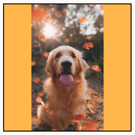
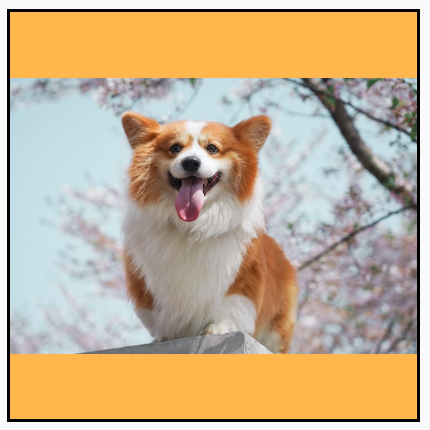
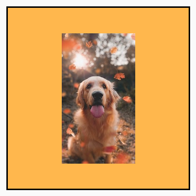
In the following example, the Image composable is restricted to a 150dp size
with a border, and the background is set to yellow on the Image composable to
showcase the different ContentScale options in the following table.
val imageModifier = Modifier .size(150.dp) .border(BorderStroke(1.dp, Color.Black)) .background(Color.Yellow) Image( painter = painterResource(id = R.drawable.dog), contentDescription = stringResource(id = R.string.dog_content_description), contentScale = ContentScale.Fit, modifier = imageModifier )
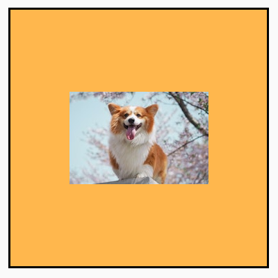
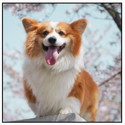
Setting different ContentScale options results in different outputs. The
following table helps you choose the correct ContentScale mode:
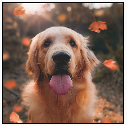
| Source image |
|
|
ContentScale |
Result - Portrait Image: | Result - Landscape Image: |
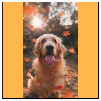
ContentScale.Fit: Scale the image uniformly, keeping the aspect ratio (default). If content is smaller than the size, the image is scaled up to fit the bounds. |
|
|
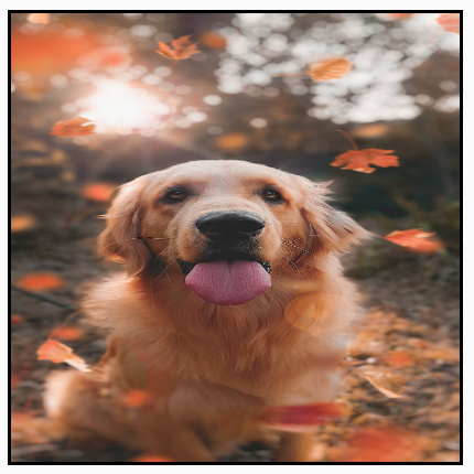
ContentScale.Crop: Center crop the image into the available space. |
|

|
ContentScale.FillHeight: Scale the source maintaining the aspect ratio so that the bounds match the destination height. |
|

|
ContentScale.FillWidth: Scale the source maintaining the aspect ratio so that the bounds match the destination width. |

|

|
ContentScale.FillBounds: Scale the content vertically and horizontally non-uniformly to fill the destination bounds. (Note: This distorts images if you place them in containers that don't match the exact ratio of the image). |
|
|
ContentScale.Inside: Scale the source to maintain the aspect ratio inside the destination bounds. If the source is smaller than or equal to the destination in both dimensions, it behaves similarly to None. Content will always be contained within the bounds. If content is smaller than bounds, no scaling will apply. |
Source image bigger than bounds:
 Source image smaller than bounds:
|
Source image bigger than bounds:
 Source image smaller than bounds:
|
ContentScale.None: Don't apply any scaling to the source. If the content is smaller than destination bounds, it won't be scaled up to fit the area. |
Source image bigger than bounds:
 Source image smaller than bounds:
|
Source image bigger than bounds:
 Source image smaller than bounds:
|
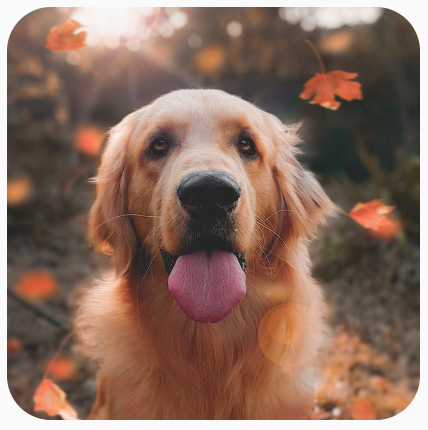
Clip an Image composable to a shape
To make an image fit into a shape, use the built-in clip modifier.
To crop an image into a circle shape, use Modifier.clip(CircleShape):
Image( painter = painterResource(id = R.drawable.dog), contentDescription = stringResource(id = R.string.dog_content_description), contentScale = ContentScale.Crop, modifier = Modifier .size(200.dp) .clip(CircleShape) )
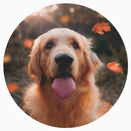
CircleShape.For a rounded corner shape, use Modifier.clip(RoundedCornerShape(16.dp)), with
the size of the corners you want to be rounded:
Image( painter = painterResource(id = R.drawable.dog), contentDescription = stringResource(id = R.string.dog_content_description), contentScale = ContentScale.Crop, modifier = Modifier .size(200.dp) .clip(RoundedCornerShape(16.dp)) )
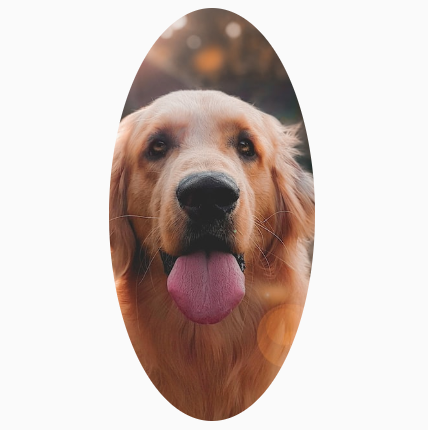
RoundedCornerShape.You can also create your own clipping shape by extending Shape, and providing
a Path for the shape to clip around:
class SquashedOval : Shape { override fun createOutline( size: Size, layoutDirection: LayoutDirection, density: Density ): Outline { val path = Path().apply { // We create an Oval that starts at ¼ of the width, and ends at ¾ of the width of the container. addOval( Rect( left = size.width / 4f, top = 0f, right = size.width * 3 / 4f, bottom = size.height ) ) } return Outline.Generic(path = path) } } Image( painter = painterResource(id = R.drawable.dog), contentDescription = stringResource(id = R.string.dog_content_description), contentScale = ContentScale.Crop, modifier = Modifier .size(200.dp) .clip(SquashedOval()) )
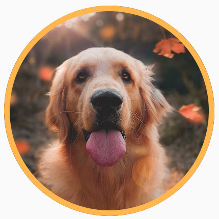
Add a border to an Image composable
A common operation is to combine the Modifier.border() with Modifier.clip()
to create a border around an image:
val borderWidth = 4.dp Image( painter = painterResource(id = R.drawable.dog), contentDescription = stringResource(id = R.string.dog_content_description), contentScale = ContentScale.Crop, modifier = Modifier .size(150.dp) .border( BorderStroke(borderWidth, Color.Yellow), CircleShape ) .padding(borderWidth) .clip(CircleShape) )
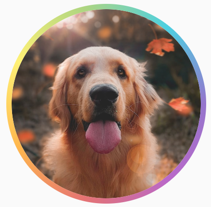
To create a gradient border, you can use the Brush API to
draw a rainbow gradient border around the image:
val rainbowColorsBrush = remember { Brush.sweepGradient( listOf( Color(0xFF9575CD), Color(0xFFBA68C8), Color(0xFFE57373), Color(0xFFFFB74D), Color(0xFFFFF176), Color(0xFFAED581), Color(0xFF4DD0E1), Color(0xFF9575CD) ) ) } val borderWidth = 4.dp Image( painter = painterResource(id = R.drawable.dog), contentDescription = stringResource(id = R.string.dog_content_description), contentScale = ContentScale.Crop, modifier = Modifier .size(150.dp) .border( BorderStroke(borderWidth, rainbowColorsBrush), CircleShape ) .padding(borderWidth) .clip(CircleShape) )
Set a custom aspect ratio
To transform an image into a custom aspect ratio, use
Modifier.aspectRatio(16f/9f) to provide a custom ratio for an image (or any
composable).
Image( painter = painterResource(id = R.drawable.dog), contentDescription = stringResource(id = R.string.dog_content_description), modifier = Modifier.aspectRatio(16f / 9f) )
Modifier.aspectRatio(16f/9f) on an Image.Color filter: transform pixel colors of image
The Image composable has a colorFilter parameter that can change the output
of individual pixels of your image.
Tint images
Using ColorFilter.tint(color, blendMode) applies a blend mode with the
given color onto your Image composable. ColorFilter.tint(color, blendMode)
uses BlendMode.SrcIn to tint content, meaning that the color supplied is
shown where the image is displayed on screen. This is useful for icons and
vectors that need to be themed differently.
Image( painter = painterResource(id = R.drawable.baseline_directions_bus_24), contentDescription = stringResource(id = R.string.bus_content_description), colorFilter = ColorFilter.tint(Color.Yellow) )

ColorFilter.tint applied with BlendMode.SrcIn.Other BlendModes result in different effects. For example, setting
BlendMode.Darken with a Color.Green on an image produces the following
result:
Image( painter = painterResource(id = R.drawable.dog), contentDescription = stringResource(id = R.string.dog_content_description), colorFilter = ColorFilter.tint(Color.Green, blendMode = BlendMode.Darken) )
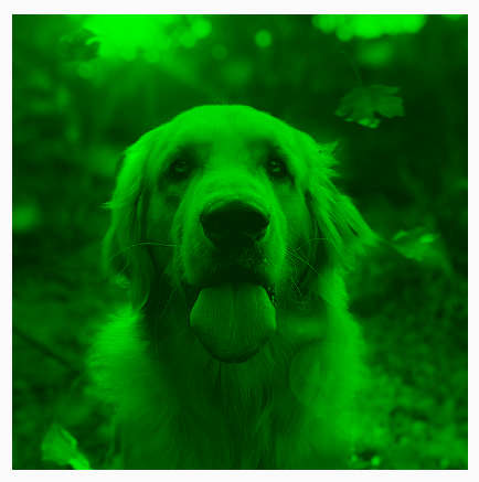
Color.Green tint with BlendMode.Darken.See the BlendMode reference documentation for more information on the
different blend modes available.
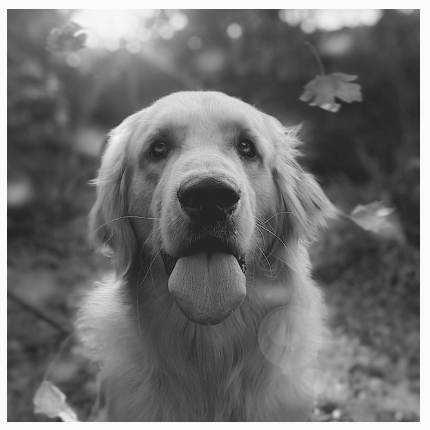
Apply an Image filter with color matrix
Transform your image using the color matrix ColorFilter option. For example,
to apply a black and white filter onto your images you could use the
ColorMatrix and set the saturation to 0f.
Image( painter = painterResource(id = R.drawable.dog), contentDescription = stringResource(id = R.string.dog_content_description), colorFilter = ColorFilter.colorMatrix(ColorMatrix().apply { setToSaturation(0f) }) )
Adjust contrast or brightness of an Image composable
To change the contrast and brightness of an image, you can use the
ColorMatrix to change the values:
val contrast = 2f // 0f..10f (1 should be default) val brightness = -180f // -255f..255f (0 should be default) val colorMatrix = floatArrayOf( contrast, 0f, 0f, 0f, brightness, 0f, contrast, 0f, 0f, brightness, 0f, 0f, contrast, 0f, brightness, 0f, 0f, 0f, 1f, 0f ) Image( painter = painterResource(id = R.drawable.dog), contentDescription = stringResource(id = R.string.dog_content_description), colorFilter = ColorFilter.colorMatrix(ColorMatrix(colorMatrix)) )
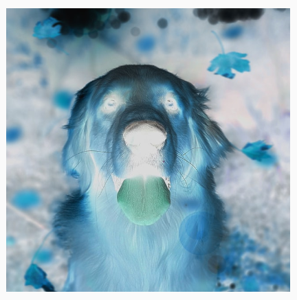
ColorMatrix.Invert colors of an Image composable
To invert the colors of an image, set the ColorMatrix to invert the
colors:
val colorMatrix = floatArrayOf( -1f, 0f, 0f, 0f, 255f, 0f, -1f, 0f, 0f, 255f, 0f, 0f, -1f, 0f, 255f, 0f, 0f, 0f, 1f, 0f ) Image( painter = painterResource(id = R.drawable.dog), contentDescription = stringResource(id = R.string.dog_content_description), colorFilter = ColorFilter.colorMatrix(ColorMatrix(colorMatrix)) )
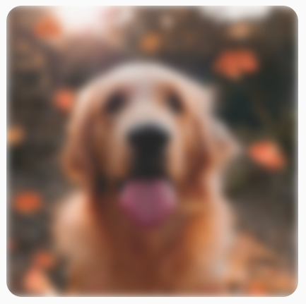
Blur an Image composable
To blur an image, use Modifier.blur(), supplying the radiusX and radiusY,
which specifies the blur radius in the horizontal and vertical direction
respectively.
Image( painter = painterResource(id = R.drawable.dog), contentDescription = stringResource(id = R.string.dog_content_description), contentScale = ContentScale.Crop, modifier = Modifier .size(150.dp) .blur( radiusX = 10.dp, radiusY = 10.dp, edgeTreatment = BlurredEdgeTreatment(RoundedCornerShape(8.dp)) ) )
BlurEffect applied to an image.When blurring Images, it is recommended to use BlurredEdgeTreatment(Shape),
instead of BlurredEdgeTreatment.Unbounded, as the latter is used for blurring
of arbitrary renderings that are expected to render outside the bounds of the
original content. For images, it is likely that they won't render outside the
bounds of the content, whereas blurring a rounded rectangle may require this
distinction.
For example, if we set the BlurredEdgeTreatment to Unbounded on the
preceding image, the edges of the image appear blurred instead of sharp:
Image( painter = painterResource(id = R.drawable.dog), contentDescription = stringResource(id = R.string.dog_content_description), contentScale = ContentScale.Crop, modifier = Modifier .size(150.dp) .blur( radiusX = 10.dp, radiusY = 10.dp, edgeTreatment = BlurredEdgeTreatment.Unbounded ) .clip(RoundedCornerShape(8.dp)) )
BlurEdgeTreatment.Unbounded.Recommended for you
- Note: link text is displayed when JavaScript is off
- Graphics Modifiers
- Loading images
- Material icons