
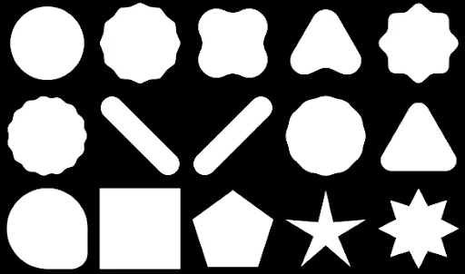
您可以使用 Compose 建立由多邊形組成的形狀。舉例來說,您可以繪製下列形狀:
如要在 Compose 中建立自訂圓角多邊形,請將 graphics-shapes 依附元件新增至 app/build.gradle:
implementation "androidx.graphics:graphics-shapes:1.0.1"
這個程式庫可讓您建立由多邊形組成的形狀。多邊形只有直邊和銳角,但這些形狀可選擇使用圓角。輕鬆在兩個不同形狀之間變形。任意形狀之間的變形很困難,而且往往是設計階段的問題。不過,這個程式庫會在這兩個形狀之間變形,簡化這個過程。
建立多邊形
下列程式碼片段會在繪圖區域中央建立含有 6 個點的基本多邊形:
Box( modifier = Modifier .drawWithCache { val roundedPolygon = RoundedPolygon( numVertices = 6, radius = size.minDimension / 2, centerX = size.width / 2, centerY = size.height / 2 ) val roundedPolygonPath = roundedPolygon.toPath().asComposePath() onDrawBehind { drawPath(roundedPolygonPath, color = Color.Blue) } } .fillMaxSize() )
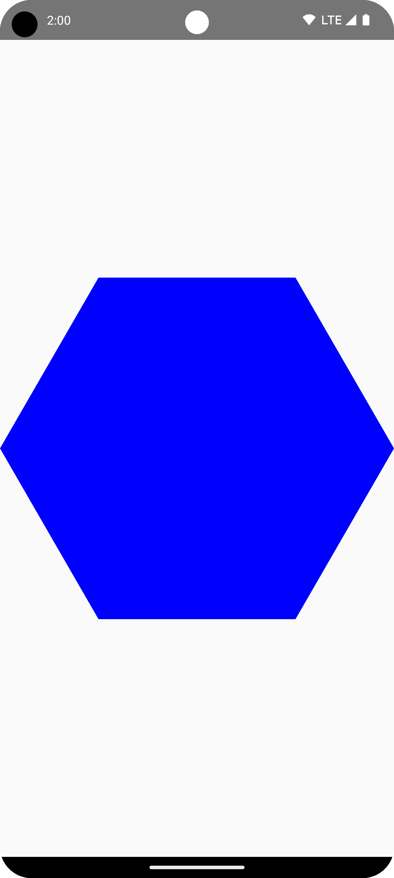
在本例中,程式庫會建立 RoundedPolygon,其中包含代表所要求形狀的幾何圖形。如要在 Compose 應用程式中繪製該形狀,您必須從中取得 Path 物件,將形狀轉換為 Compose 可繪製的形式。
將多邊形的角設為圓角
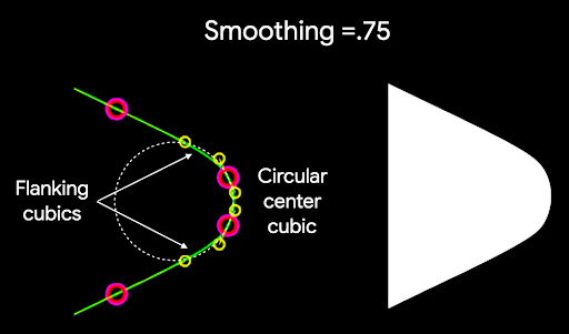
如要將多邊形的角變圓,請使用 CornerRounding 參數。這個函式會採用兩個參數:radius 和 smoothing。每個圓角都由 1 到 3 個三次曲線組成,中心為圓弧形,兩側的「側翼」曲線則從形狀邊緣過渡到中心曲線。
Radius
radius 是用於將頂點圓角化的圓形半徑。
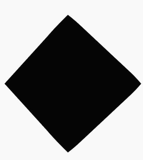
舉例來說,以下圓角三角形的製作方式如下:

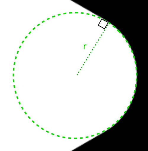
r 決定圓角的圓弧大小。平滑
平滑度是決定從圓角部分到邊緣所需時間的因素。平滑化係數為 0 (未平滑化,CornerRounding 的預設值) 時,會產生純圓形圓角。如果平滑化因數不為零 (最高為 1.0),則會以三條不同的曲線將圓角圓滑化。
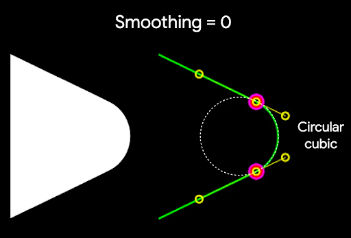
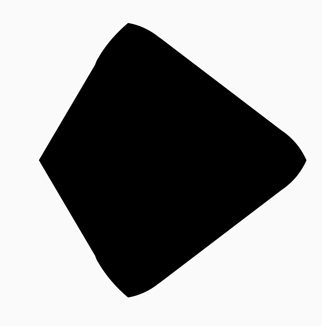
舉例來說,以下程式碼片段說明將平滑度設為 0 與 1 的細微差異:
Box( modifier = Modifier .drawWithCache { val roundedPolygon = RoundedPolygon( numVertices = 3, radius = size.minDimension / 2, centerX = size.width / 2, centerY = size.height / 2, rounding = CornerRounding( size.minDimension / 10f, smoothing = 0.1f ) ) val roundedPolygonPath = roundedPolygon.toPath().asComposePath() onDrawBehind { drawPath(roundedPolygonPath, color = Color.Black) } } .size(100.dp) )

大小和位置
根據預設,系統會以中心 (0, 0) 為圓心,建立半徑為 1 的形狀。這個半徑代表中心與形狀所依據多邊形外部頂點之間的距離。請注意,圓角會導致形狀變小,因為圓角會比圓角頂點更靠近中心。如要調整多邊形大小,請調整 radius 值。如要調整位置,請變更多邊形的 centerX 或 centerY。
或者,您也可以使用標準 DrawScope 轉換函式 (例如 DrawScope#translate()) 轉換物件,變更物件的大小、位置和旋轉角度。
漸變形狀
Morph 物件是新形狀,代表兩個多邊形之間的動畫。如要在兩個形狀之間變形,請建立兩個 RoundedPolygons 和一個採用這兩個形狀的 Morph 物件。如要計算開始和結束形狀之間的形狀,請提供介於零和一之間的 progress 值,以決定開始 (0) 和結束 (1) 形狀之間的形狀:
Box( modifier = Modifier .drawWithCache { val triangle = RoundedPolygon( numVertices = 3, radius = size.minDimension / 2f, centerX = size.width / 2f, centerY = size.height / 2f, rounding = CornerRounding( size.minDimension / 10f, smoothing = 0.1f ) ) val square = RoundedPolygon( numVertices = 4, radius = size.minDimension / 2f, centerX = size.width / 2f, centerY = size.height / 2f ) val morph = Morph(start = triangle, end = square) val morphPath = morph .toPath(progress = 0.5f).asComposePath() onDrawBehind { drawPath(morphPath, color = Color.Black) } } .fillMaxSize() )
在上述範例中,進度正好介於兩個形狀 (圓角三角形和正方形) 之間,產生以下結果:
在大多數情況下,變形是動畫的一部分,而不只是靜態算繪。如要在這兩者之間製作動畫,可以使用 Compose 中的標準動畫 API,隨著時間變更進度值。舉例來說,您可以無限次數地在這兩個形狀之間變形,如下所示:
val infiniteAnimation = rememberInfiniteTransition(label = "infinite animation") val morphProgress = infiniteAnimation.animateFloat( initialValue = 0f, targetValue = 1f, animationSpec = infiniteRepeatable( tween(500), repeatMode = RepeatMode.Reverse ), label = "morph" ) Box( modifier = Modifier .drawWithCache { val triangle = RoundedPolygon( numVertices = 3, radius = size.minDimension / 2f, centerX = size.width / 2f, centerY = size.height / 2f, rounding = CornerRounding( size.minDimension / 10f, smoothing = 0.1f ) ) val square = RoundedPolygon( numVertices = 4, radius = size.minDimension / 2f, centerX = size.width / 2f, centerY = size.height / 2f ) val morph = Morph(start = triangle, end = square) val morphPath = morph .toPath(progress = morphProgress.value) .asComposePath() onDrawBehind { drawPath(morphPath, color = Color.Black) } } .fillMaxSize() )
使用多邊形做為裁剪範圍
在 Compose 中,通常會使用 clip 修飾符變更可組合項的算繪方式,並利用繪製在裁剪區域周圍的陰影:
fun RoundedPolygon.getBounds() = calculateBounds().let { Rect(it[0], it[1], it[2], it[3]) } class RoundedPolygonShape( private val polygon: RoundedPolygon, private var matrix: Matrix = Matrix() ) : Shape { private var path = Path() override fun createOutline( size: Size, layoutDirection: LayoutDirection, density: Density ): Outline { path.rewind() path = polygon.toPath().asComposePath() matrix.reset() val bounds = polygon.getBounds() val maxDimension = max(bounds.width, bounds.height) matrix.scale(size.width / maxDimension, size.height / maxDimension) matrix.translate(-bounds.left, -bounds.top) path.transform(matrix) return Outline.Generic(path) } }
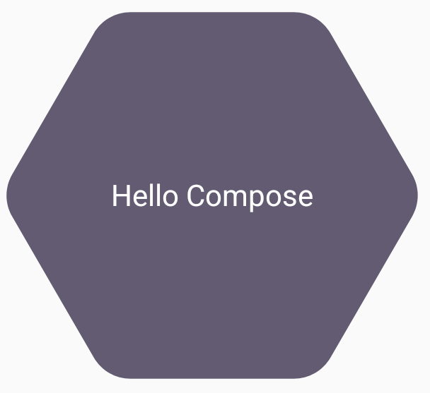
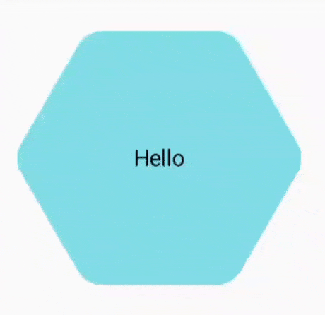
接著,您可以使用多邊形做為剪輯片段,如下列程式碼片段所示:
val hexagon = remember { RoundedPolygon( 6, rounding = CornerRounding(0.2f) ) } val clip = remember(hexagon) { RoundedPolygonShape(polygon = hexagon) } Box( modifier = Modifier .clip(clip) .background(MaterialTheme.colorScheme.secondary) .size(200.dp) ) { Text( "Hello Compose", color = MaterialTheme.colorScheme.onSecondary, modifier = Modifier.align(Alignment.Center) ) }
這會產生下列結果:
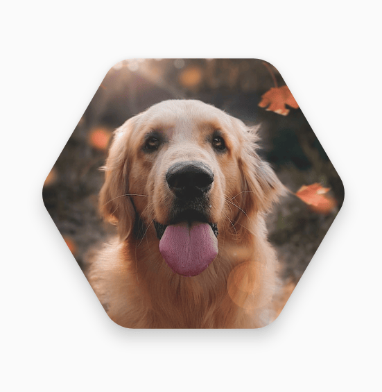
這可能與先前的算繪結果沒有太大差異,但可讓您運用 Compose 中的其他功能。舉例來說,這項技術可用於裁剪圖片,並在裁剪區域周圍套用陰影:
val hexagon = remember { RoundedPolygon( 6, rounding = CornerRounding(0.2f) ) } val clip = remember(hexagon) { RoundedPolygonShape(polygon = hexagon) } Box( modifier = Modifier.fillMaxSize(), contentAlignment = Alignment.Center ) { Image( painter = painterResource(id = R.drawable.dog), contentDescription = "Dog", contentScale = ContentScale.Crop, modifier = Modifier .graphicsLayer { this.shadowElevation = 6.dp.toPx() this.shape = clip this.clip = true this.ambientShadowColor = Color.Black this.spotShadowColor = Color.Black } .size(200.dp) ) }
點選時變形按鈕
您可以使用 graphics-shape 程式庫建立按鈕,在按下時變換兩種形狀。首先,請建立擴充 Shape 的 MorphPolygonShape,並縮放及轉譯該 MorphPolygonShape,使其適當調整大小。請注意傳遞的進度,以便動畫呈現形狀:
class MorphPolygonShape( private val morph: Morph, private val percentage: Float ) : Shape { private val matrix = Matrix() override fun createOutline( size: Size, layoutDirection: LayoutDirection, density: Density ): Outline { // Below assumes that you haven't changed the default radius of 1f, nor the centerX and centerY of 0f // By default this stretches the path to the size of the container, if you don't want stretching, use the same size.width for both x and y. matrix.scale(size.width / 2f, size.height / 2f) matrix.translate(1f, 1f) val path = morph.toPath(progress = percentage).asComposePath() path.transform(matrix) return Outline.Generic(path) } }
如要使用這個變形形狀,請建立兩個多邊形:shapeA 和 shapeB。建立並記住 Morph。接著,將變形效果套用至按鈕做為剪輯路徑,並使用 interactionSource 做為動畫的驅動力:
val shapeA = remember { RoundedPolygon( 6, rounding = CornerRounding(0.2f) ) } val shapeB = remember { RoundedPolygon.star( 6, rounding = CornerRounding(0.1f) ) } val morph = remember { Morph(shapeA, shapeB) } val interactionSource = remember { MutableInteractionSource() } val isPressed by interactionSource.collectIsPressedAsState() val animatedProgress = animateFloatAsState( targetValue = if (isPressed) 1f else 0f, label = "progress", animationSpec = spring(dampingRatio = 0.4f, stiffness = Spring.StiffnessMedium) ) Box( modifier = Modifier .size(200.dp) .padding(8.dp) .clip(MorphPolygonShape(morph, animatedProgress.value)) .background(Color(0xFF80DEEA)) .size(200.dp) .clickable(interactionSource = interactionSource, indication = null) { } ) { Text("Hello", modifier = Modifier.align(Alignment.Center)) }
輕觸方塊時,會產生下列動畫:
無限循環播放形狀變形動畫
如要無限循環播放變形形狀的動畫,請使用
rememberInfiniteTransition。
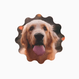
以下是個人資料相片的範例,相片會隨著時間無限變換形狀 (並旋轉)。這個方法會對上方顯示的 MorphPolygonShape 進行小幅調整:
class CustomRotatingMorphShape( private val morph: Morph, private val percentage: Float, private val rotation: Float ) : Shape { private val matrix = Matrix() override fun createOutline( size: Size, layoutDirection: LayoutDirection, density: Density ): Outline { // Below assumes that you haven't changed the default radius of 1f, nor the centerX and centerY of 0f // By default this stretches the path to the size of the container, if you don't want stretching, use the same size.width for both x and y. matrix.scale(size.width / 2f, size.height / 2f) matrix.translate(1f, 1f) matrix.rotateZ(rotation) val path = morph.toPath(progress = percentage).asComposePath() path.transform(matrix) return Outline.Generic(path) } } @Preview @Composable private fun RotatingScallopedProfilePic() { val shapeA = remember { RoundedPolygon( 12, rounding = CornerRounding(0.2f) ) } val shapeB = remember { RoundedPolygon.star( 12, rounding = CornerRounding(0.2f) ) } val morph = remember { Morph(shapeA, shapeB) } val infiniteTransition = rememberInfiniteTransition("infinite outline movement") val animatedProgress = infiniteTransition.animateFloat( initialValue = 0f, targetValue = 1f, animationSpec = infiniteRepeatable( tween(2000, easing = LinearEasing), repeatMode = RepeatMode.Reverse ), label = "animatedMorphProgress" ) val animatedRotation = infiniteTransition.animateFloat( initialValue = 0f, targetValue = 360f, animationSpec = infiniteRepeatable( tween(6000, easing = LinearEasing), repeatMode = RepeatMode.Reverse ), label = "animatedMorphProgress" ) Box( modifier = Modifier.fillMaxSize(), contentAlignment = Alignment.Center ) { Image( painter = painterResource(id = R.drawable.dog), contentDescription = "Dog", contentScale = ContentScale.Crop, modifier = Modifier .clip( CustomRotatingMorphShape( morph, animatedProgress.value, animatedRotation.value ) ) .size(200.dp) ) } }
這段程式碼會產生下列有趣結果:
自訂多邊形
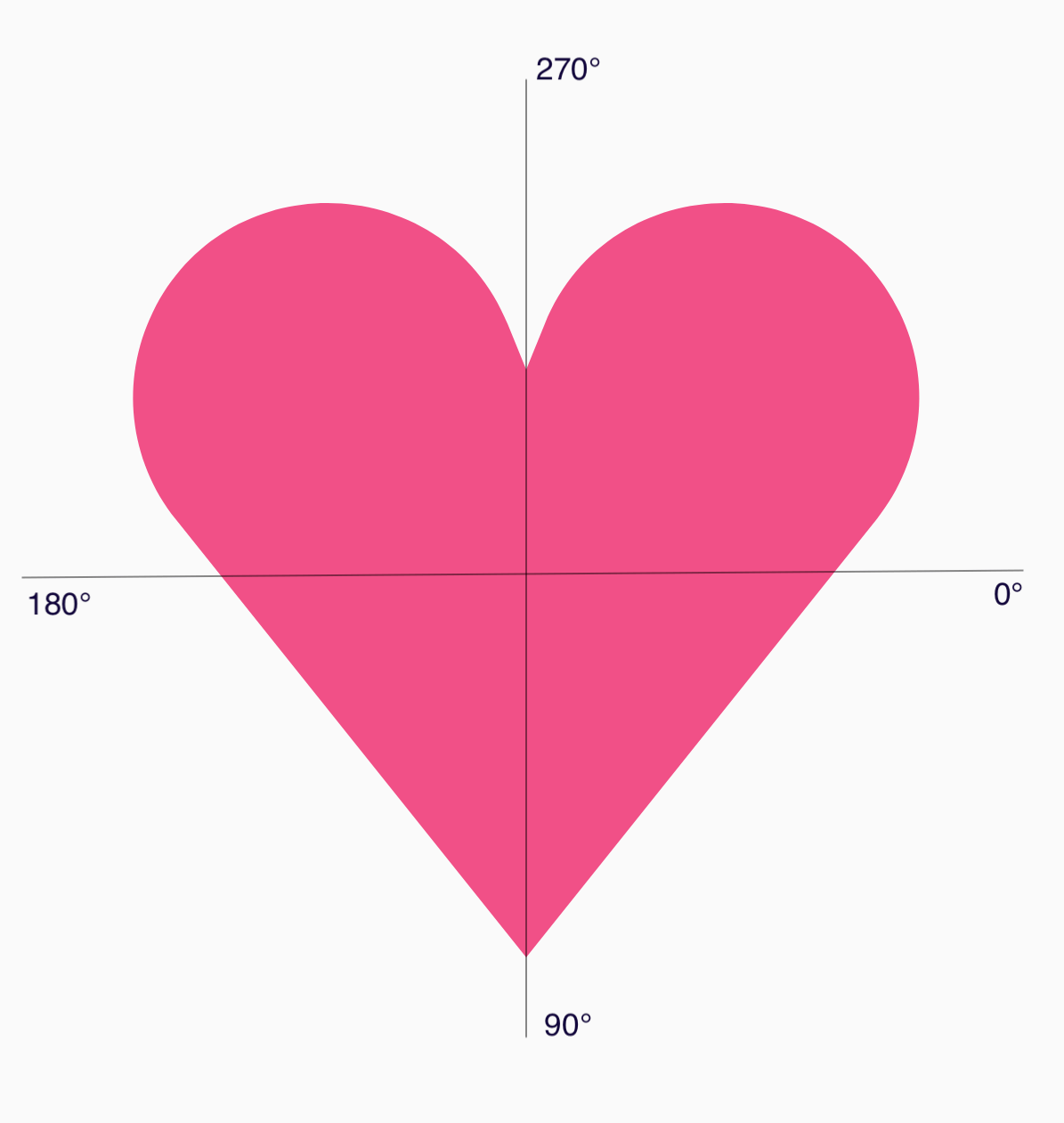
如果正多邊形建立的形狀不符合您的用途,可以透過頂點清單建立更自訂的形狀。舉例來說,您可能想建立如下所示的心形:

您可以使用 RoundedPolygon 多載,指定這個形狀的個別頂點,該多載會採用 x、y 座標的浮點陣列。
如要分解心形多邊形,請注意,指定點的極座標系統比使用笛卡兒 (x,y) 座標系統更容易,其中 0° 從右側開始,並以順時針方向繼續,270° 位於 12 點鐘位置:
現在,您可以指定每個點的角度 (𝜭) 和中心半徑,更輕鬆地定義形狀:
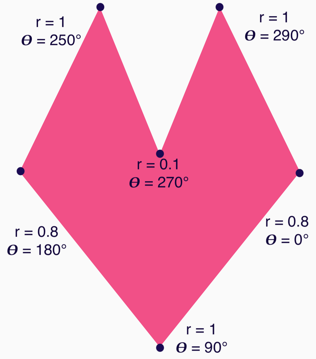
現在可以建立頂點並傳遞至 RoundedPolygon 函式:
val vertices = remember { val radius = 1f val radiusSides = 0.8f val innerRadius = .1f floatArrayOf( radialToCartesian(radiusSides, 0f.toRadians()).x, radialToCartesian(radiusSides, 0f.toRadians()).y, radialToCartesian(radius, 90f.toRadians()).x, radialToCartesian(radius, 90f.toRadians()).y, radialToCartesian(radiusSides, 180f.toRadians()).x, radialToCartesian(radiusSides, 180f.toRadians()).y, radialToCartesian(radius, 250f.toRadians()).x, radialToCartesian(radius, 250f.toRadians()).y, radialToCartesian(innerRadius, 270f.toRadians()).x, radialToCartesian(innerRadius, 270f.toRadians()).y, radialToCartesian(radius, 290f.toRadians()).x, radialToCartesian(radius, 290f.toRadians()).y, ) }
必須使用以下 radialToCartesian 函式,將頂點轉換為笛卡兒座標:
internal fun Float.toRadians() = this * PI.toFloat() / 180f internal val PointZero = PointF(0f, 0f) internal fun radialToCartesian( radius: Float, angleRadians: Float, center: PointF = PointZero ) = directionVectorPointF(angleRadians) * radius + center internal fun directionVectorPointF(angleRadians: Float) = PointF(cos(angleRadians), sin(angleRadians))
上述程式碼會提供愛心的原始頂點,但您需要將特定角點設為圓角,才能取得所選的愛心形狀。90° 和 270° 的邊角沒有圓角,但其他邊角有。如要為個別邊角設定自訂圓角,請使用 perVertexRounding 參數:
val rounding = remember { val roundingNormal = 0.6f val roundingNone = 0f listOf( CornerRounding(roundingNormal), CornerRounding(roundingNone), CornerRounding(roundingNormal), CornerRounding(roundingNormal), CornerRounding(roundingNone), CornerRounding(roundingNormal), ) } val polygon = remember(vertices, rounding) { RoundedPolygon( vertices = vertices, perVertexRounding = rounding ) } Box( modifier = Modifier .drawWithCache { val roundedPolygonPath = polygon.toPath().asComposePath() onDrawBehind { scale(size.width * 0.5f, size.width * 0.5f) { translate(size.width * 0.5f, size.height * 0.5f) { drawPath(roundedPolygonPath, color = Color(0xFFF15087)) } } } } .size(400.dp) )
這會產生粉紅色愛心:
如果上述形狀不符合您的用例,請考慮使用 Path 類別繪製自訂形狀,或從磁碟載入 ImageVector 檔案。graphics-shapes 程式庫不適用於任意形狀,而是專為簡化圓角多邊形建立作業,以及這些形狀之間的變形動畫而設計。
其他資源
如需更多資訊和範例,請參閱下列資源: