

借助 Compose,您可以创建由多边形组成的形状。例如,您可以制作以下类型的形状:
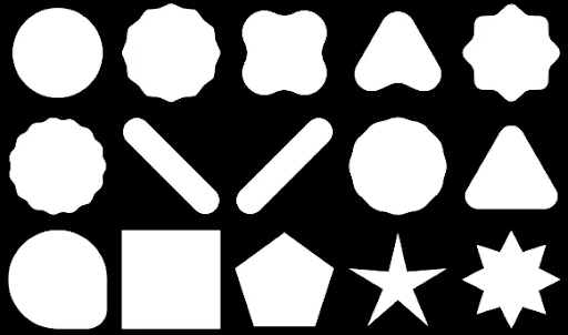
如需在 Compose 中创建自定义圆角多边形,请将 graphics-shapes 依赖项添加到 app/build.gradle:
implementation "androidx.graphics:graphics-shapes:1.0.1"
借助此库,您可以创建由多边形组成的形状。多边形只有直边和尖角,而这些形状允许使用可选的圆角。它可让您轻松在两种不同的形状之间进行变形。在任意形状之间进行变形很难,并且往往是设计时问题。但这个库通过在具有相似多边形结构的形状之间进行变形,
创建多边形
以下代码段会在绘图区域的中心创建一个包含 6 个点的基本多边形:
Box( modifier = Modifier .drawWithCache { val roundedPolygon = RoundedPolygon( numVertices = 6, radius = size.minDimension / 2, centerX = size.width / 2, centerY = size.height / 2 ) val roundedPolygonPath = roundedPolygon.toPath().asComposePath() onDrawBehind { drawPath(roundedPolygonPath, color = Color.Blue) } } .fillMaxSize() )
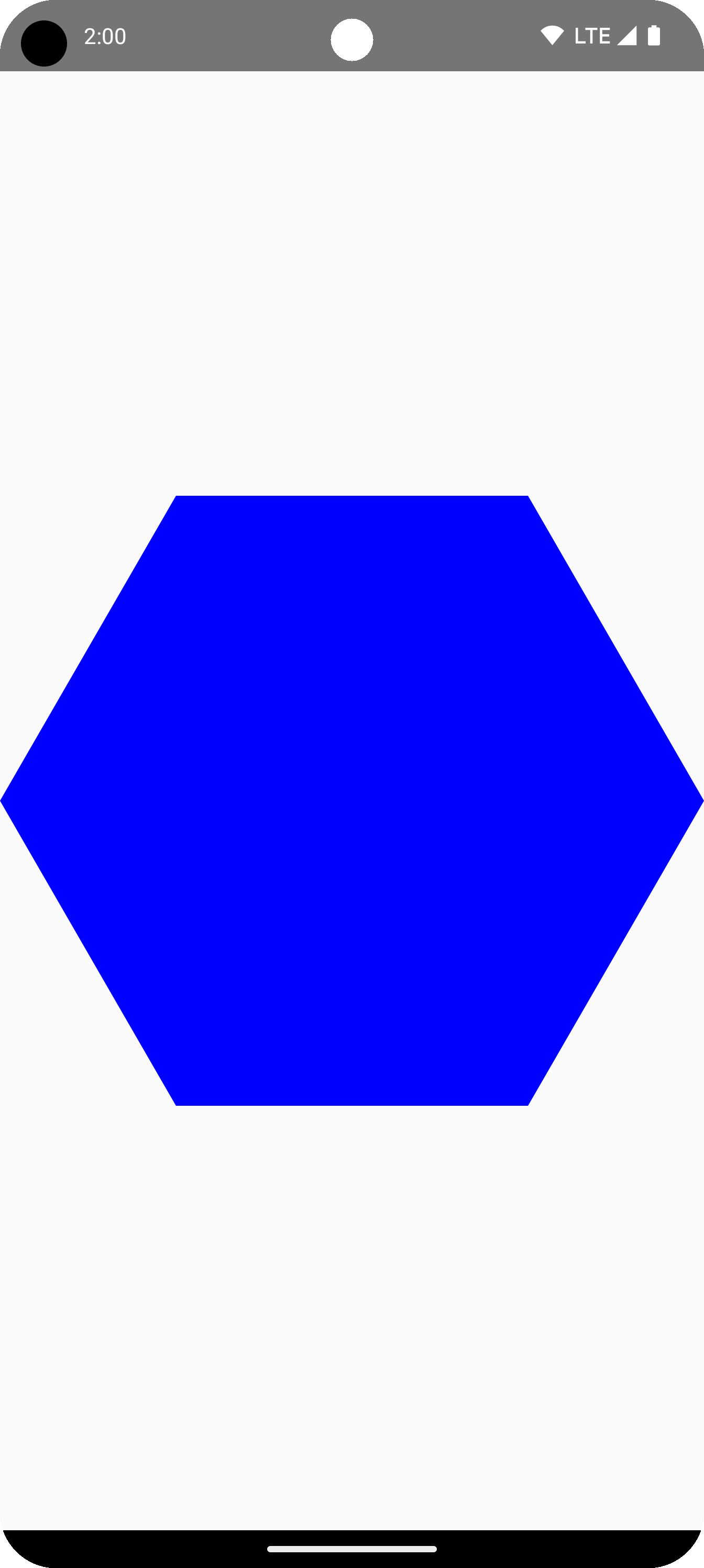
在此示例中,库会创建一个 RoundedPolygon,其中包含表示所请求形状的几何图形。如需在 Compose 应用中绘制该形状,您必须从中获取 Path 对象,以便将该形状转换为 Compose 知道如何绘制的形式。
将多边形的角设为圆角
如需将多边形的角设为圆角,请使用 CornerRounding 参数。此方法接受两个参数:radius 和 smoothing。每个圆角都由 1-3 条立方曲线组成,其中中心曲线呈圆弧形状,而两侧(“侧翼”)曲线则从形状的边缘过渡到中心曲线。
半径
radius 是用于使顶点变圆的圆的半径。
例如,以下圆角三角形的制作方法如下:

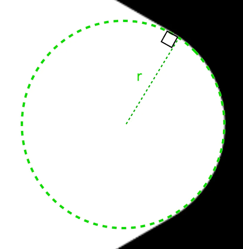
r 决定了圆角的圆形圆角大小。顺滑发丝
平滑度是一个决定从圆角的圆形圆角部分到边缘所需时间的因素。平滑因子为 0(未平滑,CornerRounding 的默认值)会产生纯圆形圆角。非零平滑因子(最大值为 1.0)会使角由三条单独的曲线进行圆角处理。
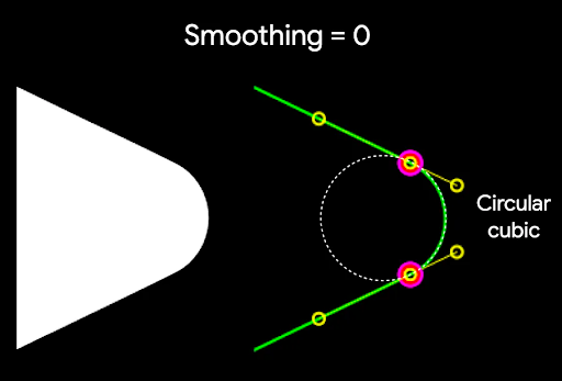
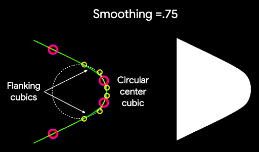
例如,以下代码段展示了将平滑度设置为 0 与 1 之间的细微差别:
Box( modifier = Modifier .drawWithCache { val roundedPolygon = RoundedPolygon( numVertices = 3, radius = size.minDimension / 2, centerX = size.width / 2, centerY = size.height / 2, rounding = CornerRounding( size.minDimension / 10f, smoothing = 0.1f ) ) val roundedPolygonPath = roundedPolygon.toPath().asComposePath() onDrawBehind { drawPath(roundedPolygonPath, color = Color.Black) } } .size(100.dp) )

尺寸和位置
默认情况下,系统会围绕中心 (0, 0) 创建一个半径为 1 的形状。此半径表示中心与形状所基于的多边形外部顶点之间的距离。请注意,圆角会导致形状变小,因为圆角会比被圆角化的顶点更靠近中心。若要调整多边形的大小,请调整 radius 值。如需调整位置,请更改多边形的 centerX 或 centerY。或者,使用标准 DrawScope 转换函数(例如 DrawScope#translate())转换对象,以更改其大小、位置和旋转。
渐变形状
Morph 对象是一种新形状,表示两个多边形形状之间的动画。如需在两个形状之间进行变形,请创建两个 RoundedPolygons 和一个接受这两个形状的 Morph 对象。如需计算起始形状和结束形状之间的形状,请提供一个介于 0 和 1 之间的 progress 值,以确定其在起始形状 (0) 和结束形状 (1) 之间的形态:
Box( modifier = Modifier .drawWithCache { val triangle = RoundedPolygon( numVertices = 3, radius = size.minDimension / 2f, centerX = size.width / 2f, centerY = size.height / 2f, rounding = CornerRounding( size.minDimension / 10f, smoothing = 0.1f ) ) val square = RoundedPolygon( numVertices = 4, radius = size.minDimension / 2f, centerX = size.width / 2f, centerY = size.height / 2f ) val morph = Morph(start = triangle, end = square) val morphPath = morph .toPath(progress = 0.5f).asComposePath() onDrawBehind { drawPath(morphPath, color = Color.Black) } } .fillMaxSize() )
在上面的示例中,进度正好位于两个形状(圆角三角形和正方形)之间,从而产生以下结果:
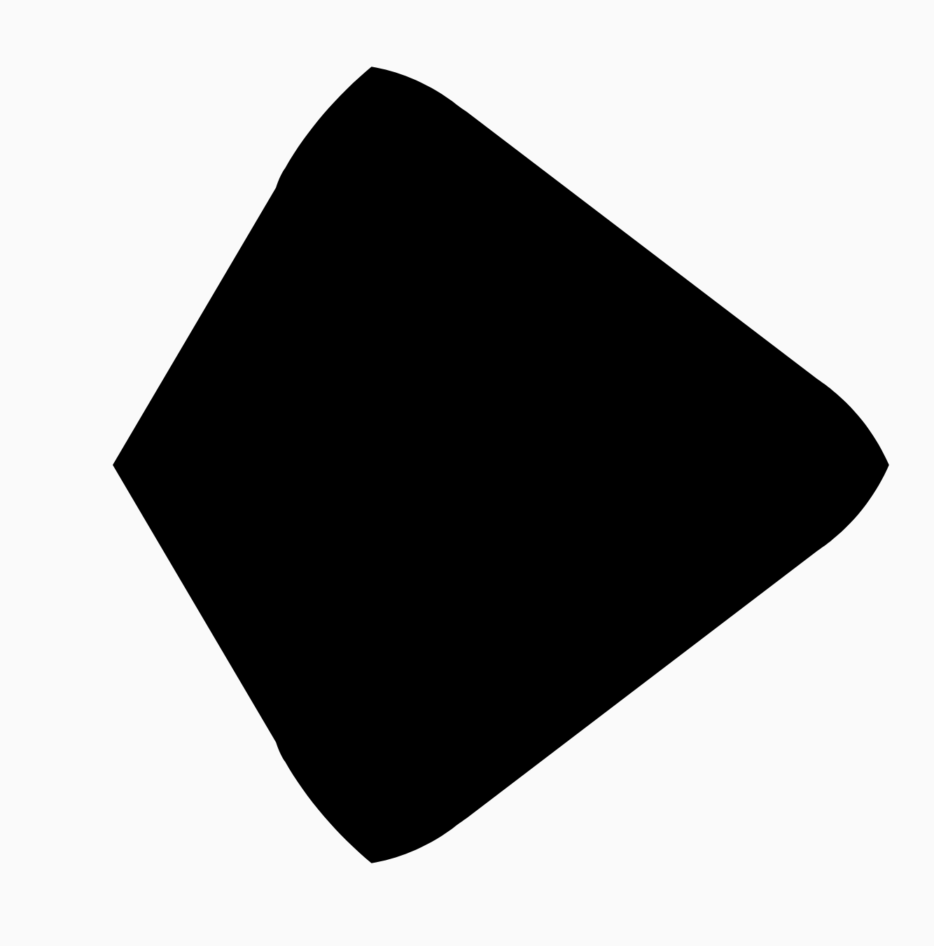
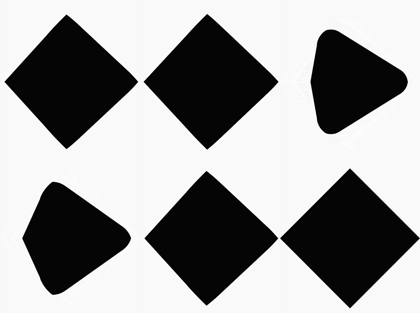
在大多数情况下,变形是作为动画的一部分完成的,而不仅仅是静态渲染。如需在这两个状态之间添加动画效果,您可以使用标准 Compose Animation API 随时间更改进度值。例如,您可以无限期地为这两个形状之间的变形添加动画效果,如下所示:
val infiniteAnimation = rememberInfiniteTransition(label = "infinite animation") val morphProgress = infiniteAnimation.animateFloat( initialValue = 0f, targetValue = 1f, animationSpec = infiniteRepeatable( tween(500), repeatMode = RepeatMode.Reverse ), label = "morph" ) Box( modifier = Modifier .drawWithCache { val triangle = RoundedPolygon( numVertices = 3, radius = size.minDimension / 2f, centerX = size.width / 2f, centerY = size.height / 2f, rounding = CornerRounding( size.minDimension / 10f, smoothing = 0.1f ) ) val square = RoundedPolygon( numVertices = 4, radius = size.minDimension / 2f, centerX = size.width / 2f, centerY = size.height / 2f ) val morph = Morph(start = triangle, end = square) val morphPath = morph .toPath(progress = morphProgress.value) .asComposePath() onDrawBehind { drawPath(morphPath, color = Color.Black) } } .fillMaxSize() )
将多边形用作裁剪范围
在 Compose 中,通常使用 clip 修饰符来更改可组合项的呈现方式,并利用在剪裁区域周围绘制的阴影:
fun RoundedPolygon.getBounds() = calculateBounds().let { Rect(it[0], it[1], it[2], it[3]) } class RoundedPolygonShape( private val polygon: RoundedPolygon, private var matrix: Matrix = Matrix() ) : Shape { private var path = Path() override fun createOutline( size: Size, layoutDirection: LayoutDirection, density: Density ): Outline { path.rewind() path = polygon.toPath().asComposePath() matrix.reset() val bounds = polygon.getBounds() val maxDimension = max(bounds.width, bounds.height) matrix.scale(size.width / maxDimension, size.height / maxDimension) matrix.translate(-bounds.left, -bounds.top) path.transform(matrix) return Outline.Generic(path) } }
然后,您可以将多边形用作剪辑,如以下代码段所示:
val hexagon = remember { RoundedPolygon( 6, rounding = CornerRounding(0.2f) ) } val clip = remember(hexagon) { RoundedPolygonShape(polygon = hexagon) } Box( modifier = Modifier .clip(clip) .background(MaterialTheme.colorScheme.secondary) .size(200.dp) ) { Text( "Hello Compose", color = MaterialTheme.colorScheme.onSecondary, modifier = Modifier.align(Alignment.Center) ) }
这会导致以下结果:
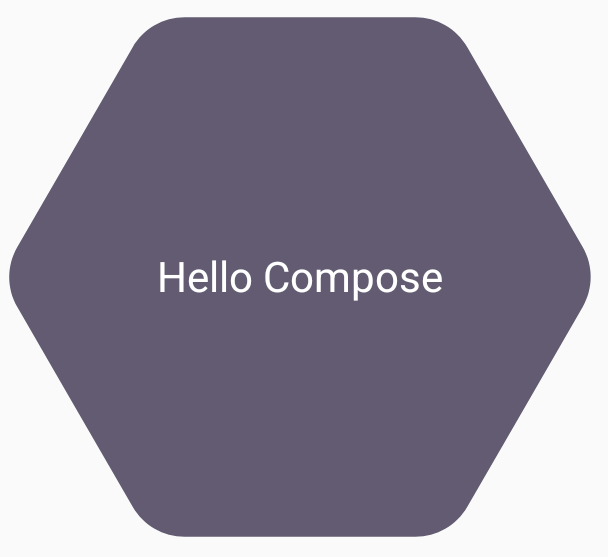
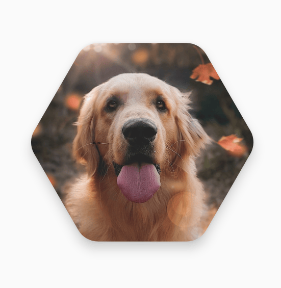
这可能与之前呈现的内容没有太大区别,但它允许在 Compose 中利用其他功能。例如,此方法可用于剪辑图片并在剪辑区域周围应用阴影:
val hexagon = remember { RoundedPolygon( 6, rounding = CornerRounding(0.2f) ) } val clip = remember(hexagon) { RoundedPolygonShape(polygon = hexagon) } Box( modifier = Modifier.fillMaxSize(), contentAlignment = Alignment.Center ) { Image( painter = painterResource(id = R.drawable.dog), contentDescription = "Dog", contentScale = ContentScale.Crop, modifier = Modifier .graphicsLayer { this.shadowElevation = 6.dp.toPx() this.shape = clip this.clip = true this.ambientShadowColor = Color.Black this.spotShadowColor = Color.Black } .size(200.dp) ) }
点击时变形按钮
您可以使用 graphics-shape 库创建一个按钮,该按钮在按下时会在两种形状之间变形。首先,创建一个扩展 Shape 的 MorphPolygonShape,并对其进行缩放和平移,使其适当贴合。请注意,传入进度以便为形状添加动画效果:
class MorphPolygonShape( private val morph: Morph, private val percentage: Float ) : Shape { private val matrix = Matrix() override fun createOutline( size: Size, layoutDirection: LayoutDirection, density: Density ): Outline { // Below assumes that you haven't changed the default radius of 1f, nor the centerX and centerY of 0f // By default this stretches the path to the size of the container, if you don't want stretching, use the same size.width for both x and y. matrix.scale(size.width / 2f, size.height / 2f) matrix.translate(1f, 1f) val path = morph.toPath(progress = percentage).asComposePath() path.transform(matrix) return Outline.Generic(path) } }
如需使用此变形形状,请创建两个多边形:shapeA 和 shapeB。创建并记住 Morph。然后,将变形作为剪辑轮廓应用于按钮,并使用按下时的 interactionSource 作为动画背后的驱动力:
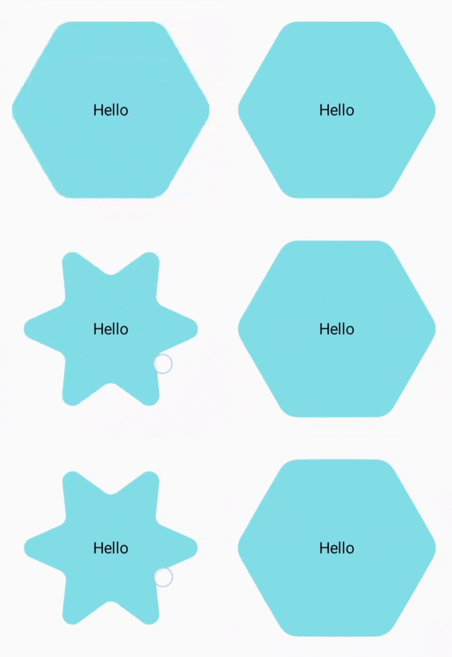
val shapeA = remember { RoundedPolygon( 6, rounding = CornerRounding(0.2f) ) } val shapeB = remember { RoundedPolygon.star( 6, rounding = CornerRounding(0.1f) ) } val morph = remember { Morph(shapeA, shapeB) } val interactionSource = remember { MutableInteractionSource() } val isPressed by interactionSource.collectIsPressedAsState() val animatedProgress = animateFloatAsState( targetValue = if (isPressed) 1f else 0f, label = "progress", animationSpec = spring(dampingRatio = 0.4f, stiffness = Spring.StiffnessMedium) ) Box( modifier = Modifier .size(200.dp) .padding(8.dp) .clip(MorphPolygonShape(morph, animatedProgress.value)) .background(Color(0xFF80DEEA)) .size(200.dp) .clickable(interactionSource = interactionSource, indication = null) { } ) { Text("Hello", modifier = Modifier.align(Alignment.Center)) }
这会在点按方框时产生以下动画效果:
为形状变形添加无限循环的动画效果
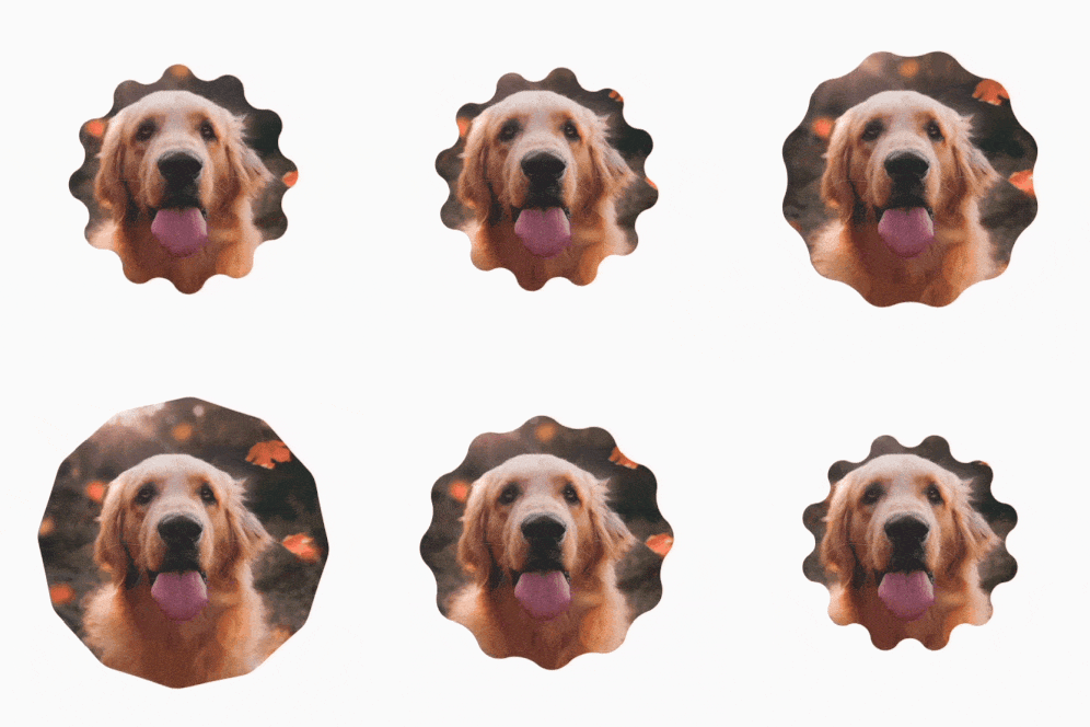
如需无限期地为变形形状添加动画效果,请使用 rememberInfiniteTransition。以下是一个个人资料照片示例,它会随着时间的推移不断改变形状(并旋转)。此方法对上面显示的 MorphPolygonShape 进行了细微调整:
class CustomRotatingMorphShape( private val morph: Morph, private val percentage: Float, private val rotation: Float ) : Shape { private val matrix = Matrix() override fun createOutline( size: Size, layoutDirection: LayoutDirection, density: Density ): Outline { // Below assumes that you haven't changed the default radius of 1f, nor the centerX and centerY of 0f // By default this stretches the path to the size of the container, if you don't want stretching, use the same size.width for both x and y. matrix.scale(size.width / 2f, size.height / 2f) matrix.translate(1f, 1f) matrix.rotateZ(rotation) val path = morph.toPath(progress = percentage).asComposePath() path.transform(matrix) return Outline.Generic(path) } } @Preview @Composable private fun RotatingScallopedProfilePic() { val shapeA = remember { RoundedPolygon( 12, rounding = CornerRounding(0.2f) ) } val shapeB = remember { RoundedPolygon.star( 12, rounding = CornerRounding(0.2f) ) } val morph = remember { Morph(shapeA, shapeB) } val infiniteTransition = rememberInfiniteTransition("infinite outline movement") val animatedProgress = infiniteTransition.animateFloat( initialValue = 0f, targetValue = 1f, animationSpec = infiniteRepeatable( tween(2000, easing = LinearEasing), repeatMode = RepeatMode.Reverse ), label = "animatedMorphProgress" ) val animatedRotation = infiniteTransition.animateFloat( initialValue = 0f, targetValue = 360f, animationSpec = infiniteRepeatable( tween(6000, easing = LinearEasing), repeatMode = RepeatMode.Reverse ), label = "animatedMorphProgress" ) Box( modifier = Modifier.fillMaxSize(), contentAlignment = Alignment.Center ) { Image( painter = painterResource(id = R.drawable.dog), contentDescription = "Dog", contentScale = ContentScale.Crop, modifier = Modifier .clip( CustomRotatingMorphShape( morph, animatedProgress.value, animatedRotation.value ) ) .size(200.dp) ) } }
此代码会生成以下有趣的结果:
自定义多边形
如果通过正多边形创建的形状不符合您的应用场景,您可以使用顶点列表创建更自定义的形状。例如,您可能想要创建 一个心形,如下所示:

您可以使用 RoundedPolygon 重载(接受 x、y 坐标的浮点数组)指定此形状的各个顶点。
为了分解心形多边形,请注意,使用极坐标系指定点比使用笛卡尔 (x,y) 坐标系更容易,其中 0° 从右侧开始,顺时针方向进行,270° 位于 12 点钟位置:
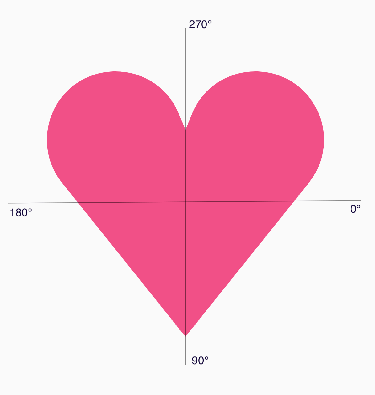
现在,您可以通过指定每个点与中心的角度 (𝜭) 和半径,以更简单的方式定义形状:
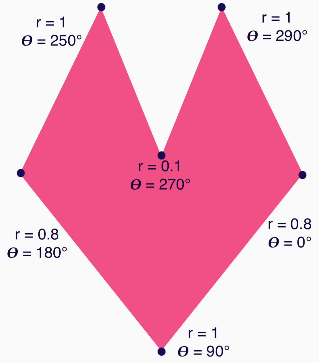
现在可以创建顶点并将其传递给 RoundedPolygon 函数:
val vertices = remember { val radius = 1f val radiusSides = 0.8f val innerRadius = .1f floatArrayOf( radialToCartesian(radiusSides, 0f.toRadians()).x, radialToCartesian(radiusSides, 0f.toRadians()).y, radialToCartesian(radius, 90f.toRadians()).x, radialToCartesian(radius, 90f.toRadians()).y, radialToCartesian(radiusSides, 180f.toRadians()).x, radialToCartesian(radiusSides, 180f.toRadians()).y, radialToCartesian(radius, 250f.toRadians()).x, radialToCartesian(radius, 250f.toRadians()).y, radialToCartesian(innerRadius, 270f.toRadians()).x, radialToCartesian(innerRadius, 270f.toRadians()).y, radialToCartesian(radius, 290f.toRadians()).x, radialToCartesian(radius, 290f.toRadians()).y, ) }
需要使用以下 radialToCartesian 函数将顶点转换为笛卡尔坐标:
internal fun Float.toRadians() = this * PI.toFloat() / 180f internal val PointZero = PointF(0f, 0f) internal fun radialToCartesian( radius: Float, angleRadians: Float, center: PointF = PointZero ) = directionVectorPointF(angleRadians) * radius + center internal fun directionVectorPointF(angleRadians: Float) = PointF(cos(angleRadians), sin(angleRadians))
上述代码为您提供了心形的原始顶点,但您需要对特定角进行圆角处理,才能获得所选的心形。90° 和 270° 处的角没有圆角,但其他角有。如需为各个角实现自定义圆角,请使用 perVertexRounding 参数:
val rounding = remember { val roundingNormal = 0.6f val roundingNone = 0f listOf( CornerRounding(roundingNormal), CornerRounding(roundingNone), CornerRounding(roundingNormal), CornerRounding(roundingNormal), CornerRounding(roundingNone), CornerRounding(roundingNormal), ) } val polygon = remember(vertices, rounding) { RoundedPolygon( vertices = vertices, perVertexRounding = rounding ) } Box( modifier = Modifier .drawWithCache { val roundedPolygonPath = polygon.toPath().asComposePath() onDrawBehind { scale(size.width * 0.5f, size.width * 0.5f) { translate(size.width * 0.5f, size.height * 0.5f) { drawPath(roundedPolygonPath, color = Color(0xFFF15087)) } } } } .size(400.dp) )
这会生成粉色的心:
如果上述形状不符合您的用例,请考虑使用 Path 类绘制自定义形状,或从磁盘加载 ImageVector 文件。graphics-shapes 库不适用于任意形状,而是专门用于简化圆角多边形以及它们之间的变形动画的创建。
其他资源
如需了解详情和示例,请参阅以下资源: