
Compose has many built-in animation mechanisms and it can be overwhelming to know which one to choose. Below is a list of common animation use cases. For more detailed information about the full set of different API options available to you, read the full Compose Animation documentation.
Animate common composable properties
Compose provides convenient APIs that allow you to solve for many common animation use cases. This section demonstrates how you can animate common properties of a composable.
Animate appearing / disappearing
Use AnimatedVisibility to hide or show a Composable. Children inside
AnimatedVisibility can use Modifier.animateEnterExit() for their own enter
or exit transition.
var visible by remember { mutableStateOf(true) } // Animated visibility will eventually remove the item from the composition once the animation has finished. AnimatedVisibility(visible) { // your composable here // ... }
The enter and exit parameters of AnimatedVisibility allow you to configure how
a composable behaves when it appears and disappears. Read the full
documentation for more information.
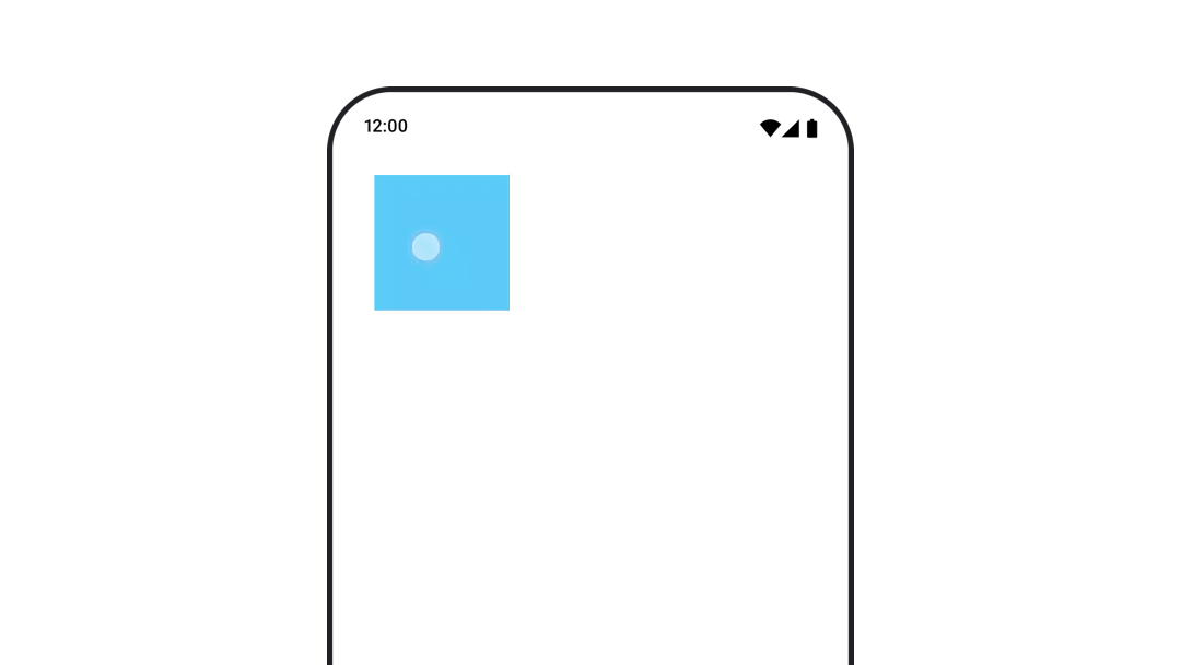
Another option for animating the visibility of a composable is to animate the
alpha over time using animateFloatAsState:
var visible by remember { mutableStateOf(true) } val animatedAlpha by animateFloatAsState( targetValue = if (visible) 1.0f else 0f, label = "alpha" ) Box( modifier = Modifier .size(200.dp) .graphicsLayer { alpha = animatedAlpha } .clip(RoundedCornerShape(8.dp)) .background(colorGreen) .align(Alignment.TopCenter) ) { }
However, changing the alpha comes with the caveat that the composable remains
in the composition and continues to occupy the space it's laid out in. This
could cause screen readers and other accessibility mechanisms to still consider
the item on screen. On the other hand, AnimatedVisibility eventually removes
the item from the composition.
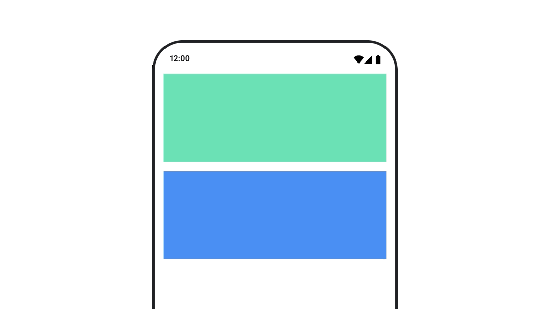
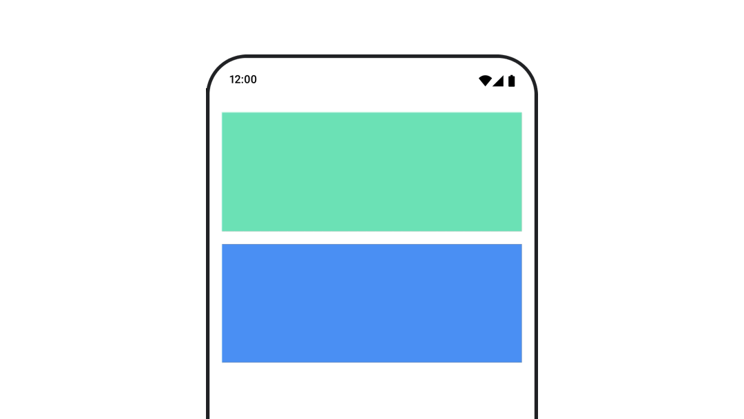
Animate background color
val animatedColor by animateColorAsState( if (animateBackgroundColor) colorGreen else colorBlue, label = "color" ) Column( modifier = Modifier.drawBehind { drawRect(animatedColor) } ) { // your composable here }
This option is more performant than using Modifier.background().
Modifier.background() is acceptable for a one-shot color setting, but when
animating a color over time, this could cause more recompositions than
necessary.
For infinitely animating the background color, see repeating an animation section.
Animate the size of a composable
Compose lets you animate the size of composables in a few different ways. Use
animateContentSize() for animations between composable size changes.
For example, if you have a box that contains text which can expand from one to
multiple lines you can use Modifier.animateContentSize() to achieve a smoother
transition:
var expanded by remember { mutableStateOf(false) } Box( modifier = Modifier .background(colorBlue) .animateContentSize() .height(if (expanded) 400.dp else 200.dp) .fillMaxWidth() .clickable( interactionSource = remember { MutableInteractionSource() }, indication = null ) { expanded = !expanded } ) { }
You can also use AnimatedContent, with a SizeTransform to describe
how size changes should take place.
Animate position of composable
To animate the position of a composable, use Modifier.offset{ } combined with
animateIntOffsetAsState().
var moved by remember { mutableStateOf(false) } val pxToMove = with(LocalDensity.current) { 100.dp.toPx().roundToInt() } val offset by animateIntOffsetAsState( targetValue = if (moved) { IntOffset(pxToMove, pxToMove) } else { IntOffset.Zero }, label = "offset" ) Box( modifier = Modifier .offset { offset } .background(colorBlue) .size(100.dp) .clickable( interactionSource = remember { MutableInteractionSource() }, indication = null ) { moved = !moved } )
If you want to ensure that composables are not drawn over or under other
composables when animating position or size, use Modifier.layout{ }. This
modifier propagates size and position changes to the parent, which then affects
other children.
For example, if you are moving a Box within a Column and the other children
need to move when the Box moves, include the offset information with
Modifier.layout{ } as follows:
var toggled by remember { mutableStateOf(false) } val interactionSource = remember { MutableInteractionSource() } Column( modifier = Modifier .padding(16.dp) .fillMaxSize() .clickable(indication = null, interactionSource = interactionSource) { toggled = !toggled } ) { val offsetTarget = if (toggled) { IntOffset(150, 150) } else { IntOffset.Zero } val offset = animateIntOffsetAsState( targetValue = offsetTarget, label = "offset" ) Box( modifier = Modifier .size(100.dp) .background(colorBlue) ) Box( modifier = Modifier .layout { measurable, constraints -> val offsetValue = if (isLookingAhead) offsetTarget else offset.value val placeable = measurable.measure(constraints) layout(placeable.width + offsetValue.x, placeable.height + offsetValue.y) { placeable.placeRelative(offsetValue) } } .size(100.dp) .background(colorGreen) ) Box( modifier = Modifier .size(100.dp) .background(colorBlue) ) }
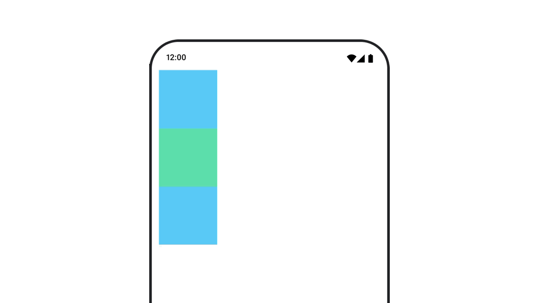
Modifier.layout{ }Animate padding of a composable
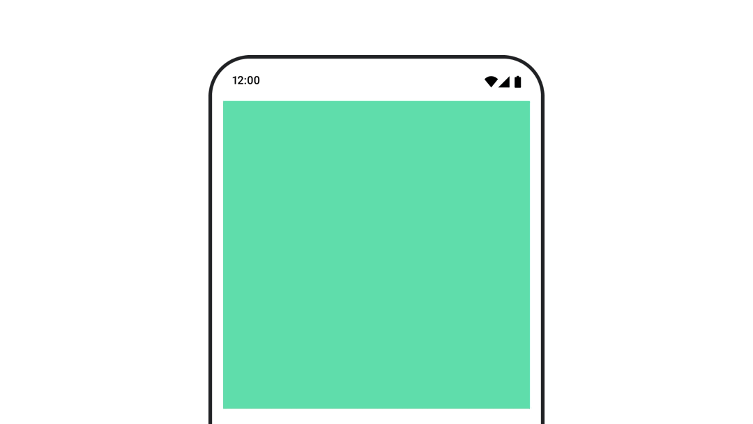
To animate the padding of a composable, use animateDpAsState combined with
Modifier.padding():
var toggled by remember { mutableStateOf(false) } val animatedPadding by animateDpAsState( if (toggled) { 0.dp } else { 20.dp }, label = "padding" ) Box( modifier = Modifier .aspectRatio(1f) .fillMaxSize() .padding(animatedPadding) .background(Color(0xff53D9A1)) .clickable( interactionSource = remember { MutableInteractionSource() }, indication = null ) { toggled = !toggled } )
Animate elevation of a composable
To animate the elevation of a composable, use animateDpAsState combined with
Modifier.graphicsLayer{ }. For once-off elevation changes, use
Modifier.shadow(). If you are animating the shadow, using
Modifier.graphicsLayer{ } modifier is the more performant option.
val mutableInteractionSource = remember { MutableInteractionSource() } val pressed = mutableInteractionSource.collectIsPressedAsState() val elevation = animateDpAsState( targetValue = if (pressed.value) { 32.dp } else { 8.dp }, label = "elevation" ) Box( modifier = Modifier .size(100.dp) .align(Alignment.Center) .graphicsLayer { this.shadowElevation = elevation.value.toPx() } .clickable(interactionSource = mutableInteractionSource, indication = null) { } .background(colorGreen) ) { }
Alternatively, use the Card composable, and set the elevation property to
different values per state.
Animate text scale, translation or rotation
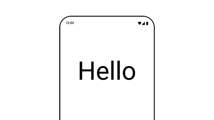
When animating scale, translation, or rotation of text, set the textMotion
parameter on TextStyle to TextMotion.Animated. This ensures smoother
transitions between text animations. Use Modifier.graphicsLayer{ } to
translate, rotate or scale the text.
val infiniteTransition = rememberInfiniteTransition(label = "infinite transition") val scale by infiniteTransition.animateFloat( initialValue = 1f, targetValue = 8f, animationSpec = infiniteRepeatable(tween(1000), RepeatMode.Reverse), label = "scale" ) Box(modifier = Modifier.fillMaxSize()) { Text( text = "Hello", modifier = Modifier .graphicsLayer { scaleX = scale scaleY = scale transformOrigin = TransformOrigin.Center } .align(Alignment.Center), // Text composable does not take TextMotion as a parameter. // Provide it via style argument but make sure that we are copying from current theme style = LocalTextStyle.current.copy(textMotion = TextMotion.Animated) ) }
Animate text color
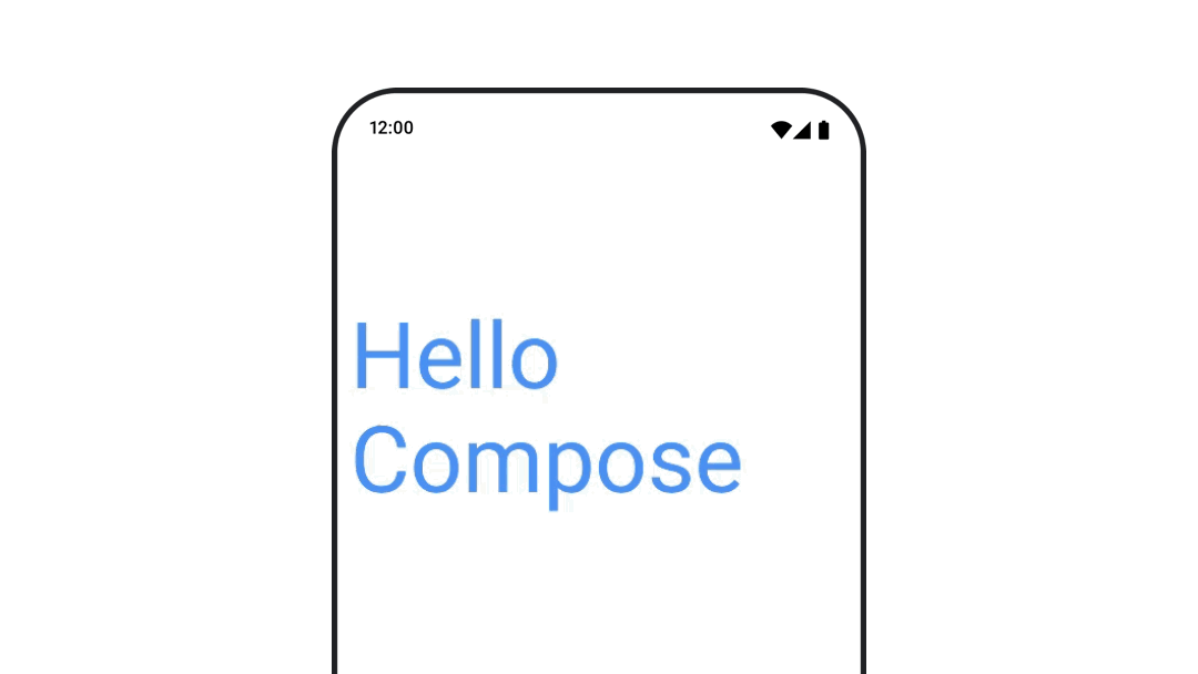
To animate text color, use the color lambda on the BasicText composable:
val infiniteTransition = rememberInfiniteTransition(label = "infinite transition") val animatedColor by infiniteTransition.animateColor( initialValue = Color(0xFF60DDAD), targetValue = Color(0xFF4285F4), animationSpec = infiniteRepeatable(tween(1000), RepeatMode.Reverse), label = "color" ) BasicText( text = "Hello Compose", color = { animatedColor }, // ... )
Switch between different types of content
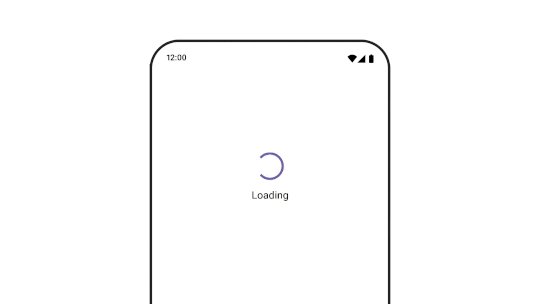
Use AnimatedContent to animate between different composables, if you
just want a standard fade between composables, use Crossfade.
var state by remember { mutableStateOf(UiState.Loading) } AnimatedContent( state, transitionSpec = { fadeIn( animationSpec = tween(3000) ) togetherWith fadeOut(animationSpec = tween(3000)) }, modifier = Modifier.clickable( interactionSource = remember { MutableInteractionSource() }, indication = null ) { state = when (state) { UiState.Loading -> UiState.Loaded UiState.Loaded -> UiState.Error UiState.Error -> UiState.Loading } }, label = "Animated Content" ) { targetState -> when (targetState) { UiState.Loading -> { LoadingScreen() } UiState.Loaded -> { LoadedScreen() } UiState.Error -> { ErrorScreen() } } }
AnimatedContent can be customized to show many different kinds of enter and
exit transitions. For more information, read the documentation on
AnimatedContent or read this blog post on
AnimatedContent.
Animate whilst navigating to different destinations
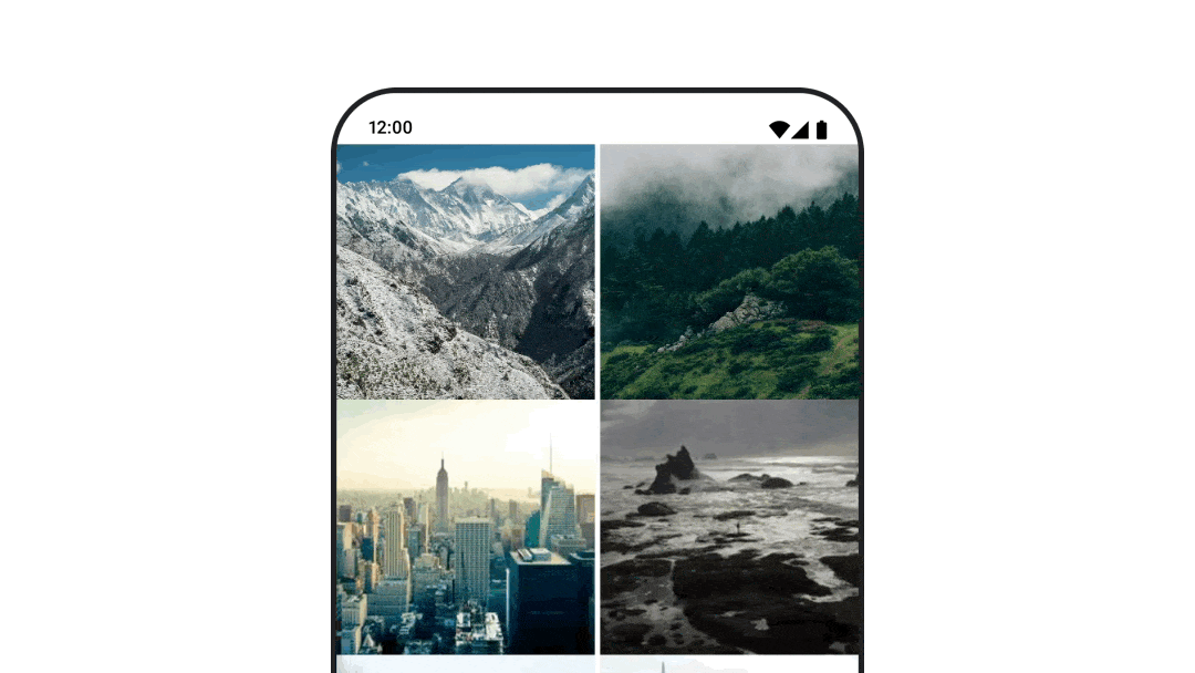
To animate transitions between composables when using the
navigation-compose artifact, specify the enterTransition and
exitTransition on a composable. You can also set the default animation to be
used for all destinations at the top level NavHost:
val navController = rememberNavController() NavHost( navController = navController, startDestination = "landing", enterTransition = { EnterTransition.None }, exitTransition = { ExitTransition.None } ) { composable("landing") { ScreenLanding( // ... ) } composable( "detail/{photoUrl}", arguments = listOf(navArgument("photoUrl") { type = NavType.StringType }), enterTransition = { fadeIn( animationSpec = tween( 300, easing = LinearEasing ) ) + slideIntoContainer( animationSpec = tween(300, easing = EaseIn), towards = AnimatedContentTransitionScope.SlideDirection.Start ) }, exitTransition = { fadeOut( animationSpec = tween( 300, easing = LinearEasing ) ) + slideOutOfContainer( animationSpec = tween(300, easing = EaseOut), towards = AnimatedContentTransitionScope.SlideDirection.End ) } ) { backStackEntry -> ScreenDetails( // ... ) } }
There are many different kinds of enter and exit transitions that apply different effects to the incoming and outgoing content, see the documentation for more.
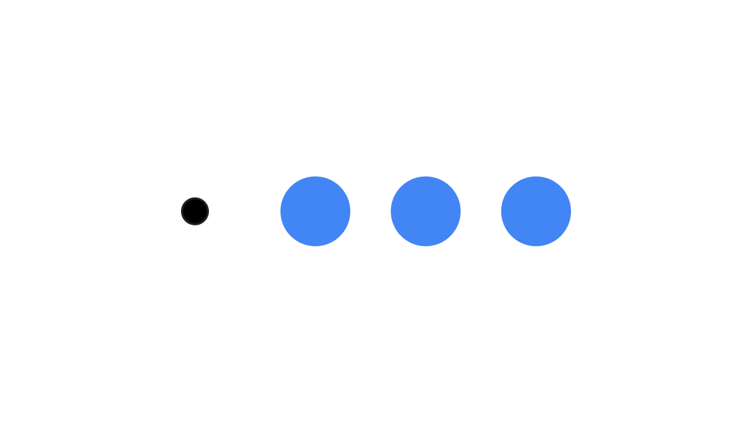
Repeat an animation
Use rememberInfiniteTransition with an infiniteRepeatable
animationSpec to continuously repeat your animation. Change RepeatModes to
specify how it should go back and forth.
Use repeatable to repeat a set number of times.
val infiniteTransition = rememberInfiniteTransition(label = "infinite") val color by infiniteTransition.animateColor( initialValue = Color.Green, targetValue = Color.Blue, animationSpec = infiniteRepeatable( animation = tween(1000, easing = LinearEasing), repeatMode = RepeatMode.Reverse ), label = "color" ) Column( modifier = Modifier.drawBehind { drawRect(color) } ) { // your composable here }
Start an animation on launch of a composable
LaunchedEffect runs when a composable enters the composition. It starts
an animation on launch of a composable, you can use this to drive the animation
state change. Using Animatable with the animateTo method to start the
animation on launch:
val alphaAnimation = remember { Animatable(0f) } LaunchedEffect(Unit) { alphaAnimation.animateTo(1f) } Box( modifier = Modifier.graphicsLayer { alpha = alphaAnimation.value } )
Create sequential animations
Use the Animatable coroutine APIs to perform sequential or concurrent
animations. Calling animateTo on the Animatable one after the other causes
each animation to wait for the previous animations to finish before proceeding .
This is because it is a suspend function.
val alphaAnimation = remember { Animatable(0f) } val yAnimation = remember { Animatable(0f) } LaunchedEffect("animationKey") { alphaAnimation.animateTo(1f) yAnimation.animateTo(100f) yAnimation.animateTo(500f, animationSpec = tween(100)) }
Create concurrent animations
Use the coroutine APIs (Animatable#animateTo() or animate), or
the Transition API to achieve concurrent animations. If you use multiple
launch functions in a coroutine context, it launches the animations at the same
time:
val alphaAnimation = remember { Animatable(0f) } val yAnimation = remember { Animatable(0f) } LaunchedEffect("animationKey") { launch { alphaAnimation.animateTo(1f) } launch { yAnimation.animateTo(100f) } }
You could use the updateTransition API to use the same state to drive
many different property animations at the same time. The example below animates
two properties controlled by a state change, rect and borderWidth:
var currentState by remember { mutableStateOf(BoxState.Collapsed) } val transition = updateTransition(currentState, label = "transition") val rect by transition.animateRect(label = "rect") { state -> when (state) { BoxState.Collapsed -> Rect(0f, 0f, 100f, 100f) BoxState.Expanded -> Rect(100f, 100f, 300f, 300f) } } val borderWidth by transition.animateDp(label = "borderWidth") { state -> when (state) { BoxState.Collapsed -> 1.dp BoxState.Expanded -> 0.dp } }
Optimize animation performance
Animations in Compose can cause performance problems. This is due to the nature of what an animation is: moving or changing pixels on screen quickly, frame-by-frame to create the illusion of movement.
Consider the different phases of Compose: composition, layout and draw. If your animation changes the layout phase, it requires all affected composables to relayout and redraw. If your animation occurs in the draw phase, it is by default be more performant than if you were to run the animation in the layout phase, as it would have less work to do overall.
To ensure your app does as little as possible while animating, choose the lambda
version of a Modifier where possible. This skips recomposition and performs
the animation outside of the composition phase, otherwise use
Modifier.graphicsLayer{ }, as this modifier always runs in the draw
phase. For more information on this, see the deferring reads section in
the performance documentation.
Change animation timing
Compose by default uses spring animations for most animations. Springs, or
physics-based animations, feel more natural. They are also interruptible as
they take into account the object's current velocity, instead of a fixed time.
If you want to override the default, all the animation APIs demonstrated above
have the ability to set an animationSpec to customize how an animation runs,
whether you'd like it to execute over a certain duration or be more bouncy.
The following is a summary of the different animationSpec options:
spring: Physics-based animation, the default for all animations. You can change the stiffness or dampingRatio to achieve a different animation look and feel.tween(short for between): Duration-based animation, animates between two values with anEasingfunction.keyframes: Spec for specifying values at certain key points in an animation.repeatable: Duration-based spec that runs a certain number of times, specified byRepeatMode.infiniteRepeatable: Duration-based spec that runs forever.snap: Instantly snaps to the end value without any animation.
Read the full documentation for more information about animationSpecs.
Additional resources
For more examples of fun animations in Compose, take a look at the following:
- 5 quick animations in Compose
- Making Jellyfish move in Compose
- Customizing
AnimatedContentin Compose - Easing into Easing functions in Compose