
The following sections describe how to create a simple app widget with Glance.
Declare the AppWidget in the Manifest
After completing the setup steps, declare the AppWidget and its
metadata in your app.
Extend the
AppWidgetreceiver fromGlanceAppWidgetReceiver:class MyAppWidgetReceiver : GlanceAppWidgetReceiver() { override val glanceAppWidget: GlanceAppWidget = TODO("Create GlanceAppWidget") }
Register the provider of the app widget in your
AndroidManifest.xmlfile and the associated metadata file:<receiver android:name=".glance.MyReceiver" android:exported="true"> <intent-filter> <action android:name="android.appwidget.action.APPWIDGET_UPDATE" /> </intent-filter> <meta-data android:name="android.appwidget.provider" android:resource="@xml/my_app_widget_info" /> </receiver>
Add the AppWidgetProviderInfo metadata
Next, follow the Create a simple widget guide to create and define the app
widget info in the @xml/my_app_widget_info file.
The only difference for Glance is that there is no initialLayout XML, but
you must define one. You can use the predefined loading layout provided in
the library:
<appwidget-provider xmlns:android="http://schemas.android.com/apk/res/android"
android:initialLayout="@layout/glance_default_loading_layout">
</appwidget-provider>
Define GlanceAppWidget
Create a new class that extends from
GlanceAppWidgetand overrides theprovideGlancemethod. This is the method where you can load data that is needed to render your widget:class MyAppWidget : GlanceAppWidget() { override suspend fun provideGlance(context: Context, id: GlanceId) { // In this method, load data needed to render the AppWidget. // Use `withContext` to switch to another thread for long running // operations. provideContent { // create your AppWidget here Text("Hello World") } } }
Instantiate it in the
glanceAppWidgeton yourGlanceAppWidgetReceiver:class MyAppWidgetReceiver : GlanceAppWidgetReceiver() { // Let MyAppWidgetReceiver know which GlanceAppWidget to use override val glanceAppWidget: GlanceAppWidget = MyAppWidget() }
You've now configured an AppWidget using Glance.
Create UI
The following snippet demonstrates how to create the UI:
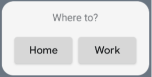
/* Import Glance Composables In the event there is a name clash with the Compose classes of the same name, you may rename the imports per https://kotlinlang.org/docs/packages.html#imports using the `as` keyword. import androidx.glance.Button import androidx.glance.layout.Column import androidx.glance.layout.Row import androidx.glance.text.Text */ class MyAppWidget : GlanceAppWidget() { override suspend fun provideGlance(context: Context, id: GlanceId) { // Load data needed to render the AppWidget. // Use `withContext` to switch to another thread for long running // operations. provideContent { // create your AppWidget here MyContent() } } @Composable private fun MyContent() { Column( modifier = GlanceModifier.fillMaxSize(), verticalAlignment = Alignment.Top, horizontalAlignment = Alignment.CenterHorizontally ) { Text(text = "Where to?", modifier = GlanceModifier.padding(12.dp)) Row(horizontalAlignment = Alignment.CenterHorizontally) { Button( text = "Home", onClick = actionStartActivity<MyActivity>() ) Button( text = "Work", onClick = actionStartActivity<MyActivity>() ) } } } }
The preceding code sample does the following:
- In the top level
Column, items are placed vertically one after each other. - The
Columnexpands its size to match the available space (via theGlanceModifierand aligns its content to the top (verticalAlignment) and centers it horizontally (horizontalAlignment). - The
Column's content is defined using the lambda. The order matters.- The first item in the
Columnis aTextcomponent with12.dpof padding. - The second item is a
Row, where items are placed horizontally one after each other, with twoButtonscentered horizontally (horizontalAlignment). The final display depends on the available space. The following image is an example of what it may look like:
- The first item in the
You can change the alignment values or apply different modifier values (such as padding) to change the placement and size of the components. See the reference documentation for a full list of components, parameters, and available modifiers for each class.