Sử dụng bộ sưu tập để sắp xếp ngăn nắp các trang
Lưu và phân loại nội dung dựa trên lựa chọn ưu tiên của bạn.
Thành phần Dialog hiển thị các thông báo hộp thoại hoặc yêu cầu người dùng nhập dữ liệu trên một lớp phía trên nội dung chính của ứng dụng. Điều này tạo ra trải nghiệm giao diện người dùng gây gián đoạn để thu hút sự chú ý của người dùng.
Sau đây là một số trường hợp sử dụng hộp thoại:
Xác nhận hành động của người dùng, chẳng hạn như khi xoá một tệp.
Yêu cầu người dùng nhập dữ liệu, chẳng hạn như trong một ứng dụng danh sách việc cần làm.
Trình bày danh sách các lựa chọn để người dùng chọn, chẳng hạn như chọn một quốc gia trong quá trình thiết lập hồ sơ.
Hình 1. Ví dụ về một hộp thoại chứa văn bản và biểu tượng.
Hộp thoại thông báo
Thành phần kết hợp AlertDialog cung cấp một API thuận tiện để tạo hộp thoại theo chủ đề Material Design. AlertDialog có các tham số cụ thể để xử lý các phần tử cụ thể của hộp thoại. Trong đó có những yếu tố sau:
title: Văn bản xuất hiện ở đầu hộp thoại.
text: Văn bản xuất hiện ở giữa hộp thoại.
icon: Hình ảnh xuất hiện ở đầu hộp thoại.
onDismissRequest: Hàm được gọi khi người dùng đóng hộp thoại, chẳng hạn như bằng cách nhấn vào bên ngoài hộp thoại.
dismissButton: Một thành phần kết hợp đóng vai trò là nút đóng.
confirmButton: Một thành phần kết hợp đóng vai trò là nút xác nhận.
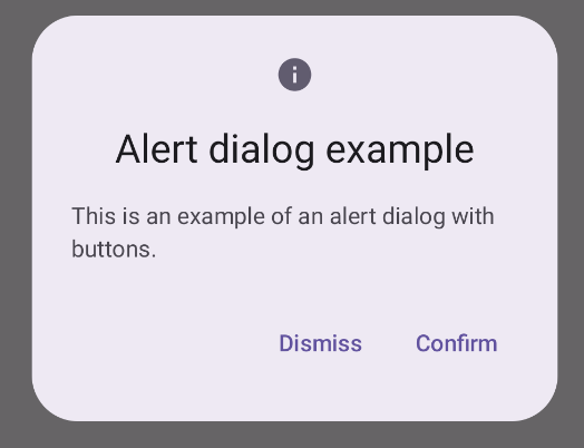
Ví dụ sau đây triển khai 2 nút trong hộp thoại cảnh báo, một nút loại bỏ hộp thoại và một nút xác nhận yêu cầu.
Cách triển khai này ngụ ý một thành phần kết hợp mẹ truyền các đối số cho thành phần kết hợp con theo cách sau:
@ComposablefunDialogExamples(){// ...valopenAlertDialog=remember{mutableStateOf(false)}// ...when{// ...openAlertDialog.value->{AlertDialogExample(onDismissRequest={openAlertDialog.value=false},onConfirmation={openAlertDialog.value=falseprintln("Confirmation registered")// Add logic here to handle confirmation.},dialogTitle="Alert dialog example",dialogText="This is an example of an alert dialog with buttons.",icon=Icons.Default.Info)}}}}
Dialog là một thành phần kết hợp cơ bản không cung cấp bất kỳ kiểu nào hoặc các vị trí được xác định trước cho nội dung. Đây là một vùng chứa tương đối đơn giản mà bạn nên điền vào bằng một vùng chứa như Card. Sau đây là một số tham số chính của hộp thoại:
onDismissRequest: Lambda được gọi khi người dùng đóng hộp thoại.
properties: Một thực thể của DialogProperties cung cấp một số phạm vi tuỳ chỉnh bổ sung.
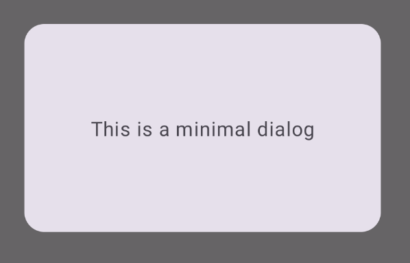
Ví dụ cơ bản
Ví dụ sau đây là một cách triển khai cơ bản của thành phần kết hợp Dialog. Xin lưu ý rằng thành phần này sử dụng Card làm vùng chứa phụ. Nếu không có Card, thành phần Text sẽ xuất hiện một mình phía trên nội dung chính của ứng dụng.
@ComposablefunMinimalDialog(onDismissRequest:()->Unit){Dialog(onDismissRequest={onDismissRequest()}){Card(modifier=Modifier.fillMaxWidth().height(200.dp).padding(16.dp),shape=RoundedCornerShape(16.dp),){Text(text="This is a minimal dialog",modifier=Modifier.fillMaxSize().wrapContentSize(Alignment.Center),textAlign=TextAlign.Center,)}}}
Phương thức triển khai có dạng như sau. Xin lưu ý rằng khi hộp thoại mở, nội dung chính của ứng dụng bên dưới sẽ xuất hiện ở dạng tối và chuyển sang màu xám:
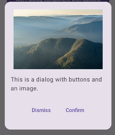
Hình 3. Hộp thoại tối giản.
Ví dụ nâng cao
Sau đây là một cách triển khai nâng cao hơn của thành phần kết hợp Dialog. Trong trường hợp này, thành phần sẽ triển khai một giao diện tương tự như ví dụ AlertDialog ở trên theo cách thủ công.
@ComposablefunDialogWithImage(onDismissRequest:()->Unit,onConfirmation:()->Unit,painter:Painter,imageDescription:String,){Dialog(onDismissRequest={onDismissRequest()}){// Draw a rectangle shape with rounded corners inside the dialogCard(modifier=Modifier.fillMaxWidth().height(375.dp).padding(16.dp),shape=RoundedCornerShape(16.dp),){Column(modifier=Modifier.fillMaxSize(),verticalArrangement=Arrangement.Center,horizontalAlignment=Alignment.CenterHorizontally,){Image(painter=painter,contentDescription=imageDescription,contentScale=ContentScale.Fit,modifier=Modifier.height(160.dp))Text(text="This is a dialog with buttons and an image.",modifier=Modifier.padding(16.dp),)Row(modifier=Modifier.fillMaxWidth(),horizontalArrangement=Arrangement.Center,){TextButton(onClick={onDismissRequest()},modifier=Modifier.padding(8.dp),){Text("Dismiss")}TextButton(onClick={onConfirmation()},modifier=Modifier.padding(8.dp),){Text("Confirm")}}}}}}
Nội dung và mã mẫu trên trang này phải tuân thủ các giấy phép như mô tả trong phần Giấy phép nội dung. Java và OpenJDK là nhãn hiệu hoặc nhãn hiệu đã đăng ký của Oracle và/hoặc đơn vị liên kết của Oracle.
Cập nhật lần gần đây nhất: 2025-08-25 UTC.
[[["Dễ hiểu","easyToUnderstand","thumb-up"],["Giúp tôi giải quyết được vấn đề","solvedMyProblem","thumb-up"],["Khác","otherUp","thumb-up"]],[["Thiếu thông tin tôi cần","missingTheInformationINeed","thumb-down"],["Quá phức tạp/quá nhiều bước","tooComplicatedTooManySteps","thumb-down"],["Đã lỗi thời","outOfDate","thumb-down"],["Vấn đề về bản dịch","translationIssue","thumb-down"],["Vấn đề về mẫu/mã","samplesCodeIssue","thumb-down"],["Khác","otherDown","thumb-down"]],["Cập nhật lần gần đây nhất: 2025-08-25 UTC."],[],[],null,["The [`Dialog`](/reference/kotlin/androidx/compose/ui/window/package-summary#Dialog(kotlin.Function0,androidx.compose.ui.window.DialogProperties,kotlin.Function0)) component displays dialog messages or requests user input on a\nlayer above the main app content. It creates an interruptive UI experience to\ncapture user attention.\n\nAmong the use cases for a dialog are the following:\n\n- Confirming user action, such as when deleting a file.\n- Requesting user input, such as in a to-do list app.\n- Presenting a list of options for user selection, like choosing a country in a profile setup.\n\n**Figure 1.** An example of a dialog populated with text and icons.\n\nAlert dialog\n\nThe [`AlertDialog`](/reference/kotlin/androidx/compose/material3/package-summary#AlertDialog(kotlin.Function0,kotlin.Function0,androidx.compose.ui.Modifier,kotlin.Function0,kotlin.Function0,kotlin.Function0,kotlin.Function0,androidx.compose.ui.graphics.Shape,androidx.compose.ui.graphics.Color,androidx.compose.ui.graphics.Color,androidx.compose.ui.graphics.Color,androidx.compose.ui.graphics.Color,androidx.compose.ui.unit.Dp,androidx.compose.ui.window.DialogProperties)) composable provides a convenient API for creating a\nMaterial Design themed dialog. `AlertDialog` has specific parameters for\nhandling particular elements of the dialog. Among them are the following:\n\n- `title`: The text that appears along the top of the dialog.\n- `text`: The text that appears centered within the dialog.\n- `icon`: The graphic that appears at the top of the dialog.\n- `onDismissRequest`: The function called when the user dismisses the dialog, such as by tapping outside of it.\n- `dismissButton`: A composable that serves as the dismiss button.\n- `confirmButton`: A composable that serves as the confirm button.\n\nThe following example implements two buttons in an alert dialog, one that\ndismisses the dialog, and another that confirms its request.\n\n\n```kotlin\n@Composable\nfun AlertDialogExample(\n onDismissRequest: () -\u003e Unit,\n onConfirmation: () -\u003e Unit,\n dialogTitle: String,\n dialogText: String,\n icon: ImageVector,\n) {\n AlertDialog(\n icon = {\n Icon(icon, contentDescription = \"Example Icon\")\n },\n title = {\n Text(text = dialogTitle)\n },\n text = {\n Text(text = dialogText)\n },\n onDismissRequest = {\n onDismissRequest()\n },\n confirmButton = {\n TextButton(\n onClick = {\n onConfirmation()\n }\n ) {\n Text(\"Confirm\")\n }\n },\n dismissButton = {\n TextButton(\n onClick = {\n onDismissRequest()\n }\n ) {\n Text(\"Dismiss\")\n }\n }\n )\n}https://github.com/android/snippets/blob/dd30aee903e8c247786c064faab1a9ca8d10b46e/compose/snippets/src/main/java/com/example/compose/snippets/components/Dialog.kt#L222-L262\n```\n\n\u003cbr /\u003e\n\nThis implementation implies a parent composable that passes arguments to the\nchild composable in this way:\n\n\n```kotlin\n@Composable\nfun DialogExamples() {\n // ...\n val openAlertDialog = remember { mutableStateOf(false) }\n\n // ...\n when {\n // ...\n openAlertDialog.value -\u003e {\n AlertDialogExample(\n onDismissRequest = { openAlertDialog.value = false },\n onConfirmation = {\n openAlertDialog.value = false\n println(\"Confirmation registered\") // Add logic here to handle confirmation.\n },\n dialogTitle = \"Alert dialog example\",\n dialogText = \"This is an example of an alert dialog with buttons.\",\n icon = Icons.Default.Info\n )\n }\n }\n }\n}https://github.com/android/snippets/blob/dd30aee903e8c247786c064faab1a9ca8d10b46e/compose/snippets/src/main/java/com/example/compose/snippets/components/Dialog.kt#L59-L137\n```\n\n\u003cbr /\u003e\n\nThis implementation appears as follows:\n**Figure 2.** An alert dialog with buttons. **Note:** When the user clicks either of the buttons, the dialog closes. When the user clicks confirm, it calls a function that also handles the confirmation. In this example, those functions are `onDismissRequest()` and `onConfirmRequest()`.\n| **Note:** In cases where your dialog requires a more complex set of buttons, you may benefit from using the `Dialog` composable and populating it in a more freeform manner.\n\nDialog composable\n\n[`Dialog`](/reference/kotlin/androidx/compose/ui/window/package-summary#Dialog(kotlin.Function0,androidx.compose.ui.window.DialogProperties,kotlin.Function0)) is a basic composable that doesn't provide any styling or\npredefined slots for content. It is a relatively straightforward container that\nyou should populate with a container such as `Card`. The following are some of\nthe key parameters of a dialog:\n\n- **`onDismissRequest`**: The lambda called when the user closes the dialog.\n- **`properties`** : An instance of [`DialogProperties`](/reference/kotlin/androidx/compose/ui/window/DialogProperties) that provides some additional scope for customization.\n\n| **Caution:** Unlike the example of `AlertDialog` in the preceding section, you need to manually specify the size and shape of `Dialog`. You also need to provide an inner container.\n\nBasic example\n\nThe following example is a basic implementation of the `Dialog` composable. Note\nthat it uses a `Card` as the secondary container. Without the `Card`, the `Text`\ncomponent would appear alone above the main app content.\n\n\n```kotlin\n@Composable\nfun MinimalDialog(onDismissRequest: () -\u003e Unit) {\n Dialog(onDismissRequest = { onDismissRequest() }) {\n Card(\n modifier = Modifier\n .fillMaxWidth()\n .height(200.dp)\n .padding(16.dp),\n shape = RoundedCornerShape(16.dp),\n ) {\n Text(\n text = \"This is a minimal dialog\",\n modifier = Modifier\n .fillMaxSize()\n .wrapContentSize(Alignment.Center),\n textAlign = TextAlign.Center,\n )\n }\n }\n}https://github.com/android/snippets/blob/dd30aee903e8c247786c064faab1a9ca8d10b46e/compose/snippets/src/main/java/com/example/compose/snippets/components/Dialog.kt#L141-L160\n```\n\n\u003cbr /\u003e\n\nThis implementation appears as follows. Note that when the dialog is open, the\nmain app content beneath it appears darkened and grayed out:\n**Figure 3.** Minimal dialog.\n\nAdvanced example\n\nThe following is a more advanced implemented of the `Dialog` composable. In this\ncase, the component manually implements a similar interface to the `AlertDialog`\nexample above.\n| **Caution:** If you only need to display a two-button dialog as in this example, you should use `AlertDialog` and its more convenient API. However, if you want to create a more complex dialog, perhaps with forms and multiple buttons, you should use `Dialog` with custom content, as in the following example.\n\n\n```kotlin\n@Composable\nfun DialogWithImage(\n onDismissRequest: () -\u003e Unit,\n onConfirmation: () -\u003e Unit,\n painter: Painter,\n imageDescription: String,\n) {\n Dialog(onDismissRequest = { onDismissRequest() }) {\n // Draw a rectangle shape with rounded corners inside the dialog\n Card(\n modifier = Modifier\n .fillMaxWidth()\n .height(375.dp)\n .padding(16.dp),\n shape = RoundedCornerShape(16.dp),\n ) {\n Column(\n modifier = Modifier\n .fillMaxSize(),\n verticalArrangement = Arrangement.Center,\n horizontalAlignment = Alignment.CenterHorizontally,\n ) {\n Image(\n painter = painter,\n contentDescription = imageDescription,\n contentScale = ContentScale.Fit,\n modifier = Modifier\n .height(160.dp)\n )\n Text(\n text = \"This is a dialog with buttons and an image.\",\n modifier = Modifier.padding(16.dp),\n )\n Row(\n modifier = Modifier\n .fillMaxWidth(),\n horizontalArrangement = Arrangement.Center,\n ) {\n TextButton(\n onClick = { onDismissRequest() },\n modifier = Modifier.padding(8.dp),\n ) {\n Text(\"Dismiss\")\n }\n TextButton(\n onClick = { onConfirmation() },\n modifier = Modifier.padding(8.dp),\n ) {\n Text(\"Confirm\")\n }\n }\n }\n }\n }\n}https://github.com/android/snippets/blob/dd30aee903e8c247786c064faab1a9ca8d10b46e/compose/snippets/src/main/java/com/example/compose/snippets/components/Dialog.kt#L164-L218\n```\n\n\u003cbr /\u003e\n\nThis implementation appears as follows:\n**Figure 4.** A dialog that includes an image.\n\nAdditional resources\n\n- [Material UI docs](https://m3.material.io/components/dialogs/overview)"]]