Düğmeler, kullanıcının tanımlanmış bir işlemi tetiklemesine olanak tanıyan temel bileşenlerdir. Beş tür düğme vardır. Bu tabloda, beş düğme türünün her birinin görünümü ve bunları nerede kullanmanız gerektiği açıklanmaktadır:
| Tür | Görünüm | Amaç |
|---|---|---|
| Doldurulmuş | Kontrastlı metin içeren düz arka plan. | Yüksek vurgulu düğmeler. Bunlar, bir uygulamadaki "gönder" ve "kaydet" gibi birincil işlemler içindir. Gölge efekti, düğmenin önemini vurgular. |
| Dolgulu tonal | Arka plan rengi, yüzeyle eşleşecek şekilde değişir. | Birincil veya önemli işlemler için de geçerlidir. Dolu tonlu düğmeler daha fazla görsel ağırlık sağlar ve "alışveriş sepetine ekle" ile "oturum aç" gibi işlevlere uygundur. |
| Normalden yüksek | Gölgesi sayesinde öne çıkar. | Ton düğmelerine benzer bir amaca hizmet eder. Düğmenin daha da belirgin görünmesi için yüksekliği artırın. |
| Dış çizgili | Dolu olmayan bir kenarlığa sahiptir. | Önemli ancak birincil olmayan işlemleri içeren orta vurgulu düğmeler. "İptal" veya "Geri" gibi alternatif, ikincil işlemleri belirtmek için diğer düğmelerle iyi eşleşirler. |
| Metin | Arka planı veya kenarlığı olmayan metinleri gösterir. | Gezinme bağlantıları veya "Daha fazla bilgi" ya da "Ayrıntıları görüntüle" gibi ikincil işlevler gibi daha az kritik işlemler için ideal olan düşük vurgulu düğmeler. |
Bu resimde, Materyal Tasarım'daki beş düğme türü gösterilmektedir:

API yüzeyi
onClick- Kullanıcı düğmeye bastığında sistemin çağırdığı işlev.
enabled- Bu parametre
falseolduğunda düğme kullanılamaz ve etkin değil olarak görünür. colors- Düğmede kullanılan renkleri belirleyen bir
ButtonColorsörneği. contentPadding- Düğme içindeki dolgu.
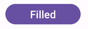
Doldurulmuş düğme
Dolu düğme bileşeni, temel Button composable'ını kullanır. Varsayılan olarak tek bir renkle doldurulur. Snippet'te bileşenin nasıl uygulanacağı gösterilmektedir:
@Composable fun FilledButtonExample(onClick: () -> Unit) { Button(onClick = { onClick() }) { Text("Filled") } }
Bu uygulama aşağıdaki gibi görünür:
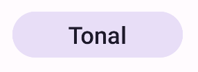
Dolu tonal düğme
Dolu tonlu düğme bileşeni, FilledTonalButton composable'ını kullanır.
Varsayılan olarak tonal bir renkle doldurulur.
Snippet, bileşenin nasıl uygulanacağını gösterir:
@Composable fun FilledTonalButtonExample(onClick: () -> Unit) { FilledTonalButton(onClick = { onClick() }) { Text("Tonal") } }
Bu uygulama aşağıdaki gibi görünür:
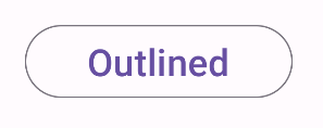
Dış çizgili düğme
Anahatlı düğme bileşeni, OutlinedButton composable'ını kullanır. Varsayılan olarak ana hatla görünür.
Snippet, bileşenin nasıl uygulanacağını gösterir:
@Composable fun OutlinedButtonExample(onClick: () -> Unit) { OutlinedButton(onClick = { onClick() }) { Text("Outlined") } }
Bu uygulama aşağıdaki gibi görünür:
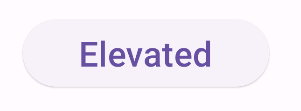
Yükseltilmiş düğme
Yükseltilmiş düğme bileşeni, ElevatedButton composable'ını kullanır. Varsayılan olarak, yüksekliği temsil eden bir gölgeye sahiptir. Gölge içeren dolu bir düğmedir.
Snippet, bileşenin nasıl uygulanacağını gösterir:
@Composable fun ElevatedButtonExample(onClick: () -> Unit) { ElevatedButton(onClick = { onClick() }) { Text("Elevated") } }
Bu uygulama aşağıdaki gibi görünür:
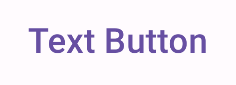
Metin düğmesi
Metin düğmesi bileşeni, TextButton composable'ını kullanır. Basılana kadar yalnızca metin olarak görünür. Varsayılan olarak düz dolgusu veya ana hattı yoktur.
Snippet, bileşenin nasıl uygulanacağını gösterir:
@Composable fun TextButtonExample(onClick: () -> Unit) { TextButton( onClick = { onClick() } ) { Text("Text Button") } }
Bu uygulama aşağıdaki gibi görünür: