Kayan işlem düğmesi (FAB), kullanıcının bir uygulamada birincil işlem gerçekleştirmesine olanak tanıyan, yüksek vurgulu bir düğmedir. Kullanıcının izleyebileceği en yaygın yol olan tek ve odaklanmış bir işlemi teşvik eder. Genellikle ekranın sağ alt kısmına sabitlenmiş olarak bulunur.
FAB kullanabileceğiniz üç kullanım alanını inceleyelim:
- Yeni öğe oluşturma: Not alma uygulamasında, yeni bir notu hızlıca oluşturmak için FAB kullanılabilir.
- Yeni kişi ekleme: Bir sohbet uygulamasında, FAB, kullanıcının bir sohbete kişi eklemesine olanak tanıyan bir arayüz açabilir.
- Konumu ortalama: Bir harita arayüzünde, FAB haritayı kullanıcının mevcut konumuna göre ortalayabilir.
Materyal Tasarım'da dört tür FAB vardır:
- FAB: Normal boyutta bir kayan işlem düğmesi.
- Küçük KİD: Daha küçük bir kayan işlem düğmesi.
- Büyük KİD: Daha büyük bir kayan işlem düğmesi.
- Genişletilmiş FAB: Yalnızca simge içermeyen bir kayan işlem düğmesi.

API yüzeyi
Materyal Tasarım'a uygun kayan işlem düğmeleri oluşturmak için kullanabileceğiniz çeşitli composable'lar olsa da parametreleri çok farklı değildir. Aklınızda bulundurmanız gereken temel parametreler arasında şunlar yer alır:
onClick: Kullanıcı düğmeye bastığında çağrılan işlev.containerColor: Düğmenin rengi.contentColor: Simgenin rengi.
Kayan işlem düğmesi
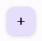
Genel bir kayan işlem düğmesi oluşturmak için temel FloatingActionButton composable'ını kullanın. Aşağıdaki örnekte, kayan işlem düğmesinin temel bir uygulaması gösterilmektedir:
@Composable fun Example(onClick: () -> Unit) { FloatingActionButton( onClick = { onClick() }, ) { Icon(Icons.Filled.Add, "Floating action button.") } }
Bu uygulama aşağıdaki gibi görünür:
Küçük düğme
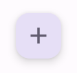
Küçük bir kayan işlem düğmesi oluşturmak için
SmallFloatingActionButton composable'ını kullanın. Aşağıdaki örnekte, özel renkler eklenerek bu işlemin nasıl yapılacağı gösterilmektedir.
@Composable fun SmallExample(onClick: () -> Unit) { SmallFloatingActionButton( onClick = { onClick() }, containerColor = MaterialTheme.colorScheme.secondaryContainer, contentColor = MaterialTheme.colorScheme.secondary ) { Icon(Icons.Filled.Add, "Small floating action button.") } }
Bu uygulama aşağıdaki gibi görünür:
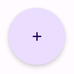
Büyük düğme
Büyük bir kayan işlem düğmesi oluşturmak için LargeFloatingActionButton composable'ını kullanın. Bu composable, daha büyük bir düğmeyle sonuçlanması dışında diğer örneklerden önemli ölçüde farklı değildir.
Aşağıda, büyük bir kayan işlem düğmesinin basit bir uygulaması verilmiştir.
@Composable fun LargeExample(onClick: () -> Unit) { LargeFloatingActionButton( onClick = { onClick() }, shape = CircleShape, ) { Icon(Icons.Filled.Add, "Large floating action button") } }
Bu uygulama aşağıdaki gibi görünür:
Genişletilmiş düğme
ExtendedFloatingActionButton composable'ı kullanarak daha karmaşık kayan işlem düğmeleri oluşturabilirsiniz. Bu composable ile FloatingActionButton arasındaki temel fark, özel icon ve text parametrelerine sahip olmasıdır. Bu parametreler, içeriğine uygun şekilde ölçeklenen daha karmaşık içerikli bir düğme oluşturmanıza olanak tanır.
Aşağıdaki snippet'te, ExtendedFloatingActionButton öğesinin nasıl uygulanacağı gösterilmektedir. icon ve text için örnek değerler iletilir.
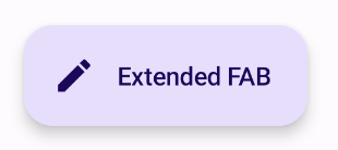
@Composable fun ExtendedExample(onClick: () -> Unit) { ExtendedFloatingActionButton( onClick = { onClick() }, icon = { Icon(Icons.Filled.Edit, "Extended floating action button.") }, text = { Text(text = "Extended FAB") }, ) }
Bu uygulama aşağıdaki gibi görünür: