Stay organized with collections
Save and categorize content based on your preferences.
Drop-down menus let users click an icon, text field, or other component, and
then select from a list of options on a temporary surface. This guide describes
how to create both basic menus and more complex menus with dividers and icons.
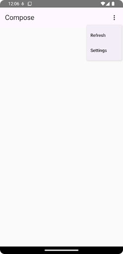
Figure 1. A basic drop-down menu with two items listed.
API surface
Use DropdownMenu, DropdownMenuItem, and the IconButton
components to implement a custom drop-down menu. The DropdownMenu and
DropdownMenuItem components are used to display the menu items, while the
IconButton is the trigger to display or hide the drop-down menu.
The key parameters for the DropdownMenu component include the following:
expanded: Indicates whether the menu is visible.
onDismissRequest: Used to handle menu dismissal.
content: The composable content of the menu, typically containing
DropdownMenuItem composables.
The key parameters for DropdownMenuItem include the following:
text: Defines the content displayed in the menu item.
onClick: Callback to handle interaction with the item in the menu.
Create a basic drop-down menu
The following snippet demonstrates a minimal DropdownMenu implementation:
@ComposablefunMinimalDropdownMenu(){varexpandedbyremember{mutableStateOf(false)}Box(modifier=Modifier.padding(16.dp)){IconButton(onClick={expanded=!expanded}){Icon(Icons.Default.MoreVert,contentDescription="More options")}DropdownMenu(expanded=expanded,onDismissRequest={expanded=false}){DropdownMenuItem(text={Text("Option 1")},onClick={/* Do something... */})DropdownMenuItem(text={Text("Option 2")},onClick={/* Do something... */})}}}
Defines a basic DropdownMenu containing two menu items.
The expanded parameter controls the menu's visibility as expanded or
collapsed.
The onDismissRequest parameter defines a callback that executes when the
user closes the menu.
The DropdownMenuItem composable represents selectable items in the
drop-down menu.
An IconButton triggers the expansion and collapse of the menu.
Result
Figure 2. A minimal drop-down menu with only two options.
Create a longer drop-down menu
DropdownMenu is scrollable by default if all the menu items can't be displayed
at once. The following snippet creates a longer, scrollable drop-down menu:
@ComposablefunLongBasicDropdownMenu(){varexpandedbyremember{mutableStateOf(false)}// Placeholder list of 100 strings for demonstrationvalmenuItemData=List(100){"Option ${it+1}"}Box(modifier=Modifier.padding(16.dp)){IconButton(onClick={expanded=!expanded}){Icon(Icons.Default.MoreVert,contentDescription="More options")}DropdownMenu(expanded=expanded,onDismissRequest={expanded=false}){menuItemData.forEach{option->
DropdownMenuItem(text={Text(option)},onClick={/* Do something... */})}}}}
The DropdownMenu is scrollable when the total height of its content
exceeds the available space. This code creates a scrollable DropdownMenu
that displays 100 placeholder items.
The forEach loop dynamically generates DropdownMenuItem composables. The
items are not lazily created, which means that all 100 drop-down items are
created and exist in the composition.
The IconButton triggers the expansion and collapse of the DropdownMenu
when clicked.
The onClick lambda within each DropdownMenuItem lets you define the
action performed when the user selects a menu item.
Result
The preceding code snippet produces the following scrollable menu:
Figure 3. A long, scrollable drop-down menu.
Create a longer drop-down menu with dividers
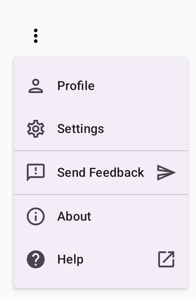
The following snippet shows a more advanced implementation of a drop-down menu.
In this snippet, leading and trailing icons are added to menu items, and
dividers separate groups of menu items.
@ComposablefunDropdownMenuWithDetails(){varexpandedbyremember{mutableStateOf(false)}Box(modifier=Modifier.fillMaxWidth().padding(16.dp)){IconButton(onClick={expanded=!expanded}){Icon(Icons.Default.MoreVert,contentDescription="More options")}DropdownMenu(expanded=expanded,onDismissRequest={expanded=false}){// First sectionDropdownMenuItem(text={Text("Profile")},leadingIcon={Icon(Icons.Outlined.Person,contentDescription=null)},onClick={/* Do something... */})DropdownMenuItem(text={Text("Settings")},leadingIcon={Icon(Icons.Outlined.Settings,contentDescription=null)},onClick={/* Do something... */})HorizontalDivider()// Second sectionDropdownMenuItem(text={Text("Send Feedback")},leadingIcon={Icon(Icons.Outlined.Feedback,contentDescription=null)},trailingIcon={Icon(Icons.AutoMirrored.Outlined.Send,contentDescription=null)},onClick={/* Do something... */})HorizontalDivider()// Third sectionDropdownMenuItem(text={Text("About")},leadingIcon={Icon(Icons.Outlined.Info,contentDescription=null)},onClick={/* Do something... */})DropdownMenuItem(text={Text("Help")},leadingIcon={Icon(Icons.AutoMirrored.Outlined.Help,contentDescription=null)},trailingIcon={Icon(Icons.AutoMirrored.Outlined.OpenInNew,contentDescription=null)},onClick={/* Do something... */})}}}
Content and code samples on this page are subject to the licenses described in the Content License. Java and OpenJDK are trademarks or registered trademarks of Oracle and/or its affiliates.
Last updated 2025-08-26 UTC.
[[["Easy to understand","easyToUnderstand","thumb-up"],["Solved my problem","solvedMyProblem","thumb-up"],["Other","otherUp","thumb-up"]],[["Missing the information I need","missingTheInformationINeed","thumb-down"],["Too complicated / too many steps","tooComplicatedTooManySteps","thumb-down"],["Out of date","outOfDate","thumb-down"],["Samples / code issue","samplesCodeIssue","thumb-down"],["Other","otherDown","thumb-down"]],["Last updated 2025-08-26 UTC."],[],[],null,["Drop-down menus let users click an icon, text field, or other component, and\nthen select from a list of options on a temporary surface. This guide describes\nhow to create both basic menus and more complex menus with dividers and icons.\n**Figure 1.** A basic drop-down menu with two items listed.\n\nAPI surface\n\nUse [`DropdownMenu`](/reference/kotlin/androidx/compose/material3/package-summary#DropdownMenu(kotlin.Boolean,kotlin.Function0,androidx.compose.ui.Modifier,androidx.compose.ui.unit.DpOffset,androidx.compose.foundation.ScrollState,androidx.compose.ui.window.PopupProperties,androidx.compose.ui.graphics.Shape,androidx.compose.ui.graphics.Color,androidx.compose.ui.unit.Dp,androidx.compose.ui.unit.Dp,androidx.compose.foundation.BorderStroke,kotlin.Function1)), [`DropdownMenuItem`](/reference/kotlin/androidx/compose/material3/package-summary#DropdownMenuItem(kotlin.Function0,kotlin.Function0,androidx.compose.ui.Modifier,kotlin.Function0,kotlin.Function0,kotlin.Boolean,androidx.compose.material3.MenuItemColors,androidx.compose.foundation.layout.PaddingValues,androidx.compose.foundation.interaction.MutableInteractionSource)), and the [`IconButton`](/reference/kotlin/androidx/compose/material3/package-summary#IconButton(kotlin.Function0,androidx.compose.ui.Modifier,kotlin.Boolean,androidx.compose.material3.IconButtonColors,androidx.compose.foundation.interaction.MutableInteractionSource,androidx.compose.ui.graphics.Shape,kotlin.Function0))\ncomponents to implement a custom drop-down menu. The `DropdownMenu` and\n`DropdownMenuItem` components are used to display the menu items, while the\n`IconButton` is the trigger to display or hide the drop-down menu.\n\nThe key parameters for the `DropdownMenu` component include the following:\n\n- `expanded`: Indicates whether the menu is visible.\n- `onDismissRequest`: Used to handle menu dismissal.\n- `content`: The composable content of the menu, typically containing `DropdownMenuItem` composables.\n\nThe key parameters for `DropdownMenuItem` include the following:\n\n- `text`: Defines the content displayed in the menu item.\n- `onClick`: Callback to handle interaction with the item in the menu.\n\nCreate a basic drop-down menu\n\nThe following snippet demonstrates a minimal `DropdownMenu` implementation:\n\n\n```kotlin\n@Composable\nfun MinimalDropdownMenu() {\n var expanded by remember { mutableStateOf(false) }\n Box(\n modifier = Modifier\n .padding(16.dp)\n ) {\n IconButton(onClick = { expanded = !expanded }) {\n Icon(Icons.Default.MoreVert, contentDescription = \"More options\")\n }\n DropdownMenu(\n expanded = expanded,\n onDismissRequest = { expanded = false }\n ) {\n DropdownMenuItem(\n text = { Text(\"Option 1\") },\n onClick = { /* Do something... */ }\n )\n DropdownMenuItem(\n text = { Text(\"Option 2\") },\n onClick = { /* Do something... */ }\n )\n }\n }\n}https://github.com/android/snippets/blob/7a0ebbee11495f628cf9d574f6b6069c2867232a/compose/snippets/src/main/java/com/example/compose/snippets/components/Menus.kt#L98-L122\n```\n\n\u003cbr /\u003e\n\nKey points about the code\n\n- Defines a basic `DropdownMenu` containing two menu items.\n- The `expanded` parameter controls the menu's visibility as expanded or collapsed.\n- The `onDismissRequest` parameter defines a callback that executes when the user closes the menu.\n- The `DropdownMenuItem` composable represents selectable items in the drop-down menu.\n- An `IconButton` triggers the expansion and collapse of the menu.\n\nResult **Figure 2.** A minimal drop-down menu with only two options.\n\nCreate a longer drop-down menu\n\n`DropdownMenu` is scrollable by default if all the menu items can't be displayed\nat once. The following snippet creates a longer, scrollable drop-down menu:\n\n\n```kotlin\n@Composable\nfun LongBasicDropdownMenu() {\n var expanded by remember { mutableStateOf(false) }\n // Placeholder list of 100 strings for demonstration\n val menuItemData = List(100) { \"Option ${it + 1}\" }\n\n Box(\n modifier = Modifier\n .padding(16.dp)\n ) {\n IconButton(onClick = { expanded = !expanded }) {\n Icon(Icons.Default.MoreVert, contentDescription = \"More options\")\n }\n DropdownMenu(\n expanded = expanded,\n onDismissRequest = { expanded = false }\n ) {\n menuItemData.forEach { option -\u003e\n DropdownMenuItem(\n text = { Text(option) },\n onClick = { /* Do something... */ }\n )\n }\n }\n }\n}https://github.com/android/snippets/blob/7a0ebbee11495f628cf9d574f6b6069c2867232a/compose/snippets/src/main/java/com/example/compose/snippets/components/Menus.kt#L132-L157\n```\n\n\u003cbr /\u003e\n\nKey points about the code\n\n- The `DropdownMenu` is scrollable when the total height of its content exceeds the available space. This code creates a scrollable `DropdownMenu` that displays 100 placeholder items.\n- The `forEach` loop dynamically generates `DropdownMenuItem` composables. The items are not lazily created, which means that all 100 drop-down items are created and exist in the composition.\n- The `IconButton` triggers the expansion and collapse of the `DropdownMenu` when clicked.\n- The `onClick` lambda within each `DropdownMenuItem` lets you define the action performed when the user selects a menu item.\n\nResult\n\nThe preceding code snippet produces the following scrollable menu:\n**Figure 3.** A long, scrollable drop-down menu.\n\nCreate a longer drop-down menu with dividers\n\nThe following snippet shows a more advanced implementation of a drop-down menu.\nIn this snippet, leading and trailing icons are added to menu items, and\ndividers separate groups of menu items.\n\n\n```kotlin\n@Composable\nfun DropdownMenuWithDetails() {\n var expanded by remember { mutableStateOf(false) }\n\n Box(\n modifier = Modifier\n .fillMaxWidth()\n .padding(16.dp)\n ) {\n IconButton(onClick = { expanded = !expanded }) {\n Icon(Icons.Default.MoreVert, contentDescription = \"More options\")\n }\n DropdownMenu(\n expanded = expanded,\n onDismissRequest = { expanded = false }\n ) {\n // First section\n DropdownMenuItem(\n text = { Text(\"Profile\") },\n leadingIcon = { Icon(Icons.Outlined.Person, contentDescription = null) },\n onClick = { /* Do something... */ }\n )\n DropdownMenuItem(\n text = { Text(\"Settings\") },\n leadingIcon = { Icon(Icons.Outlined.Settings, contentDescription = null) },\n onClick = { /* Do something... */ }\n )\n\n HorizontalDivider()\n\n // Second section\n DropdownMenuItem(\n text = { Text(\"Send Feedback\") },\n leadingIcon = { Icon(Icons.Outlined.Feedback, contentDescription = null) },\n trailingIcon = { Icon(Icons.AutoMirrored.Outlined.Send, contentDescription = null) },\n onClick = { /* Do something... */ }\n )\n\n HorizontalDivider()\n\n // Third section\n DropdownMenuItem(\n text = { Text(\"About\") },\n leadingIcon = { Icon(Icons.Outlined.Info, contentDescription = null) },\n onClick = { /* Do something... */ }\n )\n DropdownMenuItem(\n text = { Text(\"Help\") },\n leadingIcon = { Icon(Icons.AutoMirrored.Outlined.Help, contentDescription = null) },\n trailingIcon = { Icon(Icons.AutoMirrored.Outlined.OpenInNew, contentDescription = null) },\n onClick = { /* Do something... */ }\n )\n }\n }\n}https://github.com/android/snippets/blob/7a0ebbee11495f628cf9d574f6b6069c2867232a/compose/snippets/src/main/java/com/example/compose/snippets/components/Menus.kt#L167-L221\n```\n\n\u003cbr /\u003e\n\nThis code defines a `DropdownMenu` within a `Box`.\n\nKey points about the code\n\n- The `leadingIcon` and `trailingIcon` parameters add icons to the start and end of a `DropdownMenuItem`.\n- An `IconButton` triggers the menu's expansion.\n- The `DropdownMenu` contains several `DropdownMenuItem` composables, each representing a selectable action.\n- [`HorizontalDivider`](/reference/kotlin/androidx/compose/material3/package-summary#HorizontalDivider(androidx.compose.ui.Modifier,androidx.compose.ui.unit.Dp,androidx.compose.ui.graphics.Color)) composables insert a horizontal line to separate groups of menu items.\n\nResult\n\nThe preceding snippet produces a drop-down menu with icons and dividers:\n**Figure 4.** A drop-down menu divided into sections with leading and trailing icons.\n\nAdditional resources\n\n- Material Design: [Menus](https://m3.material.io/components/menus)"]]