Nút hành động nổi (FAB) là một nút có độ nhấn mạnh cao, cho phép người dùng thực hiện một hành động chính trong ứng dụng. Nút này thúc đẩy một hành động duy nhất, tập trung, là con đường phổ biến nhất mà người dùng có thể thực hiện và thường được neo ở dưới cùng bên phải màn hình.
Hãy cân nhắc 3 trường hợp sử dụng sau đây mà bạn có thể dùng FAB:
- Tạo mục mới: Trong một ứng dụng ghi chú, bạn có thể dùng FAB để nhanh chóng tạo một ghi chú mới.
- Thêm người liên hệ mới: Trong một ứng dụng trò chuyện, FAB có thể mở một giao diện cho phép người dùng thêm một người vào cuộc trò chuyện.
- Căn giữa vị trí: Trong giao diện bản đồ, FAB có thể căn giữa bản đồ theo vị trí hiện tại của người dùng.
Trong Material Design, có 4 loại FAB:
- FAB: Nút hành động nổi có kích thước thông thường.
- FAB nhỏ: Nút hành động nổi nhỏ hơn.
- FAB lớn: Nút hành động nổi lớn hơn.
- FAB mở rộng: Nút hành động nổi chỉ chứa biểu tượng.

Bề mặt API
Mặc dù có một số thành phần kết hợp mà bạn có thể dùng để tạo các nút hành động nổi phù hợp với Material Design, nhưng các tham số của chúng không khác nhau nhiều. Sau đây là một số tham số chính mà bạn cần lưu ý:
onClick: Hàm được gọi khi người dùng nhấn vào nút.containerColor: Màu của nút.contentColor: Màu của biểu tượng.
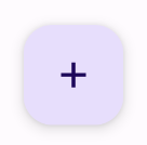
Nút hành động nổi
Để tạo một nút hành động nổi chung, hãy dùng thành phần kết hợp cơ bản
FloatingActionButton. Ví dụ sau đây minh hoạ cách triển khai cơ bản của FAB:
@Composable fun Example(onClick: () -> Unit) { FloatingActionButton( onClick = { onClick() }, ) { Icon(Icons.Filled.Add, "Floating action button.") } }
Phương thức triển khai có dạng như sau:
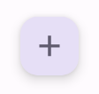
Nút nhỏ
Để tạo một nút hành động nổi nhỏ, hãy dùng thành phần kết hợp
SmallFloatingActionButton. Ví dụ sau đây minh hoạ cách thực hiện việc này, đồng thời thêm màu sắc tuỳ chỉnh.
@Composable fun SmallExample(onClick: () -> Unit) { SmallFloatingActionButton( onClick = { onClick() }, containerColor = MaterialTheme.colorScheme.secondaryContainer, contentColor = MaterialTheme.colorScheme.secondary ) { Icon(Icons.Filled.Add, "Small floating action button.") } }
Phương thức triển khai có dạng như sau:
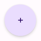
Nút lớn
Để tạo một nút hành động nổi lớn, hãy dùng thành phần kết hợp
LargeFloatingActionButton. Thành phần kết hợp này không khác biệt đáng kể so với các ví dụ khác, ngoài việc tạo ra một nút lớn hơn.
Sau đây là cách triển khai đơn giản của một FAB lớn.
@Composable fun LargeExample(onClick: () -> Unit) { LargeFloatingActionButton( onClick = { onClick() }, shape = CircleShape, ) { Icon(Icons.Filled.Add, "Large floating action button") } }
Phương thức triển khai có dạng như sau:
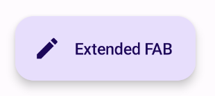
Nút mở rộng
Bạn có thể tạo các nút hành động nổi phức tạp hơn bằng thành phần kết hợp
ExtendedFloatingActionButton. Điểm khác biệt chính giữa thành phần này
và FloatingActionButton là thành phần này có các tham số icon và text
riêng. Các tham số này cho phép bạn tạo một nút có nội dung phức tạp hơn, có thể điều chỉnh để phù hợp với nội dung đó.
Đoạn mã sau đây minh hoạ cách triển khai ExtendedFloatingActionButton, với các giá trị mẫu được truyền cho icon và text.
@Composable fun ExtendedExample(onClick: () -> Unit) { ExtendedFloatingActionButton( onClick = { onClick() }, icon = { Icon(Icons.Filled.Edit, "Extended floating action button.") }, text = { Text(text = "Extended FAB") }, ) }
Phương thức triển khai có dạng như sau: