
Thành phần Chip là một phần tử trên giao diện người dùng nhỏ gọn, có tính tương tác. Thẻ này đại diện cho các thực thể phức tạp như người liên hệ hoặc thẻ, thường có biểu tượng và nhãn. Bạn có thể đánh dấu, đóng hoặc nhấp vào thông báo.
Sau đây là 4 loại chip và nơi bạn có thể sử dụng chúng:
- Hỗ trợ: Hướng dẫn người dùng trong một tác vụ. Thường xuất hiện dưới dạng một phần tử tạm thời trên giao diện người dùng để phản hồi hoạt động đầu vào của người dùng.
- Bộ lọc: Cho phép người dùng tinh chỉnh nội dung trong một nhóm lựa chọn. Bạn có thể chọn hoặc bỏ chọn các mục này và có thể thấy biểu tượng dấu kiểm khi chọn.
- Đầu vào: Đại diện cho thông tin do người dùng cung cấp, chẳng hạn như lựa chọn trong một trình đơn. Chúng có thể chứa biểu tượng và văn bản, đồng thời cung cấp một X để xoá.
- Đề xuất: Đưa ra đề xuất cho người dùng dựa trên hoạt động hoặc thông tin đầu vào gần đây của họ. Thường xuất hiện bên dưới một trường nhập dữ liệu để nhắc người dùng thực hiện hành động.

Nền tảng API
Có 4 thành phần kết hợp tương ứng với 4 loại chip. Các phần sau đây trình bày chi tiết về những thành phần kết hợp này và sự khác biệt giữa chúng. Tuy nhiên, chúng có chung các thông số sau:
label: Chuỗi xuất hiện trên khối thông tin.icon: Biểu tượng xuất hiện ở đầu khối. Một số thành phần kết hợp cụ thể có tham sốleadingIconvàtrailingIconriêng biệt.onClick: Lambda mà khối gọi khi người dùng nhấn vào khối đó.
Khối hỗ trợ
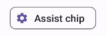
Thành phần kết hợp AssistChip cung cấp một cách đơn giản để tạo chip hỗ trợ nhằm thúc đẩy người dùng theo một hướng cụ thể. Một điểm khác biệt là tham số leadingIcon cho phép bạn hiển thị một biểu tượng ở bên trái của chip. Ví dụ sau đây minh hoạ cách bạn có thể triển khai:
@Composable fun AssistChipExample() { AssistChip( onClick = { Log.d("Assist chip", "hello world") }, label = { Text("Assist chip") }, leadingIcon = { Icon( Icons.Filled.Settings, contentDescription = "Localized description", Modifier.size(AssistChipDefaults.IconSize) ) } ) }
Phương thức triển khai có dạng như sau.
Thẻ bộ lọc
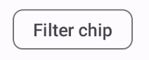
Thành phần kết hợp FilterChip yêu cầu bạn theo dõi xem chip có được chọn hay không. Ví dụ sau đây minh hoạ cách bạn chỉ có thể hiện biểu tượng đã đánh dấu ở đầu khi người dùng đã chọn khối:
@Composable fun FilterChipExample() { var selected by remember { mutableStateOf(false) } FilterChip( onClick = { selected = !selected }, label = { Text("Filter chip") }, selected = selected, leadingIcon = if (selected) { { Icon( imageVector = Icons.Filled.Done, contentDescription = "Done icon", modifier = Modifier.size(FilterChipDefaults.IconSize) ) } } else { null }, ) }
Phương thức triển khai này có dạng như sau khi chưa được chọn:
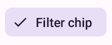
Và sẽ xuất hiện như sau khi được chọn:
Khối nhập
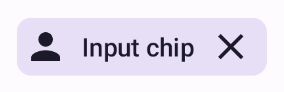
Bạn có thể dùng thành phần kết hợp InputChip để tạo các khối thông tin xuất phát từ lượt tương tác của người dùng. Ví dụ: trong một ứng dụng email, khi người dùng đang viết email, một chip đầu vào có thể đại diện cho một người liên hệ mà người dùng đã thêm vào trường "Đến:".
Quy trình triển khai sau đây minh hoạ một chip đầu vào đã ở trạng thái được chọn. Người dùng đóng chip khi nhấn vào chip.
@Composable fun InputChipExample( text: String, onDismiss: () -> Unit, ) { var enabled by remember { mutableStateOf(true) } if (!enabled) return InputChip( onClick = { onDismiss() enabled = !enabled }, label = { Text(text) }, selected = enabled, avatar = { Icon( Icons.Filled.Person, contentDescription = "Localized description", Modifier.size(InputChipDefaults.AvatarSize) ) }, trailingIcon = { Icon( Icons.Default.Close, contentDescription = "Localized description", Modifier.size(InputChipDefaults.AvatarSize) ) }, ) }
Phương thức triển khai có dạng như sau.
Khối đề xuất
Thành phần kết hợp SuggestionChip là thành phần cơ bản nhất trong số các thành phần kết hợp được liệt kê trên trang này, cả về định nghĩa API và các trường hợp sử dụng phổ biến. Các gợi ý hiển thị những gợi ý được tạo linh động. Ví dụ: trong một ứng dụng trò chuyện AI, bạn có thể sử dụng các đề xuất dạng chip để trình bày các câu trả lời có thể cho tin nhắn gần đây nhất.
Hãy cân nhắc việc triển khai SuggestionChip này:
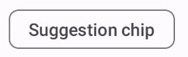
@Composable fun SuggestionChipExample() { SuggestionChip( onClick = { Log.d("Suggestion chip", "hello world") }, label = { Text("Suggestion chip") } ) }
Phương thức triển khai có dạng như sau:
Khối nổi
Tất cả ví dụ trong tài liệu này đều sử dụng các thành phần kết hợp cơ bản có giao diện phẳng. Nếu bạn muốn một chip có giao diện nổi, hãy dùng một trong 3 thành phần kết hợp sau: