The Layout Editor enables you to quickly build View-based layouts by dragging
UI elements into a visual design editor instead of writing layout XML.
The design editor can preview your layout on different Android devices and
versions, and you can dynamically resize the layout to be sure it works properly
on different screen sizes.
The Layout Editor is especially powerful when
building a layout with ConstraintLayout.
This page provides an overview of the Layout Editor. To learn more about layout fundamentals, see Layouts.
Introduction to the Layout Editor
The Layout Editor appears when you open an XML layout file.
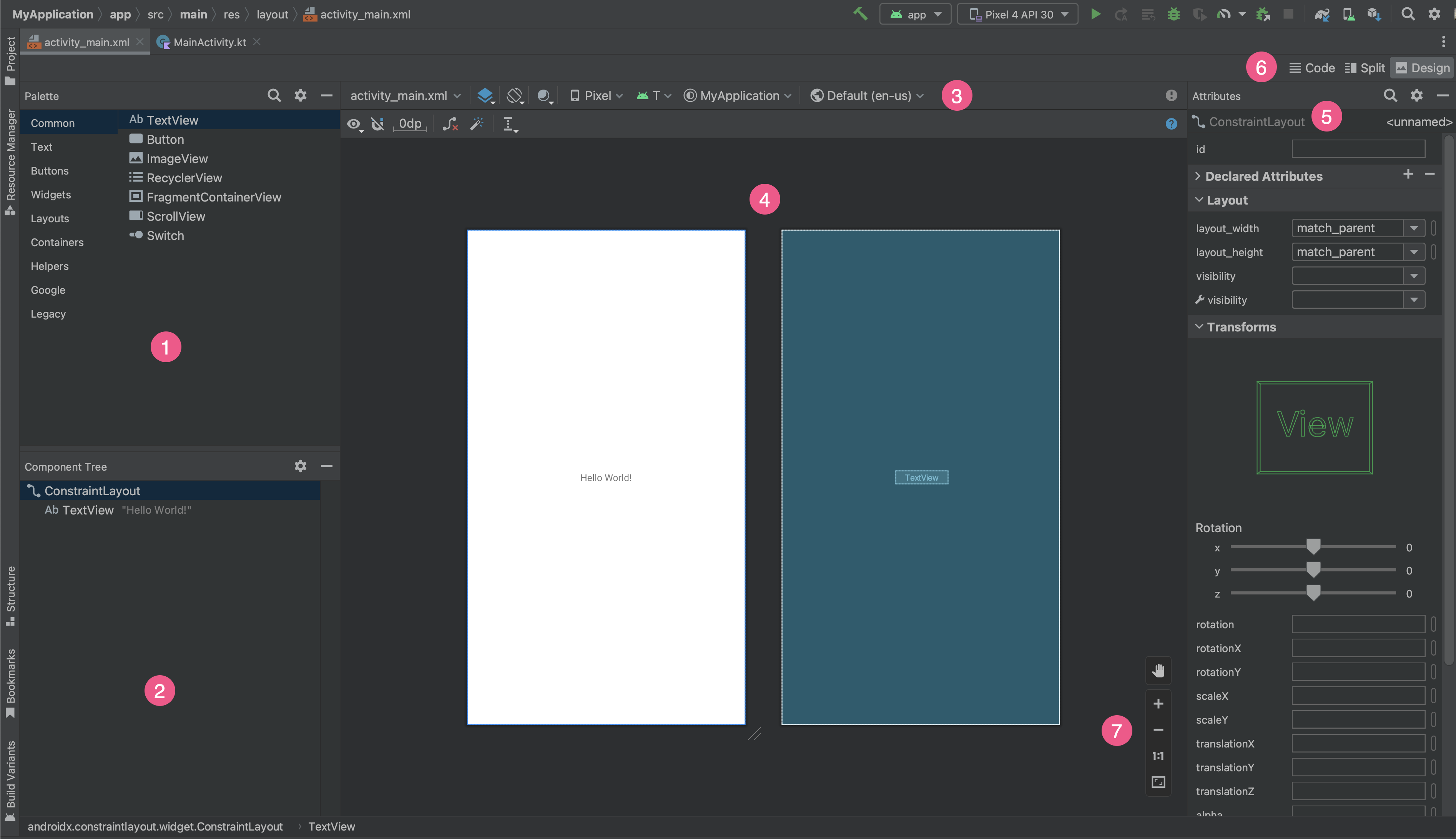
- Palette: contains various views and view groups that you can drag into your layout.
- Component Tree: shows the hierarchy of components in your layout.
- Toolbar: has buttons that configure your layout appearance in the editor and change layout attributes.
- Design editor: lets you edit your layout in Design view, Blueprint view, or both.
- Attributes: has controls for the selected view's attributes.
- View mode: lets you view your layout in either Code
 , Split
 , or Design
 modes. Split mode shows the
Code and Design windows at the same time.
 - Zoom and pan controls: control the preview size and position within the editor.
When you open an XML layout file, the design editor opens by default, as shown
in figure 1. To edit the layout XML in the text editor, click the Code
![]() button in the top-right corner of the window. Note that
the Palette, Component Tree, and Attributes panels are not
available while editing your layout in Code view.
button in the top-right corner of the window. Note that
the Palette, Component Tree, and Attributes panels are not
available while editing your layout in Code view.
Tip: To switch between design and text editors, press
Alt (Control on macOS) plus Shift and the right or left arrow key.
Change the preview appearance
The buttons in the top row of the design editor let you configure the appearance of your layout in the editor.

- Design and Blueprint: Select how you want to view your layout in the
editor. You can also press
Bto cycle through these view types.- Choose Design to see a rendered preview of your layout.
- Choose Blueprint to see only outlines for each view.
- Choose Design + Blueprint to see both views side by side.
- Screen orientation and layout variants: Choose between landscape or
portrait screen orientation or choose other screen modes that your app
provides alternative layouts for, such as night mode. This menu also
contains commands for creating a new layout variant,
as described in a section on this page.
You can also press the letter
Oon your keyboard to change orientation. System UI Mode: If you've enabled dynamic color in your app, switch wallpapers and see how your layouts react to different users chosen wallpaper. Note that you must first change the theme to a Material dynamic color theme, then change the wallpaper.
Device type and size: Select the device type (phone/tablet, Android TV, or Wear OS) and screen configuration (size and density). You can select from several pre-configured device types and your own AVD definitions, and you can create a new AVD by selecting Add Device Definition from the list, as shown in figure 3.
- To resize the device, drag the bottom-right corner of the layout.
- Press
Dto cycle through the device list.
Testing your layout against the Reference Devices in this menu helps your app scale well to layout states on real devices.
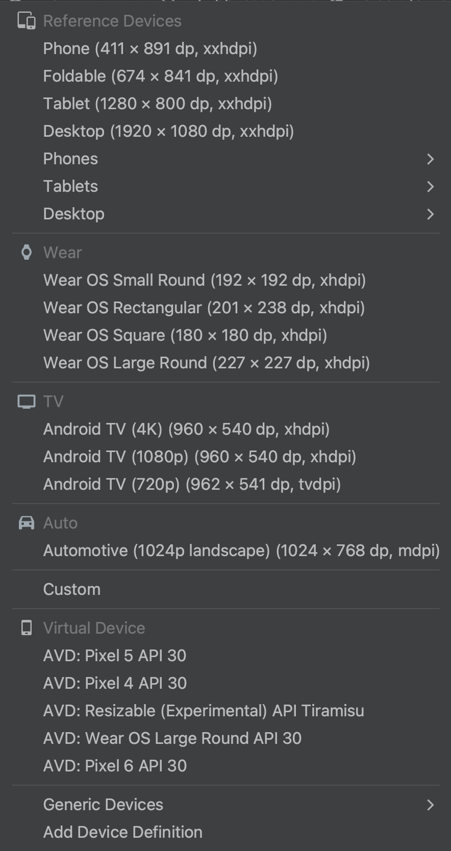
Figure 3. The device list showing Reference Devices. API version: Select the version of Android to preview your layout. The list of available Android versions depends on which SDK platform versions you have installed using SDK Manager.
App theme: Select which UI theme to apply to the preview. This works only for supported layout styles, so many themes in this list result in an error.
Language: Select the language to show for your UI strings. This list displays only the languages available in your string resources. If you'd like to edit your translations, click Edit Translations from the menu. For more information on working with translations, see Localize the UI with Translations Editor.
Create a new layout
When adding a new layout for your app, first create a default layout file in
your project's default layout/ directory so that it applies to all device
configurations. Once you have a default layout, you can
create layout variations, as described in a section on this
page, for specific device configurations, such as for large screens.
You can create a new layout in one of the following ways:
Use Android Studio's main menu
- In the Project window, click the module you want to add a layout to.
- In the main menu, select File > New > XML > Layout XML File.
- In the dialog that appears, provide the filename, the root layout tag, and the source set where the layout belongs.
- Click Finish to create the layout.
Use the Project view
- Choose the Project view from within the Project window.
- Right-click the layout directory where you'd like to add the layout.
- In the context menu that appears, click New > Layout Resource File.
Use the Android view
- Choose the Android view from within the Project window.
- Right-click the
layoutfolder. - In the context menu that appears, select New > Layout Resource File.
Use the Resource Manager
- In the Resource Manager, select the Layout tab.
- Click the
+button, and then click Layout Resource File.
Use layout variants to optimize for different screens
A layout variant is an alternative version of an existing layout that is optimized for a certain screen size or orientation.
Use a suggested layout variant
Android Studio includes common layout variants that you can use in your project. To use a suggested layout variant, do the following:
- Open your default layout file.
- Click the Design
 icon in the top-right corner of the window.
 - The name of the layout file appears in the Action to switch and create qualifiers for layout files drop-down. Select the drop-down.
- In the drop-down list, select a variant such as
Create Landscape Qualifier or Create Tablet Qualifier.
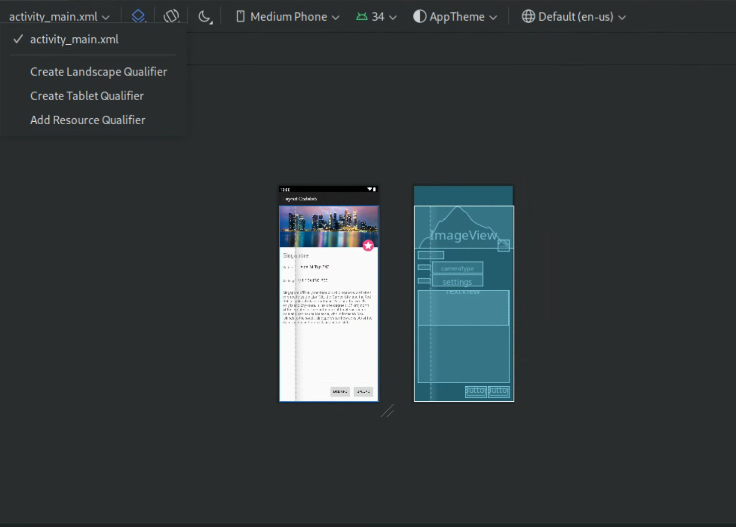
Figure 4. Drop-down list of layout qualifiers.
A new layout directory is created.
Create your own layout variant
If you'd like to create your own layout variant, do the following:
- Open your default layout file.
- Click the Design
 icon in the top-right corner of the window.
 - The name of the layout file appears in the Action to switch and create qualifiers for layout files drop-down. Select the drop-down.
In the drop-down list, select Add Resource Qualifier. (See figure 4 above.)
The Select Resource Directory dialog appears.
In the Select Resource Directory dialog, define the resource qualifiers for the variant:
- Select a qualifier from the Available qualifiers list.
- Click the Add
 button.
 - Enter any required values.
- Repeat these steps to add other qualifiers.
Once you've added all of your qualifiers, click OK.
When you have multiple variations of the same layout, you can switch between them by selecting a variant from the Action to switch and create qualifiers for layout files drop-down.
For more information about how to create layouts for different displays, see Support different display sizes.
Convert a view or layout
You can convert a view to another kind of view, and you can convert a layout to another kind of layout:
- Click the Design button in the top-right corner of the editor window.
- In the Component Tree, right-click the view or layout, and then click Convert view.
- In the dialog that appears, choose the new type of view or layout, and then click Apply.
Convert a layout to ConstraintLayout
For improved layout performance, convert older layouts to
ConstraintLayout.
ConstraintLayout uses a constraint-based layout system that lets you
build most layouts without any nested view groups.
To convert an existing layout to a ConstraintLayout, do the following:
- Open an existing layout in Android Studio.
- Click the Design
 icon
in the top-right corner of the editor window.
 - In the Component Tree, right-click the layout, and then click
Convert
your-layout-typeto ConstraintLayout.
To learn more about ConstraintLayout, see
Build a Responsive UI with ConstraintLayout.
Find items in the Palette
To search for a view or view group by name in the Palette, click the
Search
 button at the top of the palette. Alternatively, you can type the name of the
item whenever the Palette window has focus.
In the Palette, you can find frequently used items in the Common category. To add an item to this category, right-click a view or view group in the Palette and then click Favorite in the context menu.
Open documentation from the Palette
To open the Android Developers reference documentation for a view or view group,
select the UI element in the Palette and press Shift+F1.
To view Material Guidelines documentation for a view or view group, right-click the UI element in the Palette and select Material Guidelines from the context menu. If no specific entry exists for the item, then the command opens the homepage of the Material Guidelines documentation.
Add views to your layout
To start building your layout, drag views and view groups from the Palette into the design editor. As you place a view in the layout, the editor displays information about the view's relationship with the rest of the layout.
If you are using ConstraintLayout, you can
automatically create constraints
using the Infer Constraints and Autoconnect features.
Edit view attributes
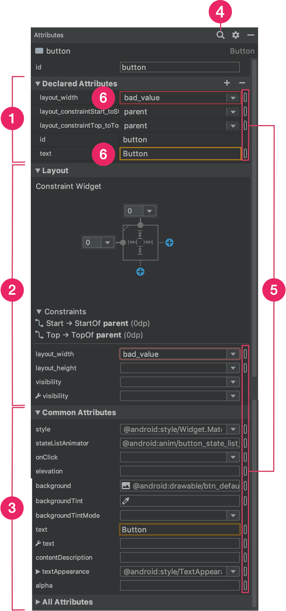
You can edit view attributes from the Attributes panel in the Layout Editor. This window is available only when the design editor is open, so view your layout in either Design or Split mode to use it.
When you select a view, whether by clicking the view in the Component Tree or in the design editor, the Attributes panel shows the following, as indicated in figure 5:
- Declared Attributes: Lists attributes specified in the layout
file. To add an attribute, click the Add
 button at the top of the section.
 - Layout: Contains controls for the width and height of the
view. If the view is in a
ConstraintLayout, this section also shows constraint bias and lists the constraints that the view uses. For more information on controlling the size of views withConstraintLayout, see Adjust the view size. - Common Attributes: Lists common attributes for the selected view. To see all available attributes, expand the All Attributes section at the bottom of the window.
- Search: Lets you search for a specific view attribute.
The icons to the right of each attribute value indicate whether the attribute values are resource references. These indicators are solid
 when the value is a resource reference
and empty
 when the value is hardcoded to
help you recognize hardcoded values at a glance.
when the value is hardcoded to
help you recognize hardcoded values at a glance.Click indicators in either state to open the Resources dialog, where you can select a resource reference for the corresponding attribute.
A red highlight around an attribute value indicates an error with the value. For example, an error might indicate an invalid entry for a layout-defining attribute.
An orange highlight indicates a warning for the value. For example, a warning might appear when you use a hardcoded value where a resource reference is expected.
Add sample data to your view
Because many Android layouts rely on runtime data, it can be difficult to
visualize the look and feel of a layout while designing your app. You can add
sample preview data to a TextView, an
ImageView, or a RecyclerView from within the Layout Editor.
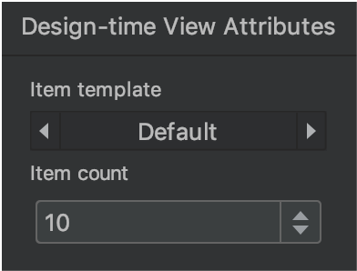
To display the Design-time View Attributes window, right-click one of these view types and choose Set Sample Data, as shown in figure 6.
For a TextView, you can choose between different sample text categories. When
using sample text, Android Studio populates the text attribute of the
TextView with your chosen sample data. Note that you can choose sample text
via the Design-time View Attributes window only if the text attribute is
empty.
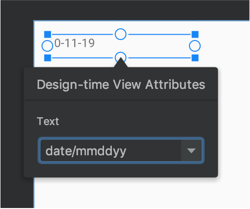
TextView
with sample data.For an ImageView, you can choose between different sample images. When you
choose a sample image, Android Studio populates the tools:src attribute of the
ImageView (or tools:srcCompat if using AndroidX).
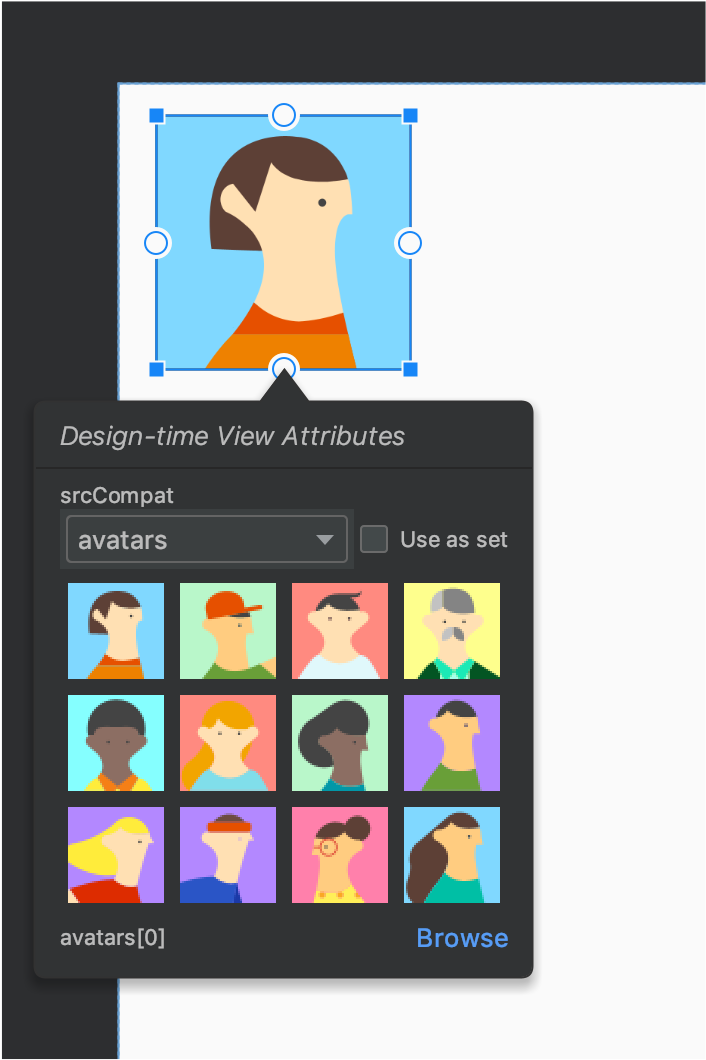
ImageView
with sample data.For a RecyclerView, you can choose from a set of templates that contain
sample images and texts. When using these templates, Android Studio adds a file
to your res/layout directory, recycler_view_item.xml, that contains the
layout for the sample data. Android Studio also adds metadata to the
RecyclerView to properly display the sample data.
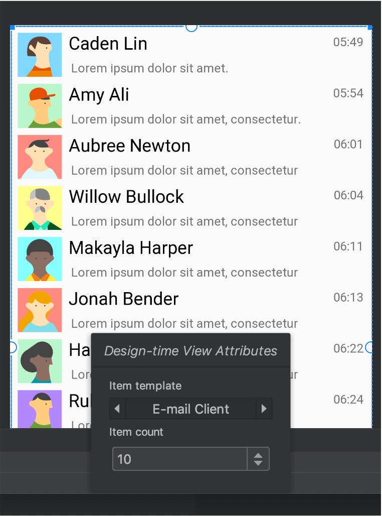
RecyclerView
with sample data.Show layout warnings and errors
The Layout Editor notifies you of any layout issues next to the corresponding
view in the Component Tree by using a red circle exclamation icon
 for errors or an orange triangle exclamation icon
 for warnings. Click the icon to see more details.
To see all known issues in a window below the editor, click
Show Warnings and Errors
( or
or
 )
in the toolbar.
Download fonts and apply them to text
When using Android 8.0 (API level 26) or the Jetpack Core library, you can select from hundreds of fonts by following these steps:
- In the Layout Editor, click the Design
 icon to view your layout in the design
editor.
 - Select a text view.
- In the Attributes panel, expand textAppearance, and then expand the fontFamily box.
- Scroll to the bottom of the list and click More Fonts to open the Resources dialog.
- In the Resources dialog, to select a font, browse the list or type into the search bar at the top. If you select a font under Downloadable, then you can either click Create downloadable font to load the font at runtime as a downloadable font or click Add font to project to package the TTF font file in your APK. The fonts listed under Android are provided by the Android system, so they don't need to be downloaded or bundled in your APK.
- Click OK to finish.
Layout Validation
Layout Validation is a visual tool for simultaneously previewing layouts for different devices and display configurations, helping you catch problems in your layouts earlier in the process. To access this feature, click the Layout Validation tab in the top-right corner of the IDE window:

Figure 10. Layout Validation tab.
To switch between the available configuration sets, select one of the following from the Reference Devices drop-down at the top of the Layout Validation window:
- Reference Devices
- Custom
- Color Blind
- Font Sizes
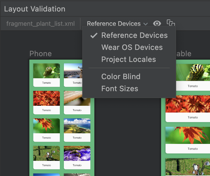
Figure 11. Reference Devices drop-down.
Reference Devices
Reference devices are a set of devices that we recommend you test against. They include phone, foldable, tablet, and desktop interfaces. You should preview how your layout appears on this set of reference devices:
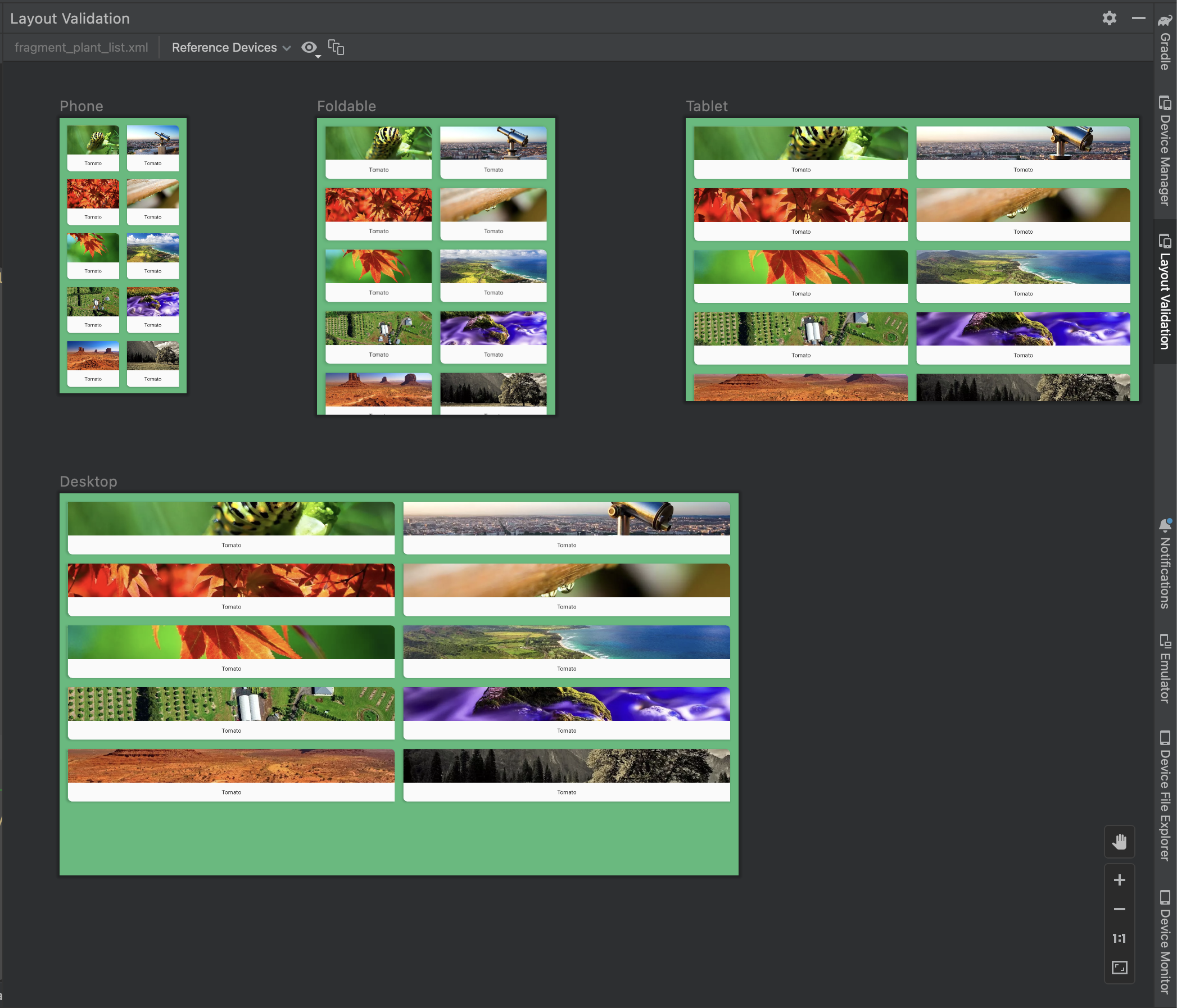
Figure 12. Reference device previews in the Layout Validation tool.
Custom
To customize a display configuration to preview, choose from a variety of settings including language, device, or screen orientation:
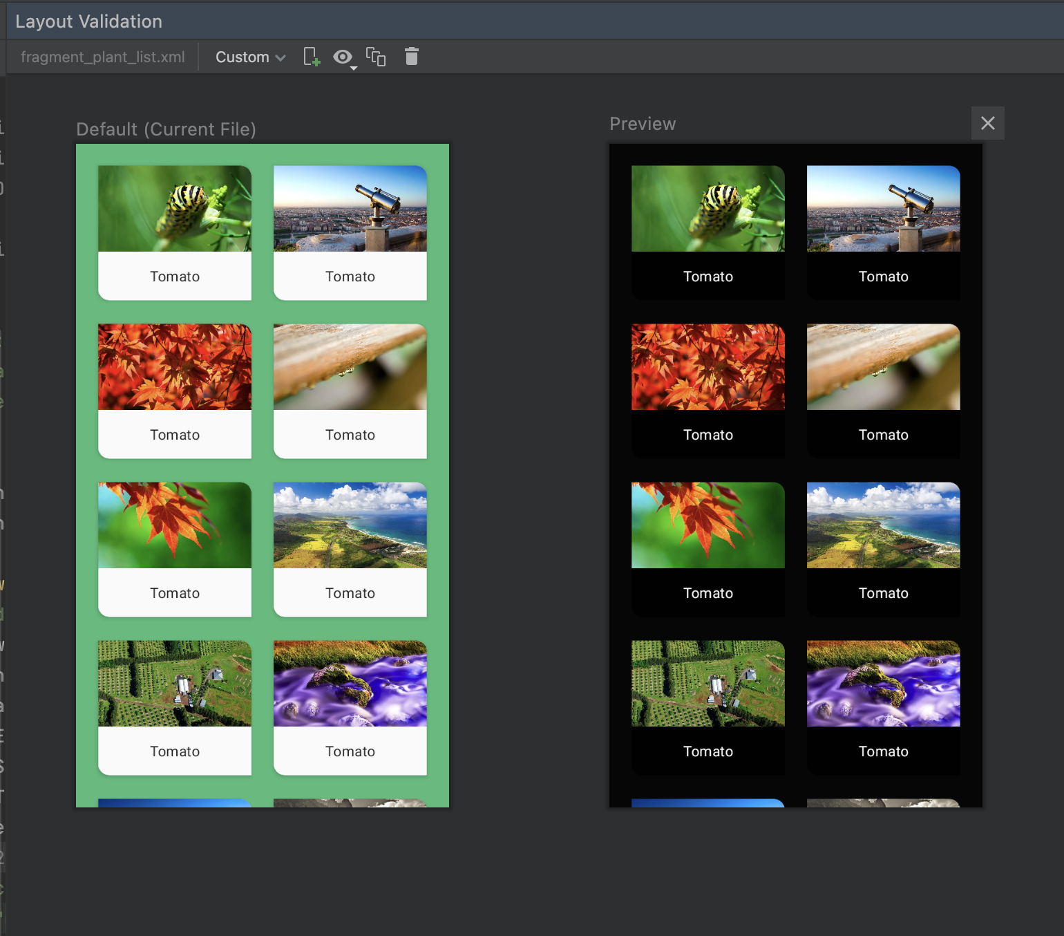
Figure 16. Configure a custom display in the Layout Validation tool.
Color Blind
To help make your app more accessible for users who are color blind, validate your layout with simulations of common types of color blindness:
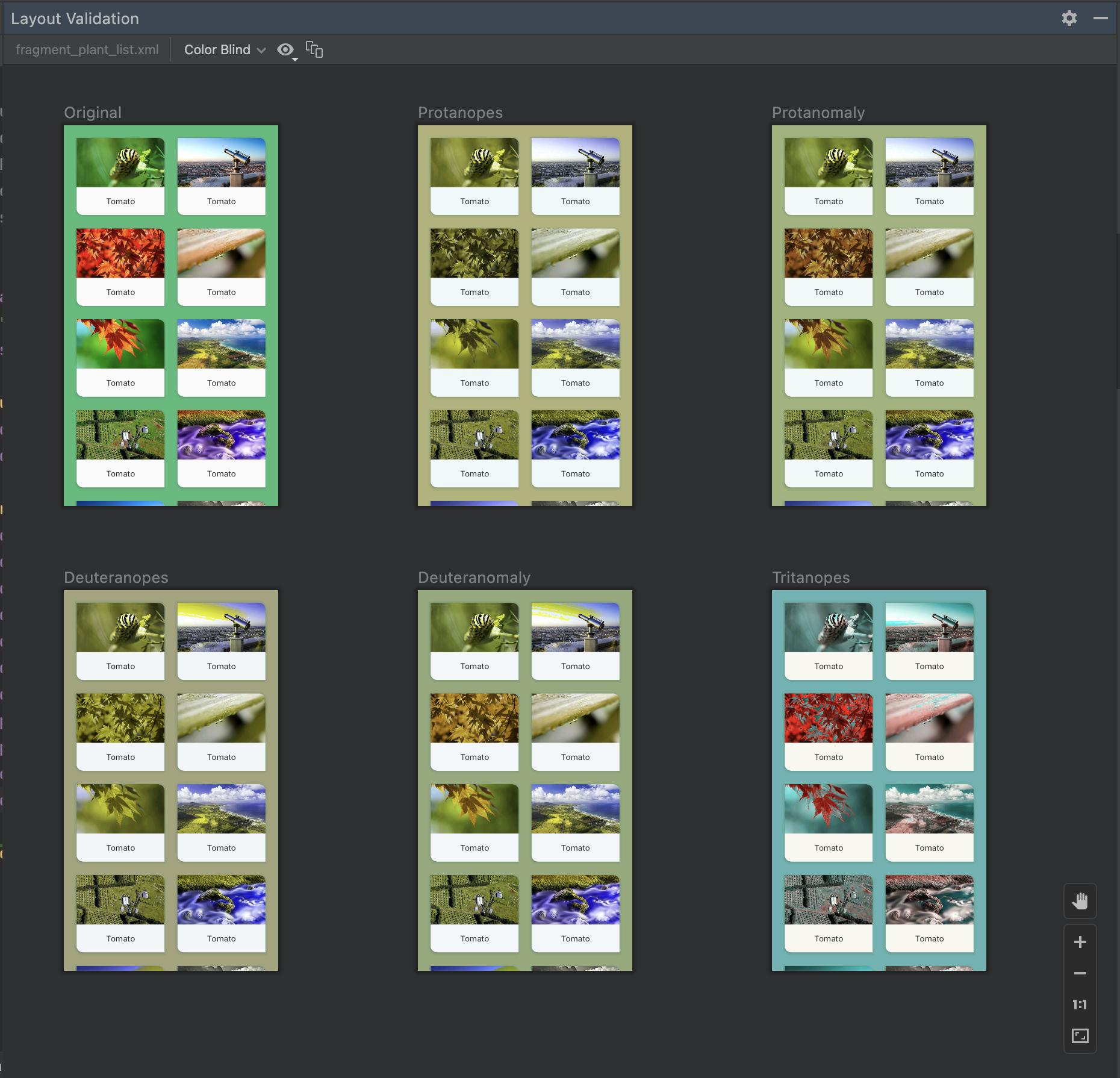
Figure 13. Color blindness simulation previews in the Layout Validation tool.
Font Sizes
Validate your layouts at various font sizes, and improve your app's accessibility for visually impaired users by testing your layouts with larger fonts:
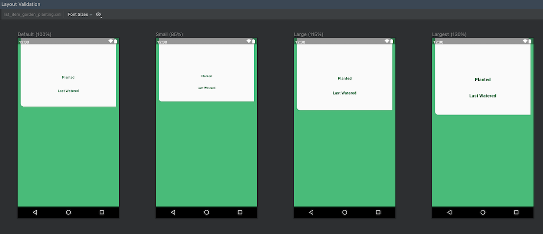
Figure 14. Variable font size previews in the Layout Validation tool.
