
A composable is defined by a function and annotated with @Composable:
@Composable fun SimpleComposable() { Text("Hello World") }

To enable a preview of this composable, create another composable, annotated
with @Composable and @Preview. This new, annotated composable now contains
the composable you created initially, SimpleComposable:
@Preview @Composable fun SimpleComposablePreview() { SimpleComposable() }
The @Preview annotation tells Android Studio that this
composable should be shown in the design view of this file. You can see live
updates to your composable preview as you make your edits.
You can add parameters manually in your code to customize the way Android Studio
renders @Preview. You can even add the @Preview annotation to the same
function multiple times to preview a composable with different properties.
One of the primary benefits of using @Preview composables is to avoid reliance
on the emulator in Android Studio. You can save the memory-heavy startup of the
emulator for more final look-and-feel changes, and @Preview's ability to make
and test small code changes with ease.
To leverage @Preview annotation most effectively, make sure to define your
screens in terms of the state it receives as input and the events that it
outputs.
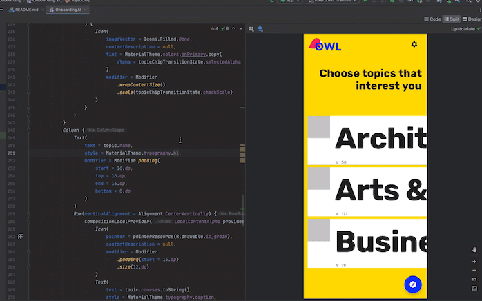
Define your @Preview
Android Studio offers some features to extend composable previews. You can change their container design, interact with them, or deploy them directly to an emulator or device.
Dimensions
By default, @Preview dimensions are chosen automatically to wrap its content.
To set the dimensions manually, add heightDp and widthDp parameters. Those
values are already interpreted as dp, so you don't need to add .dp
to them:
@Preview(widthDp = 50, heightDp = 50) @Composable fun SquareComposablePreview() { Box(Modifier.background(Color.Yellow)) { Text("Hello World") } }

Dynamic color preview
If you've enabled dynamic
color in your app,
use the wallpaper attribute to switch wallpapers and see how your UI reacts to
different users' chosen wallpaper. Select from the different wallpaper themes
offered by the
Wallpaper
class. This feature requires Compose 1.4.0 or higher.
Use with different devices
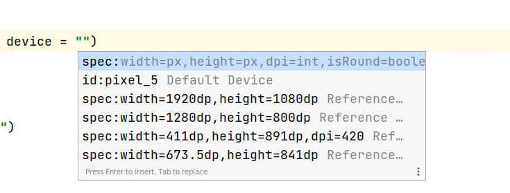
In Android Studio Flamingo, you can edit the device parameter of the Preview
annotation to define configurations for your composables in different devices.
When the device parameter has an empty string (@Preview(device = "")), you can
invoke autocomplete by pressing Ctrl + Space. Then, you can set the values
of each parameter.

From autocomplete, you can select any device option from the list–for example,
@Preview(device = "id:pixel_4"). Alternatively, you can enter a custom device
by choosing spec:width=px,height=px,dpi=int… to set the individual values of
each parameter.
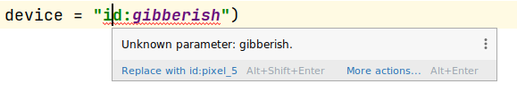
To apply, press Enter, or cancel with Esc.
If you set an invalid value, the declaration is underlined in red and a fix may
be available (Alt + Enter (⌥ + ⏎ for macOS) > Replace with …. The
Inspection attempts to provide a fix that is closest to resembling your input.
Locale
To test different user locales, add the locale parameter:
@Preview(locale = "fr-rFR") @Composable fun DifferentLocaleComposablePreview() { Text(text = stringResource(R.string.greeting)) }

Set background color
By default, your composable is displayed with a transparent background. To add a
background, add the showBackground and backgroundColor parameters. Keep in
mind that backgroundColor is an ARGB Long, not a Color
value:
@Preview(showBackground = true, backgroundColor = 0xFF00FF00) @Composable fun WithGreenBackground() { Text("Hello World") }

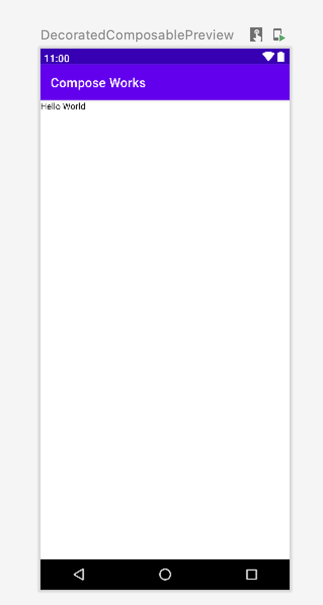
System UI
If you need to display the status and action bars inside a preview, add the
showSystemUi parameter:
@Preview(showSystemUi = true) @Composable fun DecoratedComposablePreview() { Text("Hello World") }
UI mode
The parameter uiMode can take any of the Configuration.UI_*
constants and allows you to change the behavior of the preview accordingly. For
example, you can set the preview to Night Mode to see how the theme reacts.
LocalInspectionMode
You can read from the LocalInspectionMode
CompositionLocal to see if the composable is rendered in a preview (inside an
inspectable component). If the composition is rendered
in a preview, LocalInspectionMode.current evaluates to true. This
information lets you customize your preview; for example, you can show a
placeholder image in the preview window instead of showing real data.
This way, you can also work around the limitations. For example, showing sample data instead of calling network request.
@Composable fun GreetingScreen(name: String) { if (LocalInspectionMode.current) { // Show this text in a preview window: Text("Hello preview user!") } else { // Show this text in the app: Text("Hello $name!") } }
Interact with your @Preview
Android Studio provides features that allow you to interact with your defined previews. This interaction helps you understand your previews' runtime behavior and allows you to better navigate your UI with previews.
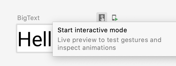
Interactive mode
The interactive mode lets you interact with a preview similarly to how you would on a device running your program, like a phone or tablet. The interactive mode is isolated in a sandbox environment (meaning, isolated from other previews), where you can click elements and enter user input in the preview. It's a quick way to test different states, gestures, and even animations of your composable.
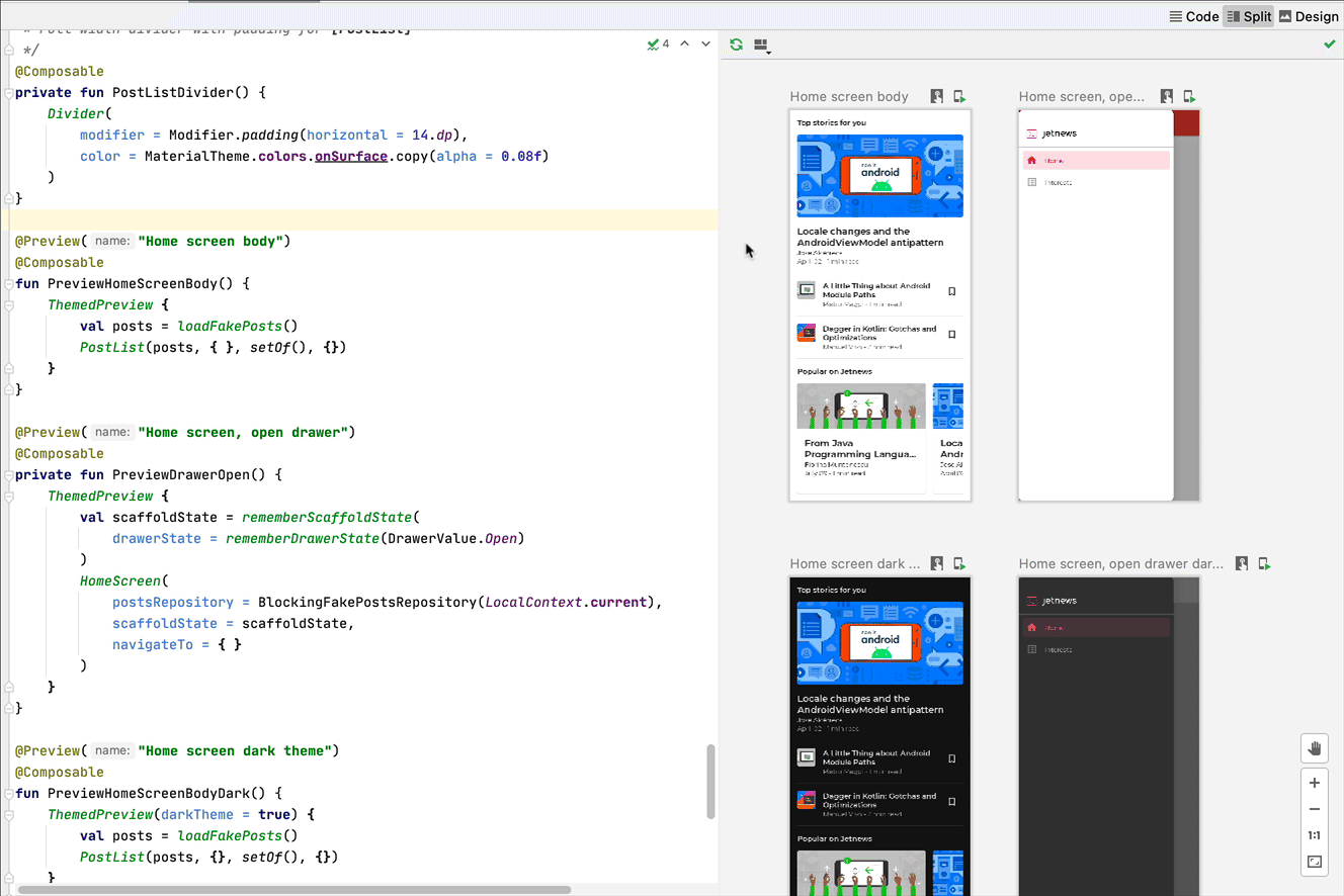
Code navigation and composable outlines
You can hover over a preview to see the outlines of the composables contained within. Clicking on a composable outline triggers your editor view to navigate to its definition.
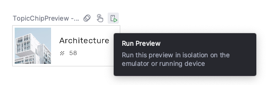
Run preview
You can run a specific @Preview on an emulator or a physical device. The
preview is deployed within the same project app as a new Activity, so it
shares the same context and permissions. It does not require you to write
boilerplate code asking for a permission if it has already been granted.
Click the Run Preview icon  next to the
 @Preview annotation or at the top of the preview, and Android
Studio deploys that @Preview to your connected device or emulator.
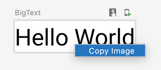
Copy @Preview render
Every rendered preview can be copied as an image by right clicking on it.
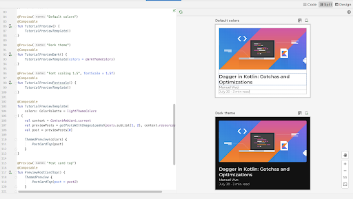
Multiple previews of the same @Preview annotation
You can showcase multiple versions of the same @Preview composable with
different specifications, or different parameters passed to the composable. This
way, you can reduce the boilerplate code that you would need to write otherwise.
Multipreview templates
androidx.compose.ui:ui-tooling-preview 1.6.0-alpha01+ introduces Multipreview
API templates: @PreviewScreenSizes, @PreviewFontScales, @PreviewLightDark,
and @PreviewDynamicColors, so that with one single annotation, you can
preview your Compose UI in common scenarios.
Create custom multipreview annotations
With multipreview, you can define an annotation class that itself has multiple
@Preview annotations with different configurations. Adding this annotation to
a composable function automatically renders all of the different previews at
once. For example, you can use this annotation to preview multiple devices, font
sizes, or themes at the same time without repeating those definitions for every
single composable.
Start by creating your own custom annotation class:
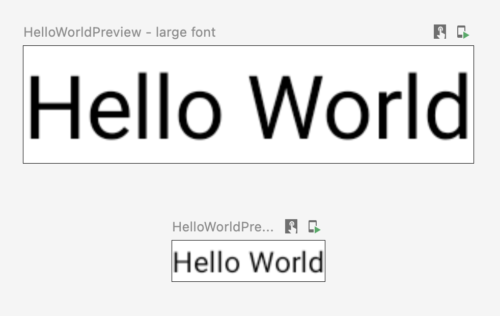
@Preview( name = "small font", group = "font scales", fontScale = 0.5f ) @Preview( name = "large font", group = "font scales", fontScale = 1.5f ) annotation class FontScalePreviews
You can use this custom annotation for your preview composables:
@FontScalePreviews @Composable fun HelloWorldPreview() { Text("Hello World") }
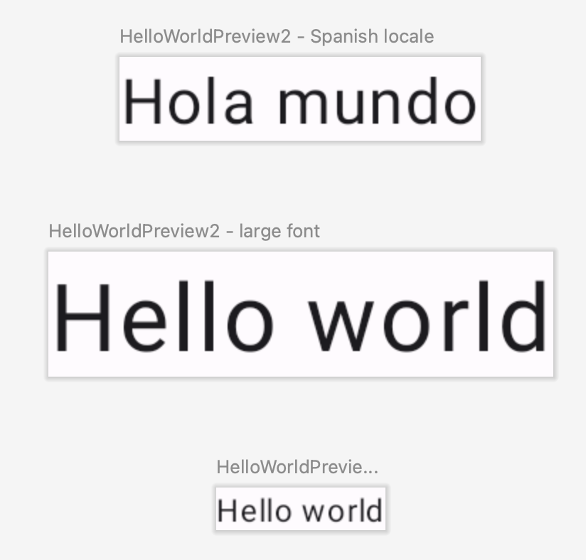
You can combine multiple multipreview annotations and normal preview annotations to create a more complete set of previews. Combining multipreview annotations doesn't mean all the different combinations are shown. Instead, each multipreview annotation acts independently and renders only its own variants.
@Preview( name = "Spanish", group = "locale", locale = "es" ) @FontScalePreviews annotation class CombinedPreviews @CombinedPreviews @Composable fun HelloWorldPreview2() { MaterialTheme { Surface { Text(stringResource(R.string.hello_world)) } } }
The mix-and-match nature of multipreview-- and normal preview!-- lets you more comprehensively test many properties of larger scale projects.
@Preview and large data sets
Very often, a need arises where you must pass a large dataset to your composable
preview. To do this, simply pass sample data to a Composable Preview function by
adding a parameter with the @PreviewParameter
annotation.
@Preview @Composable fun UserProfilePreview( @PreviewParameter(UserPreviewParameterProvider::class) user: User ) { UserProfile(user) }
To provide the sample data, create a class that implements
PreviewParameterProvider and returns the
sample data as a sequence.
class UserPreviewParameterProvider : PreviewParameterProvider<User> { override val values = sequenceOf( User("Elise"), User("Frank"), User("Julia") ) }
This renders one preview per data element in the sequence:

You can use the same provider class for multiple previews. If necessary, limit the number of previews by setting the limit parameter.
@Preview @Composable fun UserProfilePreview2( @PreviewParameter(UserPreviewParameterProvider::class, limit = 2) user: User ) { UserProfile(user) }
Previews using @PreviewParameter are named by default using the parameter
index and property name (user 0, user 1, user 2, and so on), which can make
it difficult to tell them apart. To improve preview clarity, you can provide
custom display names for each preview by overriding getDisplayName() in your
PreviewParameterProvider. This helps distinguish between different data
variations or UI states. For example, you can label previews based on the input
data:
class UserAgePreviewParameterProvider : PreviewParameterProvider<User> { // Using a List internally for efficient index-based access private val userList = listOf( User(name = "Elise", age = 30), User(name = "Frank", age = 31), User(name = "Julia", age = 40) ) override val values = userList.asSequence() override fun getDisplayName(index: Int): String? { // Return null or an empty string to use the default index-based name val user = userList.getOrNull(index) ?: return null return "${user.name} - ${user.age}" } }

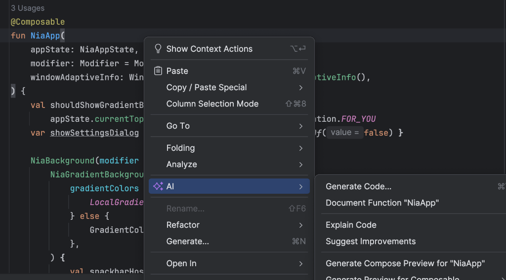
AI-assisted preview generation
The AI agent in Android Studio can automatically generate Compose previews for your
composables. Right-click on a Composable function and select
AI > Generate Preview for [Composable name]. The agent analyzes your composable to
generate the necessary @Preview boilerplate with correct parameters,
helping you quickly verify that your UI renders as expected.
Annotation class @Preview
You can always 'ctrl or ⌘ + click' the @Preview annotation in Android
Studio for a full list of parameters that can be adjusted when customizing your
preview.
annotation class Preview( val name: String = "", val group: String = "", @IntRange(from = 1) val apiLevel: Int = -1, val widthDp: Int = -1, val heightDp: Int = -1, val locale: String = "", @FloatRange(from = 0.01) val fontScale: Float = 1f, val showSystemUi: Boolean = false, val showBackground: Boolean = false, val backgroundColor: Long = 0, @UiMode val uiMode: Int = 0, @Device val device: String = Devices.DEFAULT, @Wallpaper val wallpaper: Int = Wallpapers.NONE, )
Limitations and best practices
Android Studio executes previews code directly in the preview area. It doesn't
require running an emulator or physical device because it leverages a ported
part of the Android framework called Layoutlib. Layoutlib is a custom
version of the Android framework designed to run outside of Android devices. The
goal of the library is to provide a preview of a layout in Android Studio that
is very close to its rendering on devices.
Previews limitations
Because of the way previews are rendered within Android Studio, they are lightweight and don't require the whole Android framework to render them. However, this comes with the following limitations:
- No network access
- No file access
- Some
ContextAPIs may not be fully available
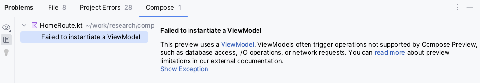
Previews and ViewModels
Previews are limited when using ViewModel within a
composable. The previews system is not capable of constructing all of the
parameters passed to a ViewModel, such as repositories, use cases, managers,
or similar. Also, if your ViewModel participates in dependency injection (such
as with Hilt), the previews system can't build the whole dependency
graph to construct the ViewModel.
When you try to preview a composable with ViewModel, Android Studio shows an
error when rendering the particular composable:
If you want to preview a composable that uses a ViewModel, you should create
another composable with the parameters from ViewModel passed as arguments of
the composable. This way, you don't need to preview the composable that uses the
ViewModel.
@Composable
fun AuthorScreen(viewModel: AuthorViewModel = viewModel()) {
  AuthorScreen(
    name = viewModel.authorName,
    // ViewModel sends the network requests and makes posts available as a state
    posts = viewModel.posts
  )
}

@Composable
fun AuthorScreen(
  name: NameLabel,
  posts: PostsList
) {
  // ...
}

@Preview
@Composable
fun AuthorScreenPreview(
  // You can use some sample data to preview your composable without the need to construct the ViewModel
  name: String = sampleAuthor.name,
  posts: List<Post> = samplePosts[sampleAuthor]
) {
  AuthorScreen(
      name = NameLabel(name),
      posts = PostsList(posts)
  )
}
Additional resources
- To read more about how Android Studio promotes
@Previewease of use, and learn more tooling tips, check out the blog Compose Tooling. - For the legacy Views guidance, see Develop a layout with Views.
Recommended for you
- Note: link text is displayed when JavaScript is off
- Locally scoped data with CompositionLocal
- Material Design 2 in Compose
- Using Views in Compose