Selektory czasu często pojawiają się w oknach. Możesz użyć stosunkowo ogólnej i minimalnej implementacji okna lub wdrożyć okno niestandardowe, które daje większą elastyczność.
Więcej informacji o oknach dialogowych, w tym o tym, jak używać stanu selektora czasu, znajdziesz w przewodniku po selektorach czasu.
Podstawowy przykład
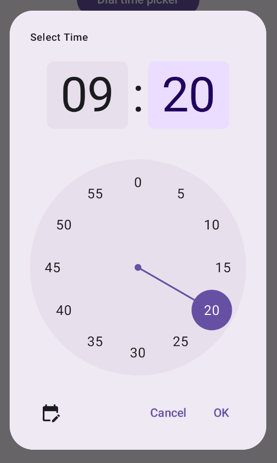
Najprostszym sposobem utworzenia okna dialogowego selektora czasu jest utworzenie funkcji kompozycyjnej, która implementuje interfejs AlertDialog. Poniższy fragment kodu zawiera przykład stosunkowo prostego okna dialogowego, które korzysta z tego podejścia:
@Composable fun DialWithDialogExample( onConfirm: (TimePickerState) -> Unit, onDismiss: () -> Unit, ) { val currentTime = Calendar.getInstance() val timePickerState = rememberTimePickerState( initialHour = currentTime.get(Calendar.HOUR_OF_DAY), initialMinute = currentTime.get(Calendar.MINUTE), is24Hour = true, ) TimePickerDialog( onDismiss = { onDismiss() }, onConfirm = { onConfirm(timePickerState) } ) { TimePicker( state = timePickerState, ) } } @Composable fun TimePickerDialog( onDismiss: () -> Unit, onConfirm: () -> Unit, content: @Composable () -> Unit ) { AlertDialog( onDismissRequest = onDismiss, dismissButton = { TextButton(onClick = { onDismiss() }) { Text("Dismiss") } }, confirmButton = { TextButton(onClick = { onConfirm() }) { Text("OK") } }, text = { content() } ) }
Zwróć uwagę na najważniejsze kwestie w tym fragmencie kodu:
- Funkcja kompozycyjna
DialWithDialogExampleopakowuje elementTimePickerw oknie. TimePickerDialogto niestandardowy komponent, który tworzyAlertDialogz tymi parametrami:onDismiss: funkcja wywoływana, gdy użytkownik zamknie okno (za pomocą przycisku zamykania lub nawigacji wstecz).onConfirm: funkcja wywoływana, gdy użytkownik kliknie przycisk „OK”.content: funkcja kompozycyjna, która wyświetla selektor czasu w oknie.
AlertDialogobejmuje:- Przycisk zamykania z etykietą „Zamknij”.
- Przycisk potwierdzenia z etykietą „OK”.
- Treść selektora czasu przekazana jako parametr
text.
- Funkcja
DialWithDialogExampleinicjuje funkcjęTimePickerStatez bieżącym czasem i przekazuje ją do funkcjiTimePickerionConfirm.
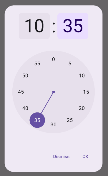
Zaawansowany przykład
Ten fragment kodu przedstawia zaawansowaną implementację konfigurowalnego okna wyboru czasu w Jetpack Compose.
@Composable fun AdvancedTimePickerExample( onConfirm: (TimePickerState) -> Unit, onDismiss: () -> Unit, ) { val currentTime = Calendar.getInstance() val timePickerState = rememberTimePickerState( initialHour = currentTime.get(Calendar.HOUR_OF_DAY), initialMinute = currentTime.get(Calendar.MINUTE), is24Hour = true, ) /** Determines whether the time picker is dial or input */ var showDial by remember { mutableStateOf(true) } /** The icon used for the icon button that switches from dial to input */ val toggleIcon = if (showDial) { Icons.Filled.EditCalendar } else { Icons.Filled.AccessTime } AdvancedTimePickerDialog( onDismiss = { onDismiss() }, onConfirm = { onConfirm(timePickerState) }, toggle = { IconButton(onClick = { showDial = !showDial }) { Icon( imageVector = toggleIcon, contentDescription = "Time picker type toggle", ) } }, ) { if (showDial) { TimePicker( state = timePickerState, ) } else { TimeInput( state = timePickerState, ) } } } @Composable fun AdvancedTimePickerDialog( title: String = "Select Time", onDismiss: () -> Unit, onConfirm: () -> Unit, toggle: @Composable () -> Unit = {}, content: @Composable () -> Unit, ) { Dialog( onDismissRequest = onDismiss, properties = DialogProperties(usePlatformDefaultWidth = false), ) { Surface( shape = MaterialTheme.shapes.extraLarge, tonalElevation = 6.dp, modifier = Modifier .width(IntrinsicSize.Min) .height(IntrinsicSize.Min) .background( shape = MaterialTheme.shapes.extraLarge, color = MaterialTheme.colorScheme.surface ), ) { Column( modifier = Modifier.padding(24.dp), horizontalAlignment = Alignment.CenterHorizontally ) { Text( modifier = Modifier .fillMaxWidth() .padding(bottom = 20.dp), text = title, style = MaterialTheme.typography.labelMedium ) content() Row( modifier = Modifier .height(40.dp) .fillMaxWidth() ) { toggle() Spacer(modifier = Modifier.weight(1f)) TextButton(onClick = onDismiss) { Text("Cancel") } TextButton(onClick = onConfirm) { Text("OK") } } } } } }
Zwróć uwagę na najważniejsze kwestie w tym fragmencie kodu:
- Funkcja kompozycyjna
AdvancedTimePickerExampletworzy konfigurowalne okno wyboru czasu. - Używa funkcji
Dialog, która zapewnia większą elastyczność niżAlertDialog. - Okno zawiera dostosowywany tytuł i przycisk przełączania między trybami wybierania i wpisywania.
Surface– stosuje kształt i wysokość do okna, przy czymIntrinsicSize.Mindotyczy zarówno szerokości, jak i wysokości.- Układy
ColumniRowzawierają komponenty struktury okna. - W przykładzie śledzimy tryb selektora za pomocą parametru
showDial.- Ikona
IconButtonumożliwia przełączanie się między trybami i odpowiednio zmienia swój wygląd. - Treść okna zmienia się między
TimePickeraTimeInputw zależności od stanushowDial.
- Ikona
Ta zaawansowana implementacja zapewnia wysoce konfigurowalne i wielokrotnego użytku okno wyboru czasu, które można dostosować do różnych przypadków użycia w aplikacji.
Ta implementacja wygląda tak: