Koleksiyonlar ile düzeninizi koruyun
İçeriği tercihlerinize göre kaydedin ve kategorilere ayırın.
Slider composable'ı, kullanıcıların bir dizi değer arasından seçim yapmasına olanak tanır. Kullanıcının aşağıdakileri yapmasına izin vermek için kaydırma çubuğu kullanabilirsiniz:
Ses ve parlaklık gibi bir değer aralığı kullanan ayarları düzenleyin.
Fiyat aralığı belirlerken olduğu gibi, grafikteki verileri filtreleme
Kullanıcı girişi (ör. yorumda puan verme)
Kaydırma çubuğu; iz, başparmak, değer etiketi ve işaretler içerir:
Parça: Parça, kaydırıcının alabileceği değer aralığını temsil eden yatay çubuktur.
Başparmak: Başparmak, kaydırıcı üzerinde sürükleyebileceğiniz bir kontrol öğesidir. Kullanıcı, bu öğe sayesinde iz tarafından tanımlanan aralıkta belirli bir değer seçebilir.
Onay işaretleri: Onay işaretleri, kaydırma çubuğunun yolu boyunca görünen isteğe bağlı görsel işaretler veya göstergelerdir.
1. Şekil. Kaydırma çubuğu uygulaması.
Temel uygulama
Tam API tanımı için Slider referansına bakın. Slider composable'ın bazı temel parametreleri şunlardır:
value: Kaydırma çubuğunun geçerli değeri.
onValueChange: Değer her değiştiğinde çağrılan bir lambda.
enabled: Kullanıcının kaydırma çubuğuyla etkileşime girip giremeyeceğini belirten bir Boole değeri.
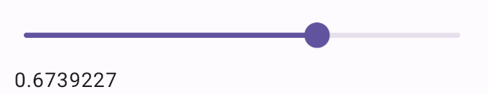
Aşağıdaki örnekte basit bir kaydırma çubuğu gösterilmektedir. Bu, kullanıcının 0.0 ile 1.0 arasında bir değer seçmesine olanak tanır. Kullanıcı bu aralıktaki herhangi bir değeri seçebildiğinden kaydırma çubuğu sürekli olur.
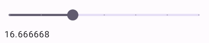
Aşağıdaki snippet, 0.0 ile 50.0 arasında bir aralığa sahip üç adımlı bir kaydırma çubuğu uygular. Başparmak her adıma oturduğu için bu kaydırma çubuğu ayrıktır.
3.şekil Adımları ve ayarlanmış bir değer aralığı olan kaydırma çubuğu.
Aralık kaydırma çubuğu
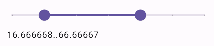
Ayrıca özel RangeSlider composable'ı da kullanabilirsiniz. Bu, kullanıcının iki değer seçmesine olanak tanır. Bu, kullanıcının minimum ve maksimum fiyat seçmek istediği gibi durumlarda faydalı olabilir.
Aşağıdaki örnek, sürekli aralık kaydırma çubuğunun nispeten basit bir örneğidir.
@Preview@ComposablefunRangeSliderExample(){varsliderPositionbyremember{mutableStateOf(0f..100f)}Column{RangeSlider(value=sliderPosition,steps=5,onValueChange={range->sliderPosition=range},valueRange=0f..100f,onValueChangeFinished={// launch some business logic update with the state you hold// viewModel.updateSelectedSliderValue(sliderPosition)},)Text(text=sliderPosition.toString())}}
Bu sayfadaki içerik ve kod örnekleri, İçerik Lisansı sayfasında açıklanan lisanslara tabidir. Java ve OpenJDK, Oracle ve/veya satış ortaklarının tescilli ticari markasıdır.
Son güncelleme tarihi: 2025-08-28 UTC.
[[["Anlaması kolay","easyToUnderstand","thumb-up"],["Sorunumu çözdü","solvedMyProblem","thumb-up"],["Diğer","otherUp","thumb-up"]],[["İhtiyacım olan bilgiler yok","missingTheInformationINeed","thumb-down"],["Çok karmaşık / çok fazla adım var","tooComplicatedTooManySteps","thumb-down"],["Güncel değil","outOfDate","thumb-down"],["Çeviri sorunu","translationIssue","thumb-down"],["Örnek veya kod sorunu","samplesCodeIssue","thumb-down"],["Diğer","otherDown","thumb-down"]],["Son güncelleme tarihi: 2025-08-28 UTC."],[],[],null,["The [`Slider`](/reference/kotlin/androidx/compose/material3/package-summary#Slider(androidx.compose.material3.SliderState,androidx.compose.ui.Modifier,kotlin.Boolean,androidx.compose.material3.SliderColors,androidx.compose.foundation.interaction.MutableInteractionSource,kotlin.Function1,kotlin.Function1)) composable allows users to make selections from a range of\nvalues. You might use a slider to let the user do the following:\n\n- Adjust settings that use a range of values, such as volume, and brightness.\n- Filter data in a graph, as when setting a price range.\n- User input, like setting a rating in a review.\n\nThe slider contains a track, thumb, value label, and tick marks:\n\n- **Track**: The track is the horizontal bar that represents the range of values the slider can take.\n- **Thumb**: The thumb is a draggable control element on the slider that allows the user to select a specific value within the range defined by the track.\n- **Tick marks**: Tick marks are optional visual markers or indicators that appear along the track of the slider.\n\n**Figure 1.** An implementation of a slider.\n\nBasic implementation\n\nSee the [`Slider`](/reference/kotlin/androidx/compose/material3/package-summary#Slider(androidx.compose.material3.SliderState,androidx.compose.ui.Modifier,kotlin.Boolean,androidx.compose.material3.SliderColors,androidx.compose.foundation.interaction.MutableInteractionSource,kotlin.Function1,kotlin.Function1)) reference for a full API definition. Some of the key\nparameters for the `Slider` composable are the following:\n\n- **`value`**: The current value of the slider.\n- **`onValueChange`**: A lambda that gets called every time the value is changed.\n- **`enabled`**: A boolean value that indicates if the user can interact with the slider.\n\nThe following example is a straightforward slider. That allows the user to\nselect a value from `0.0` to `1.0`. Because the user can select any value in\nthat range, the slider is *continuous*.\n\n\n```kotlin\n@Preview\n@Composable\nfun SliderMinimalExample() {\n var sliderPosition by remember { mutableFloatStateOf(0f) }\n Column {\n Slider(\n value = sliderPosition,\n onValueChange = { sliderPosition = it }\n )\n Text(text = sliderPosition.toString())\n }\n}https://github.com/android/snippets/blob/7a0ebbee11495f628cf9d574f6b6069c2867232a/compose/snippets/src/main/java/com/example/compose/snippets/components/Slider.kt#L59-L70\n```\n\n\u003cbr /\u003e\n\nThis implementation appears as follows:\n**Figure 2.** A basic implementation of a slider.\n\nAdvanced implementation\n\nWhen implementing a more complex slider, you can additionally make use of the\nfollowing parameters.\n\n- **`colors`** : An instance of `SliderColors` that lets you control the colors of the slider.\n- **`valueRange`**: The range of values that the slider can take.\n- **`steps`**: The number of notches on the slider to which the thumb snaps.\n\nThe following snippet implements a slider that has three steps, with a range\nfrom `0.0` to `50.0`. Because the thumb snaps to each step, this slider is\n*discrete*.\n\n\n```kotlin\n@Preview\n@Composable\nfun SliderAdvancedExample() {\n var sliderPosition by remember { mutableFloatStateOf(0f) }\n Column {\n Slider(\n value = sliderPosition,\n onValueChange = { sliderPosition = it },\n colors = SliderDefaults.colors(\n thumbColor = MaterialTheme.colorScheme.secondary,\n activeTrackColor = MaterialTheme.colorScheme.secondary,\n inactiveTrackColor = MaterialTheme.colorScheme.secondaryContainer,\n ),\n steps = 3,\n valueRange = 0f..50f\n )\n Text(text = sliderPosition.toString())\n }\n}https://github.com/android/snippets/blob/7a0ebbee11495f628cf9d574f6b6069c2867232a/compose/snippets/src/main/java/com/example/compose/snippets/components/Slider.kt#L74-L92\n```\n\n\u003cbr /\u003e\n\nThe implementation appears as follows:\n**Figure 3.** A slider with steps and a set value range. **Note:** The very beginning and end of a slider count as \"steps\". In the preceding example where the range is `0f..50f` and the number of `steps` is `3`, each interval along the range is `12.5` because the beginning and end of the slider are also intervals the user can select.\n| **Note:** You can also pass `Slider` a `thumb` and `track` composable to more thoroughly customize the appearance of the component.\n\nRange slider\n\nYou can also use the dedicated `RangeSlider` composable. This allows the user to\nselect two values. This can be useful in cases such as when the user wishes to\nselect a minimum and maximum price.\n\nThe following example is a relatively straightforward example of a continuous\nrange slider.\n\n\n```kotlin\n@Preview\n@Composable\nfun RangeSliderExample() {\n var sliderPosition by remember { mutableStateOf(0f..100f) }\n Column {\n RangeSlider(\n value = sliderPosition,\n steps = 5,\n onValueChange = { range -\u003e sliderPosition = range },\n valueRange = 0f..100f,\n onValueChangeFinished = {\n // launch some business logic update with the state you hold\n // viewModel.updateSelectedSliderValue(sliderPosition)\n },\n )\n Text(text = sliderPosition.toString())\n }\n}https://github.com/android/snippets/blob/7a0ebbee11495f628cf9d574f6b6069c2867232a/compose/snippets/src/main/java/com/example/compose/snippets/components/Slider.kt#L96-L113\n```\n\n\u003cbr /\u003e\n\n**Figure 4.** An implementation of a range slider.\n\nAdditional resources\n\n- [Material UI docs](https://m3.material.io/components/sliders/overview)"]]