Dialog bileşeni, ana uygulama içeriğinin üzerindeki bir katmanda iletişim kutusu mesajları gösterir veya kullanıcı girişini ister. Kullanıcının dikkatini çekmek için kesintiye neden olan bir kullanıcı arayüzü deneyimi oluşturur.
İletişim kutusunun kullanım alanlarından bazıları şunlardır:
- Kullanıcı işlemini onaylama (ör. dosya silme)
- Yapılacaklar listesi uygulamasında olduğu gibi kullanıcı girişi isteme
- Kullanıcıların seçim yapabileceği seçeneklerin listesini gösterme (ör. profil ayarlarında ülke seçme).

Uyarı iletişim kutusu
AlertDialog composable'ı, Materyal Tasarım temalı bir iletişim kutusu oluşturmak için uygun bir API sağlar. AlertDialog, iletişim kutusunun belirli öğelerini işlemek için özel parametrelere sahiptir. Bunlardan bazıları:
title: İletişim kutusunun üst kısmında görünen metin.text: İletişim kutusunun ortasında görünen metin.icon: İletişim kutusunun üst kısmında görünen grafik.onDismissRequest: Kullanıcı iletişim kutusunu kapattığında (ör. dışına dokunarak) çağrılan işlev.dismissButton: Kapatma düğmesi olarak kullanılan bir composable.confirmButton: Onay düğmesi olarak kullanılan bir composable.
Aşağıdaki örnekte, uyarı iletişim kutusunda iki düğme uygulanıyor. Bu düğmelerden biri iletişim kutusunu kapatıyor, diğeri ise isteği onaylıyor.
@Composable fun AlertDialogExample( onDismissRequest: () -> Unit, onConfirmation: () -> Unit, dialogTitle: String, dialogText: String, icon: ImageVector, ) { AlertDialog( icon = { Icon(icon, contentDescription = "Example Icon") }, title = { Text(text = dialogTitle) }, text = { Text(text = dialogText) }, onDismissRequest = { onDismissRequest() }, confirmButton = { TextButton( onClick = { onConfirmation() } ) { Text("Confirm") } }, dismissButton = { TextButton( onClick = { onDismissRequest() } ) { Text("Dismiss") } } ) }
Bu uygulama, bağımsız değişkenleri alt composable'a şu şekilde ileten bir üst composable'ı ifade eder:
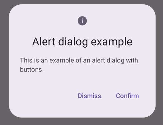
@Composable fun DialogExamples() { // ... val openAlertDialog = remember { mutableStateOf(false) } // ... when { // ... openAlertDialog.value -> { AlertDialogExample( onDismissRequest = { openAlertDialog.value = false }, onConfirmation = { openAlertDialog.value = false println("Confirmation registered") // Add logic here to handle confirmation. }, dialogTitle = "Alert dialog example", dialogText = "This is an example of an alert dialog with buttons.", icon = Icons.Default.Info ) } } } }
Bu uygulama aşağıdaki gibi görünür:
Dialog composable'ı
Dialog, stil veya içerik için önceden tanımlanmış yuvalar sağlamayan temel bir composable'dır. Card gibi bir kapsayıcıyla doldurmanız gereken nispeten basit bir kapsayıcıdır. Aşağıda, bir iletişim kutusunun temel parametrelerinden bazıları verilmiştir:
onDismissRequest: Kullanıcı iletişim kutusunu kapattığında çağrılan lambda.properties: Özelleştirme için ek kapsam sağlayan birDialogPropertiesörneği.
Temel örnek
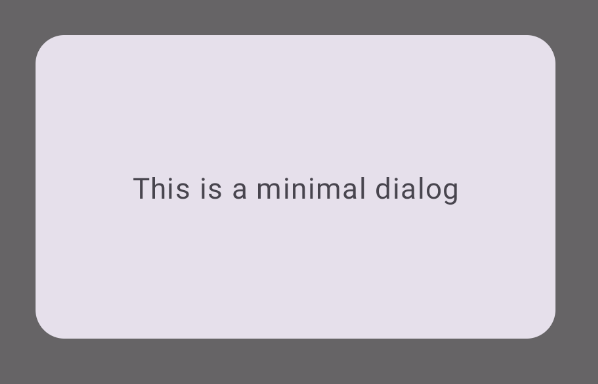
Aşağıdaki örnek, Dialog composable'ın temel bir uygulamasıdır. İkincil kapsayıcı olarak Card kullandığını unutmayın. Card olmadan Text bileşeni, ana uygulama içeriğinin üzerinde tek başına görünür.
@Composable fun MinimalDialog(onDismissRequest: () -> Unit) { Dialog(onDismissRequest = { onDismissRequest() }) { Card( modifier = Modifier .fillMaxWidth() .height(200.dp) .padding(16.dp), shape = RoundedCornerShape(16.dp), ) { Text( text = "This is a minimal dialog", modifier = Modifier .fillMaxSize() .wrapContentSize(Alignment.Center), textAlign = TextAlign.Center, ) } } }
Bu uygulama yöntemi aşağıdaki gibi görünür. İletişim kutusu açıkken altındaki ana uygulama içeriğinin karartılmış ve gri renkte göründüğünü unutmayın:
İleri düzey örnek
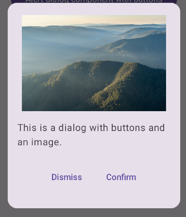
Aşağıdaki örnek, Dialog composable'ın daha gelişmiş bir uygulamasıdır. Bu durumda, bileşen, önceki AlertDialog örneğine benzer bir arayüzü manuel olarak uygular.
@Composable fun DialogWithImage( onDismissRequest: () -> Unit, onConfirmation: () -> Unit, painter: Painter, imageDescription: String, ) { Dialog(onDismissRequest = { onDismissRequest() }) { // Draw a rectangle shape with rounded corners inside the dialog Card( modifier = Modifier .fillMaxWidth() .height(375.dp) .padding(16.dp), shape = RoundedCornerShape(16.dp), ) { Column( modifier = Modifier .fillMaxSize(), verticalArrangement = Arrangement.Center, horizontalAlignment = Alignment.CenterHorizontally, ) { Image( painter = painter, contentDescription = imageDescription, contentScale = ContentScale.Fit, modifier = Modifier .height(160.dp) ) Text( text = "This is a dialog with buttons and an image.", modifier = Modifier.padding(16.dp), ) Row( modifier = Modifier .fillMaxWidth(), horizontalArrangement = Arrangement.Center, ) { TextButton( onClick = { onDismissRequest() }, modifier = Modifier.padding(8.dp), ) { Text("Dismiss") } TextButton( onClick = { onConfirmation() }, modifier = Modifier.padding(8.dp), ) { Text("Confirm") } } } } } }
Bu uygulama aşağıdaki gibi görünür: