The Dialog component displays dialog messages or requests user input on a
layer above the main app content. It creates an interruptive UI experience to
capture user attention.
Among the use cases for a dialog are the following:
- Confirming user action, such as when deleting a file.
- Requesting user input, such as in a to-do list app.
- Presenting a list of options for user selection, like choosing a country in a profile setup.

Alert dialog
The AlertDialog composable provides a convenient API for creating a
Material Design themed dialog. AlertDialog has specific parameters for
handling particular elements of the dialog. Among them are the following:
title: The text that appears along the top of the dialog.text: The text that appears centered within the dialog.icon: The graphic that appears at the top of the dialog.onDismissRequest: The function called when the user dismisses the dialog, such as by tapping outside of it.dismissButton: A composable that serves as the dismiss button.confirmButton: A composable that serves as the confirm button.
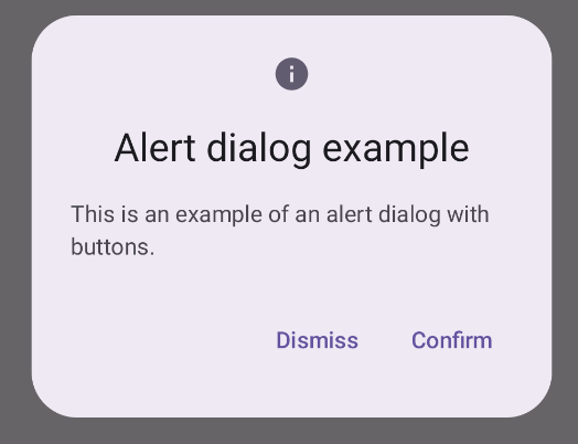
The following example implements two buttons in an alert dialog, one that dismisses the dialog, and another that confirms its request.
@Composable fun AlertDialogExample( onDismissRequest: () -> Unit, onConfirmation: () -> Unit, dialogTitle: String, dialogText: String, icon: ImageVector, ) { AlertDialog( icon = { Icon(icon, contentDescription = "Example Icon") }, title = { Text(text = dialogTitle) }, text = { Text(text = dialogText) }, onDismissRequest = { onDismissRequest() }, confirmButton = { TextButton( onClick = { onConfirmation() } ) { Text("Confirm") } }, dismissButton = { TextButton( onClick = { onDismissRequest() } ) { Text("Dismiss") } } ) }
This implementation implies a parent composable that passes arguments to the child composable in this way:
@Composable fun DialogExamples() { // ... val openAlertDialog = remember { mutableStateOf(false) } // ... when { // ... openAlertDialog.value -> { AlertDialogExample( onDismissRequest = { openAlertDialog.value = false }, onConfirmation = { openAlertDialog.value = false println("Confirmation registered") // Add logic here to handle confirmation. }, dialogTitle = "Alert dialog example", dialogText = "This is an example of an alert dialog with buttons.", icon = Icons.Default.Info ) } } } }
This implementation appears as follows:
Dialog composable
Dialog is a basic composable that doesn't provide any styling or
predefined slots for content. It is a relatively straightforward container that
you should populate with a container such as Card. The following are some of
the key parameters of a dialog:
onDismissRequest: The lambda called when the user closes the dialog.properties: An instance ofDialogPropertiesthat provides some additional scope for customization.
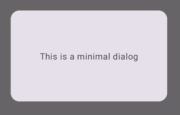
Basic example
The following example is a basic implementation of the Dialog composable. Note
that it uses a Card as the secondary container. Without the Card, the Text
component would appear alone above the main app content.
@Composable fun MinimalDialog(onDismissRequest: () -> Unit) { Dialog(onDismissRequest = { onDismissRequest() }) { Card( modifier = Modifier .fillMaxWidth() .height(200.dp) .padding(16.dp), shape = RoundedCornerShape(16.dp), ) { Text( text = "This is a minimal dialog", modifier = Modifier .fillMaxSize() .wrapContentSize(Alignment.Center), textAlign = TextAlign.Center, ) } } }
This implementation appears as follows. Note that when the dialog is open, the main app content beneath it appears darkened and grayed out:
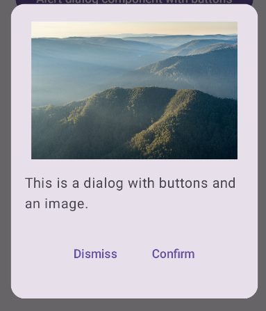
Advanced example
The following is a more advanced implementation of the Dialog composable. In
this case, the component manually implements a similar interface to the
preceding AlertDialog example.
@Composable fun DialogWithImage( onDismissRequest: () -> Unit, onConfirmation: () -> Unit, painter: Painter, imageDescription: String, ) { Dialog(onDismissRequest = { onDismissRequest() }) { // Draw a rectangle shape with rounded corners inside the dialog Card( modifier = Modifier .fillMaxWidth() .height(375.dp) .padding(16.dp), shape = RoundedCornerShape(16.dp), ) { Column( modifier = Modifier .fillMaxSize(), verticalArrangement = Arrangement.Center, horizontalAlignment = Alignment.CenterHorizontally, ) { Image( painter = painter, contentDescription = imageDescription, contentScale = ContentScale.Fit, modifier = Modifier .height(160.dp) ) Text( text = "This is a dialog with buttons and an image.", modifier = Modifier.padding(16.dp), ) Row( modifier = Modifier .fillMaxWidth(), horizontalArrangement = Arrangement.Center, ) { TextButton( onClick = { onDismissRequest() }, modifier = Modifier.padding(8.dp), ) { Text("Dismiss") } TextButton( onClick = { onConfirmation() }, modifier = Modifier.padding(8.dp), ) { Text("Confirm") } } } } } }
This implementation appears as follows: