
Durumu veya başka bir composable'daki sayısal değeri belirtmek için küçük bir görsel öğe görüntülemek üzere rozet kullanın. Rozet kullanabileceğiniz birkaç yaygın senaryo aşağıda verilmiştir:
- Bildirimler: Okunmamış bildirimlerin sayısını uygulama simgesinde veya bildirim zilinde gösterir.
- Mesajlar: Bir sohbet uygulamasındaki yeni veya okunmamış mesajları gösterir.
- Durum güncellemeleri: Bir görevin durumunu gösterir (ör. "tamamlandı", "devam ediyor" veya "başarısız oldu").
- Sepet miktarı: Kullanıcının alışveriş sepetindeki öğe sayısını gösterin.
- Yeni içerik: Kullanıcının erişebileceği yeni içerikleri veya özellikleri vurgulayın.

API yüzeyi
Uygulamanızda rozetleri uygulamak için BadgedBox composable'ını kullanın. Sonuçta bir kapsayıcıdır. Görünümünü şu iki ana parametreyle kontrol edebilirsiniz:
content:BadgedBoxöğesinin içerdiği birleştirilebilir içerik. NormaldeIcon.badge: İçeriğin üzerinde rozet olarak görünen composable. Genellikle özelBadgecomposable'dır.
Temel örnek
Bu kod snippet'i, BadgedBox'nın temel bir uygulamasını gösterir:
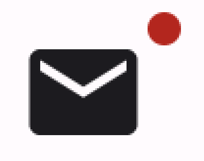
@Composable fun BadgeExample() { BadgedBox( badge = { Badge() } ) { Icon( imageVector = Icons.Filled.Mail, contentDescription = "Email" ) } }
Bu örnekte, sağlanan Icon composable'ı kaplayan bir rozet gösterilmektedir. Koddaki aşağıdaki noktalara dikkat edin:
BadgedBoxgenel kapsayıcı olarak kullanılır.BadgedBoxparametresininbadgebağımsız değişkeniBadge'dir.Badge'ün kendi bağımsız değişkenleri olmadığından uygulama, küçük kırmızı bir daire olan varsayılan rozeti gösterir.Icon,BadgedBoxöğesinincontentparametresinin bağımsız değişkeni olarak işlev görür. Rozetin üzerinde göründüğü simgedir. Bu durumda, posta simgesi gösterilir.
Bu özellik şu şekilde görünür:
Ayrıntılı örnek
Aşağıdaki snippet, rozetteki değerleri kullanıcı işlemlerine yanıt verecek şekilde nasıl gösterebileceğinizi gösterir.
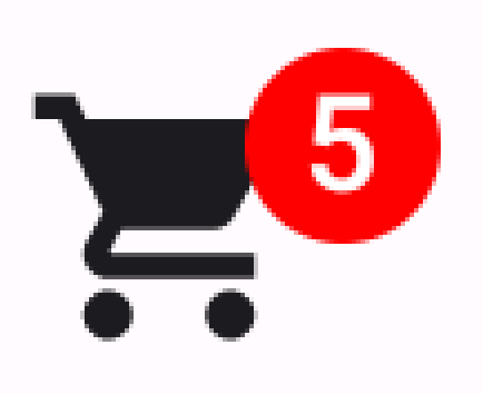
@Composable fun BadgeInteractiveExample() { var itemCount by remember { mutableIntStateOf(0) } Column( verticalArrangement = Arrangement.spacedBy(16.dp) ) { BadgedBox( badge = { if (itemCount > 0) { Badge( containerColor = Color.Red, contentColor = Color.White ) { Text("$itemCount") } } } ) { Icon( imageVector = Icons.Filled.ShoppingCart, contentDescription = "Shopping cart", ) } Button(onClick = { itemCount++ }) { Text("Add item") } } }
Bu örnekte, kullanıcının sepetindeki öğe sayısını gösteren bir rozet içeren alışveriş sepeti simgesi uygulanmaktadır.
BadgedBox, yalnızca öğe sayısı 0'dan fazla olduğunda gösterilir.containerColorvecontentColorbağımsız değişkenleri, rozetin görünümünü kontrol eder.Badgeiçerik alanınınTextcomposable'ı rozetin içinde görünür. Bu durumda, alışveriş sepetindeki öğelerin sayısı gösterilir.
Bu uygulama aşağıdaki gibi görünür: